


MPEG news: a report from the 155th meeting
1 month ago
A research team including Nobuo Masataka, a professor at Kyoto University’s Primate Research Institute, has found that boys with autism spectrum disorder (ASD) tend not to like yellow but show a preference for green. “Yellow may tire autistic children. I want people to take this into account when they use the color on signboards and elsewhere,” Masataka said.
The team, also including France’s University of Rennes 1, has confirmed the color preference of boys with the disorder, according to an article recently published in the journal Frontiers in Psychology. In the study, the color preference of 29 autistic boys aged 4 to 17 was compared with that of 38 age-matched typically developing (TD) boys. All participants were recruited in France, which has clear diagnostic criteria for autism spectrum disorder.
Shown cards of six colors—red, blue, yellow, green, brown and pink—the children were asked to answer which color they like. Yellow was liked by TD boys without the disorder but far less preferred by ASD boys. On the other hand, green and brown were liked more by boys in the ASD group than by those in the TD group, while red and blue were favored to similar degrees by both groups of boys. Pink was unpopular in both groups.
Given the relatively small sample size in each of the three age groups, the failure to find any difference in preference scores between TD children and children with ASD with regard to red, blue and pink might be attributable to a ceiling/floor effect.
The article said yellow has the highest luminance value among the six colors. “The observed aversion to this color might reflect hypersensitivity” of children with ASD, the article said. There is also a general consensus that yellow is the most fatiguing color. When yellow is perceived, both L and M must be involved. The perception of yellow should thus be the most heavily sensory-loaded of the perception of any type of color. Its perception is bearable for TD children but could be over-loaded for children with ASD whose sensitivity to sensory stimulation is enhanced.
Marine Grandgeorge and Nobuo Masataka: "Atypical Color Preference in Children with Autism Spectrum Disorder," Front. Psychol., 23 December 2016, https://doi.org/10.3389/fpsyg.2016.01976


The American Association for the Advancement of Science (AAAS) is setting up a new platform for scientific collaboration called Trellis. A key feature is that you can upload papers you want to discuss and anybody in the group can read the paper online: the AAAS takes care of all the copyright issues with the journal publisher. Another feature is that you can control how much noise you get from Trellis. Messages can have up to 2500 characters, but if you have longer text you can create a PDF and upload it like a paper. The same holds for images and videos.
Many AAAS members are teachers: if you do crowd-sourced experiments, you can easily find subjects. The AAAS is also involved in policy making in Washington, in case you need help with that. You can also announce conferences and other scientific events, and use the shared calendar.
Trellis is currently in pilot phase for educators, policy makers, and Section T of AAAS (Information, Computing, and Communication). There are still a few rough edges that are being ironed out. That might be why you have not yet heard of Trellis.
I am setting up a group called Computational Color Science in Section T. However, we are trying out something new. We are making it a completely open group, i.e., anybody with the URL can sign up and participate, without having to be an AAAS member. To join, go to http://www.trelliscience.com/color/. You can invite anybody else you want by giving them the URL and they can sign up.

Yesterday afternoon, at the Stanford Center for Image Systems Engineering, Dr. Joyce Farrell hosted Prof. M. Ronnier Luo for an update on the latest activities at the International Commission on Illumination (CIE), of which he is the Vice-President. He focussed on the aspects relevant to imaging.
Division 7, terminology, has been disbanded because it has finished its work. The e-ILV can be accessed at this link.
There is a new CIE 2006 physiologically based observer model with XYZ functions transformed from the CIE (2006) LMS functions. These functions are linear transformations of the cone fundamentals of Stockman and Sharpe, the 10º LMS fundamental colour matching functions. In the plot below, you can see the 2º XYZ CMFs transformed from the CIE (2006) LMS cone fundamentals. Note the different shapes around 450 nm compared to the 1931 and 1964 observer models.

The new model is a pipeline in whose stages the age-related parameters can be set. The 10º LMS functions are corrected for the absorption of the ocular media and the macular pigment, and take into account the optical densities of the cone visual pigments, all for a 10° viewing field, yielding the low-density absorbance functions of these pigments. Using these low-density absorbance functions one can derive, taking into account the absorption of the ocular media and the macula, and taking into account the densities of the visual pigments for a 2° viewing field, the 2° cone fundamentals.
There is also a new luminous efficiency function V(λ), which has changed mostly in the blue region.
There are new scales for whiteness and blackness, which corresponds to those in the NCS system. They are based on the comprehensive CAM16 appearance model. Considering a hue leaf of CIELAB in cylindrical coordinates, the south–east ↘ diagonal scale is whiteness–depth and the north–east ↗ is blackness–vividness. These new scales are particularly useful in imaging for adjusting complexion. The skin colors of Asian and Caucasian people vary along the whiteness–depth scale and those of African people vary along the blackness–vividness scale.
Next, Ronnier explained the new color rendering index (CRI) that works also for LED light sources. He also presented a very compelling demonstration of the apparatus used to develop the standard. The new color rendering index is called CRI 2010 and IESNA-TM40. It is based on the measurement of 99 test samples.
I was a little disappointed that the new CRI is still based on colorimetry and not on spectral data. Using colorimetry is an analytical process and having a much larger number of samples helps. However, it does not allow a full characterization of a light source, as we learned many years ago with the tri-band fluorescent lamps. They use less energy, but at the cost of quality.
In this case, I am not too much of a fan of the energy reduction because in practice when you reduce the cost of running a light, people will just deploy more lights and in the end you do not save energy. This is so in consumer applications and does not hold for industrial applications.
Our environment is not made out of BICRA tiles and usually, we are not in aperture mode. We perceive complex images and the light from a set of spot lamps modulates our ambient. While in the case of OLED or fluorescent lamps we might have diffuse light, with LEDs and conventional halogen spot lamps we have more of a set of directed sources with a rapid fall-off.
The rooms in my house are painted in a fusion Italian and Japanese style. The colors are vivid (Italian style), but the paints have a very peaked spectrum so the color is modulated by the illumination (Japanese style). We use older high-quality LED sources with two different green phosphors (the additional one is based on Europium), which we dim. The visual effect is similar to candlelight, except for the correlated color temperature (CCT).
From my experience, I think that a CRI model should include the difference between the spectral distributions of the light source and the reference illuminant. I would also like to have two different reference distributions, A for mood light and D for work light. For thousands of years, we have evolved performing work in daylight and relaxing in blackbody radiator light from fires, oil lamps, and candles. When we want to be in a cozy mood, we pull out the candles, which is also common in upscale restaurants. Candles are more expensive and dangerous than LEDs in houses built from flammable materials.
Should the new CRI also have a provision for the blue hour? Ronnier concluded his presentation stating that the new research topic is tunable white.
As noted on lines 23 and 24 in column 4 of the printed version of patent 8,770,625,
the U.S. Patent Office procedure discourages the use of color drawings. This makes Fig. 4 a little hard to visualize for the non color scientist (there are no color figures in Wyszecki & Stiles), so here it is in color (right pane):

The invention is relatively simple. The general field is anti-counterfeiting as it applies to packaging. Professional counterfeiters have no problem faking ordinary measures like serial numbers and holograms, so the trick is to embed information that cannot easily be perceived by a counterfeiter, hence is omitted in the facsimile. Fortunately color does not exist in nature, it is just an illusion happening in our minds. Therefore, all we have to do is to create an illusion you can only perceive if you expect it.
As described in patent 8,770,625, a number computed from the—possibly counterfeited—serial number on the package can be encoded positionally in a tic-tac-toe grid. The marking is just above the visual threshold, so the naive counterfeiter will reproduce the same pattern on all packages. The trained inspector can then quickly assert whether an actual positional code corresponds, for example, to the possibly fake serial number.
Patent 8,770,625 is relatively short with just three claims, but reducing it to practice is a little tricky, even when all the steps are disclosed in the patent. The difficult part is to design the tool to determine experimentally the visual thresholds for the print process being used and the light conditions under which the inspections are expected to happen. You need to be skilled in the art.
The above figure is a screen-shot of that tool. To implement it you need to write a spectral color management system with CIE colorimetry to simulate the press on the display and vision colorimetry to model what the actual human visual system perceives. The details of the controls are explained in patent 8,770,625.
Depending on your viewing conditions, the above color version of Fig. 4 might be under the visual threshold. If that is the case, in the figure below we crank up the saliency and decrease the background coverage, so you will see the encoding for sure. If you have aliasing problems, you can click on the figures to display them at the original resolution in which they were created eight years ago, early July 2006 (time flies).

When we snorkel in a tropical coral reef we are amazed at the colorful displays of the marine fauna and flora. Then we wonder why some of the fish are so flashy, making them conspicuous to predators.
As we wrote in our post on Why are animals colourful? Sex and violence, seeing and signals, Justin Marshall first showed a video snorkeling in a coral reef with a camcorder with spectral sensitivities close to ours, then he showed the same scene using a camcorder with spectral sensitivities close those of coral fish and all the sudden the fish could no longer be distinguished from the background.
In his presentation, Justin Marshall also described how stomatopods like the mantis shrimp are masters of color vision because on top of multiple spectral channels they have sensors for both linear and circular polarization. Shortly thereafter we reported in Nature's almost perfect quarter-wave retarder on Justin Marshall's new paper revealing how the mantis shrimp detects polarization.

How color vision works in the mantis shrimp had remained a mystery, at least until now. Justin Marshall and his collaborators have just published the paper A Different Form of Color Vision in Mantis Shrimp in Science 24 January 2014: Vol. 343 pp. 411-413 (membership required, or check in your local library). It turns out that unlike other animals, mantis shrimp do not have a color-opponent coding system based on a processing system of multiple dichromatic comparisons.
Instead, it appears that their color vision system is based on temporal signaling combined with scanning eye movements, enabling a type of color recognition rather than color discrimination. This would enable the mantis shrimp to make quick and reliable determinations of color, without the processing delay required for a multidimensional color space. This fits their rapid-fire lifestyle of combat and territoriality.
The next step could be to unveil the details of the neural processing from the receptors.
 A Western Australian company has used pioneering research by leading University of WA shark experts to develop wetsuits designed to confuse sharks or render surfers invisible to the predators. The world-first shark repellent suits are based on discoveries by Associate Professor Nathan Hart and Winthrop Professor Shaun Collin, from UWA's Oceans Institute and School of Animal Biology, about how predatory sharks see and detect prey. The suits use a specific combination of colours and patterns to deter the creatures. One design — known as the ‘cryptic' wetsuit — allows the wearer to effectively blend with background colours in the water, making it difficult for a shark to detect or focus on the wearer. The other design — the ‘warning' wetsuit — makes the user appear highly visible by using disruptive and high contrast banding patterns to make them appear totally unlike any normal prey, or even as an unpalatable or dangerous option. The designs also come in the form of stickers for the undersides of surfboards. While the company Shark Attack Mitigation Systems could not claim the suits were a failsafe protection against shark attacks, results from initial testing of the wetsuits in the ocean with wild sharks had been ‘extraordinary'.
Original article: UWA science leads to world-first anti-shark suits
See also Why are animals colourful? Sex and violence, seeing and signals
The firefly plays a special role in Japanese culture. It is called hotaru (蛍, ほたる) and we researchers know it from the expression 蛍雪 (けいせつ), or firefly-writing, which refers to diligence in studying (i.e., continue to study even in such poor light as offered by a firefly). For more wordly people, the firefly is the symbol of passionate love.
At least from the 24 April 1185 battle of Dan-no-ura, where the Genji under Minamoto no Yoshitsune, defeated the Heike (Taira), if not from earlier, it is believed that when soldiers are killed in battle, their souls are transformed into fireflies. Therefore, in Japan the view of hotaru is very sentimental and patriotic.
Today the life of scientists is more peaceful, as researchers are no longer killed like Goethe's Faustus when his grant was up or Giordano Bruno when he came up with the mathematical concept of infinity (see glad not to be on the stake), so we can be cheerful when we see fireflies.
I remember when we moved to Lugano, at the city's border, consisting mostly of untended fields. The place did not even have a name yet, it was just the far end of Besso, or Lugano 3, as the postal system prosaically called it with the introduction of zip codes. As kids we only had to run away from the apartment buildings for a few minutes to be in a completely dark environment devoid of any light pollution. The black sky was dotted with infinite stars, but in summer, towards Cortivallo and the lake of Muzzano, we were immersed in a cloud of fireflies. It was a magic experience.
Of course, today as color scientists we are more interested in the spectrum of the firefly. Entomology teaches us that males and females are anatomically different, with the latter having two lateral light sources and the former three adjacent light sources. This means that we have to measure the sexes independently. How can we achieve that?
In his recent paper in Atti della Fondazione Giorgio Ronchi, volume LXVII (2012), number 3, pages 455–458, Paolo Stefanini reports how he accomplished it.

The males normally cruise above the fields, while the females are hidden in the grass. When the females want to mate, the crawl to the apex of the grass leaves and wait. A males ready to mate flashes his light and a female flashes back, then they go at it. Therefore, Stafanini first measured the males, then he built a male decoy using LEDs. The decoy allowed him to beat the females out of the bushes, so he could measure them too.
In the mid-80s, when we were building up the new digital color research area at PARC, we invited as many color scientists active in digital reproduction as we could. We had two motives: scope the field and identify potential candidates to hire.
One visitor stood out for his deep knowledge both in color vision science and in the mathematical modeling of reproduced color. With his tall slender figure he was immediately recognizable, and his soft voice was very determined in technical discussions. He also had a unique curriculum vitæ: he developed the avionics color displays for Honeywell and Boeing while never changing location; his employer would change, but his lab remained intact. While others were trying to characterize CRTs, he build a complete model for LCD displays; without him, we would not have high fidelity color LCD displays today.
Dr. Louis D. Silverstein has died at age 61. Farewell Lou!

I has been almost a year since we posted on Maryam's color semiotics research.
Everyone is talking about it these days, but where can we find a certain rule or framework which defines it? What parameters are involved? Is this framework useful for designers? Can it be communicated? Can its variation be modelled?
Last January 23rd Maryam reached the 1800th response to her survey. This is the last chance for your participation before her ultimate analysis. Please take to survey now at https://www.keysurvey.co.uk/votingmodule/s180/survey/365495/1a02/
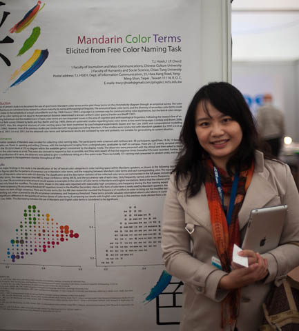
At the AIC 2011 meeting, Tsuei-Ju Hsieh from the Chinese Culture University presented the poster Mandarin color terms elicited from free color naming task she prepared with I-Ping Chen of the Chiao-Tung University.
Up to now, there have been only few color naming experiments in Mandarin and their behavioral results are outdated. Tsuei-Ju Hsieh enrolled 36 native Mandarin speakers and asked them to freely name 121 evenly sampled stimuli sweeping the 50 cd/m2 level of the 1931 CIE chromaticity diagram. The response times were also recorded and following the production of a name, the observers were asked to give a confidence rating on a five-point scale.
The result is the identification of the foci of lexical color categories in a color naming space within Mandarin speakers, as shown in the figure below:
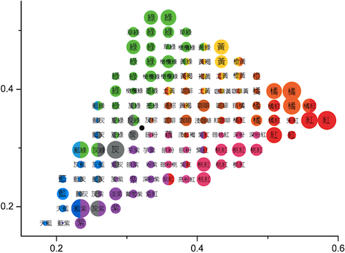
There is significant difference in the quantity of various classes of color terms when comparing Tsuei-Ju Hsieh's results with the English color terms in a previous study elicited from a similar task.
A full journal paper is about to appear in Color Research and Applications.

At the AIC 2011 meeting, Midori Tanaka presented the paper Color naming experiment using 2D and 3D rendered samplesColor naming experiment using 2D and 3D rendered samples she wrote with Shoji Tominaga and Takahiko Horiuchi, all of Chiba University.
Usually in color naming experiments the observer is shown color swatches and asked to provide a color term for each swatch. In Tanaka's psychophysics experiments the observers were shown a single color swatch and then asked to assign to it one of the 15 basic Japanese color terms (the 11 universal plus turquoise, chartreuse, gold, and silver).
While usually the color swatch is completely uniform, i.e., the pixels all have the same identical RGB values, Tanaka chose a different rendering in each experiment. They were 2D (i.e., identical RGB values), 3D rendering with low contrast shading, 3D with high contrast shading, and 3D with shading and specular reflection:
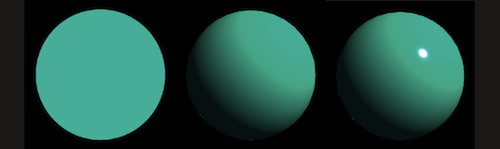
An unexpected result is that observer determine the color term significantly faster with the 3D sample than with the 2D sample. Unfortunately this does not lead to a methodology for faster color naming. Indeed, the main result of the paper is that the number of bright color terms decreases in the case of 3D samples, so the data from 3D samples cannot be compared directly with data from 2D samples.
Not unexpected is that orange and brown change in opposite directions from 2D to 3D. This paper is clearly the beginning of research to much better understand the mechanisms of color naming in the human visual system.
Midori Tanaka will graduate from her master course next March and she still has to decide whether to pursue a Ph.D. or find employment in industry. If you can provide her with an active role in your organization, please let her know.
Color semiotics: everyone is talking about it these days, but where can we find a certain rule or framework which defines it? What parameters are involved? Is this framework useful for designers? Can it be communicated? Can its variation be modelled?
Meet Maryam M. Darrodi, who is trying to answer all of these questions in her Ph.D. research under supervision of Professor Stephen Westland in the University of Leeds.
But there is a part for you too. You can join her Global Online Survey about Colour Semiotics in your very own native language and answer a few questions about a certain color by just clicking on this link: https://www.keysurvey.co.uk/survey/365495/1a02/.
This survey takes less than 3 minutes and you can participate as many times as you wish (each time you will be presented with a different color).
For more information visit http://coloursemiotics.wordpress.com/.
Friday, January 28, 2011 we wrote about our EI papers, but then Saturday, February 19, 2011 we had to backpedal on the accessibility of the papers. Today we are happy to announce that with the generous support of our lab director who is sponsoring the page charges, we are able to make the fuchsia paper open access.

Colors are often named ad hoc, like in the image above. In the fuchsia paper, we derive the correct method to elicit color terms. In a second part, we report on the calibrated lunch experiment, where we show that color terms elicited from emissive samples like those from crowd-sourcing correlate very well with those elicited from reflection samples like those used in the World Color Survey.
Here is the link to the paper: http://dx.doi.org/10.1117/12.872581 (the button to download the PDF is on the right). The slides are still in the post of Tuesday, January 25, 2011.
Happy Easter and happy reading!
Researchers at the University of Basel have discovered that computer screens with a LED backlight unit (BLU) have a greater effect on a person's sleepiness and cognitive performance, as compared to other types of BLUs. LEDs emit more energy at a wavelength of around 464 nanometers, which has a strong effect on the circadian hormone melatonin's level as well as on cognitive performance. Tests showed that people who sat in front of an LED display for five hours in the evening had a 20% faster reaction time and had better cognitive abilities according to other tests as well. The researchers suggest creating BLUs with a variable spectral power distribution so that sleep cycles are not disturbed. If you are an avid video gamer, consider upgrading to an LED display.
Read the article at this link: http://tinyurl.com/03-110325.
Source: Science-Switzerland, February – March 2011.

Once upon a time, a day came when the management at Xerox PARC decided to hold elaborate Open Lab events to share our knowledge and achievements in pursuit of synergies. In the color project we had just finished building a research lab, and our director instructed us to better have a good demo in the Gray Lab, justifying is construction.
In fact, we had achieved quite a bit of notoriety, because we had it painted in gray, which was taken as a joke by our colleagues, who expected us building a colorful room. We even had it painted twice, because the first time, when we instructed the painting company to add pure black to white base and nothing else because we needed a spectrally flat color, they thought they were smarter than us and mixed a multitude of pigments to match the gray Munsell Sheet of Color we gave them as the standard.
When they called us upon finishing their job, their boss proudly held the Munsell Sheet against the wall, but we could see immediately that something was fishy, because the wall had a different color where it was hit by the light from the hallway (the lamps in the room were D50 simulators). We simply showed them their spectrum and they had to repaint the lab at their expense.
Other than the instruments and display monitors, the lab was completely bare, as to avoid contaminating the retina during psychophysics experiments. On the side we had also a small room completely painted in black with a spectroradiometer for the measurements. All lamps were D50, so we did not have to wait to adapt our visual system, and could reset it anytime by staring at a wall.
The announcement of the Open Lab event came with a big surprise: all the other team members would be on sabbatical or vacation that week, so I would have to set up the demo all by myself, including dealing with the crowd.
After some reflection, I concluded this was an impossible task, because all the other demos were very high concept. I decided to instead shoot a video in the lab and then just put in the door to the lab a cart with a big TV and a U-matic tape player. The question now was what experiment could I tape to demonstrate the need for a gray lab?
 One Sunday I surveyed the offices of my colleagues working in graphics and imaging, in search of an error possibly due to inaccurate color evaluation. Of course each office had pictures of Utah teapots showing off the occupant's algorithms, but I noticed that images of flamingos were quite common. I was amazed all these flamingos were of a vivid pink, unlike the vermilion I remembered from a zoo visit when I was a child.
So I thought I drive to Marine World/Africa U.S.A., which had just moved from Redwood City (now the site of Oracle) to Vallejo, get a flamingo feather, measure it, and achieve a perfectly matching reproduction on our monitors and printers, showing off the importance of chromatic adaptation and cross-device color reproduction.
My plan was to keep a professional Betacam in my office and just opportunistically record material, so I could make up a story at the end depending on what I was able to gather. When I showed the first drafts to my colleagues, they educated me that when Americans think of flamingos, they do not think of the bird at all, but instead they think of pink plastic lawn flamingos.
Well, so much for a naive boy from the Alps. There was not enough time for a different demo, so I stared at my hours of video sequences and made up this movie:
[If there is a problem with the above stream or you have a slow connection, you can download the movie from this link. If you stream from this link, there will be a buffering delay due to the slow connection.]
Unfortunately, the original U-matic cassette is no longer available, and my VHS copy is all gummed up. Unlike U-matic, VHS does not have SMPTE time code and the signal bandwidth is very narrow, so it took me 2 months of conditioning the tape and attempting replays, until I got most of the frames.
I would have loved to have Peter Schnorf's digital video editor having lost video frame protection, because I would just have run the digitization process a few times and the system would assemble the complete video.
I used a semiprofessional VHS player and first split the signal in separate luma and chroma components. I then adjusted each signal to fill its gamut and after analog-to-digital conversion denoised each signal. Since the signal is pretty bad, I did not try to do any enhancements, as they would amplify the defects: I simply transformed the digital video stream into MPEG-4 using Quicktime.
In the VHS device gamut of the YIQ color space, very little of the bandwidth is allocated to the magenta region, therefore the flamingos look terrible in the movie, washed out and like followed by a ghost.
An now a lame flamingo joke: Why do flamingos stand on one leg?

If they would lift also the other leg, they would fall over.
"One of the most influential committees is a group of 10 people whose names are a secret. They meet in Europe twice a year (May and November) at the invitation of Pantone, a company based in Carlstadt, N.J., whose only business is color. In fact, Pantone has a hand in the color of roughly half of all garments sold in the U.S."All of which begs the obvious question: Is this is an example of Bose-Einstein condensation (winner takes all) in a scale-free marketplace?
"Why would any designer want to run with the pack? John Crocco, the creative director for Perry Ellis, calls color forecasts 'a self-fulfilling prophecy.' He says if designers choose to follow such forecasts, then they'll be 'part of what ultimately becomes the trend.' But if designers disregard the trend, they risk irrelevance — just about the worst thing imaginable for any label."
In five minutes we are presenting our paper on arithmetic with color terms in the Harbour Room A here at EI. In case you did not make it, here are our slides:
Here are the speaker's notes:
{Color diagrams by scientists}
When color scientists draw chromaticity diagrams to illustrate their publications, they do it in black and white. Color, at most, is used for annotation purposes, not as self-reference.
{Color diagrams by designers}
This frustrates color designers, who make ample use of colors and expect more guidance from color scientists using the designer's language. Therefore, they prefer colorized chromaticity diagrams and they like how they can pencil in color theories because chromaticity diagrams can be used to predict the mixture of aperture color.
However, when they explain color theories using color terms, they get confused, because they have samples for the basic color terms and use them to label the colorized chromaticity diagram.
{sRGB color diagram}
In fact, the colorization of chromaticity diagrams is just that: a colorization. It bears little relation to the color's self-reference, because there is not device gamut covering the entire chromaticity diagram.
This figure shows how a chromaticity diagram can be more accurately colorized on an sRGB device.
{It is 3-dimensional!}
In the yellow range, the colorization fails and sticks out of the chromaticity diagram. This is because the gamut is tridimensional and the gamut rendering algorithm is somewhat imprecise. On the right side we move the viewpoint.
{Printer gamut}
You are seeing the projected image from a beamer, which in reality is not an sRGB device, so right now you are not seeing the correct self-referenced colors. In the case of a printer the error is even larger, but if for a moment you imagine viewing the diagram at right on a SWOP printer, you realized how off the colorized chromaticity diagram we saw earlier is.
{Color theories — an abstraction}
From a color science point of view, the various color theories have their own problems. Compare for example Leonardo's color circle with that proposed by Itten. The color are quite different. What happened?
{Itten revealed}
Of Leonardo we know that he considered color to be a perceived entity and his theory is based on color opponency. We discover Itten's method by looking at the black and white version of the color circle published in the student version of his book: He simply started with monolexemic color names and then interpolated with bilexemic color names to obtain a richer circle.
{Color by measurement}
We conclude, that we cannot predict arbitrary color mixtures by doing arithmetic with color terms obtained from colorized chromaticity diagrams. The general way to predict color mixtures is to reproduce actual samples and then measure them.
{Naming color}
How then can we determine the proper color terms? The World Color Survey has shown how to do it for the colors on the surface of the Munsell color gamut, and Boynton and Olson have shown how to do it for the full OSA color gamut.
Both experiment classes are limited to the basic color terms. For a large number of color terms, we need data from thousands of observers, which we can hardly do using controlled psychophysics techniques. Possible approaches include Amazon's Mechanical Turk and open Web surveys based on crowd-sourcing.
{Validating crowd-sourcing}
Unfortunately, non-withstanding Boynton's positive assessment of the uncontrolled protocol used in the World Color Survey, crowd-sourcing is still considered very controversial in the color science community. Therefore, we decided to perform a controlled experiment with an unusually large number of observers.
{Color chips given and color seating arrangement}
We printed a number of color chips and gave them to the researchers having lunch at the cafeteria and asked them to sit at the labelled tables with the term closest to their color chip.
{Calibrated lunch vs. Web color centroids}
As you can see from this diagram, we achieved excellent correlation between the controlled lunch room experiment and the uncontrolled crowd-sourced experiment on the Web. Thus, our data from the Web is scientifically valid.
{Beyond crowd-sourcing}
One question arising when teaching color design is which synonym to use for a given color. To answer this question we need more data than even crowd-sourcing can provide. Also, we have repeatedly written how color terms are ephemeral and change with time.
In this diagram we used Google's English book corpus and tracked the number times fuchsia and magenta appear in book each year from 1800 to 2000. The appearance of the term magenta coincides with the historical facts and the numbers suggest your should prefer the term magenta over fuchsia.
{What is the best term for RGB = (0, 1, 1)?}
This diagram illustrates how cyan is not a good choice and you should use the term turquoise instead.
{Is the term for RGB = (1, 1, 0) monolexemic?}
We can use this approach also to answer very difficult questions, like the number of basic color terms. This diagram illustrates that olive green might be becoming a basic term also in English, because chartreuse is monolexemic.
Our data shows that few people ever learned to correctly spell fuchsia, but the data shows this is not critical. However, you should definitely learn how to spell chartreuse.
Around 1986, I prepared a set on slides on digital color reproduction. In 1990, enough people bugged me about them, that I converted them from Tioga to FrameMaker. Over the Nineties, I gave this tutorial—which at some point I renamed to Understanding Color because it evolved more into an introduction to color science than a primer in color reproduction—many times, each time updating it with the latest feedback.
In 2004, a benefactor gave me a laptop and I converted the slides from portrait format for overhead projectors to landscape format for beamers. In 2008 the benefactor surprised me with a new laptop, for which there no longer was FrameMaker, so once again I converted the slides, this time to LaTeX. The old Frame slides, I made available on SlideShare.
As a society, in this country we are now investing our wealth more in the financial industry than in technology. If I look at the PISA scores, I should move from Palo Alto to Shanghai, but I guess I am too old now for switching to a fifth culture. Therefore, since the slides were viewed, downloaded, embedded by more than 3000 people, I am making available the 2010 version for the benefit of whoever can make good use of them.
When we think about places we have never visited, we build on other information about the place—the stereotypes—we have gained from variou...


