Showing posts with label etymology. Show all posts

Friday, August 9, 2013

Skin-Whitening

In Japanese culture a white skin is an important component of female aesthetics. In the old days, maikos applied a thick white base mask that was made with lead, but after the discovery that it poisoned the skin and caused terrible skin and back problems for the older geisha towards the end of the Meiji Era, it was replaced with rice powder.

At the end of 2007 it appeared that the cosmetics industry had finally invented a skin whitening product that is both safe and convenient, as we reported in this blog in a whiter shade of pale. Unfortunately it now appears this Rhododenol product is unsafe after all.

2,250 users of Kanebo Cosmetics Inc. skin-whitening cosmetics have reported developing serious symptoms such as white blotches on their skin. Serious effects of the products include depigmentation in an area of at least 5 cm and depigmentation in three or more areas of the body, as well as clearly visible depigmentation in parts of the face. In total, the company has received more than 100,000 inquiries in connection with the recall.

The product in question is named "Rhododenol." Kanebo earlier said it has been marketing cosmetics that use the ingredient as an active substance since 2008 via various retail outlets. The company said it has secured the cooperation of the Japanese Dermatological Association in getting a list of medical facilities which will treat the symptoms posted on the association's website. Kanebo Cosmetics Inc.'s voluntary recall of its skin-whitening line is likely to deal a crippling blow not only to its brand image but also to its parent Kao Corp. It will not be easy to restore the image of the damaged brand. The recall became more damaging due to Kanebo's delayed response.

Sunday, June 17, 2012

berberine CI 75160

Berberine is strongly yellow colored, which is why in earlier times Berberis species were used to dye wool, leather and wood. Wool is still today dyed with berberine in northern India. Under ultraviolet light, berberine shows a strong yellow fluorescence. Because of this it is used in histology for staining heparin in mast cells. As a natural dye, berberine has a Colour Index (CI) of 75160.

Berberine is a quaternary ammonium salt from the protoberberine group of isoquinoline alkaloids. It is found in such plants as Berberis (e.g. Berberis aquifolium (Oregon grape), Berberis vulgaris (Barberry), and Berberis aristata (Tree Turmeric)) and Coptis chinensis (Chinese Goldthread, Huang-Lian, Huang-Lien), and to a smaller extent in Eschscholzia californica (Californian Poppy). Berberine is usually found in the roots, rhizomes, stems, and bark.

Recent progress in metagenomcs (databases, mathematical algorithms, modeling approaches, and software packages for the study of the gut microbiome) has lead to the suspicion that one cause for obesity might be the lack of sufficient Coptis chinensis in the diet. Are you fat? Check your yellowness.

Tuesday, May 29, 2012

Isatis tinctoria

Isatis tinctoria is a flowering plant in the family Brassicaceae, from whose leaves a blue dye is produced (the flowers are yellow). It is commonly known as woad or Asp of Jerusalem. The common names in Italian, German, and French are guado or gualdo, Färberwaid, respectively pastel des teinturiers or guède. It was used with weld (for yellow) and madder (for red) to produce full color images from at least the Neolithic Age, when it was introduced in Europe.

With the European discovery of the seaway to India, woad was replaced with indigo or Indigofera tinctoria, which contains the dye in higher concentration. Today, synthetic indigoes are used. However, Isatis tinctoria still has use in some inkjet inks because it is biodegradable.

Monday, March 7, 2011

Honeysuckle

Honeysuckle is not a color term in Nathan Moroney's color thesaurus, meaning none of the contributors to the online color naming experiment ever mentioned this term. It is a reddish pink, which is a color term in his dictionary. Unfortunately Google's Book Ngram Viewer is not of much help, because it cannot distinguish the color term from the widely distributed climbing shrub with tubular flowers that are typically fragrant and of two colors or shades, opening in the evening for pollination by moths. • Genera Lonicera and Diervilla, family Caprifoliaceae (the honeysuckle family).

Indeed, the graph (click on it for a larger view) shows a much higher frequency for honeysuckle than for rose pink, which is just a color term and would be more frequent than honeysuckle.

Click for larger view

Nevertheless, this year you will hear it often used as a color term. Indeed, Pantone has declared it the color for 2011. Its formal specification is PANTONE 18-2120 Honeysuckle.

honeysuckle

"In times of stress, we need something to lift our spirits. Honeysuckle is a captivating, stimulating color that gets the adrenaline going — perfect to ward off the blues," explains Leatrice Eiseman, executive director of the Pantone Color Institute. "Honeysuckle derives its positive qualities from a powerful bond to its mother color red, the most physical, viscerally alive hue in the spectrum."

Eiseman continues, "The intensity of this festive reddish pink allures and engages. In fact, this color, not the sweet fragrance of the flower blossoms for which it was named, is what attracts hummingbirds to nectar. Honeysuckle may also bring a wave of nostalgia for its associated delicious scent reminiscent of the carefree days of spring and summer."

Now we have to see how long it will take for honeysuckle to show up in Nathan's color dictionary and thesaurus.

Monday, February 21, 2011

Pity the Pilcrow

Fascinating ancient history of ¶, and writing in general.
Who knew that ¶ started life as the letter 'Κ' for kaput?

Aside: I’m puzzled by the claim that ‘K’ represents kaput or head. As neither an epigrapher nor an etymologist, I would’ve thought the Κ was a Greek kappa, based on surrounding the text; unless it was inserted at a much later time. In which case, it would be the Latin caput for head, wouldn't it? But that's not a K. If, however, it’s a later Teutonic inscription, the word for head would be kopf.

Thursday, December 16, 2010

which color synonym should I use?

Recently we wrote about magenta and fuchsia being synonyms, and on Water Day we wrote about the difference between cyan, aqua, and (for the horizontal readers of our blog using the etymology tag) turquoise, (see also here, since we are still in 2010). The question we left open was how to choose between color synonyms. As color scientists, we do not want to come across as being too geeky or おたく…

From today, there is a tool to answer this question.

In the old days of color science, in psychophysics we dealt with about 15 subjects (logarithmically: 1). Then with the multilingual color naming experiment, HP Labs ratched this up to thousands (logarithmically: 3). Today, Google Labs is taking this to the next level: millions (logarithmically: 6), or 5,195,769 observers if you need an exact number.

When the color naming experiment allowed you to find color names and their synonyms, the new corpus allows you to decide which synonyms to use. Let us get back to magenta and fuchsia. You are at Silicon Valley cocktail party, want to talk about your daughter painting her room in hot lips color, but do not want to come across as a geek. Should you call it magenta or fuchsia?

First learn our latest tag: culturomics. While our technological advantage was crowd-sourcing, the next level is culturomics, where instead of harvesting an audience, all books are interrogated. Moreover, while crowd-sourcing was ephemeral, culturomics introduces time as a new parameter. The details are in the upcoming Science magazine paper Quantitative Analysis of Culture Using Millions of Digitized Books, by Jean-Baptiste Michel1, Yuan Kui Shen, Aviva P. Aiden, Adrian Veres, Matthew K. Gray, The Google Books Team, Joseph P. Pickett, Dale Hoiberg, Dan Clancy, Peter Norvig, Jon Orwant, Steven Pinker, Martin A. Nowak and Erez Lieberman Aiden.

Essentially, Google Labs today is making 5,195,769 of the 15 million books they have digitized available for research. To put the number in perspective, these are about 4% of all books ever published.

So, is it magenta or fuchsia? [click on the graph to view it at full size]

use of magenta vs. fuchsia

In harmony with what we wrote, fuchsia has been around since 1730, while magenta emerged 1851 with the battle in Magenta. While the first use in books was probably regarding Magenta, uses after London's 1860 red magenta definitively refer to the color. The above graph teaches us, that when talking to non-scientists we should use magenta rather than fuchsia, even when the former is currently dipping.

This is good. After all, the color naming experiment teaches us that nobody knows how to spell fuchsia anyway.

Now, let us look at cyan. [Click on the graph to view it at full size]

use of cyan

The corpus queried was English books, specifically, Italian books were excluded. Although the Latin spelling aqua has always dominated, up to 1870 the Italian spelling acqua was sometimes used. At the cocktail party, however, you should call it turquoise.

Although this is a quantum leap, it does not yet solve the hot lips problem, because there is not enough data to isolate the context of color. For that we will have to progress beyond books, but Google does not yet know how to structure its corpus, as we wrote a while back. Will it be Bing?

Friday, October 15, 2010

The color of water

You may say "water is transparent," but this is not necessarily true. Color is not a physical phenomenon, it is an illusion happening in our mind. The color of water depends on the context. For example, little air bubbles make water appear white, reflecting sky makes water appear blue, etc.

the colors for aqua used by computers, printers, and crowds

The Latin word for water is aqua. In the X11 window system this term was introduced to designate the color with RGB coordinates (0, 255, 255), or #00FFFF in hexadecimal. In the print industry the color term corresponding to this RGB value is cyan, thus in the context of computers aqua is a synonym of cyan.

We have to explicitly mention the context, because the term aqua is used also in the printing industry, where it does not refer to cyan but is short for aquamarine. Aquamarine, in turn, does not refer to sea water but to the gemstone of the same name. Its color is more greenish than cyan, in X11 exactly RGB (127, 255, 212) or #7FFFD4 in hexadecimal.

Finally, we can ask the on-line color thesaurus what crowds think aqua looks like. Crowds converge on the RGB value (66, 218, 211) or #42DAD3 in hexadecimal. This is a quite different color.

Returning to the Latin word for water, it remains in the Italian acqua, the Japanese アクア and the German aqua. A propos German, let us look up aqua in the German thesaurus:

Quell des Lebens (umgangssprachlich); blaues Gold; Wasser; das nasse Element (umgangssprachlich); kostbares Nass (umgangssprachlich); H2O (fachsprachlich); Nass

Indeed, wet it is, but it also is precious like gold, it is the blue gold, and it is the source of life.

Water, transparent but of so many different colors. And so precious.

Wednesday, June 23, 2010

A Few Shahs

Of course, Shah refers to the title of Iranian kings including the Achaemenid dynasty which unified Persia and created a vast intercontinental empire. What does this have to do with color?

Some color names have been beaten up during history, like purple and glaucus. Presently, the most tormented color name refers to this color:

a magenta patch

This is a device color. If you print his page, the rectangle is reproduced with 100% magenta ink and nothing else. On your display it is rendered with 100% red and 100% blue. What you perceive depends on your display device and its calibration or miscalibration state.

Legend has it the name comes from the City of Magenta, where 151 years ago a battle took place that left the fields in the above color from the soldier's blood. But the above color is not the color of Magenta, because in Italian by color of a city we mean the colors in its crest. Therefore, the colors of Magenta are yellow and black:

Città di Magenta

The little village of Magenta near Epernay, smack in the middle of Champagne, got its name from the Italian Magenta 151 years ago, to celebrate the French victory over the Austrians in the battle of Magenta. Unlike the yellow and black original Magenta, the French Magenta is all magenta, starting with its crest:

blason de Magenta

Their magenta Web site explains that in 1859 a new red colorant with a pink slant was discovered, and to commemorate the French blood spilled in the battle of Magenta, it was called magenta (and not because of the fields of Magenta being red from blood). In 1860 this color became fashionable in London as red magenta.

London notwithstanding, "magenta" is more a technical term from the printing industry than an everyday color name. According to the Wikipedia, magenta was originally called fuchsine, and it mentions fuchsia as the non-technical color name for the perception of the colored rectangle at the top of this page.

Indeed, we can confirm this from Nathan's color naming experiment, where the color name fuchsia is very frequent.

And here we come to the Persian kings. People generally know that this color is pronounced few Shah in English, but they have no idea on how to spell it, making it the most tormented color name in Nathan's English color name thesaurus.

The trick to remember how to spell few Shah, is to think at a German fox. The name comes from a flowering plant that in the western culture was identified in the late 17th century by Charles Plumier, who in 1703 named it after the German botanist Leonhart Fuchs (1501–1566).

Although I have driven through both the Italian and the French Magenta, I did not take pictures in either of them, also because in both green is a preponderant color as you scan the landscape. Since I started by showing you magenta, let me conclude with a few fuchsias from Mrs. Nonaka's garden (some have portions of a table as a background, and that table's paint color is named botticelli):

Monday, March 23, 2009

Mimosa

mimosa color

When I was a pupil in elementary school, our teacher Mr. Egidio Bernasconi used to give us mimeographed blank maps that we had to complete. One such map had the streets of Besso (a.k.a. Lugano 3) and from time to time he would give us the name of a plant we had to learn to recognize, find in the quarter, and mark on the map.

I still remember that for a mimosa pudica I had to go to via Coremmo, just a stone throw from school. I wish I had such a map today. Yes, now we have powerful search engines that allow us to find everything we need to know. However, searching the Web for a mimosa in Palo Alto just returns a company providing information immediacy, discovery and continuity for the new generation of critical enterprise information; and of course a number of local establishments serving mimosa cocktails.

I quickly walk a couple of blocks to Gamble Garden, camera in hand. Unfortunately, I do not find a mimosa. However, a major nursery is just a short drive away. Yet, they never heard about a plant called mimosa. How can they not know a mimosa pudica? It is so magic for children: you can touch a leave and it just shamefully closes.

A quick check in The Jepson Manual of higher Plants of California reveals its absence in the index. Hence, it does not exists here. In fact, the USDA database reveals that in the US, this mimosa is limited to Florida, Hawaii, Maryland, Virginia, Puerto Rico, and the Virgin Islands. Therefore, at his time I can only offer this canned picture, credits Steve Hurst @ USDA-NRCS PLANTS Database:

Steve Hurst @ USDA-NRCS PLANTS Database

Another proof that navigating is much more powerful than searching. Instead of finding 27,300 pages for my search, the engine should have told me "dummy, it does not grow here!"

Why was I looking for a mimosa in the first place? Every year, Pantone announces the color of the year. Last year it was blue iris, which I quickly found at Gamble Garden. This year is is mimosa, which I figured should bloom about now and therefore now would be the time to blog about it.

mimosa color

In their press release, Pantone describes mimosa as a warm, engaging yellow. They write: "In a time of economic uncertainty and political change, optimism is paramount and no other color expresses hope and reassurance more than yellow."

Leatrice Eiseman, executive director of the Pantone Color Institute, continues: "The color yellow exemplifies the warmth and nurturing quality of the sun, properties we as humans are naturally drawn to for reassurance. … Mimosa also speaks to enlightenment, as it is a hue that sparks imagination and innovation."

In the press release, Pantone concludes: "Best illustrated by the abundant flowers of the Mimosa tree and the sparkle of the brilliantly hued cocktail, the 2009 color of the year represents the hopeful and radiant characteristics associated with the color yellow. Mimosa is a versatile shade that coordinates with any other color, has appeal for men and women, and translates to both fashion and interiors. Look for women's accessories, home furnishings, active sportswear and men's ties and shirts in this vibrant hue."

Now let me don that mimosa tie I bought on my last business trip to Bergamo and go out for a mimosa. The blue flowers are a nice touch to last year's color, so I guess this is a transitional tie.

my tie

By the way, the cherries at Gamble Garden are about to burst out in さきみだれる. Get ready for the cherry blossom viewing or お花見.

cherry blossom, sakura, hanami

Thursday, January 1, 2009

Today's color is orange

In my recent post on ephemerality of color names I wrote how these days オレンジ (orenji) is more frequent than 橙 (ダイダイ, daidai). Well, there is an exception — today's color is daidai, which is also the pronounciation for 代代, which is translated as for generations, hereditary, generation after generation.

With this linguistic game, today's color is orange and in Japan today people have offered mirror rice cakes (鏡餅, かがみもち) at their home altars, where the mirror's face is made out of a bitter orange.

Read all about it on Wikipedia's entry on kagami mochi.

今年も どうぞ 宜しくお願いします

Monday, December 22, 2008

Transitioning colors: glaucus

In Switzerland, when I was a pupil in elementary school, at the beginning of the school year we used to receive a small box of colored pencils in the main colors. The first years of school were spent learning the names and semiotics of those colors, as well as depicting our environment.

It was only later in elementary school that I learned a new color name, namely glauco. It was in a poem from our textbook, that we had to memorize.

The Zanichelli vocabulary translates glauco into English as blue-green, sea-green, glaucous. I guess the readers of this blog will be familiar with this color name from glaucoma, a condition of increased pressure within the eyeball, causing gradual loss of sight.

Today in Italian, glauco is associated most commonly with eye colors, because of the gray-green haze in the pupil.

Why am I counting this color among the transitioning colors? Over time, this color label is one that has changed quite dramatically in its association with a perceived color.

It starts with eye colors. My Sanesi classical Greek vocabulary from high school lists the following classical terms, in alphabetic order (apologies for the missing accents):

  • γλαυκιαω, to have an inflamed look
  • γλαυκ-ομματος, with inflamed eye
  • γλαυκος, scintillating, brilliant, shining || cerulean, azure
  • Γλαυκος, name of many characters
  • γλαυκοςτης, luster, shine of the eyes || cerulean color
  • γλαυκο-χρως, of azure color, of olive and pale color
  • γλαυκ-ωπις, of the shining, brilliant, cerulean eyes

In summary the classical use was for the shining color of eyes, mostly light blue, for example the color of Athene's eyes (glaukopsis). However, in the Homeric epics it has been used also for dark blue. Strangely, γλαυκο-χρως has been used also for olive and pale colors.

This strange use might at first explain why then in the later Middle Ages the meaning of the derived Latin term glaucus changed dramatically from blue-gray to yellow. Instead, I would like to speculate here that it might be connected to the loss of diphthongs as Latin became vulgarized.

In my Campagnini-Carboni classic Latin vocabulary from middle school I find these two definitions:

  • cærúleus, cerulean, azure, turquoise, dark; cærula cæli, or simply cærula, the azure, the azure sky
  • cerula, piece of wax

As you see, as the diphthongs were dropped with the vulgarization of Latin, cerulean blue might have become the color of wax. Indeed, Roger Bacon (~1214-1292) used glaucitas to refer to yellowness and ceruleus (wax color) as a yellow color falling between glaucus and citrinus (yellow and orange, respectively).

In the 14th century, Theodoric of Freiburg used glaucus with the same meaning. But then, in the mid-16th century, Scaliger (1557) put it back in the blue category, where it still was in the beginning of the 17th century with Francois d'Aguilon. (This data from Kuehni and Schwarz, Color Ordered, p. 8.)

If the label purple changed as a consequence of the collapse of a major civilization, the label glaucus might have been done in by an overworked or sloppy monk. In this case, γλαυκο-χρως used for olive and pale colors can be a medieval mistake rather than a genuine classical Greek color label.

Make sure, you dot your is and cross your ts, and watch out for those pesky diphthongs!

Wednesday, December 10, 2008

Transitioning colors: purple

In my post on the ephemerality of color names I wrote that color names can go out of fashion and then the label of a given color is lost. It also happens that a label is persistent, but the color associated with that name changes. Purple is such an example.

Nathan's color thesaurus responds to "porpora" with the color of hexadecimal value b23372, which looks like


However, if we look at this old mosaic in San Vitale in Ravenna, we see a different color for the same label "porpora":

What happened?

From Phoenician times the purple colorant was extracted from molluscs living in the coast of present day Lebanon and Israel. It was a rare colorant, hence used only for textiles destined to the rich and powerful. In fact, in 1464 Pope Paul II decreed that cardinals have to wear purple.

By coincidence this was the time the Byzantine empire crumbled and in the Ottoman empire the Purple industry in the Eastern Mediterranean disappeared. Hence, the tailors had to switch to a red colorant, but the papal decree cast the label "purple" into concrete.

If today you visit a religious clothing store, when you ask for Purple you will get a red cape, as shown below. In this case, Italian crowdsourcing returns Purple more to the original color, but not quite.

This is a big problem for restorers. As you might have seen in the Sixtine Chapel or Leonardo's Last Supper, today's restorers are very aggressive in restoring the original colors, instead of just freshening up the old paint in its current state.

One way to figure out the original colors is to study the master's notebooks and find textual descriptions of the colors. Unfortunately, for a given label, the colors transition, especially today when all paints care constantly reformulated to make them less toxic.

Anyway, these color transitions is exactly why Prof. Giovanni Brini in Torino has compiled his comprehensive color name dictionary. It is intended for restorers who have to pin-point the color for a given name at a given date.

Tuesday, December 9, 2008

The ephemerality of names

From the paper mentioned in my post of 2 December we know that color categorization is probably mediated by language, which is what is meant by the statement "a form of categorical perception that is lexically influenced." The next problem is how to deal with the ephemerality of language.

Languages are in constant evolution (well, maybe with the exception on French, where bytes are still called octets). For example, in Japanese the katakana script that was originally used for bureaucratic and male writing, has been repurposed to write words of foreign origin — and how many foreign words there are! Look at something as common as milk, which used to be 牛乳 (ぎゅうにゅう, gyuunyuu) but now is simply ミルク (miruku).

Closer to home, consider late ETH Prof. Heinrich Zollinger's work ca. 1975, where he collected color names from TKD chemistry students:

The ordinate is the frequency of occurrence for the name of the Munsell hue in the abscissa. Note how オレンジ (orenji) is more frequent than 橙 (ダイダイ, daidai) and ピンク (pinku) is more frequent than 桃色 (ももいろ, momoiro).

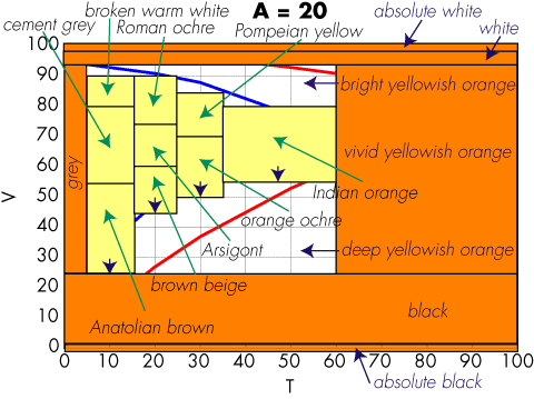
Maybe the change of the Japanese language is a bit extreme, but English is also changing fast, especially for words related to fashion, like color names. Look for example at the names in Coloroid hue 20 I showed last week:

Did you know the color name Arsigont? Did you know the difference between Pompeian yellow and Indian orange?

This is not a problem of the Coloroid system. Consult any color name compilation older than a few years, and you will find names that look unfamiliar. For example, a decade ago teal was all the rage in Palo Alto and all home decoration stores were selling many items in this color. Today, people hardly remember its appearance.

So, how do we deal with the ephemerality of language? Obviously a printed leather-bound collector's edition of a color dictionary is not the ticket. The ephemerality of a blog tool post is more like it. But color names are very hard to collect, we cannot start from scratch every few months.

This is why in the Italian version of his color thesaurus, Nathan included a mechanism to rate the pairing of the color name with the displayed color. As names fade, they get rated worse and by using the rating in the creation of the thesaurus, a more contemporary color name will emerge to label that color.

Friday, March 28, 2008

Blue rose

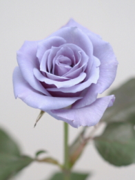
Suntory Ltd. blue roseOn next year's Valentine Day your roses might be blue. Suntory Ltd. has obtained government permission to market the world's first blue rose that it developed in 2004. The company plans to put it on sale in 2009 after building production facilities and sales outlets.

Roses have no genes to create a blue pigment, and rose growers have long worked hard in vain to produce a blue rose. In English, blue rose is a synonym for impossible. Suntory organized a Blue Rose Development Team jointly with its Australian subsidiary in 1990 and successfully produced a blue rose by recombining a gene capable of creating a blue pigment taken from pansy, using gene-splicing technology. In the process of the research, the team has succeeded in developing a blue carnation, which is already on sale in Japan.

A blue-like rose has already been produced by suppressing a red pigment through cross breeding and marketed in the world. But no rose with a blue pigment has ever been marketed yet.

Source: Kansai Window, Kippo News, Vol.14 No.562, Wednesday, February 20, 2008.

Saturday, March 22, 2008

This is not Easter Blue

Easter Blue

In a recent paper with Silvia Zuffi and Carla Brambilla on color readibility, we wrote that you can perform psychophysics on the Web even if it is uncontrolled, because the errors average out and you can recruit a large crowd of observers. Sure, Carla had to prune some non-sense outliers, but statisticians know how to do that correctly.

On the other hand, the Germans have the saying "even if a gazillion flies eat shit, this does not mean that shit tastes good." In the color readability test, the task was sufficiently arcane that we can safely assume that the subjects had some domain knowledge and knew what they were doing. But what if the task is so easy and natural that anybody can perform it. Do errors average out when you do a viral Web experiment? Let us find out!

Now that it is Easter, you can go to Nathan's post on his On-Line Color Thesaurus and enter Easter egg blue. His tool will return color #66CCEE shown above. Hmmm. Where does that color come from? No, he did not make up the name. What he did was to use the Internet and his Color Naming Experiment to have a crowd come up with that name. He showed them a patch of #66CCEE and got back Easter egg blue.

How authoritative is this datum? We can search Easter egg blue on the Internet and we get 8,050 hits. A relatively low number, and not a clue on the name's history. We get a better datum by checking the raw data on the server; the number of people who proposed that name where only three. Hardly an authoritative number.

For privacy reasons we do not collect any demographic data from the Web site, so we cannot go back and ask these three people how they came up with the name; we have to come up with a plausible argument.

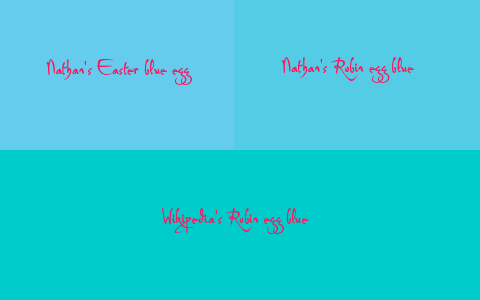
Easter is not blue. Here in the USA we have the concept of holiday blues, but it refers to the time from Thanksgivings to Christmas. And what do eggs have to do with it? Is it blue eggs then? Indeed, when you tried the query on the on-line color thesaurus you got robin egg blue as a synonym. But when you click on it, you are told it is color #55CCE5. Here are the two color side by side

Easter Blue vs. Robin Egg Blue

They are pretty close, but do not match. The Wikipedia thinks Robin egg blue is color #00CCCC, but they do not give a source.

Egg Blues

by Dmytro SergiyenkoA different approach is needed. Human memory is not cast in concrete, it has to be continuously refreshed by reliving memories. When a human is isolated, his memories are not checked and it drifts. And because memory is associative, we can easily get side-tracked by incorrect associations.

It is possible, that our famous three subjects had at some point heard Easter Blue, but because it does not make sense in isolation, they somehow added egg. Indeed, The ISCC-NBS Color Name Dictionary lists an Easter Egg Yellow, but no Easter Egg Blue. My wild guess is that the three subjects were thinking turquoise.

Turquoise is a strong hint. The next stong hint is: it is not a solid color at all.

Blue and green cabochons showing spiderweb, Bunker Hill Mine, Royston

If you cross the Death Valley from west to east and after enjoying the famous opera at Amargosa Valley drive north on Highway 95, on your right you will drive along the Tonopah Test Range, and finally hit Tonopah. In Tonopah you will find the Easter Blue Mine owned and operated by Danny and Dean Otteson. You can see the very approximate location on this map, and here is information on Nevada Turquoise.

A Web site on the New Nevada Turquoise Trail has a page on Easter Blue, depicting a number of Easter Blue stones you may want to check out. They explain: "The Easter Blue mine is located northwest of Tonopah, Nevada a few miles from the Royston district. Turquoise from this claim has also been called Blue Mountain and Blue Gem. Compared to some of the other deposits in Nevada, the Easter Blue was never considered a large producer and changed hands a number of times. It was discovered in 1907 and the first material found was a fine blue color, usually occurring in thin veins, later the mine produced a blue green turquoise with a light to dark brown matrix. A very pretty turquoise when set in silver."

In reality, naming colors is a difficult research task. To elicit your subjets to suggests the Easter Blue name, you have first to be able to present a large mottled spider web with light blue centers in the webbing. …And no, Easter Blue is not in Nathan's on-line color thesaurus. Instead, it suggests you to use Pastel Blue, which is #7FC5EB and not a synonym of Easter Blue. Lots of research still remains to do.

Happy Easter!

Thursday, March 20, 2008

Blue iris

Iris Blue

A Web color like #333399 is easy to remember. How did I get to it? I went to Pantone's Web page for their color of the year for 2008: Pantone® 18-3943 Blue Iris. There I averaged the pixel colors in the depicted Pantone 18-3943 TCX textile swatch and obtained CIELAB value (23, 27, -53), which in RGB hex coordinates is 333399.

Iris at Gamble Gardens, Palo Alto. (c) Giordano Beretta. All rights reserved.How did Pantone get to this color? On their Web page they explain "From a color forecasting perspective, we have chosen PANTONE 18-3943 Blue Iris as the color of the year, as it best represents color direction in 2008 for fashion, cosmetics and home products," explains Leatrice Eiseman, executive director of the Pantone Color Institute®. "As a reflection of the times, Blue Iris brings together the dependable aspect of blue, underscored by a strong, soul-searching purple cast. Emotionally, it is anchoring and meditative with a touch of magic. Look for it artfully combined with deeper plums, red-browns, yellow-greens, grapes and grays."

That was how they selected it. As for the description of this color, they write "Blue Iris is a beautifully balanced blue-purple. Combining the stable and calming aspects of blue with the mystical and spiritual qualities of purple, Blue Iris satisfies the need for reassurance in a complex world, while adding a hint of mystery and excitement."

Saturday, March 1, 2008

Maya blue paint: an ancient nanostructured material

I must be going through a blue period. After posting on the Blue Hour and just the day before yesterday on International Klein Blue, yesterday's New York Times brings us The Grim Story of Maya Blue by Kenneth Chang (subscription required). Nathan tells me I have to post about it. On the Web, Maya Blue is color #73C2FB.

Maya Blue

Yoko on top of the pyramid, Chichén Itzá in YucatánI will not write about Chaak, the rain god, and of human sacrifice. You already read that in yesterday's newspaper. In fact, we happened to visit Chichén Itzá in Yucatán back in 1994 and nearby we even visited the Cenote of Sacrifice shown below at right. The guide explained us those sacrifices, noting they were only performed as a last resort during draughts.

Until 1993, Maya Blue paint was a mistery, because it survived the harshest conditions in the jungle, and even modern acids, without fading. No need for Ingeborg Tastl's Fading Tool when you use the original Maya Blue pigment!Cenote of Sacrifice

The mistery was solved by Constantino Reyes-Valerio (1922 - 2006), who is also the creator of the Maya Blue Web site. His research revealed that the indigo dye from the leaves of añil was encased in a superlattice of palygorskite, a magnesium aluminium phyllosilicate. He contributed the beautiful image below at left.A warrior with Azul Maya on the background. Constantino Reyes

You can read about the science behind this paint in the Science magazine of 12 July 1996 in the article Maya Blue Paint: An Ancient Nanostructured Material by M. José-Yacamán, Luis Rendón, J. Arenas, and Mari Carmen Serra Puche (subscription required).

They describe that the añil dye was obtained from the sprigs of the xiuquilit (indigophera sp.) plant. However, the superlattice of palygorskyte mixed with indigo molecules does not explain by itself the color tone of Maya blue.

They found that the low concentration impurities of Fe, Mn, and Cr must also be present. Indeed, metallic and oxide particles of nanometer dimensions can strongly influence the optical properties of a material, and small impurity concentrations are sufficient to produce particles.

Science 12 July 1996Nanoparticles can have both linear and nonlinear optical properties. Linear absorbance of small particles can create a resonance feature related to surface-plasmon excitation. The main effect of the particles is classical in nature, although quantum effects are not excluded. Particles much smaller than the wavelength of visible light have an extinction spectrum dominated by the imaginary part of the refractive index. The blue color comes from an absorption curve peaked in the visible part of the spectrum. The oxide metals can account at least in part for the color. In addition, many of the particles are nonspherical, and planar defects may play an important role in the optical properties. The color of Maya blue could be at least partially associated with the presence of nanoparticles.

The authors further report that it is likely that impurities were added to the indigo during the preparation of the añil (heating clay in añil at 100ºC). Oxidation or encapsulation of particles in the substrate explains the acid-resistant character of the paint. The indigo molecules encapsulated in the palygorskite pores probably also contribute to the final color. The combination of an intercalated clay forming a superlattice and the metallic and oxide nanoparticles supported on an amorphus substrate makes the ancient Maya blue look like modern nanostructured materials.

Maya Blue

Friday, February 29, 2008

This is not International Klein Blue

IKB International Klein Blue

However, it is the color displayed on http://www.international-klein-blue.com/, so I guess the Web rendition of IKB is #002FA7. This is very far from the color specified by French artist Yves Klein (28 April 1928 - 6 June 1962). I once was in a room full of his paintings at the Kunsthaus in Zürich, and the effect was stunning. One trick was that these painting are correctly displayed by hanging them projecting out slightly from the wall, so that the canvasses appear to be suspended in space.

The ultramarine IKB paint is applied on the canvas with thick, highly textured strokes. Take the time to sit on a bench in front of a solid IKB painting, and the painting will hit you. The chromaticness is as high as it can get, and the few S-cones in your retina are contribuing to your visual system as they never have before. It will teach you, what the "deep" in "deep blue" means.

Klein started using IKB in 1958 and between 1960 and 1961 he created 15 monochrome IKB paintings. He developed IKB with chemists to achieve paint with the same chroma as dry pigment. This is done by suspending the pigment in a clear resin, and it allowed him to obtain the first patent (actually, just an enveloppe Soleau) for a color. As far as I know, IKB was never produced commercially.

Speaking of commerce, there is an interesting story about the first exhibition at the galleria Apollinaire in Milano. The eleven canvasses, although identical, were not appreciated equally by the public — they were sold for different prices. Klein concluded that each painting, as well as its material reality, was impregnated with an immaterial quality that made it distinct from the others.

And now I already see Nathan planning his next post, where he will not ask you to name colors, but to price them…

Tuesday, January 15, 2008

A whiter shade of pale

When we render complexion in preferred color reproduction, we must enhance the color to match local cultural expectations. The expectations are set by color consultants, who are influenced by what is available from industry. A recent breakthrough will require we tweak our color lookup tables.

CC-By-SA-2.5 Daniel BachlerKanebo Cosmetics Inc., the maker of the Blanchir brand of medicated whitening skin care, has developed a way to double the skin-penetrating capacity of magnolignan, a compound for skin whitening products that inhibits the activity of the enzyme tyrosinase which catalyzes the production of melanin. By adjusting the ingredients of the carrier oil, Kanebo was able to develop a formulation of magnolignan that penetrates below the keratinous layer to the true skin, where the cells that activate melanocytes live.

The new product will be released this spring, so there is still plenty of time to update the perceptual color rendering tables.

Monday, November 19, 2007

The blue hour

In the Francophone world you often come across theatres and hotels named "l'heure bleue." When clocks are depicted in suggestive paintings, they are often set at the blue hour. When is the blue hour, and why is it important to painters and photographers?

Vincent van Gogh: Nuit étoilée (Saint-Rémy-de-Provence), 1889The blue hour is at four o'clock in the morning, before the opulent and busy morning has started and many people still sleep. During the blue hour, when the night plays with dawn, light has a rare quality from the sky's cold blue and the star's warm yellow light, which bathe objects with two opponent illuminants. At this mesoptic illuminance level our visual system is tetrachromatic, with rods and cones all contributing to colors appearance.

In the Silicon Valley, the light pollution is so high, that this special time of the day cannot be appreciated, but for example in the Alps, nature is still pristine and nights are dark. I invite you to experience the blue hour, and even dawn, on top of a pristine mountain. Then, please, help fighting light pollution and turn off your lights when you sleep.

By the way, five and six o'clock are not colored, they are "l'aube" (dawn), and "le levé" (get up).

In reality, l'heure bleue, this quiet time of the day when nocturnal animals have already gone to sleep and diurnal animals are still sleeping, has a different meaning to artists. That perfumes have been named L'Heure Bleue is a hint. As Félix Vallotton's 1899 "La visite" shows, it is the time for lovers to say good bye, and the time on the alarm clock on the gentleman's night stand indicates the blue hour.

Félix Vallotton: La visite, 1899