Tuesday, April 19, 2016

Different analytics tools for different jobs

When people talk about analytics jobs, they usually have a mental picture of a single job and skill set. They talk about analysts, or data analysts (in the Silicon Valley they may be called data scientists). However, we can structure the users of analytics tools by the kind of job they have. The builders of these tools must then have the same skills, but at a much deeper level.

The first job type is the office worker. Today, every employee is expected to be able to produce some analytics. The basic tools include the office suites from Microsoft, Google, or Apple. Proficiency in more specialized tools like Adobe Illustrator, InDesign, Acrobat, FileMaker, and Tableau are a plus. The worker is expected to be able to convert data between formats like CSV and Excel. Workers are typically given assignments like “Prepare a presentation explaining our performance and suggesting how it can be improved.” Therefore, office workers must be able to produce visualizations, where visualization refers to being able to produce graphics from tables using Adobe Illustrator, Microsoft Excel, and PowerPoint. By nature, the office workers are domain experts in their daily activities.

The second job type is that of a data analyst in a traditional company. The all-round data analyst must be proficient in a relational database system like MySQL, and in Excel. The analyst must also have a good understanding of descriptive statistics. A key skill is to be an expert in munging data across applications and file formats; this is also known as data shaping, wrangling, ETL, etc. The required statistical expertise is not deep, but basic A/B testing and Google Analytics experience are required. Presenting and selling the results of an analysis are very important, requiring the ability to be able to do basic data visualization in Excel and Tableau. The data analyst has to have a good understanding of the company’s products and general all-round skills.

The third job type is that of an analyst in a start-up company, where a typical assignment may sound like "please munge our data." This requires proficiency in the basic tools and the ability to move fast: go for the low-hanging fruits and be able to quickly implement a new analysis or visualization by writing Excel macros, Access programs, or R functions, which in turn requires a good knowledge of the available libraries in Excel, R, or Tableau. The data analyst in a start-up company must be proficient in the implementation of advanced parsers and creating ad hoc MySQL databases for persistent storage. Basic statistics knowledge, for example, contingency tables and Poisson tests, are also a must. Since a start-up does not have historical data, the analyst must be able to do the ground-truthing by themselves. As a lot of the data may come from social networks, this job type also requires the ability to use linguistics functions to clean up unstructured text and extract useful information.

An analyst in a data company has a completely different job. Here data is the product: “we are data — data is us.” This requires a formal background in mathematics, statistics, machine learning, or linguistics (natural language processing, NLP). The analyst must be able to discriminate among the various algorithms and understand their parameters. On the bright side, most data is already munged, but the analyst must be able to customize parsers and workflows. Understanding privacy laws is a must, especially the European ones because the internet has no borders, but the laws have and the fines can be debilitating. The analyst in a data company must have a good sense of emerging techniques, like topological data analysis.

The fifth job type is that of analysts in an enterprise, where they are members of an established data team with experts in various tools. By enterprise here we mean a reasonable sized non-data company who is data-driven, to distinguish it from the second job type. The work is about data, but data is often not central to the product. An example is the fourth industrial revolution, or industry 4.0. This analyst is a generalist with broad experience, a jack-of-all-trades. For survival, this analyst must be able to find blind spots where niche roles can be played. It requires heavy experience in munging and aggregating data from all possible sources: SQL and NoSQL, logs, IoT, social networks (Twitter, LinkedIn, Facebook, etc.), news feeds, REST services, data.gov, Google Public Data Explorer, etc.

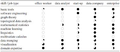
We can summarize these job types and the skills they require in this table:

Skills for analytics jobs

This is a generalization and it can be debated. For example, graph theory is topology, actually the historical beginning of it, but topological data analysis focuses on point clouds to build graphs, while traditional graph theory uses completely different mathematical tools to analyze graphs which is why I listed them as two different items. One could also make this list summarizing skills:

  • Tools of the trade: SQL, R, Java, Scala, Python, Spark, MapReduce, …
  • Basic statistics: distributions, maximum likelihood estimation, statistical tests, regression, …
  • Machine learning: k-nearest neighbors, random forests, …
  • Linear algebra and multivariate calculus
  • Data munging: imputation, parsing, formatting; aka wrangling, shaping
  • Data visualization and communication: Tableau, ggplot, d3.js
  • Software engineering: logging, performance analysis, REST interfaces, connectors, …
  • Curiosity for emerging technologies, like algebraic topology
  • Thinking like a data scientist: business sense, approximations, teamwork, …
Monday, April 18, 2016

Data Shamans

The benefit of attending meet-ups and conferences is that, compared to papers and webinars, you can hear and understand questions and you can talk to the speakers and other audience members during the breaks. Especially in conferences, in the formal presentation, you hear a scientific report, while in the breaks you can learn all the false turns the researchers have taken in their endeavors but have no place in short scientific communications.

As I mentioned last October regarding the ACM Data Science Camp Silicon Valley, the field of advanced analytics is full of hype. Data scientists are perceived like demigods, but in reality, their employment can be insecure and harsh.

Indeed, I often hear from data scientists that they are treated like shamans, i.e., a person regarded as having access to, and influence in, the world of benevolent and malevolent spirits, who typically enters into a trance state during a ritual, and practices divination and healing.

When the organization has a problem it cannot solve and the scientists or engineers are at the end of their wit, they collect big data and deposed it a the feet of their data scientists in the hope to get a miracle by the next day. A problem can only be solved when the causality is known, and correlation does not imply causality. There is no magic algorithm the data scientists can throw at the data and solve the engineering riddle.

In the end, the data scientists have to be able to go back to first principles. However, their training and experience make them more diffident to project preconceptions into the data, and their toolbox allows them to formulate hypotheses and test them statistically more efficiently. There are no data shamans.

Not a data shaman

Thursday, April 14, 2016

The Shape of Data

Last week I attended a San Francisco Bay Area ACM Chapter event at Pivotal Labs, which now occupies one of the former HP Labs buildings up on Deer Creek Road. The speaker was Gunnar Carlsson and the topic was algebraic topology analytics. I was waiting to write this post until the slides would be posted, but they never materialized—maybe the fancy rendering of a coffee mug metamorphosing into a topologically equivalent donut broke the system.

I must admit that what attracted me the most to attend was to see how Gunnar Carlsson would give a presentation on a very arcane topic requiring intimate familiarity with Betti numbers, functional persistence barcodes, simplicial complexes, and Vietoris-Rips complexes to the 244 registered attendees, probably mostly lacking the necessary mathematical background. I was also curious to see if he would reveal some of the fast algorithms which he must have invented to perform the very complex calculations involved.

He did a superb job! After the demonstration that for mathematicians coffee mugs and donuts are equivalent, he had everybody's attention. He then showed some examples of how conventional methods for regression and cluster analysis can fail and lead to completely incorrect conclusions, leaving the task of understanding topological pattern recognition for point cloud data as an exercise.

Gunnar Carlsson started by noting that big data in not about "big" but about complexity in format and structure. Data has shape and shape matters. Therefore, the task of the data scientist is not to accumulate myriad data, but to simplify the data in a way that the shape is easily inferred.

Consider for example the point cloud on the left side of the figure below. You can import it in your favorite analytics program and perform a linear regression. This simplifies the data to two parameters: a slope and an intercept. However, if you look more carefully, you see that this an incorrect representation of the data. Indeed, the point cloud is on two intersecting lines, therefore, the green cross at the right is a more accurate representation of the data's shape.

A linear regression would give an incorrect result

A second example is the confusion between recurrent data and periodic data. People tend to equate them and then use Fourier analysis on recurrent data that is not periodic, getting meaningless results. Recurrence is a concept from chaos theory and does not imply regular cycles, like the El Niño Southern Oscillation (ENSO).

The solution is to use topological modeling, like in the figure. If you are older, you need to revisit topology, because the field has started to study point clouds only in the last 20 to 15 years.

The first step in a project is to determine a relevant distance metric. Examples include Euclidean distance, Hamming distance, and correlation distance. The distance metric should be such that it is sensitive to nearby events but not so much to far away events because the interesting stuff happens close by: consider for example a distance metric based on the statistical momenta.

The output of an algebraic topology analysis is not a set of algebraic formulæ but a network.

For exercising, Carlsson recommends the World Values Survey, which contains a lot of interesting data. When you play with the data, it is often useful to consider a topological model of the space of columns rather than the rows in a data set.

Adapting to street lighting

Although in Switzerland light pollution is a fraction of what it is in American urban areas, in an interesting study, Florian Altermatt from Zurich and Dieter Ebert from Basel have shown experimentally that moths have adapted to light pollution. They reared moths from 10 different populations from early-instar larvae and experimentally compared their flight-to-light behavior under standardized conditions. Moths from urban populations had a significant reduction in the flight-to-light behavior compared with pristine populations.

This adaptation has direct consequences for ecosystems, because as moths avoid light pollution they will fly less and will pollinate fewer flowers.

If you delve into data science, beware that correlation does not predict causality: if Americans have become couch potatoes and move less than the Swiss, this is not due to the difference in light pollution :-)

Citation: Florian Altermatt, Dieter Ebert: Reduced flight-to-light behaviour of moth populations exposed to long-term urban light pollution, Biol. Lett. 2016 12 20160111; DOI: 10.1098/rsbl.2016.0111. Published 12 April 2016.

Helvetia by Night

Tuesday, April 12, 2016

How to pronounce LIRE

One of the difficulties of the English language is that it is often not clear, how to correctly pronounce words. For example, Edinburgh, Gloucester, and Leicester are often mispronounced. Fortunately, a dictionary will teach you how to pronounce a word correctly, and if you do not find it there, you can try the Wikipedia.

The situation is a little more hairy in the case of acronyms. Often there is a pun, which can guide you in guessing the pronunciation, but sometimes it is a genuine acronym, and therefore impossible to guess.

In the age of big data, the default approach to crack this riddle is to crowd-source the answer on a social network. Blast the question on Twitter, write a small R program using twitterR, and calculate the statistical mode. You can even get creative and use the PBSmapping package to plot the locations of the responders.

Unfortunately, the crowds are not wise and they might never have crossed path with the acronym, so they just guess. This is a classical case of garbage-in, garbage-out. In German, this process is also known with the expression "mit Kanonen auf Spatzen schiessen."

People were debating how one might pronounce LIRE, a Java library that provides a simple way to retrieve images and photos based on color and texture characteristics. LIRE is an acronym for Lucene Image Retrieval and is used to build content based image retrieval (CBIR, rhymes with cyber) systems.

Nothing is easier than shooting a one-line email to the creator Mathias Lux in Klagenfurt (do not fear, the Lindwurm is made of stone and will not byte you) and you get the correct answer, no need for confidence intervals: "Ich persönlich gehe von der italienischen Sprechweise aus"— it is pronounced the Italian way: li like liberty plus re like record.