When we think about places we have never visited, we build on other information about the place—the stereotypes—we have gained from various information sources, like friends, movies, documentaries, books, and newspapers—or YouTube in this day and age. About the Silicon Valley, the stereotype is that of the young entrepreneur who drops out of college to start up a company and become a billionaire before the tender age of 25.
In reality, most technologists here are just gnomes that work hard to make a contribution to humanity. The difference to other places in the world is that we do have the opportunity to create billion dollar businesses in technology, but as for our personal lives, they tend to be very modest, both in monetary term as well as in terms of fame or peer recognition. After all, being charismatically challenged is one of the reasons for becoming a programmer.
When I moved to the Valley with a freshly minted doctorate in computational geometry, for three years I worked on design rule checking. The task was not easy, especially from the point of view of the group dynamics. The project was building the next generation workstation—called Dragon—using full custom VLSI design instead of the ECL bit-slice technology common at the time.
The bootstrap problem was that there were no tools to design chips of such complexity (the Dragon had four to eight processors with separate IFU and EU chips, plus bus arbiter, memory controller, floating point unit, display controller, etc.). We leaned on principles from UCB's Magic and Spice tools to create our own. The key difference was that to handle the complexity of Dragon (each chip had an individual designer using a 32-bit Dorado with 8 MB of RAM), the tools we were inventing were hierarchical.
Although at first doing a hierarchical design instead of a flat design looked like a stroke of genius because of the bit parallelism, in practice it was a fata morgana. Indeed, designers tended to use the hierarchical features as macros, and the design was flat. The cells just contained the repetitive geometry, the key logic being added on top flat above the hierarchy, globally across the chip.
Therefore, maintaining the hierarchical design rule checker was in large part an act of self-flagellation. Nevertheless, I was puzzled by the enormous amount of design rule violations I was seeing. The designers were the best of the best in the world; why would they do so many mistakes?
I was most puzzled by the very high incidence of using the wrong sex diffusion over wells. Originally the underlying technology was NMOS, but when I joined the project they had already switched to CMOS, and as the designers were learning the new technique, the sex of diffusion was one thing on which they were really focusing. Why did they err so frequently?
I decided to study the problem and talked to each designer asking them to explain me some layout created by a different designer. I quickly noticed, they were not able to read the layout: they had to physically deconstruct it in order to navigate it. In my view, this was a shortcoming of the layout editor and I thought I can fix it by using a more appropriate color scheme.
As I learned, the specific colors came from Carver Mead and Lynn Conway's book written at PARC. At that time the thickness of the layers on a chip was in the range of visible light, so when you looked at a chip under a microscope in transmission mode, you would see each layer in a different color, according to its thickness.

Since the whole point of Mead and Conway's design technique was to abstract from the physical reality, I thought this coloring was arbitrary and I could come up with a better coloring. However, I immediately found myself accused of anathema: the colors by religion must be red for polysilicon, green for diffusion, yellow for gates, and blue for metal! Never mind the wells were also yellow and there were two metal layers.
Wary of religious wars, I decided to learn about color so I could nudge the colors to make layout more readable. I contacted the color scientists in Gary Starkweather's group and Mik Lamming kindly lent me his copy of Wyszecki and Stiles, telling me it contained all I needed to know about color.
After reading about 150 pages, I learned enough to come up with a coloring scheme, which essentially consisted in nudging the colors so that poly and diffusion would try to preserve their lightness, while the metal layers would preserve their hue. This made the layout appear transparent, so one could follow a wire no matter what other wires were under or above it.
This concept of transparency in IC designs is different from that of real world transparency, because—for example—it must prevent large power or clock wires from hiding the layout under them.
At that time my assignment was to automate the printing of checkplots, so I integrated the new color scheme in the plotter driver. This is how the layout for an inverter looked with the old driver:
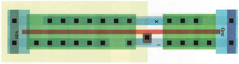
Although with the new color scheme the layout was much more readable, most of the designers were shocked about the radical change. I tried to compromise by sitting down with each designer and try to reach a compromise on the color scheme.
It was at this time that I realized some of the designers had serious color discrimination problems. Unfortunately, they declined to be tested for color vision deficiency, but I developed a strong suspicion that one designer was a dichromat and another was either a dichromat or seriously anomalous.
Anyway, due to the memory restrictions, the designers were driving the color displays in 8-bit mode and each workstation had both a color and a black-and-white display, because text was too fuzzy on the color displays of the time. I wrote a little graphical tool called Meta-Palette running on the black-and-white display that had a chromaticity diagram with a mark for each color map entry, whose RGB values I could change by simply dragging around the corresponding mark. With the designers, I then created a couple of consensus palettes, which I made user-selectable in the printer driver.
This is the same inverter layout as above rendered with one of the preferred color palettes:
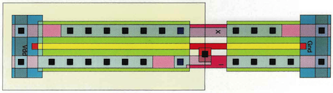
The number of design errors dropped dramatically to a manageable number, but the intervention still had strong religious opposition.
I wrapped up my work in a technical report and moved on to greener pastures in the new Electronic Documents Lab (EDL):
This report was sort of a kitchen sink, focusing more on the system integration aspects than on the color problems in rendering logical circuits for VLSI design. Therefore, I later doubled up with a shorter report just on the color problem:

I never submitted them anywhere because I immediately went on to tackle the more general problem of selecting colors for creating electronic documents. I used the same implementation strategy as for the VLSI design tool. However, the illustrator Gargoyle was used mostly in full color mode (24 bits), so to edit the colors by dragging marks in chromaticity diagrams I had to copy the colors into a hash table (metaphor: apply turpentine), noting that a typical 512 pixel square image typically contains only 26,000 different colors and most often less than 256.
After editing the colors in the color map I had to write them back into the Gargoyle data structure (metaphor: apply fixative). This is shown in the video at the top of this post.
Despite eloping to EDL, I did not escape the religious color wars. When I implemented the Xerox Color Encoding Standard as a color management system, I carefully optimized the inner loops so that managed color would render faster than unmanaged color, assuming it would be generally adopted by the Cedar community.
However, despite the efforts of my more charismatic colleagues to explain colorimetric color reproduction, generally the idea that a device-independent colorimetric color specification would be a good universal solution for portable color documents, the general belief was that any device RGB values specified by an author were the holy untouchable truth.
The idea that a printer produced a different color appearance for the same device coordinates than a display monitor was considered to be a failure of the printer designers. The religious fervor was so strong, that many people preferred to manually gamut-map color one by one by modifying color values in a simulation of the print, rather than accept color management and its automatic gamut mapping by algorithm.
Despite this fervor, most people did not really understand the concept of gamut mapping, let alone additive and subtractive color. Encouraged by the unexpected success of the flamingo movie, yet unable to defend my work in a talk, I decided to do a video explaining my work and then let people watch the video. This is the video at the top of this post.
In summary, Meta-Palette is an interactive tool to edit a color palette colorimetrically. To achieve device independence, I implemented a color management system (CMS) based on the Xerox Color Encoding Standard. Since device independent color was not generally accepted at the time, I did not use the CMS to just match color across devices, but to simulate how the same device coordinates are rendered across devices.
With this, you might just think I was a moron who lacked the persuasive skills to evangelize device independent color reproduction. This is not so. Half a decade later, Adobe created PostScript Level 2 (PS2) with colorimetric color reproduction. PS2 being device independent, you would expect that color would be encoded in a device independent colorimetric manner. However, based on the feedback from its professional users during the design and implementation phase, Adobe stored the color data in the input device coordinates, along with the devices profile.
The reason the printer's gamuts were so limited was because the inks and toners still had toxicity problems, especially liquid electrophotography.

It would take a decade for printers to achieve a gamut comparable to that of a CRT display monitor. This progress, however, did not bring a renaissance of colorimetric color reproduction. Instead, it brought sRGB, where the same device coordinates are sent to every device. In retrospect, the skeptics of yore were right.
As for colorimetric color reproduction, it has achieved full maturity with ICC version 4. However, mostly due of its ignorance of workflow, managed color is still a nightmare almost 30 years later.


Wow. Is that really you?
ReplyDelete