Commercial color print workflows sometimes require manual intervention to adjust colors, for example to change a background color or the color of rules. Instead of aborting the job, sometimes the color can be changed on the fly. Typically this is accomplished with a color selection tool running on a mobile device, such as a pad computer or a smart phone.
Mobile color selection tools can use the built-in motion sensors for input. For output, due to the limited available screen space, the systems just show a swatch and maybe a color name. We describe a new output design that is well-tailored to motion-sensor based input. Using the right user interface paradigm allows users to work more efficiently, thus cutting costs and increasing profits.
Sometimes a print job requires changing a solid color, for example when the halftoning algorithm creates an unexpected interference pattern (moiré) or when the color does not print well on the particular media. It is then necessary to abort the job and send it back to the client. Such an issue can delay a job for days, possibly causing problems with the service level agreement (SLA).
The previous generation devices like laptops and tablet computers used a graphical user interface (GUI) metaphor known as WIMP, for windows, icons, menus (or mice) and pointing devices. Current mobile devices like slates and smart phones, use a different GUI paradigm known as MPG, for multi-touch, physics and gestures.
As we move beyond WIMPs, the visual feedback metaphors are no longer adequate, because they are optimized for a mouse moving on a two-dimensional plane. Current mobile devices have built-in accelerometers and gyroscopes. With them, movement between points on a plane is replaced with roll, yaw, pitch, and translational movements in three-dimensional space (see this earlier post for an informative video). In this particular implementation, the GUI consists of a colored patch and the color term.
We can provide visual feedback for MPG color selection tools using a rivet metaphor. A rivet is a short metal pin or bolt for holding together two plates of metal, its headless end being beaten out or pressed down when in place. Here are two examples of rivets. Left: Round head. Right: flat head.
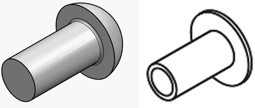
Regardless of how the MPG GUI maps the Tait–Bryan angles yaw, pitch and roll, as well as translational movements and acceleration into color specifications, either absolute or relative, we use the image of a rivet to provide feedback.
The rivet head provides feedback on the total available color gamut and the hue at the center of the edge towards the user indicates the currently selected hue correlate. The length of the cylindrical shaft indicates the currently selected lightness correlate. The shaft diameter indicates the chroma correlate.
We anticipate that the user can easily learn the correspondence between MPG input and the effect on the color selection process, thus providing a very effective tool.
The figure below shows the current state of the art for WIMP operating systems. The left window is from the Windows operating system, where the color selection tool has three panels. On the bottom right is a panel showing a patch with the currently selected color and the previous selection. On the bottom left are the RGB counts. The top left is the graphical color selection panel.
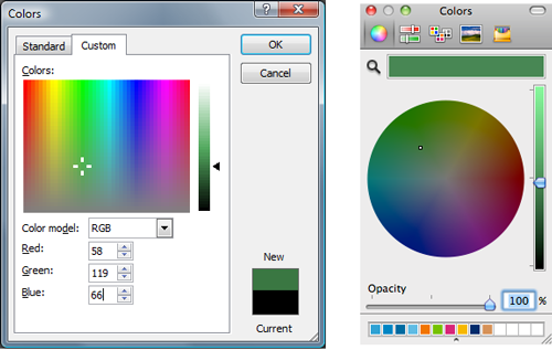
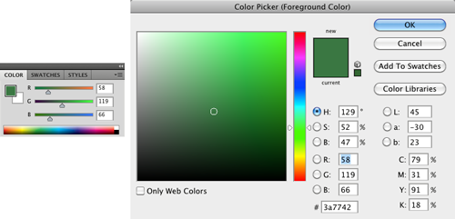
Regarding color selection tools in applications, they mostly use the tool provided by the operating system. One notable exception is the color selection tool in Photoshop. This application actually has two color selection tools, one simple and fast for the experienced user, and one more detailed for careful color selection. We describe first the simple tool at the left of the figure below and then the detailed tool at the right.
The simple tool has three panels: a sample patch (actually two: one each for foreground and background), a set of three sliders for RGB counts, and a complex graphical single point selection panel. The single point panel is a rectangle where the abscissa is a correlate for perceived hue. The ordinate is a correlate of saturation, which contains both lightness and chroma. This hue–saturation paradigm allows color specification through a single two-dimensional point, at a possibly increased cognitive cost.
The larger window at the right side of the above figure is Photoshop's detailed color selection tool. On the top right we note the split old and new color patches as in the Windows tool. The slider in the middle is used to select the hue, while the chroma and lightness are selected in the large square at the left. In this square, the abscissa is a correlate of chroma, while the ordinate is a correlate of lightness.
All these tools have evolved from the early days of color GUIs and are optimized for input on a two-dimensional surface with a mouse. The slider interfaces are actually older, when the early interactive graphics workstations had dials for data entry.
Like everywhere else in our lives, also on the print shop floor we transitioned from desktop and laptop computers to mobile devices like pads and smart phones. Parallel to this transition is the paradigm shift from WIMP to MPG GUIs and the visual feedback for three-dimensional input devices must be different from that for two-dimensional devices.
We use a feedback mechanism in the approximate shape of a rivet, which can change its location and orientation in space in accordance to user gestures. This mechanism changes its appearance according to the color being selected.
The rivet head represents the color gamut. It can be either a flat head showing the gamut in a chromaticity diagram, or a three-dimensional head showing the full gamut (with transparency to optionally mark the currently selected color). When users change the hue through a gesture, the rivet rotates along its symmetry axis, so that the currently selected hue is always pointed towards the user.
The shaft is used to represent chroma and lightness. The shaft length is proportional to the current selection's lightness and the shaft diameter is proportional to the current selection's chroma. The shaft itself is colored in the current selection's color.
Yaw, pitch, and roll, also known as Tait-Bryan angles, named after Peter Guthrie Tait and George H. Bryan, are a specific kind of Euler angles used to define the relative orientation of an object with respect to some reference orientation, usually a set of reference axes. The three angles specified in this formulation are defined as the roll angle, pitch angle, and yaw angle. Yaw, pitch and roll are used in mobile devices where the object in question is the handheld device itself.
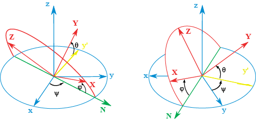
The figure below illustrates the Tait-Bryan angles. They can be statically defined using a line of nodes constructed by the intersection of two non-homologous planes (for example XZ and xy are not homologous planes), unlike proper Euler angles which use homologous planes (for example XZ and xz).
This second kind of Euler angles is such as it is equivalent to three rotations composed with a different axis, z-y-x for example. There are therefore six possibilities of this kind (xyz, xzy, zxy, zyx, yzx, yxz). They behave slightly differently than Euler angles. In the zyx case, the two first rotations determine the line of nodes and the axis x, and the third rotation is around the axis x.
Because the line of nodes is the intersection of two non-homologous planes the pitch angle is measured from the horizontal plane instead of the vertical axis. Therefore this kind of construction would give a pitch equal to zero for an airplane flying horizontally while the first kind of Euler angles would assign it an angle of π/2.
Since this terminology originates in aeronautics, in this section we use an aircraft instead of a handheld mobile device, but the physics is the same. The concepts are shown in this figure:
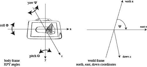
Yaw, pitch and roll are used in aerospace to define rotations between a reference axis system (world frame) and a vehicle-fixed axis system (body frame), which in the context of an aircraft sometimes are called its heading, elevation and bank.
Consider an aircraft-body coordinate system (body frame) with axes XYZ which is fixed to the vehicle, rotating and translating with it. This intrinsic frame of the vehicle, XYZ system, is oriented such that the X-axis points forward along some convenient reference line along the body, the Y-axis points to the right of the vehicle along the wing, and the Z-axis points downward to form an orthogonal right-handed system.
Consider a second coordinate system (world frame) with axes xyz, aligned having x pointing in the direction of true north, y pointing to true east, and the z-axis pointing down, normal to the local horizontal direction.
Given this setting, the rotation sequence from xyz to XYZ is specified by and defines the angles yaw, pitch and roll as follows:
- right-handed rotation Ψ ∈ (-180, 180] about the z-axis by the yaw angle
- right-handed rotation θ ∈ [-90, 90] about the new (once-rotated) y-axis by the pitch angle
- right-handed rotation φ ∈ (-180, 180] about the new (twice-rotated) x-axis by the roll angle
The motion of an aircraft is often described in terms of rotation about these axes, so rotation about the X-axis is called rolling, rotation about the Y-axis is called pitching, and rotation about the Z-axis is called yawing.
The equivalent MPG feedback to the WIMP feedback in the above figures is shown on the top side of the figure below. In this example we use the flat head rivet metaphor from the right side of rivet figure above. It is obvious how to generalize to the three-dimensional gamut as mentioned earlier.
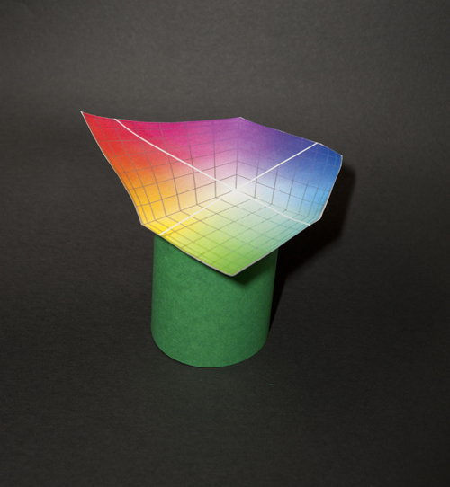
the user has selected a dull green
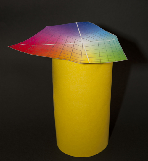
the user has rotated the hue towards yellow and increased both lightness and chroma
In this case the gamut is a chromaticity diagram, referring to a ZR-class HP display. Since CIELAB does not have a chromaticity diagram, we use the CIELUV space. For a most sophisticated feedback, a color appearance space like CIECAM02 could be used, rendered with transparency to show the position of the mark for the selected color. For a simpler feedback, the rivet could be displayed in a pure frontal projection, with a hue ribbon lining the flat head edge. In the higher figure above, the rivet is rotated along the symmetry axis so that the same green as in the color selection tool figures at the beginning is in the front.
The shaft is colored in this green, its diameter corresponds to the chroma and the length to the lightness.
The lower of the above figure shows what happens when the user moves the mobile device to select a yellow color. The head rotates so that yellow is now on front. The shaft is colored in this yellow and has become longer and thicker. The left and right sides of the figure are at the same scale.
In summary, I have described how the feedback for color selection tools for a WIMP GUI are not adequate for mobile devices, which make extensive use of MPG GUIs. I have presented a rivet metaphor that provides a much more ergonomic representation of the color selection tool's state. This radically new representation allows print shops to work faster and more reliably when they have to select or modify colors, thus preventing a disruption of the workflow.
Providing a commercial print workflow with superior tools will cut costs due to workflow exceptions and maximize the press owner's profits. A successful customer will buy additional presses from the vendor and use more consumables.


