Showing posts with label technology. Show all posts

Saturday, June 30, 2018

Creative Professions

The Silicon Valley has seen radical changes in how people work. By people, I mean mostly the creative professionals who conceive the products that made the valley famous. Today, these professionals are not as creative as in the past. We are transitioning to the gig economy, where professionals do not have a fixed job but use the internet to find small assignments. The pay is very low, there are no benefits, and the money is all made by the service website owners: all work is purely transaction oriented and in the case of software, when an app breaks, it is simply abandoned.

There are conventional jobs with an employment contract and benefits, but the setting is more that of factory workers doing piecework controlled by the company's GitHub site. The companies do not invest in their workers, which do not learn new technologies and hop to a new employer every couple of years.

The gig economy is different from consulting. Consultants earn approximately twice the salary of a regular employee and make a considerable investment to deepen their expertise.

In the past, an employee was a resource groomed by companies. The new trend is the reason the most creative products now come from outside the Silicon Valley. The new centers for innovation include (from west to east) London, Lausanne, Zurich, Berlin Beijing, Shanghai, Taipei, Seul, Tokyo, …

Before the transition to piecework, a paradigm popular in the Silicon Valley was that of the field dependence of cognitive styles, going back to Herman Witkin in 1962. This paradigm was used to give employees work in which they could excel, form powerful synergistic teams, and also to design user interfaces.

People with a field dependent cognitive style, are driven by an inner motor (god). They think in a global context and tend to think in parallel, making associations. Field-dependent employees often work well in teams, as they tend to be better at interpersonal relationships. When designing user interfaces, approaches that connect different parts of a topic are useful for field-dependent learners. For example, users can discuss what they know about a topic, predict content, or look at and read related material.

People driven by a field-independent cognitive style are driven by an outer motor, for example, the product's user. They are analytical, detail oriented, and tend to think sequentially, drawing inferences. Field-independent workers tend to rely less on managers or colleagues for support. In user interfaces, approaches such as extensive reading and writing, which users can carry out alone, are useful.

Research labs looked for employees that have both a field dependent and a field-independent cognitive style. Such people can envision new theories and can also reduce them to practice by implementing them. Such an activity is called speculative design.

This paradigm can be extended to the pieceworker of today, who is driven by greed (self). It is also useful to extend the idea to other activities, as shown in this diagram:

creative professions and speculative design

Thursday, March 23, 2017

Breaking the barriers to true augmented reality

Today, when you run a job on a digital press, you just turn it on, load the stock, and start printing. An army of sensors and feedback loops work with mathematical models will set up the press. In the heydays of color printing, the situation was very different: skilled press operators would spend hours making ready the press, with only the use of a densitometer and their eyes. It took them years of experience to achieve their master status.

A big breakthrough came when in 1968 when Felix Brunner invented the print control strip, which made press make-ready more of a technical process instead of a magic ceremony. Felix Brunner lived in Corippo, Val Verzasca.

Corippo seen from Fiorenzo Scaroni's rustico in Lavertezzo. © 13 July 2003 by Yoko Nonaka

Corippo is a beautiful village but it had been abandoned—people like Michael Silacci of the Opus One Winery, whose grandparents had come to California and never went back. Corippo is still the smallest municipality in Switzerland, with a population of just 13.

Corippo is so stunning, in 1975 it became a protected heritage village. This was quite difficult because the village had become dilapidated. Switzerland raised the funds to transform it into a state-of-the-art modern village that would attract a sophisticated population like Felix Brunner. The challenge was to rebuild it to modern architectural standards without changing its atmosphere and look.

The architecture department at the ETH in Zurich build a 3D model of the entire village, then one by one they started rebuilding the interiors of the houses to the state-of-the-art. The department acquired an Evans and Sutherland Picture System and at each planning step, the commission walked through the virtual village to ascertain that nothing changed the spirit outdoors. For example, if a roof was raised, it was not allowed to cast new and unexpected shadows. If a window was changed, the character of the street was not allowed to change for a passerby, and the view had to feel original from any window.

Although the Picture System was limited to 35,000 polygons, the experience was truly impressive for the planners. If you have a chance to visit Corippo, you will be surprised by the realization. The system was such a breakthrough for urbanists, that Unesco used it for the restoration of Venice. I was also sufficiently impressed to sit down and implement an interactive 3D rendering system, although on the PDP-11with 56 KB of memory running RT-11, I could only display wireframes.

My next related experience was in 1993 when Canon had developed a wearable display and was looking for an acquirer of the rendering software. While the 1975 system for Corippo was rendering coarse polygons, by early 1990 it was possible to do ray tracing, although using an SGI RealityEngine for each eye. An application was to train astronauts for building a space station.

On the quest of finding an interested party for the software, I had the chance to visit almost all companies in the San Francisco Bay Area who were developing wearable displays. On one side, using ray tracing instead of rendering plain solid color polygons made the scene feel more natural, but the big advantage over the Picture System was to be immersed in the virtual scene instead of looking at a display.

There were still quite a few drawbacks. For one, the helmets felt like they were made of lead. The models were still crude because to follow the head movements, ideally, the refresh rate should have been 90 Hz, but even with simple scenes, the refresh rate was typically just 15 or 30 Hz. However, the worst perceptual problem was the lag, which disabled the physiological equilibrium system and caused motion sickness. Another positive development was the transition from the dials and joysticks of 1975 to gloves providing a haptic user interface.

People from my generation spent 13 years in school learning technical drawing, which allows us to visualize mentally a 3D scene from three orthographic projections or from an axonometric projection with perspective. However, in general, understanding a 3D scene from projections is difficult for most people. The value of an immersive display is that you can move your head and thus more easily decode the scene. Consequently, there is still a high interest in wearable displays.

Today, a decent smartphone with CPU, GPU, and DSP has sufficient computing power to do all the rendering necessary for a wearable display. The electronic is so light that it can be fit in a pair of big spectacles that are relatively comfortable to wear and are affordable for professionals to buy. Last year, Bernard Kress had predicted that 2017 would be the year of the wearable display, with dozens of brands and prices affordable by consumers. Why is it not happening?

On March 14, 2017, Prof. Christian Sandor of the Nara Institute of Science and Technology (NAIST) gave a talk with title Breaking the Barriers to True Augmented Reality at SCIEN in Stanford, where he suggested the problem might be that today's developers are not able to augment reality so that the viewer cannot tell what is real. He showed the example of Burnar, where flames are mixed with the user's hands and these users had to interrupt the experiment because their hands were feeling too hot.

Christian Sandor, Burnar

True AR has the following two requirements:

  1. undetectable modification of user's perception
  2. goal: seamless blend of real and virtual world

On a line from manipulating atoms with controlled matter to manipulating perception with implanted AR, current systems should achieve surround AR (full light field display) or personalized AR (perceivable subset). In a full light-field display, the display functions as a window, but with the problem of matching accommodation and vergence. Personalized AR is a smarter approach because the human visual system is measured and only a subset of the light-field is generated, reducing the required display pixels by several orders of magnitude.

In many current systems, the part of the image generated from a computer model is just rendered as a semitransparent blue rendering, hence it is perceived as separate from the real world. True AR requires a seamless blend. The most difficult step is the alignment calibration with the single point active alignment method (SPAAM). The breakthrough from NAIST is that they need to perform SPAAM only once: after that, they use eye tracking for calibration.

The technology is hard to implement. The HoloLens has solved the latency problem, but Microsoft has invested thousands of man-years in developing the system. The optics are very difficult and there are only a few universities teaching it.

Wednesday, January 11, 2017

Designing and assessing near-eye displays to increase user inclusivity

Today Emily Cooper, Psychological and Brain Sciences Department at Dartmouth College, gave a talk on designing and assessing near-eye displays to increase user inclusivity. A near-eye display is a wearable display, for example, an augmented reality (AR) or a virtual reality (VR) display.

With most near-eye displays it is not possible or recommended to wear glasses. Some displays, like the HTV Vive, have available lenses to correct the accommodation. We do want to integrate flexible correction into near-eye displays. This can be achieved with a liquid polymer lens with a membrane that can be tuned.

In her lab, for the refraction self-test, the presenter uses an EyeNetra auto-refractometer, which is controlled with a smartphone.

The near-eye display correction is as good as with contact lenses, both in sharpness and in fusion correction. Therefore, it is not necessary to make users wear their correction glasses.

There are two factors determining the image quality of a near-eye display: accommodation and vergence. The problems with incorrect vergence are that users get tired after 20 minutes and the reaction time is slower when the vergence is incorrect.

The solution is to use tunable optics to match the user's visual shortcomings.

A different problem is presbyopia, which is a range reduction. For people older than 45 years, an uncorrected stereo display provides better image quality than correcting the accommodation. However, tunable optics provide better vergence for older people.

A harder problem are people with low vision, regardless of their age. In her lab, Emily Cooper investigated whether consumer-grade augmented reality displays are good enough to help users with low vision.

She used the HoloLens, in which the depth camera in the NIR domain is the key feature to address this problem. Her proposal is to overlay the depth information as a luminance map over the image so that near objects are light and far objects are dark. This allows the users to get by with their residual vision.

Instead of a luminance overlay, a color overlay also works. In this approach, the hue is changed on a segment from warm to cold colors in dependence of their distance. She also tried to encode depth with flicker but is does not work well.

With the HoloLens, it is possible to integrate OCR in the near-eye display and then read all text in the field of view using the 4 speakers in the HoloLens, making the sound come from the location where the text is written.

Thursday, October 13, 2016

Facebook Surround

Yesterday afternoon, Brian Cabral, Director of Engineering at Facebook, gave a talk at the Stanford Center for Image Systems Engineering (SCIEN) with the title "The Soul of a New Camera: The design of Facebook's Surround Open Source 3D-360 video camera." Here is his abstract:

Around a year ago we set out to create an open-source reference design for a 3D-360 camera. In nine months, we had designed and built the camera and published the specs and code. Our team leveraged a series of maturing technologies in this effort. Advances and availability in sensor technology, 20+ of computer vision algorithm development, 3D printing, rapid design photo-typing and computation photography allowed our team to move extremely fast. We will delve into the roles each of these technologies played in the designing of the camera, giving an overview of the system components and discussing the tradeoffs made during the design process. The engineering complexities and technical elements of 360 stereoscopic video capture will be discussed as well. We will end with some demos of the system and its output.

The design goals for the Surround were the following:

  • High-quality 3D-360 video
  • Reliable and durable
  • Fully spherical
  • Open and accessible
  • End-to-end system

These goals cannot be achieved by strapping together GoPro cameras because they get too hot and it is very difficult to make them work reliably. Monoscopic is old and no longer interesting. The challenge for VR is to do it stereoscopically: we are interested in a stereoscopic 3D-360 capture.

They are using 14 Point Grey cameras with wide angle lenses around the equator and a camera with a fisheye on the north pole. For the south pole they are using two fisheyes to get rid of the pole holding the Surround.

A rolling shutter is much worse in 3D than in 2D, so it is necessary to use a global shutter, at the expense of SNR. Brian Cabral discussed the various trade-offs between number and size of cameras, spatial resolution, wide angle vs. fisheye lenses and physical size.

Today, we have a lot of progress in rapid prototype designs. We can just try out things in the lab. For this application, the hardware is easy, but stitching together the images is difficult. The solution is to use optical flow and to simulate slit cameras.

No attempt is made to compress the data. The images are copied completely raw to a RAID of SSD drives. The rendering then takes 30 seconds per frame.

The Surround has been used for a multi-million dollar shot at grand Central Station. The camera is being open sourced because so far it is only 1% of the solution and making it open will encourage many people to contribute to the remaining 99%.

At the end of the presentation, two VR displays were available to experience the result. I did not quite dare to strap in front of my eyes a recalled smartphone that can explode anytime, so I passed on the demo. However, the brave people commented, that you can rotate your head but not move sidewise because the image falls apart. It was also commented, that the frame rate should be at least 90 Hz. Finally, people reported vergence problems and slight nausea.

Facebook Surround kit

Thursday, October 6, 2016

Progress in wearable displays

Yesterday afternoon, Bernard Kress, Partner Optical Architect at Microsoft Corp, in the HoloLens project, gave a talk at the Stanford Center for Image Systems Engineering (SCIEN) with the title "Human-centric optical design: a key for next generation AR and VR optics." Here is the abstract:

The ultimate wearable display is an information device that people can use all day. It should be as forgettable as a pair of glasses or a watch, but more useful than a smartphone. It should be small, light, low-power, high-resolution and have a large field of view (FOV). Oh, and one more thing, it should be able to switch from VR to AR.

These requirements pose challenges for hardware and, most importantly, optical design. In this talk, I will review existing AR and VR optical architectures and explain why it is difficult to create a small, light and high-resolution display that has a wide FOV. Because comfort is king, new optical designs for the next-generation AR and VR system should be guided by an understanding of the capabilities and limitations of the human visual system.

There are three kinds of wearable displays:

  • Smart eyewear: extension of eyewear. Example: Google Glass
  • Augmented reality (AR) and mixed reality (MR): extension of the computer. An MR display has a built-in 3d scanner to create a 3d model of the world
  • Virtual reality (VR): extension of the gaming console

Bernard surveyed all avenues in wearable displays from their inception to the projections in the future. The speed of the presentation and the amount of material made it impossible to follow the talk unless you are an expert in the field. After the presentation, Bernard told me the size of his PowerPoint file is about 250 MB!

My takeaway was that the biggest issue in wearable displays is cost. So far, the optics engineers designed with cameras in mind and over-designed. The current breakthrough is that now the optics engineers start understanding the HVS, so they can design systems that are just as good as our MTF. Bernard claims that so far the industry has been mostly about hype but in 2017, products will take off and the new challenge is "show me the money."

By Microsoft Sweden [CC BY 2.0 (http://creativecommons.org/licenses/by/2.0)], via Wikimedia Commons

Friday, September 30, 2016

Navigating instead of searching

I believe it was on a day at the end of March or beginning of April 1996, when out of the blue I received the assignment to write a report on why the world wide web would be important for my employer at the time. I was given only two weeks to write a blurb and a slide deck. I had not thought about this matter and it was a struggle to write something meaningful in such a short time, without any time to read up. It ended up as an exercise in automatic writing: just write ahead and never look back and revise.

At the end, I delivered the blurb, but management decided the web was just a short-lived fad like citizen band (CB) radio that would go away shortly and put the blurb in the technical report queue for external publication. I did not think much about it because such is life in a research lab. However, with all the hype of the time on the "Internet Tsunami" by Bill Gates, the "Dot in the Dot Com" by Scott McNealy, and all the others—while my employer remained silent and kept everybody curious—the report W3 + Structure = Knowledge was requested hundreds of times (at that time a tech report was typically requested much less than ten times). Subsequently, I received quite a few requests to present the companion slide deck.

In my struggle to write something in two weeks, I typed about the need to structure information on the world wide web so it can be easily navigated, instead of searching for information.

little dancer leaping over the world wide web

It appears today we are at such a disruptive juncture again. This time, it is not about websites: it is about data (some prefer to call it big data, but size does not really matter). Solid state drives are now inexpensive, can hold 60 TB of data in each 3.5" drive, and have access times similar to RAM. In addition, we have all the shared data in the various clouds.

Today, we are not interested in finding data, we are maybe wiling to navigate to data, but preferably we would like the data to anticipate our need for it and come to us in digested, actionable form. Actually, we are not interested in the data, we are interested in data in a context: knowledge. We want the data to come to us and ask us if it is OK to take an anticipated action based on a compiled body of knowledge: wisdom.

This is an emergent property because all the pieces have fallen together. Our mobile devices and the internet of things constantly gather data. There are open source implementations of deep learning algorithms. CUDA 8 lets us run them on inexpensive Pascal GPGPUs like the Tesla P100. Algebraic topology analytics lets us build networks that compile knowledge about the data. Digital assistant technology brings this knowledge at our service.

Another key ingredient is the skilled workforce. Mostly Google, but also Facebook, Apple, Amazon, etc. have been aggressively educating their workforce in advanced analytics, and as brains move from company to company in the Silicon Valley, these skills are diffused in the industry.

In a recent New York Times article, G.E.'s Jeffrey R. Immelt explained how he is taking advantage of this talent pool in a new Silicon Valley R&D facility employing 1,400 people. Microsoft is creating a new group, the AI and Research Group, by combining the existing Microsoft Research group with the Bing and Cortana product groups, along with the teams working on ambient computing. Together, the new AI and Research Group will have some 5,000 engineers and computer scientists.

This is the end of search engines. This is the end of metadata: we want wisdom based on all the data.

Here is a revised version of the post I wrote in July.

The asumption is that to be useful, technology has to enable society to become more efficient so life quality increases. The increase has to be at least one order of magnitude.

Structured data

In the context of big data, we read a lot about structured versus unstructured data. So far, so good. Things get a little murky and confusing when advanced analytics—which refers to analytics for big data—joins the conversation. The confusion comes from the subtle difference between "structured data" and "structure of data," which contain almost the same words (their edit distance is 3). Both concepts are key to advanced analytics, so they often come up together. In this post, we will try to shed some light on this murkiness to clarify it.

The categorization in structured, semi-structured, and unstructured data comes from the storage industry. Computers are good at chewing on large amounts of data of the same kind, like for example the readings from a meter or sensor, or the transactions on cash registers. The data is structured in the sense that each record has the same fields at the same locations, for example on an 80 or 96 column punched card, if you want a visual image. This structure is described in a schema.

Databases are optimized for storing structured data. Since each record has the same structure, the location of the i-th record on the disk is i times the record length. Therefore, it is not necessary to have a file system: a simple block storage system is all that is needed. When instead of the i-th record we need the record containing a given value in a given field, we have to scan the entire database. When this is a frequent operation in a batch step, we can accelerate it by first sorting the records by the values in this field, which allows us to use binary search, which is logarithmic instead of linear.

Because an important performance metric is the number of transactions per second, database management systems use auxiliary structures like index files and optimizing query systems like SQL. In a server-based system, when we have a query, we do not want to transfer the database record by record to the client: this leads to server-based queries. When there are many clients, often the same query is issued from various clients, therefore, caching is an important mechanism to optimize the number of transactions per second.

Database management systems are very good at dealing with transactions on structured data. There are many optimization points that allow for huge performance gains, but it is a difficult art requiring highly specialized analysts.

Semi-structured data

With cloud computing, it has become very easy to quickly deploy a consumer application. The differentiation is no longer by the optimization of the database, but in being able to collect and aggregate user data so it can be sold. This process is known as monetization and an example is click-streams. The data is to a large extent in the form of logs, but their structure is often unknown. One reason is that the schemata often change without a notification because the monetizers infer them by reverse engineering. Since the data is structured with an unknown schema, it is called semi-structured. With the Internet of Things (IoT), also known as Web of Things, Industrial Internet, etc., a massive source of semi-structured data is coming towards us.

This semi-structured data is high-volume and high-velocity. This breaks traditional relational databases because data parsing and schema inference become a performance bottleneck. Also, the indexing facilities may not be able to cope with the data volume. Finally, the traditional database vendor's pricing models do not work for high volumes of less costly data. The paradigms for semi-structured data are column based storage and NoSQL (not only SQL).

In big data scenarios, structured data can have high-volume and high-velocity. Although it may be fully structured, e.g., rows of double precision floating point values from a set of sensors (a time series), a commercial database system might lose data when reindexing. Even a NoSQL database might be too slow. In this case, this structured data is treated as unstructured and each column is stored in a separate file for concurrent writes. Typically, the content of such a file is a time series.

Unstructured data

The ubiquity of smartphones with their photo and video capabilities and connectedness to the cloud has brought a flood of large data files. For example, when the consumer insurance industry thought it can streamline its operations by having insured customers upload images of damages instead of keeping a large number of claim adjusters in the field, they got flooded with images. While an adjuster knows how to document a damage with a few photographs, consumers take dozens of images because they do not know what is essential.

Photographs and videos have a variety of image dimensions, resolutions, compression factors, and duration. The file sizes vary from a few dozen kilobytes to gigabytes. They cannot be stored in a database other than as a blob, for binary large object: the multimedia item is stored as a file or an object and the database just contains a file pathname or the address of an object. In general, not just images and video are stored in blobs, therefore we use the more generic term of digital items. Examples of digital items in engineering applications are drawings, simulations, and documentation. In their 2006 paper, Jim Gray et al. found that databases can store efficiently digital items of up to 256 KB [1].

For digital items, in juxtaposition to conventional structured data, the storage industry talks about unstructured data.

Unstructured data can be stored and retrieved, but there is nothing else that can be done with it when we just look at it as a blob. When we look at analytics jobs, we see that analysts spend most of their time munging and wrangling data. This task is nothing else than structuring data because analytics is applied to structured data.

In the case of time series data, the wrangling is easy, as long as the columns have the same length. If not, a timestamp is needed to align the time series elements and introduce NA values where data is missing. An example of misaligned data is when data from various sources is blended.

In the case of semi-structured data, wrangling entails reverse engineering the schema, convert dates between formats, distinguish numbers and strings from factors, and dealing correctly with missing data. In the case of unstructured data, it is about extracting the metadata by parsing the file. This can be a number of tags like the color space, or it can be a more complex data structure like the EXIF, IPTC, or XMP metadata.

Structure in time series

A time series is just a bunch of data points, so at first one might think there is no structure. In a way, statistics, with its aim to summarize data, can describe the structure in raw data. It can infer its distribution and its parameters, model it through regression, etc. These summary statistics are the emergent metadata of the time series.

Structure in images

A pictorial image is usually compressed with the JPEG method and stored in a JFIF file. The metadata in a JPEG image consists of segments beginning with a marker, the kind of the marker, and if there is a payload, the length and the payload itself. An example of a marker kind is the type (baseline or progressive) followed by width, height, number of components, and their subsampling. Other markers are the Huffman table (HT), the quantization tables (DQT), a comment, and application-specific markers like the color space, color gamut, etc. This illustrates that unstructured data contains a lot of structure. Once the data wrangler has extracted and munged this data, it is usually stored in R frames, or in a dedicated HIVE or MySQL database. These allow processing with analytics software.

Deeper structure in images

Analytics is about finding even deeper structure in the data. For example, a JPEG image is first partitioned in 8×8 pixel blocks, which are each subjected to a DCT. Pictorially, the cosine basis (the kernels) looks like in this figure:

the kernels of the discrete cosinus transform (DCT)

The DCT transforms the data into the frequency domain, similar to the discrete Fourier transform, but in the real domain. We do this to decorrelate the data. In each of the 64 dimensions, we determine the number of bits necessary to express the values without perceptual loss, i.e., in dependence of the MTF of the combined HVS and capture & viewing devices. These numbers of bits are what is stored in the discrete quantization table DQT, and we zero out the lower order bits, i.e., we quantize the values. At this point, we have not reduced the storage size of the image, but we have introduced many zeros. Now we can analyze statistically the bit patterns in the image representation and determine the optimal Huffman table, which is stored with the HT marker, and we compress the bits, reducing the storage size of the image through entropy coding.

Like we determine the optimal HT, we can also study the variation in the DCT-transformed image and optimize the DQT. Once we have implemented this code, we can use it for analytics. We can compute the energy in each of the 64 dimensions of the transformed image. As a proxy for energy, we can compute the variance and obtain a histogram with 64 abscissa points. The shape of ordinates gives us an indication of the content of the image. For example, the histogram will tell us, if an image is more likely scanned text or a landscape.

We have built a rudimentary classifier, which gives us a more detailed structural view of the image.

Let us recapitulate: we transform the image to a space that gives a representation with a better decorrelation (like transforming from RGB to CIELAB, then from Euclidean space to cosine space). Then we perform a quantization of the values and study the histogram of the energy in the 64 dimensions. We start with a number of known images and obtain a number of histogram shapes: this is the training phase. Then we can take a new image and estimate its class by looking at its DCT histogram: we have built a rudimentary classifier.

An intuition for deep learning

We have used the DCT. To generalize, we can build a pipeline of different transformations followed by quantizations. In the training phase, we determine how well the final histogram classifies the input and propagate back the result by adjusting the quantization table, i.e., to fine-tune the weights making up the table elements. In essence, this is an intuition for what happens in deep learning, or more formally, in CNN.

In the case of image classification and object recognition, the CNN equivalent of a JPEG block is called receptive field and the generalization of the DCT DQT is called CNN filter or CNN kernel. The CNN kernel elements are the weights, just as they are the coordinates in cosine space in the case of JPEG (this is where the analogy ends: while in JPEG the kernels are the basis elements of the cosine space, in CNN the kernels are the weights and the basis in unknown). The operation of applying each filter in parallel to each receptive field is a convolution. The result of the convolution is called the feature map. While in JPEG the kernels are the discrete cosine basis elements, in CNN the filters can be arbitrary feature identifiers. While in JPEG the kernels are applied to each block, in CNN they “slide” by a number of pixels called the stride (in JPEG this would be the same as the block size, in CNN it is always smaller than the receptive field).

The feature map is the input for a new filter set and the process is iterated. However, to obtain a faster convergence, after the convolution it is necessary to introduce a nonlinearity, in a so-called ReLU layer. Further, the feature map is down-sampled, using what in CNN is called a pooling layer: this helps to avoid to overfit the training set. At the end, we have the fully connected layer, where for each class being considered, there is the probability for the initial image to belong to that class:

CC Aphex34 (Wikimedia Commons)

The filters are determined by training. We start with a relatively large set of images for whom we have determined manually the probabilities to belong to the various classes: this is the ground truth and the process is called groundtruthing. The filters can be seeded with random patterns (in reality we use the filters from a similar classification problem: transfer learning or pre-training, see the figure below) and we apply the CNN algorithm to the ground truth images. At the end, we look at the computed connected layer and compare it with the ground truth obtaining the loss function. Now we propagate the errors back to reduce the weights in the filters that caused the largest losses. The process of forward pass, loss function back-propagation, and weight update is called an epoch. The training phase is applied over a large ground truth over many epochs.

Evolution of pre-trained conv-1 filters with time; after 5k, 15k, and 305k iterations, from [2]:

Evolution of pre-trained conv-1 filters with time; after 5k, 15k, and 305k iterations, from Agrawal et al.

CNN and all the following methods are only possible because of the recent progress in GPGPUs.

A disadvantage of machine learning is that the training phase takes a long time and if we change the kind of input we have to retrain the algorithm. For some applications, you can use your customers as free workers, like for OCR you can use the training set as captcha, which your customers will classify for free. For scientific and engineering applications, you typically do not have the required millions of free workers. This is the motivation for unsupervised machine learning.

Assimilation and accommodation

So far, we took a random walk from unstructured data to multimedia files, JPEG compression, a DCT-inspired classifier, and deep learning. We saw that the crux of supervised machine learning is the training.

There are two reasons for needing classifiers. We can design more precise algorithms if we can specialize them for a certain data class. For humans, the reason is that our immediate memory can hold only 7 ± 2 chunks of information. This means that we aim to break down information into categories each holding 7 ± 2 chunks. There is no way humans can interpret the graphical representation of graphs with billions of nodes.

As already Immanuel Kant noted, categories are not natural or genetic entities, they are purely the product of acquired knowledge. One of the functions of the school system is to create a common cultural background, so people learn to categorize according to similar rules and understand each other's classifications. For example, in the biology class, we learn to organize botany according to the 1735 Systema Naturæ compiled by Carl Linnæus.

As we know from Jean Piaget's epistemological studies with children, there is assimilation when a child responds to a new event in a way that is consistent with an existing classification schema. There is accommodation when a child either modifies an existing schema or forms an entirely new schema to deal with a new object or event. Piaget conceived intellectual development as an upward expanding spiral in which children must constantly reconstruct the ideas formed at earlier levels with new, higher order concepts acquired at the next level.

The data scientist's social role is to further expand this spiral. Concomitantly, data scientists have to be well aware of the cultural dependencies of acquired knowledge.

For data, this means that we want to cluster it (recoding by categorization). Further, we want to connect the clusters in a graph so we can understand its structure (finding patterns). At first, clustering looks easy: we take the training set and do a Delaunay triangulation, the dual graph of the Voronoi diagram. After building the graph with the training set, for a new data point, we just look in which triangle it falls and know its category. Color scientists are familiar with Delaunay triangulations because they are used for device modeling by table lookup. Engineers use them to build meshes for finite element methods.

The problem is that the data is statistical. There is no clear-cut triangulation and points from one category can lie in a nearby category with a certain probability. Roughly, we build clusters by taking neighborhoods around the points and the intersect them to form the clusters. The crux is to know what radius to pick for the neighborhoods because the outcome will be very different.

Algebraic topology analytics

This is where the relatively new field of algebraic topology analytics comes into play [4]. It has only been about 15 years that topology has started looking at point clouds. Topology, an idea of the Swiss mathematician Leonhard Euler, studies the properties of shape independent of coordinate systems, dependent only on a metric. The topological properties are deformation invariant (a donut is topologically equivalent to a mug). Finally, topology constructs compressed representations of shape.

The interesting element of shape in point clouds are the k-th Betti numbers βk, the number of k-dimensional "holes" in a simplicial complex. For example, informally β0 is the number of connected components, β1 the number of roundish holes, and β2 the number of cavities.

Algebraic topology analytics relieves the data scientist from having to guess the correct radius of the point neighborhoods by considering all radii and retaining only those that change the topology. If you want to visualize this idea, you can think of a dendrogram. You start with all the points and represent them as leaves; as the radii increase, you walk up the hierarchy in the dendrogram.

This solves the issue of having to guess a good radius to form the clusters, but you still have the crux of having to find the most suitable distance metric for your data set. This framework is not a dumb black-box: you still need the skills and experience of a data scientist.

The dendrogram is not sufficiently powerful to describe the shape of point clouds. The better tool is the set of k-dimensional persistence barcodes that show the Betti numbers in function of the neighborhood radii for building the simplicial complexes. Here is an example from page 347 in Carlsson's article [4]:
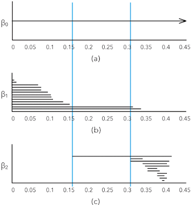
(a) Zero-dimensional, (b) one-dimensional, and (c) two-dimensional persistence barcodes

Motifs

With large data sets, when we have a graph, we do not necessarily have something we can look at because there is too much information. Often we have small patterns or motifs and we want to study how a higher order graph is captured by a motif [5]. This is also a clustering framework.

For example, we can look at the Stanford web graph at some time in 2002 when there were 281,903 nodes (pages) and 2,312,497 edges (links).

Clusters in the Stanford web graph

We want to find the core group of nodes with many incoming links and the tied together periphery groups that are tied together and also up-link to the core.

A motif that works well for social network kind of data is that of three interlinked nodes. Here are the motifs with three nodes and three edges:

Motifs for social networks

In motif M7 we marked the top node in red to match the figure of the Stanford web.

Conceptually, given a higher order graph and a motif Mi, the framework searches for a cluster of nodes S with two goals:

  1. the nodes in S should participate in many instances of Mi
  2. the set S should avoid cutting instances of Mi, which occurs when only a subset of the nodes from a motif are in the set S

The mathematical basis for this framework are motif adjacency matrices and the motif Laplacian. With these tools, a conductance metric in spectral graph theory can be defined, which is minimized to find S. The paper [5] in the references below contains several worked through examples for those who want to understand the framework.

References

  1. R. Sears, C. van Ingen, and J. Gray. To BLOB or not to BLOB: Large object storage in a database or a filesystem? Technical Report MSR-TR-2006-45, Microsoft Research, One Microsoft Way, Redmond, WA 98052, April 2006.
  2. P. Agrawal, R. Girshick, and J. Malik. Analyzing the Performance of Multilayer Neural Networks for Object Recognition, pages 329–344. Springer International Publishing, Cham, September 2014.
  3. G. A. Miller. The magical number seven, plus or minus two: Some limits on our capacity for processing information. Psychological Review, 63(2):81–97, 1956
  4. G. Carlsson. Topological pattern recognition for point cloud data. Acta Numerica, 23:289–368, 5 2014
  5. A. R. Benson, D. F. Gleich, and J. Leskovec. Higher-order organization of complex networks. Science, 353(6295):163–166, 2016

Thursday, September 1, 2016

Industrie 4.0: Entwicklungsfelder für den Mittelstand

In den 80er Jahren verschob sich die US-amerikanische industrielle Herstellung nach Fernost, vorwiegend China. Es war ein unaufhaltbares Ereignis, denn der Stand der industriellen Fertigung hatte sich seit Anfang Jahrhundert nicht mehr weiterentwickelt.

Nachdem ich in den 60er und 70er Jahre mehrere Werke in der Schweiz und Deutschland besucht hatte, alle sauber wie ein Spital und Qualitätskontrollen an jedem Schritt, und die Fachkräfte im angewandten Physik Institut kennenlernte, die jedes noch so verrückt schwierige Apparat-Teilchen mit unglaublich engen Toleranzen herstellen konnten, war mir der erste Besuch einer US-amerikanischen Fabrik ein grosser Schock, den ich wohl nie vergessen werde.

Es war die Burroughs B1700 Fabrik in Goleta bei Santa Barbara, ende 1977. Die Fabrikationshalle war laut, da die Arbeiterinnen jede ein Transistor Radio an hatte, jeder auf einem anderen Sender. Der Fussboden war schmutzig, die Arbeitsflächen voller Chips- und Kekskrümeln. Die Lötstrasse in der Mitte der Halle sah aus, als ob sie aus einem Charlie Chaplin Film herausgefallen war. Keine Arbeits-Station hatte eine Qualität-Kontrolle: am Ende der verknoteten Herstellungsstrasse war ein grosser Tisch an dem sich die fertigen Schaltkreis-Platinen stapelten. Eine Arbeiterin nahm eine nach der anderen die Platinen und klopfte sie mit einem Bleistift nach kalten Lötstellen ab, denn auf dem Ende des Bleistifts war ein Schreibmaschinen-Radiergummi aufgeschoben.

Nun wusste ich, weshalb wir die Computer in die Schweiz erst im Geschäft aufbauen mussten und dann die Defekte suchen mussten, bevor wir sie den Kunden liefern konnten. Praktisch jede Platine musste nachgelötet werden. Ein Jahrzehnt später, war die Fabrik bei Xerox in Rochester immer noch auf dem gleichen Niveau, nur wurde dort mehr mit dem Hammer gearbeitet um bei der manuellen Montage die fehlenden Toleranzen zu überwältigen.

Mit diesem Hintergrund, stand der Verlagerung nach Fernost mit den niedrigen Löhnen nichts im Wege. Ich glaubte, dass sich die industrielle Fertigung in den USA nie erholen würde. Dies ist ganz anders als in Europa oder Japan, wo das gesellschaftliche Schwergewicht auf Schulung der Arbeiter und Verbesserung der Herstellungs-Technologien liegt. Das Resultat ist, dass zum Beispiel der Zughersteller Stadler Rail einen Grossauftrag aus den USA erhalten konnte: Das Bahnunternehmen Caltrain hat bei Stadler 16 Doppelstocktriebzüge für 551 Millionen Dollar bestellt. Die Züge werden zwischen San Francisco und dem Silicon Valley fahren, wie der Tages Anzeiger vom 16. August berichtete.

Aber, es bewegt sich nun doch etwas im Silicon Valley. Praktisch jede Auto Firma hat jetzt eine Niederlassung im Silicon Valley, aber nicht nur die klassischen Firmen: die Chinesischen Firmen die die amerikanischen Produkte anfertigen, investieren hier in Forschungs- und Entwicklungs-Labors um die neuesten Technologien zu konzepieren. Während deutsche Hersteller immer noch 7 Jahre brauchen um ein neues elektronisches Auto zu entwickeln, kann man im Silicon Valley frischgebackene Doktoren von Stanford und UC Berkeley anstellen, die die gleiche Arbeit in ein paar Jahre machen, denn mit Industrie 4.0 haben wir eine Revolution.

Gerade letztes Wochenende hatte es im New York Times einen Artikel, wie die General Electric ein Labor mit 1400 Software-Entwicklern in San Ramon aufgestellt hat, um das System Predix zu schmieden, welches nich nur eine Grundlage für Industrie 4.0 sein soll, sondern auch es ermöglichen soll, die Wartung der Produkte im Einsatz vorherzusagen.

Das Fraunhofer-Institut für Produktionstechnik und Automatisierung IPA baut nun das Applikationszentrum Industrie 4.0 auf. Jedes Unternehmen sollte die Studie Industrie 4.0: Entwicklungsfelder für den Mittelstand anfordern und sie sorgfältig lesen. Sie ist von Herrn Markus Bressner, markus.bressner(at)ipa.fraunhofer.de erhältlich, Telefon +49 711 970-1808.

Industrie 4.0: Entwicklungsfelder für den Mittelstand

Wednesday, June 22, 2016

9,355,339: system and method for color reproduction tolerances

In the early days of digital imaging for office use, there was a religion that the response of the system had to be completely neutral. The motivation came from a military specification that a seventh generation copy had to still look good and be readable. If there would be a deviation from neutrality, every generation would enhance this deviation.

When a Japanese manufacturer entered the color copier market, they enhanced the images to improve memory colors and boost the overall contrast. They were not selling to the government and rightfully noted that commercial users do not do multiple generation copies.

Color is not a physical phenomenon, it is an illusion and color imaging is about predicting illusions. Visit your art gallery and look carefully at an original Rembrandt van Rijn painting. The perceived dynamic range is considerably larger than the gamut of the paints he used because he distorted the colors depending on their semantics. With Michel Eugène Chevreul's discovery of simultaneous contrast, the impressionists then went wild.

When years later I interviewed for a position in a prestigious lab, I gave a talk on how—based on my knowledge of the human visual system (HVS)—I could implement a number of algorithms that greatly enhance the images printed on consumer and office printers. The hiring engineering managers thought I was out of my mind and I did not get the job. For them, the holy grail was the perfect neutral transmission function.

This neutral color reproduction is a figment of imagination in the engineer's minds in the early days of digital color reproduction. The scientists who earlier invented the mechanical color reproduction did not have this hang-up. As Evans observed on page 599 of [R.M. Evans, “Visual Processes and Color Photography,” JOSA, Vol. 33, 11, pp. 579–614, November 1943], under the illuminator condition color constancy mechanisms in the human visual system (HVS) correct for improper color balance. As Evans further notes on page 596, we tend to remember colors rather than to look at them closely; for the most part, he notes, careful observation of stimuli is made only by trained observers. Evans concludes that it is seldom necessary to obtain an exact color reproduction of a scene to obtain a satisfying picture, although it is necessary that the reproduction shall not violate the principle that the scene could have thus appeared.

We can interpret Evans’ consistency principle (page 600) as what is important is the relation among the colors in a reproduced image, not their absolute colorimetry. A color reproduction system must preserve the integrity of the relation among the colors in the palette. In practice, this suggests that three conditions should be met. The first is that the order in a critical color scale should not have transpositions, the second is that a color should not cross a name boundary, the third is that the field of reproduction error vectors of all colors should be divergence-free. The intuition for the divergence condition is that no virtual light source is introduced, thus supporting color constancy mechanisms in the HVS.

We all know the Farnsworth-Munsell 100 hue test. The underlying idea is that when an observer has poor color discrimination, either due to a color vision deficiency or due to lack of practice, this observer will not be able to sort 100 specimen varying only in hue. In the test, the number of hue transpositions is counted to score an observer.

Farnsworth-Munsell 100 hue test

We can considerably reduce the complexity of a color reproduction system if we focus on the colors that actually are important in the specific images being reproduced. We can minimally choose the quality of the colorants, paper, halftoning algorithm, and the number of colorants to just preserve the consistency of that restricted palette.

First, we determine the palette, then we reproduce a color scale with a selection of the above parameters and we give the resulting color scale image a partial Farnsworth-Munsell hue test. This is the idea behind invention 9,355,339. The non-obvious step is how to select color scales and how to use a color management system to simulate a reproduction. The whole process is automated.

A graphic artist manually identifies the locus of the colors of interest, which is different for each application domain, like reproductions of cosmetics or denim clothes. A scale encompassing these critical colors is built and printed in the margin. In the physical application, the colors are measured and the transpositions are counted.

complexion color scale

The more interesting case is a simulation. There is no printing, just the application of halftoning algorithms and color profiles. The system extracts the final color scale and identifies the transpositions compared to the original. Why is the simulation more important?

Commercial printing is a manufacturing process and workflow design is crucial to the financial viability of the factory. Printing is a mass-customization process, thus every day in the shop is different. This makes it impossible to assume a standard workload.

For each manufacturing task, there are different options using different technologies. For example, a large display piece can be printed on a wide bubblejet printer, or the fixed background can be silkscreen printed and the variable text can be added on the wide bubblejet printer. Another example is that a booklet can be saddle stitched, perfect bound, or spiral bound.

print fulfillment diagam

In an ideal case, a print shop floor can be designed in a way to support such reconfigurable fulfillment workflows, as shown in this drawing (omitted here are the buffer storage areas).

example of a print fullfillment floor rendering; the buffer zones are omitted

However, this would not be commercially viable. In manufacturing, the main cost item is labor. Different fulfillment steps require different skill levels (at different salary levels) and take a different amount of time.

Additionally, not all print jobs are fulfilled at the same speed. A rush job is much more profitable than a job with a flexible delivery time. To stay in business, the plant manager must be able to accommodate as many rush jobs as possible.

This planning job is similar to that of scheduling trains in a saturated network like the New Railway Link through the Alps (NRLA or NEAT for Neue Eisenbahn-Alpentransversale, or simply AlpTransit). For freight, it connects the ports of Genoa and Rotterdam, with an additional interchange in Basle (the Rotterdam–Basel–Genoa corridor). For passengers, it connects Milan to Zurich and beyond. There are two separate basis tunnel systems: the older Lötschberg axis and the newer Gotthard axis. In the latter, freight trains travel at least at 100 km/h and passenger trains at least at 200 km/h. These are the operational speeds, the maximal speed is 249 km/h, limited by the available power supply.

The trains are mostly of the freight type, traveling at the lower operational speed. A smaller number of passenger trains travels at twice the operational speed. A freight train can be a little late, but a passenger train must always be on time lest people miss their connections, which is not acceptable.

The trains must be scheduled so that passenger trains can pass freight trains when these are at a station and can move to a bypass rail. However, there can be unforeseen events like accidents, natural disasters, and strikes that can delay the trains on their route. The manager will counter these problems by accelerating trains already in the system above their operational speed when there is sufficient electric power to do so. This way, when the problem is solved, there is additional capacity available.

The problem with modifying the schedule is that one cannot just accelerate trains: new bypass stations have to be determined and the travel speeds have to be fine-tuned. Train systems are an early implementation of industry 4.0 because the trains also automatically communicate between each other to avoid collisions and to optimize rail usage. For AlpTransit this required solving the political problem of forcing all European countries to adopt a new ERTMS/ETCS (European Train Control System) Level 2, to which older locomotives cannot be upgraded.

The regular jobs and rush jobs in a print fulfillment plant are similar. The big difference is that the train schedule is the same every day, while in printing each day is completely different. The job of the plant designer is to predict the bottlenecks and do a cost analysis to alleviate these bottlenecks. In particular, deadlocks have to be identified and mitigated. There are two main parameters: the number and speed of equipment, and the amount of buffer space. Buffering is highly nonlinear and cannot be estimated by eye or from experience. The only solution is to build a model and then simulate it.

We used Ptolemy II for the simulation framework and wrote Java actors for each manufacturing step. To find and mitigate the bottlenecks, but especially to find the dreaded deadlock conditions, we just need to code timing information in the Java actors and run Montecarlo simulations.

We used a compute cluster with the data encrypted at rest and using Ganymed SSH-2 for authentication with certificates and encryption on the wire. Each actor could run on a separate machine in the cluster. The system allows the well-dimensioned design of the plant, its enhancement through modernization and expansion, and the daily scheduling.

So far, the optimization is just based on time. In a print fulfillment plant, there are also frequent mistakes in the workflow definition. The workflow for a job is stored in a so-called ticket (believe me, reaching a consensus standard was more difficult than for ERTMS/ETCS). One of the highest costs in a plant is an error in the ticket, which causes the job to be repeated after the ticket has been amended. With this, risk mitigation through ticket verification is a highly valuable function, because it allows a considerable cost reduction for not having to allocate insurance expenses.

While in office printing A4 or letter size paper are the norm, commercial printers use a possibly large paper size to save printing time and, with it, cost. This means there are ganging and imposition, folding, rotating, cutting, etc. It is easy to make an imposition mistake and pages end up in the wrong document or at the wrong place. Similarly, paper can be cut at the wrong point in the process or folded incorrectly.

Once we have a simulation of the print fulfillment factory, we can easily solve these workflow problems, thus reducing risk and with it insurance cost. The data for print jobs is stored in portable document format (PDF) files. For each workstation in a print fulfillment plant, we take the Java actor implemented for the simulation and add input and output ports for PDF files. We then implement a PDF transformer for each workstation that applies the work step to the PDFs. There can be multiple input and output PDFs. For example, a ganging workstation takes several PDF files and outputs a new PDF file for each imposed sheet.

Most errors happen when a ticket is compiled. After simulating the workflow, the operator simply checks the resulting PDF files. A mistake is immediately visible and can be diagnosed by looking at the intermediate PDF files. A more subtle error source is when workstations negotiate workflow changes in the sense of the industry 4.0 technology. Before the change can be approved, the workflow has to be simulated again and the difference between the two output PDF files has to be computed.

A more valuable, but also more complex workflow change is accommodating rush jobs by taking shortcuts. For example, if there is a spot color in the press, can we reuse the same color or do we have to clean out the machine to change or remove the spot color? Another example is the question of using dithering instead of stochastic halftoning to expedite a job. Finally, earlier we mentioned the possibility of running a fixed background through a silkscreen press and printing only the variable contents on a bubblejet press.

In a conventional setting, any such change requires doing a new press-check and having the customer come in to approve it. In practice, this is not always realistic and the owner will use his best judgment so self-approve the proof.

9,355,339 automates this check and approval. The ICC profiles are available and can be used to compute the perceived colors in each case. The transposition score for the color scale (there can be more than one) can predict the customer's approval of the press-check.

9,355,339 automates the press-check and approval

Thus, we have created a Java actor that simulates a human and can predict the human's perception. This is an industry 4.0 application where we not only have semantic models for the machines but also for the humans, and the machines can take the humans into consideration.

simulating the human in the loop

Monday, February 29, 2016

Industrie 4.0

In our post on the Fourth Industrial Revolution last January, we showed a table from the World Economic Forum. It had 1784 as the date for the first industrial revolution, 1870 for the second, 1969 for the third, and a big question mark for the fourth.

Indeed, technology breakthroughs can rarely be pinned to a single date. In a post on a color scientist's role I had written that discoveries are in the air or ether. Discoveries happen when the time is ripe for them, and at that time, many people will have the same insight with a time interval of a few weeks or months. Research is very expensive, it is a high-risk investment. Timing is everything, otherwise, you lose your investment.

With that, I meant that technologies emerge over an interval of time. The widespread adoption of a revolutionary technology takes an order of magnitude longer than its emergence—giving a precise date is not possible.

When the industry was still artisanal, the force was supplied by waterwheels, donkeys, or indentured labor. Although this allowed mechanical production equipment, the force generation was unreliable and limited. In the first industrial revolution, steam allowed a steady supply of considerable mechanical force. It became possible to build factories with elaborate mechanical force distribution systems based on rods and belts. The layout of a factory floor was dictated by the force distribution system.

In the second industrial revolution, the electric motor made the design of the factory floor layout much easier, because what was distributed was the electricity, while the mechanical force was generated independently and locally at each workstation by electric motors. This allowed the distribution of labor, conveyor belts, and true mass production.

The third industrial revolution was the digitization of the entire design and production process through the use of CAD/CAM tools. Engineers could use interactive software to design new products. The design consisting of a software program meant that the program could be executed to generate simulations. It was not only possible to design smoother products with Bézier curves: the simulation could verify if a part was manufacturable by a CNC lathe and how long the process took. CAD/CAM programs were able to generate the control program for the CNC lathe, thus automating the entire manufacturing process.

If we have to put dates and names to the birthing of the fourth industrial revolution, it would be Kristen Nygaard (1957) and Ole-Johan Dahl (1962). When he was a visiting scientist at Xerox PARC, Nygaard told me how a newspaper trade union came to him for help with stressed out newspaper workers. The newspapers were introducing digital layout systems, which were supposed to be much more ergonomic that the old system of comps and rubylith. As a professor for operations research, he conducted research on planning, control, and data processing to sleuth the source of the stress.

The corollary was in 1962 Simula I, a superset of Algol 60, for simulating typesetting (discrete event networks). This was refined in Simula 67 with objects, classes, subclasses, virtual methods, co-routines, discrete event simulation, and garbage collection. In a first visit from Oslo to Palo Alto, this begat Smalltalk.

In 1973 came Hewitt & co-worker's extension to exploit massively parallel computers with the concurrent execution of objects. Communication was by message passing, decoupling the communication from the sender. The key new concept is that of an actor, a computational entity that, in response to a message it receives, can concurrently 1) send a finite number of messages to other actors, 2) create a finite number of new actors, and 3) designate the behavior to be used for the next message it receives.

In the actor model, messages are simply sent, there is no buffering, no synchronous handshaking, no ordering—FIFO requires explicit queue actor. Everything is local. These ideas were influenced by packet switched networks. The power comes also from the fact that a message can contain another actor, e.g., resumption, (a.k.a. continuation, stack frame) to which the recipient sends a response, enabling a variable topology.

This technology is also known as functional programming because the behavior is that of a mathematical function to express what an actor does when it processes a message.

To build the bridge to industry, the actor is a model for a machine or workstation. Variable topology means that each workstation can autonomously adapt the workflow depending on external factors (sensors). This requires refining the concept of modeling.

Modeling is the act of representing a system or subsystem formally. From a mathematical point of view, it is a set of assertions about properties of the system such as its functionality or physical dimensions. The constructive counterpart defines a computational procedure that mimics a set of properties of the system, also called executable mode or simulation.

With this, we can define design as the act of defining a system or subsystem. Usually, this involves defining one or more models of the system and refining the models until the desired functionality is obtained within a set of constraints.

Embedded software is software that resides in devices that are not first-and-foremost computers. A key feature of embedded software is that it engages the physical world, and hence has temporal constraints that desktop software does not share.

Executable models are constructed under a model of computation, which is the set of ``laws of physics'' that govern the interaction of components in the model. A set of rules that govern the interaction of components is called the semantics of the model of computation.

In the example of a printing plant, each actor can be a PDF transformer that performs the step of a workstation (e.g., imposition, folding, or trimming) by performing the corresponding operation on a PDF file. By combining the actors in a workflow, we can simulate the set of all print jobs in the printing plant and assert correctness. When timing information is collected, the simulation can find bottlenecks and deadlocks. Because rush jobs increase the profit, the simulation allows the workflow topology to reconfigure itself locally dynamically to maximize the profit function. Also, if there is a breakdown, e.g., a jam, the other workstations can reconfigure their use of queues.

An example of a work station is the raster image processor. We can change the algorithm for the black skeleton, gamut mapping, or halftoning. The actor can use simulation to select the most efficient algorithms. It considers the corresponding ICC profiles for the printer and can simulate giving the printer a virtual Farnsworth-Munsell 100-hue test, as shown in this diagram of the workflow in physical respectively simulation mode.

Workflow in physical respectively simulation mode

Returning to the concept of the fourth industrial revolution, in Germany, the brand name for this initiative is Industrie 4.0. They use slightly different terminology based on the concept of the twin. They would write:

Four aspects drive the future of manufacturing: modularity, connectivity, autonomy, digital twin. A digital twin of an autonomous system is a very realistic model of the current state of the process and its own behavior in interaction with its environment in the real world. It is a notion where the information created in each stage of the product lifecycle is seamlessly made available to subsequent stages.

The digital twin approach is the next wave in modeling, simulation and optimization technology. Simulation is extended to all life cycle phases as a core product or system functionality.

The concept of using “twins” is rather old. It dates back to NASA’s Apollo program, where at least two identical space vehicles were built to allow mirroring the conditions of the space vehicle during the mission. One vehicle remaining on earth was called the twin. NASA definition: A digital twin is an integrated multiphysics, multiscale simulation of a vehicle or system that uses the best available physical models, sensor updates, fleet history, etc., to mirror the life of its corresponding flying twin. At Airbus, a digital twin is called an iron bird.

Tuesday, December 15, 2015

OLED TVs are here

OLED displays for handheld devices have been around for a while, but large TVs have been rare due to manufacturing difficulties. LG group has been one of the few manufacturers. At the end of October, Panasonic has introduced a 65 inch 4K ultrahigh definition TV in Europe. It combines LG's OLED panel with Panasonic's image processing technology.

Despite a high price of 10,000€, the TVs are selling well. If in the past the rule was that your display can never be too bright, now the rule is that your display's gamut is never too big.

Link to article

Thursday, October 22, 2015

Photonics for data access and delivery

When we use the cloud for heavy duty computations, we quickly find out that although storage is inexpensive, we never know how fast we can access our data. If we want guaranteed performance in terms of IOPS, the price quickly goes up. This has to do with the distance the data has to travel. In a warehouse-scale datacenter, we have two cabling lengths: up to a couple meters for vertical networking in a rack and up to a couple hundred meters for horizontal networking between racks. There are some game-changing technology developments on the horizon regarding the horizontal networking.

For the vertical cabling, copper can be used, but for the horizontal cabling fiber optics has to be used due to dispersion, as shown in the figure below.

dispersion in cabling

Since the processor is electronic, at each end of the optical fiber cable we need an expensive transducer. Chip companies have invested substantial resources trying to grow lasers on CMOS chips to feed an optical cable, but the physical manufacturing process was very messy and never worked well.

The breakthrough came a dozen years ago with the development of nanotechnology to fabricate devices based on the optical bandgap. This allowed to take a PowerPC processor, make it flat, then use nanotechnology to grow an optical resonance ring on top of it. Now the laser source can be external to the chip and make a round in the ring while being modulated from the PowerPC. This was a seminal breakthrough.

At the end of July, Jürg Leuthold, professor of photonics and communications at ETH Zurich, and his colleagues had another seminal breakthrough. Hitherto, miniaturization of the modulator has been limited by the wavelength of the laser. In order to beat that limit and to make the device even smaller, the light is first turned into so-called surface plasmon polaritons (SPP). Plasmon polaritons are a combination of electromagnetic fields and electrons that propagate along a surface of a metal strip. At the end of the strip, they are converted back to light once again. The advantage of this detour is that plasmon polaritons can be confined in a much smaller space than the light they originated from. The signal is created by modulating the plasmon-polaritons in an interferometer.

By applying a voltage, the refractive index and hence the velocity of the plasmons in one arm of the interferometer can be varied, which in turn changes their amplitude of oscillation at the exit. After that, the plasmons are re-converted into light, which is fed into a fiber optic cable for further transmission.

This is the cheapest modulator ever built. It is very simple, consisting of a gold layer on glass that is only 150 nm thick and an organic material whose refractive index changes when an electric voltage is applied and that thus modulates the plasmons inside the interferometer. As such a modulator is much smaller than conventional devices and it consumes very little energy—only a few thousandth of Watts at a data transmission rate of 70 Gigabits per second. This corresponds to merely a hundredth of the consumption of commercial models.

Source: Nature Photonics 9, 525–528 (2015), doi:10.1038/nphoton.2015.127.

New technologies take a few years to evolve from universities to industrial research labs and then to industry. One of the accelerators of this process is CERN, in particular, the Large Hadron Collider (LHC) project. The detectors produce about 25 PB of data each year, which travel through more than 100,000 optical links to obtain the required bandwidth. The distance from the detectors to the control rooms is about 150 m and the connectors have to be able to withstand the 3.8 Tesla magnetic field in the detector and enormous levels of radiation.

For this application, scientists at CERN have developed so-called “versatile-link” optical components with a minimal energy consumption. By 2018 Marcel Zeiler and his colleagues will have new modulators—of course, also based on interferometry—that can withstand the harsh environment in the LCH.

Source: SPIE Professional October 2015.

Although in a datacenter the radiation is negligible and the magnetic fields are very far from Teslas, the experience is that CERN technology transitions to industry very fast, so we should not be surprised to see new generation versatile optical links in a year or two at most. The capability of economically moving data for hundreds of meters on 100 Gigabit Ethernet (100GbE) links renders old architectures like Hadoop moot because there is no reason for moving the data to HDFS for MapReduce.

Wednesday, August 12, 2015

9,098,487: categorization based on word distance

One of the correlates for the social appreciation or value of scientists is the Gini coefficient. Indeed, poor people cannot afford technologies that make their lives more comfortable (and would not be able to amortize the investment anyway because their labor has little value). Rich people also cannot necessarily amortize the investment in new technology, because they can just hire the poor to do the work for them for a low pay. What drives technology is a low Gini coefficient, because it is a broad middle class that can and does invest in new technologies that makes their lives more efficient.

Worldwide, over the past two centuries the Gini factor has been on the rise, yet there has been incredible technological progress. This means we have to look at a smaller geographical scale. Indeed, for the late 2000s, the United States had the 4th highest measure of income inequality out of the 34 OECD countries measured, after taxes and transfers had been taken into account. As it happens, except for the medical sciences, the American science establishment is only a pale shadow of what it was half a century ago.

In this context, we were naive when three years ago we embarked to solve an efficiency problem for customers processing medical bills, invoices and receipts. These artifacts are still mostly on paper and companies spend a huge amount of time having minimum wage people ingesting it for processing in their accounting systems. In the datasets we received from the customers, the medical bills were usually in good physical shape, but the spelling checkers in the OCR engines had a hard time cracking the cryptic jargon. Receipts were in worst physical shape, printed on poor printers and crumpled, and often imaged by taking a picture with a smart phone.

Surprisingly, invoices were also difficult to process. They often had beverage stains and sometimes they had been faxed several times using machines that looked like they had mustard on the platen and mayonnaise under the lid. But the worst was that in the datasets we received, the form design of the invoices was very inconsistent: the fields and their labels were all over the place, many gratuitous and inconsistent abbreviations were used, etc.

Considerable effort had been spent in the 80s to solve this problem by people like Dan Bloomberg with his mathematical morphology methods to clean up the scanned images (Meg Withgott coined the phrase "document dry cleaning") and Rob Tow with David Hecht and others invented the glyph technology to mark forms so that the location and semantics of each field could be looked up. Maybe due to the increasing Gini coefficient they were not commercially successful. However because this time we had actual customers, we decided to give it another go.

Note that OCR packages already have pretty good built-in spelling checkers, so we are dealing with hard cases. The standard approach used in semantic analysis is based on predetermining all situations for a lexeme and store them into NoSQL databases. In our applications this turned out to be too slow: we needed a response time under 16 µs.

Looking at our dataset, we had a number of different issue types:

  • synonym: a word or phrase that means exactly or nearly the same as another word or phrase in the same language
  • abbreviation: a shortened form of a word or phrase
  • figure of speech: a word or phrase used in a nonliteral sense to add rhetorical force to written passage
  • misspelling: a word or phrase spelled incorrectly
  • mistyping: like misspelling, but depends on the distance between the keys on a keyboard or the stroke classes in the OCR engine
  • metonym: a word, name, or expression used as a substitute for something else with which it is closely associated
  • synecdoche: a figure of speech in which a part is made to represent the whole or vice versa
  • metalepsis: a figure of speech in which a word or phrase from figurative speech is used in a new context
  • kenning: a compound expression in Old English and Old Norse poetry with metaphorical meaning
  • acronym: an abbreviation formed from the initial letters of other words and pronounced as a word

In addition to computational speed, we wanted to be able to address each of these constructs explicitely. In the following we call a lexeme "category" because the used process is a categorization more than a linguistic analysis.

We solved the problem by introducing a metric, so that we could deal with everything as distances and intervals. For the metric we chose the edit distance, also known as Levenshtein distance: the number of edits used to change a first word in the category into a second word in the category, such as using additions, deletions, substitutions, and transpositions. This metric can be computed very fast. We also tried the Damerau-Levenshtein distance, but in this application it did not make a difference.

With a metric, everything was simple. We took the lexemes in each category and computed the center of gravity to determine the prototype for each category and the diameter of the category. The category then received a label that is the word or phrase used in the document typing application.

interval of a lexeme

With misspellings the diameters could be small, but with with synonyms and figures of speech the intervals could be quite large and can overlap. The intersections could easily be computed. Because in all three out datasets the dictionaries were small, we easily resolved the overlaps visually by constructing a graph in which each node had the category diameter as the value and the edges between two nodes had their Levenshtein distance as a weight. Then we plotted the graph with Gephi and split up the overlapping categories into smaller one with the same label.

With this, document typing became very fast: for each word or phrase we looked into which category it fell, and in there we looked for a match. When there was one, we replaced it with the lexeme's label, when not, we added it to the category and logged it for manual verification.

Patent 9,098,487 was filed November 29, 2012 and issued August 4, 2015.

Friday, November 7, 2014

Sharp has developed a reflective liquid crystal display panel for wearable computer devices, such as smart-watches, that consumes 0.1% the energy of current backlit panels. The Japanese electronics maker will mass-produce the panel in Japan by next spring and ship it to device makers domestically and abroad.

The panels incorporate memory chips and can save power on retrieving data by storing images for a certain amount of time. Panels account for more than 30% of the power usage of current wearable devices. With the new model, devices will be able to function for 30% longer before recharging.

Nikkei Asian Review, 31 October 2014

Wednesday, October 8, 2014

New reflective LCD panel slashes power consumption

Sharp has developed a touch panel that can accurately pick up text written with a ballpoint pen. This sets the device apart from conventional ones that require a stylus with a wider tip. The new liquid crystal display panel has roughly four times the sensitivity of hitherto existing models, making it the world's top performer in that regard, according to Sharp. The Japanese electronics company plans to start domestic mass production of the device next spring and make it a mainstay product in its LCD business.

Sharp's new panel works with ballpoint pens and mechanical pencils with 1mm or even narrower tips. The company's current production lines can make the panel.

Source: Nikkei

Thursday, June 5, 2014

3D print of van Gogh's ear

Vincent van Gogh self-portrait with bandaged ear, 1889

The German artist Diemut Strebe used a 3D printer at a Boston hospital to create a replica of Vincent van Gogh's ear. Strebe said the copy of the ear uses DNA material from Lieuwe van Gogh, the great-great-grandson of Theo Van Gogh, Vincent's brother.

The artifact is on display at the Center for Art and Media in Karlsruhe, Germany through July 6.

Source: Los Angeles Times