Thursday, July 21, 2016

Virtual energy production and delivery at IWB

In our post on the virtual print factory, we saw how an art director can be simulated and used in a simulated press check to optimize print production. There are other applications that can be revolutionized through the online simulation of production. Today, we have a look at the future of energy production and delivery. Society is improved by making it more efficient.

In 1852 Basel, the private company Gasindustrie was founded and in 1867 it was nationalized. Over the years other utilities were added: water delivery, water production, electricity, long-distance heating, refuse processing, and a fiber network for broadband internet and telephony. The name became IWB, forIndustrielle Werke Basel. It was privatized in 2010 (CEO David Thiel), but all shares belong to the Canton Basel-City. IWB is responsible for the supply of energy, water, and telecom; it has a mandate to optimize its operations (smart IWB 2020).

During industrialization, like in most countries, Switzerland's main energy source was coal. After World War I, not having coal mines, Switzerland boosted the education of engineers, who could then electrify the country. For example, the Crocodile locomotive was an engineering feat that could pull up a freight train on the Gottardo line. Actually, the regenerative braking energy from two trains could pull up one train on the other side of the Alps. When in the 1930s the regime in Germany started flexing its muscle and using its coal to wield power, Switzerland invested considerable brain power to wean away from coal as much as possible. For example, the cantonal buildings in Zurich are heated with heat pumps extracting heat from the Limmat.

The ETH cranked out generation after generation of skilled engineers who designed hydroelectric dams, turbines, and power distribution systems. Many plants were of the pump type, consisting of an upper and a lower reservoir: during the day water falls and generates power, while at night cheap electricity is imported from fixed throughput plants to pump the water back up.

This history is reflected in IWB's energy sources. In 2015, the energy sources for electricity in percent were

hydroelectric
96.14
wind
0.22
solar
0.14
other renewable
3.50

In the 4th quarter of 2015, on the European domestic market, the cost of a kilowatt-hour (kWh) of power was 3.3 cents. However, in Basel, at the public car charge boxes, the consumer price varies between 45 and 70 cents per kWh. This is an opportunity to increase efficiency. Smart IWB 2020 aims at reducing and stabilizing the end-user energy costs.

The old big central power plants will remain and keep producing and storing energy. New small decentralized systems have been built to produce and store energy at the regional level. Now, end-users are starting to produce, store, and consume energy. Excess energy is shared at the neighborhood level.

This is how a 1 MW lithium-metal-oxide battery in Zurich looks like:

1 MW lithium-metal-oxide battery in Zurich

End-users must also store energy in some form to even out the network dependence during the day. There may be excess solar energy in the afternoon and a lack of energy during a cold winter night.

each house has a facility to store excess energy

This is made possible by the new control network shown in dark gray in the figure below (for an animation see here). IWB can collect data everywhere on the network and feed it to its simulation that allows it to optimize the overall energy generation and conversion system.

Smart IWB 2020. The control network is shown in dark grey

Electricity companies have been using simulations for many years. For robustness, a distribution system cannot have a tree topology, because a failure at a node will black out the entire subtree. The required mesh topology is difficult to manage because the system has to be kept in equilibrium, otherwise, a failure will cascade to a blackout of the entire network.

What is new with smart IWB 2020, is that the regulation is no longer made by dropping more water when the network frequency drops under 49.8 Hz and by pumping up water when the frequency rises over 50.2 HZ. As the figure above shows, there are many more sources for electricity that have to be synchronized and balanced out.

In 2000, Germany introduced a law to subsidize renewable energies by guaranteeing the producers a profit, i.e., by taking out a major part of their risk to conduct business. In 2004, the European Union liberalized the power market, adding to the mix the windmill farms in Denmark among others. In Germany alone, renewable energy production surged from 6,277 GWh in 2000 to 153,000 GWh in 2015.

The availability of this low-cost renewable energy from the north wrecked havoc in the business model of the Swiss generators, who were generating expensive electricity during the day by draining the high reservoirs and importing cheap electricity at night to pump up the water from the low reservoirs. Today, solar plants in Germany deliver the maximum energy around noon, exactly the time when pump plants in the Alps used to generate the highest profits.

According to Alpiq CEO Jasmin Staiblin (SFR 25 April 2016), the producer Alpiq can generate only ¼ of its hydropower at a profit, while ½ breaks even and ¼ is sold at a loss. On average, to Alpiq, hydropower generation costs 6.5 cents per kWh, twice the European market price. Even at its newest generation facilities with the latest turbine designs, the cost is 3.8 respectively 4.5 cents per kWh. Alpiq expects that next year or the year after, the open market price will sink to 2 cents per kWh or even slightly less.

The numerous nuclear power plants in France and Switzerland, while also causing losses to the hydroelectric generators, cannot compete with the renewable sources. At the Gösgen nuclear power plant, production costs in 2014 were 3.4 cents per kWh. In 2015 they were 5.1 cents per kWh, but this was due to accounting changes and costs are supposed to sink again, but 3.4 > 2. According to GE Chief Productivity Officer Philippe Cochet in Fairfield CT (NZZ 13 January 2016), before the 2008 financial crisis, in Europe each year 7 GW of new power generation capacity was sold; after the crisis, sales dropped to 1.3 GW and in the past two years sales were less than 1 GW.

The solution is to use online simulations to not just optimize electric power generation, but all energy management: electricity, hot steam for electricity production, hot water for heating, and warm water for washing. Heat is produced by burning refuse, natural gas, biomass (wood refuse), etc. It is also recovered from data centers, instead of dispersing it in the atmosphere through air conditioning chillers. This photograph by Mathias Leemann shows the refuse burning plant of Basel.

Refuse burning plant Basel; photo by Mathias Leemann

Heat can be stored in water, soil, and stones, as has been done since Roman times. A more contemporary method used by IWB is the use of fuel cells. When there is excess electricity, electrolysis of water is used to generate hydrogen. Hydrogen is also produced from natural gas when consumption is low. This hydrogen is easy to store. When electricity prices are high, hydrogen fuel cells are used to generate electricity.

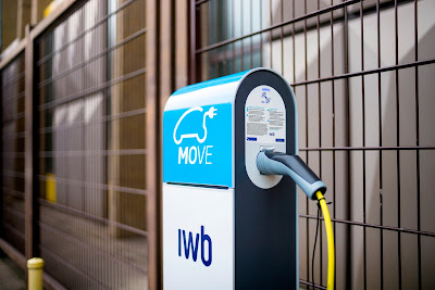
Coordinating and timing all these sources, stores, carriers, and consumers of energy is a very complex task. When IWB will sell its electricity at the public charge boxes (photograph by Simon Havlik) around the Canton for a much lower price than today's 45 to 70 cents per kWh, cars based on burning fossil fuels will disappear very fast. Such is the impact of smart energy management.

IWB charge box; photograph by Simon Havlik

So far, we have seen how the online simulation of a complex energy provision system can considerably reduce the cost of energy. However, this does not yet help with the goal of the 2000 Watt Society. If we build our houses with recycled glass shards in the outer concrete walls, then use 12 cm of insulation and cover it with 16 cm of solid wood on the inside, and also give up private ownership of cars, we might achieve a 3500 Watt Society, said ZHAW sustainability expert Prof. Andreas Hofer (SRF 26 November 2015).

50 years ago, people got by with less than 2000 Watt. Where is the problem? It is not at the individual level but at the society level. We have become much more mobile: if you live in Lugano, you not longer go to San Moritz for an extended weekend, but to Paris. Also, we have become digital packrats. All over the world, we have huge server farms that store all that digital media we never consume but is valuable for social network companies to dissect our lives and sell us stuff we do not really need.

Back to the virtual print factory:

virtual print factory

The output of the prepress stage is a PDF file. The two presses take raster images, therefore the computer in front of the press has to do the ripping and is called the digital front-end. In John L. Recker et al.; Font rendering on a GPU-based raster image processor; Proc. SPIE 7528 (January 18, 2010), the authors calculated that over a year of usage, the regular front-end RIP consumed 38,723 kWh and generated 23,234 Kg of CO2, while for the GPU-RIP they built, the corresponding numbers are 10,804 kWh and 6,483 Kg.

This is the kind of innovation that is required to achieve the 2000 Watt Society at the society level rather than at the individual level. There is still a lot of work to do. We recently wrote that the internet of things is a power guzzler: fortunately the cited report has some good advice.

Tuesday, July 19, 2016

Structure in Unstructured Data, Part 2

Follow this link for an updated post.

In the first part, we took a random walk from unstructured data to multimedia files, JPEG compression, a DCT-inspired classifier, and deep learning. We saw that the crux of supervised machine learning is the training.

There are two reasons for needing classifiers. We can design more precise algorithms if we can specialize them for a certain data class. For humans, the reason is that our immediate memory can hold only 7±2 chunks of information. This means that we aim to break down information into categories each holding 7±2 chunks. There is no way humans can interpret the graphical representation of graphs with billions of nodes.

As already Immanuel Kant noted, categories are not natural or genetic entities, they are purely the product of acquired knowledge. One of the functions of the school system is to create a common cultural background, so people learn to categorize according to similar rules and understand each other's classifications. For example, in the biology class, we learn to organize botany according to the 1735 Systema Naturæ compiled by Carl Linnæus.

As we know from Jean Piaget's epistemological studies with children, there is assimilation when a child responds to a new event in a way that is consistent with an existing classification schema. There is accommodation when a child either modifies an existing schema or forms an entirely new schema to deal with a new object or event. Piaget conceived intellectual development as an upward expanding spiral in which children must constantly reconstruct the ideas formed at earlier levels with new, higher order concepts acquired at the next level.

The data scientist's social role is to further expand this spiral.

For data, this means that we want to cluster it (recoding by categorization). Further, we want to connect the clusters in a graph so we can understand its structure (finding patterns). At first, clustering looks easy: we take the training set and do a Delaunay triangulation, the dual graph of the Voronoi diagram. After building the graph with the training set, for a new data point, we just look in which triangle it falls and know its category. Color scientists are familiar with Delaunay triangulations because they are used for device modeling by table lookup. Engineers use them to build meshes for finite element methods.

The problem is that the data is statistical. There is no clear-cut triangulation and points from one category can lie in a nearby category with a certain probability. Roughly, we build clusters by taking neighborhoods around the points and the intersect them to form the clusters. The crux is to know what radius to pick for the neighborhoods because the result will be very different.

This is where the relatively new field of algebraic topology analytics comes into play. It has only been about 15 years that topology has started looking at point clouds. Topology, an idea of the Swiss mathematician Leonhard Euler, studies the properties of shape independent of coordinate systems, dependent only on a metric. The topological properties are deformation invariant (a donut is topologically equivalent to a mug). Finally, topology constructs compressed representations of shape.

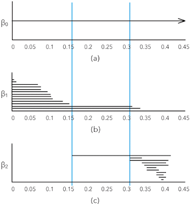
The interesting element of shape in point clouds are the k-th Betti numbers βk, the number of k-dimensional "holes" in a simplicial complex. For example, informally β0 is the number of connected components, β1 the number of roundish holes, and β2 the number of cavities.

Algebraic topology analytics relieves the data scientist from having to guess the correct radius of the point neighborhoods by considering all radii and retaining only those that change the topology. If you want to visualize this idea, you can think of a dendrogram. You start with all the points and represent them as leaves; as the radii increase, you walk up the hierarchy in the dendrogram.

This solves the issue of having to guess a good radius to form the clusters, but you still have the crux of having to find the most suitable distance metric for your data set. This framework is not a dumb black-box: you still need the skills and experience of a data scientist.

The dendrogram is not sufficiently powerful to describe the shape of point clouds. The better tool is the set of k-dimensional persistence barcodes that show the Betti numbers in function of the neighborhood radii for building the simplicial complexes. Here is an example from page 347 in Carlsson's article cited below:

(a) Zero-dimensional, (b) one-dimensional, and (c) two-dimensional persistence barcodes

With large data sets, when we have a graph, we do not necessarily have something we can look at because there is too much information. Often we have small patterns or motifs and we want to study how a higher order graph is captured by a motif. This is also a clustering framework.

For example, we can look at the Stanford web graph at some time in 2002 when there were 281,903 nodes (pages) and 2,312,497 edges (links).

Clusters in the Stanford web graph

We want to find the core group of nodes with many incoming links and the tied together periphery groups that are tied together and also up-link to the core.

A motif that works well for social network kind of data is that of three interlinked nodes. Here are the motifs with three nodes and three edges:

Motifs for social networks

In motif M7 we marked the top node in red to match the figure of the Stanford web.

Conceptually, given a higher order graph and a motif Mi, the framework searches for a cluster of nodes S with two goals:

  1. the nodes in S should participate in many instances of Mi
  2. the set S should avoid cutting instances of Mi, which occurs when only a subset of the nodes from a motif are in the set S

The mathematical basis for this framework are motif adjacency matrices and the motif Laplacian. With these tools, a conductance metric in spectral graph theory can be defined, which is minimized to find S. The third paper in the references below contains several worked through examples for those who want to understand the framework.

Further reading:

Monday, July 18, 2016

Structure in Unstructured Data, Part 1

Follow this link for an updated post.

In the context of big data, we read a lot about structured versus unstructured data. So far, so good. Things get a little murky and confusing when advanced analytics—which refers to analytics for big data—joins the conversation. The confusion comes from the subtle difference between "structured data" and "structure of data," which contain almost the same words. Both concepts are key to advanced analytics, so they often come up together. In this post, I will try shed some light on this murkiness to illuminate it.

The categorization in structured, semi-structured, and unstructured data comes from the storage industry. Computers are good at chewing on large amounts of data of the same kind, like for example the readings from a meter or sensor, or the transactions on cash registers. The data is structured in the sense that each record has the same fields at the same locations, for example on an 80 or 96 column punched card, if you want a visual image. This structure is described in a schema.

Databases are optimized for storing structured data. Since each record has the same structure, the location of the i-th record on the disk is i times the record length. Therefore, it is not necessary to have a file system: a simple block storage system is all that is needed. When instead of the i-th record we need the record containing a given value in a given field, we have to scan the entire database. If this is a frequent operation in a batch step, we can accelerate it by first sorting the records by the values in this field, which allows us to use binary search, which is logarithmic instead of linear.

Because an important performance metric is the number of transactions per second, database management systems use auxiliary structures like index files and optimized query systems like SQL. In a server-based system, when we have a query, we do not want to transfer the database record by record to the client: this leads to server-based queries. When there are many clients, often the same query is issued from various clients, therefore, caching is an important mechanism to optimize the number of transactions per second.

Database management systems are very good at dealing with transactions on structured data. There are many optimization points that allow for huge performance gains, but it is a difficult art requiring highly specialized analysts.

With cloud computing, it has become very easy to quickly deploy an application. The differentiation is no longer by the optimization of the database, but in being able to collect and aggregate user data so it can be sold. This process is known as monetization and an example is click-streams. The data is to a large extent in the form of logs, but their structure is often unknown. One reason is that the schemata often change without a notification because the monetizers infer them by reverse engineering. Since the data is structured with an unknown schema, it is called semi-structured. With the Internet of Things (IoT), also known as Web of Things, Industrial Internet, etc., a massive source of semi-structured data is coming to us.

This semi-structured data is high-volume and high-velocity. This breaks traditional relational databases because data parsing and schema inference become a performance bottleneck. Also, the indexing facilities may not be able to cope with the data volume. Finally, the traditional database vendor's pricing models do not work for this kind of data. The paradigms for semi-structured data are column based storage and NoSQL (not only SQL).

The ubiquity of smartphones with their photo and video capabilities and connectedness to the cloud has brought a flood of large data files. For example, when the consumer insurance industry thought it can streamline its operations by having insured customers upload images of damages instead of keeping a large number of claim adjusters in the field, they got flooded with images. While an adjuster knows how to document a damage with a few photographs, consumers take dozens of images because they do not know what is essential.

Photographs and videos have a variety of image dimensions, resolutions, compression factors, and duration. The file sizes vary from a few dozen kilobytes to gigabytes. They cannot be stored in a database other than as a blob, for binary large object: the multimedia item is stored as a file or an object and the database just contains a file pathname or the address of an object.

In juxtaposition to conventional structured data, the storage industry talks about unstructured data.

Unstructured data can be stored and retrieved, but there is nothing else that can be done with it when we just look at it as a blob. When we looked at analytics jobs, we saw that analysts spend most of their time munging and wrangling data. This task is nothing else than structuring data because analytics is applied to structured data.

In the case of semi-structured data, this consists in reverse engineering the schema, convert dates between formats, distinguish numbers and strings from factors, and dealing correctly with missing data. In the case of unstructured data, it is about extracting the metadata by parsing the file. This can be a number of tags like the color space, or it can be a more complex data structure like the EXIF, IPTC, and XMP metadata.

A pictorial image is usually compressed with JPEG and stored in a JFIF file. The metadata in a JPEG image consists of segments beginning with a marker, the kind of the marker, and if there is a payload, the length and the payload itself. An example of a marker kind is the type (baseline or progressive) followed by width, height, number of components, and their subsampling. Other markers are the Huffman tables (HT), the quantization tables (DQT), a comment, and application-specific markers like the color space, color gamut, etc.

This illustrates that unstructured data contains a lot of structure. Once the data wrangler has extracted and munged this data, it is usually stored in R frames or in a dedicated MySQL database. These allow processing with analytics software.

Analytics is about finding even deeper structure in the data. For example, a JPEG image is first partitioned in 8×8 pixel blocks, which are each subjected through a discrete cosine transformation (DCT). Pictorially, the cosine basis (the kernels) looks like this:

the kernels of the discrete cosinus transform (DCT)

The DCT transforms the data into the frequency domain, similar to the discrete Fourier transform, but in the real domain. We do this to decorrelate the data. In each of the 64 dimensions, we determine the number of bits necessary to express the values without perceptual loss, i.e., in dependence of the modulation transfer function (MTF) of the combined human visual system (HVS) and viewing device. These numbers of bits are what is stored in the discrete quantization table DQT, and we zero out the lower order bits, i.e., we quantize the values. At this point, we have not reduced the storage size of the image, but we have introduced many zeros. Now we can analyze statistically the bit patterns in the image representation and determine the optimal Huffman table, which is stored with the HT marker, and we compress the bits, reducing the storage size of the image through entropy coding.

Like we determine the optimal HT, we can also study the variation in the DCT-transformed image and optimize the DQT. Once we have implemented this code, we can use it for analytics. We can compute the energy in each of the 64 dimensions of the transformed image. As a proxy for energy, we can compute the variance and obtain a histogram with 64 abscissa points. The shape of ordinates gives us an indication of the content of the image. For example, the histogram will tell us, if an image is more likely scanned text or a landscape.

We have built a classifier, which gives us a more detailed structural view of the image.

Let us recapitulate: we transform the image to a space that gives a representation with a better decorrelation (like transforming from RGB to CIELAB). Then we perform a quantization of the values and study the histogram of the energy in the 64 dimensions. We start with a number of known images and obtain a number of histogram shapes: this is the training phase. Then we can take a new image and estimate its class by looking at its DCT histogram: we have built a classifier.

We have used the DCT. We can build a pipeline of different transformations followed by quantizations. In the training phase, we determine how well the final histogram classifies the input and propagate back the result to give a weight to each transformation in the pipeline by adjusting the quantization. In essence, this is an intuition for what happens in deep learning.

A disadvantage of machine learning is that the training phase takes a long time and if we change the kind of input we have to retrain the algorithm. For some applications, you can use your customers as free workers, like for OCR you can use the training set as captcha, which your customers will classify for free. For scientific and engineering applications you typically do not have the required millions of free workers. In the second part, we will look at unsupervised machine learning.

Wednesday, July 13, 2016

ZimRim

One way of categorizing computer users is to partition them into consumers and producers. Consumers follow their friends on social networks, watch movies, and read the news. Producers create the contents for the consumers, either as chroniclers or as copywriters.

The former enter small amounts of text into the device, so they typically give the finger to a smartphone or tablet; this finger often being a thumb or an index (thumbing). The latter need to be efficient when entering bulk data, so they typically use a desktop computer or a laptop because they come with a keyboard, allowing them to type with all ten fingers, without looking at the keyboard (touch typing).

Although a producer will mostly be touch typing, the user interfaces are mostly graphical and use a paradigm known as WIMP, for windows, icons, mice, and pointing. A mode or context change requires removing one hand from the keyboard to grab the mouse. Since this takes a longer time than moving a finger to a different key, GUIs have keyboard shortcuts. Mousing is exacerbated by today's big screens, which make it harder to locate the pointer.

Hypertext is based on links. A link is followed by clicking on it, which requires moving a hand from the keyboard to the mouse and finding the pointer. This can be annoying in activities like doing research using a search engine while summarizing the results and typing them into a text editor.

Life is easier when each link is labeled with a letter and a link can be followed by pressing that letter on the keyboard. This is what you can do with ZimRim, a free application from a Silicon Valley data science startup of the same name.

The result screen of ZimRim; click to enlarge

ZimRim's result screen is a scroll-free view with all 10 links appearing on one screen: on most laptops / desktops you do not need to scroll up and down to see and compare the links. A user can compare all 10 results in one glance and decide which are best fit for their query. It is clutter free with a uniform look and currently ad-free.

Results are opened in separate tabs so as to keep the results page open as the reference to open other links so you do not have to press "back" button. If results do not open, users should look for "popup blocked" message below the address bar and allow popups from this domain. Some browsers mistakenly block opening new tabs for result links thinking of those as potential popup ads.

ZimRim makes whole search experience "mouse optional" as a bonus for producers although consumers / mouse users can click the usual way.