Showing posts with label categorical perception. Show all posts

Friday, September 26, 2014

Unique hues

Color does not exist in nature, it is an illusion happening in our mind. Therefore, we can not solve color appearance problems with physics alone. The situation gets even hairier when we converse about color, because color names are just an ephemeral convention. For example, it is easy to "synonimize" blue and cyan or red and magenta.

Especially the latter is not out of the blue. Back in the days when I was doing research in color science, I had an OSA-UCS atlas. Periodically, I was getting updates of color tiles. One tile was standing out: the one that Boynton and Olson had determined to be the best red, with coordinates (L, j, g) = (–3.6, 1.5, –6.9), representing the consensus for the basic color term "red." Not only was it changing, but is was changing frequently. When I lined the updates up in the light-booth, the best red was shifting towards magenta.

I was so puzzled about the OSA changing the tile for the best red, that I called them up. I found out that they periodically where getting new tiles from their supplier Dupont when they developed new pigments. The OSA would then scale them visually and emit updates to the atlas. Therefore, the shift of basic red was a sign that industry was getting better at creating what humans consider to be the best red, and the hue was shifting from yellow towards magenta.

This indicates that the above synonymity is not arbitrary.

Art teachers are the ones most victimized by the non physicality of color, especially when they have to teach the difference between additive and subtractive color, as I wrote in "Is it turquoise + fuchsia = purple or is it turquoise + fuchsia = blue?" a few years ago. Recently I received the following question: do you have any ideas as to how I can prove that red, green, yellow and blue are the unique hues?

It is not that Goethe's yellow-red-blue (today we would write yellow-magenta-cyan) primary theory is wrong. His 1810 Farbenlehre and his battle against Newton with the theory of red-green-blue primaries was a little weird, especially considering Newton (1642–1727) had long been dead when Goethe started fighting against him.

Go back to the 1470s in Florence. The 1453 collapse of the Roman Empire of the Orient (Byzantium) had generated an influx of scientists fleeing from Constantinople to Venice, who took along their over 1500 year old libraries. Aldo Manuzio, exploited this trove of works and cheap scientists to create the new profession of "publisher" and popularized this knowledge that had gone lost in the west. This lead to the Renaissance in Italy, which essentially consisted in taking a field, studying all books about it, and formulating a theory about this field, which can be used to apply it over and over. An example was Niccolò Machiavelli studying politics and creating the field of political science.

At that time, somebody we would now call "engineer" did not go to study at a university but to a place called a "bottega" or "workshop" in English. One of the most famous ones in Florence at that time was the Bottega del Verrocchio, run by Andrea di Michele di Francesco de' Cioni. Verrocchio was his nickname and can be translated as "true eye."

In the pictorial arts, at that time the hot trend was to use very vivid colors and to try to reproduce reality as faithfully as possible. In Verrocchio's bottega, students would learn about pigments and binders and research the creation of new paints to realize highly vivid colors.

One of these students was a lad from the village of Vinci, called Leonardo. Leonardo was passionate about this quest for realism and would dissect cadavers at the hospital to learn how muscles and tendons worked anatomically. For color, he invented a new method to analyze a scene consisting in viewing it through a series of stained glasses (a common novelty in the street markets of the 1470s). Today we would call this a spectroradiometer.

From his studies, Leonardo da Vinci formed a new theory that color is not a physical quality mastered by studying pigment admixtures, rather it is a new phenomenon he called "perception." Perception is the capacity to have a sensate or sentient experience, what philosophers call quale (the plural is qualia). Quale is what something feels like; for example, the smell of a rose or the taste of wine as specific sensations or feelings. We experience the world through qualia, but qualia are not patterns of bits in memory, far from it.

From this he developed a methodology to paint the light illuminating a scene instead of the scene itself. The technique he developed was to paint in many layers with very little pigment. He called this technique "sfumato" and the result "sfumatura."

Working with the spectroradiometer, he realized that colors are not a discrete set with the names of pigments. Rather it was a set of opponents. Doing his drawings he realized, that white and black are actually colors (in 1475 they were not considered to be colors) and they are opposites he called "chiaro" and "scuro", resulting into a technique he called "chiaroscuro."

Once you realize colors are not related to pigments, you have to come up with a representation based on perception. This is where language comes in. When describing a color in 1475, you would say for example "this color is a vermilion with a hint of lapislazzuli" to describe a certain pink. So in 1475 the primary colors were the pure pigments, like oltremare (lapislazzuli), azzurro (azzurrite), indaco, tornasole, vermilion, gold, etc.

Some pigments like lapislazzuli were very expensive and others like azzurrite were more affordable. Admixture would allow you to obtain a given color with a cheaper paint that elicits the same perception. Therefore, Leonardo concluded that the old naming scheme is not useful. To find a representation, he then set out to find if there are any perceived colors that you would never describe as an admixture of two or more colors. This lead him to red, green, yellow, blue, black and white, which are his unique hues.

Further, he discovered that you would never use descriptions like reddish green, bluish yellow, or dark white. This is what he called the "color opponent system" and allowed him to describe perceived color as points in a 3-dimensional space. This is the basis for CIELAB and for the NCS color atlas. For the Munsell color tree there is an extra step for purple.

Leonardo da Vinci’s opponent colors, rendered here using his chiaro-scuro technique to suggest 3-dimensionality. Left: view from top. Center: view from slight left. Right: view from slight right.

With this you have the answer to the above question: you have to distinguish between the creation of color with colorants and the perception of color.

Friday, June 7, 2013

Why color naming

Mid June 1993 I was strolling along the Duna river in Szentendre with Antal Nemcsics and Lucia Ronchi. We stopped, looking across the river, while Nemcsics was explaining his Dynamic Color theory. Then he turned around and with a broad sweep of his arm he referred to the cityscape stating "it has just been all repainted in its original colors; is it not beautiful how all these yellows from the local clays harmonize?" He then started calling out the names for the yellows and explained how the restoration was based on the sequence of the color names.

When I interjected that color names are arbitrary conventions between painters, and sequences in a perceptually uniform color space might be better, he countered that the color names were not arbitrary but based on solid psychophysics. He answered my question on how the 15 students typically recruited for psychophysical experiments could define something so complex as the names of colors, with the bold statement that for many years all his students had to contribute their data and his Coloroid system was based on the outcome of over 80,000 experiments. Wow, big data!

I had to turn around to the Duna river and take a deep breath. That instant in Szentendre remained deeply impressed in my memory, and I visualized the color name regions of varying volume in the Coloroid space.

A decade later, when I was working on the readability problem of colored text on a colored background, I first implemented an algorithm based on distances in CIELAB. While the solution worked from an engineering point of view, it was not entirely satisfying, because a fixed distance in the entire CIELAB space did not reflect the reality of readability for the various color combinations.

Szentendre came to mind and I decided to try out a different implementation based on lexical distances. Implementing the Coloroid system was not a piece of cake, because the calculations are numerically instable and not all the details of the space are published. Also, if the color names in the Coloroid atlas are adequate for urbanistic applications, some extensions are required to achieve a bullet-proof application for automatic document publishing.

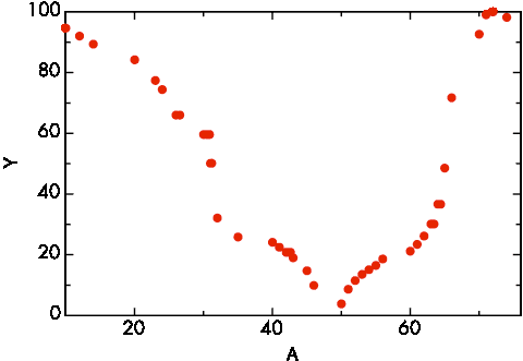
Boundary color Coloroid luminance

I presented the result at the 2005 AIC meeting in Granada, but I must admit that not many people stopped by at my poster, although it resulted in a collaboration with Silvia Zuffi on the CIELAB based implementation.

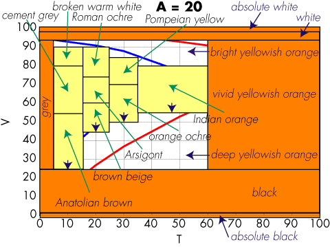
Coloroid hue A = 20

Since the color naming solution was going into a product, a patent application was filed, but very reluctantly and with much hesitation. Indeed, color naming and color categorization were very controversial.

Suddenly, in the last few days everything has changed. We now know experimentally that at the quantum level time does not really exists as we perceive it. This new twist on entanglement is one of the tenets for Federico Faggin's new proposal for the concept of awareness. In one arm of the entanglement we have Kirsty L. Spalding, who after a decade of very difficult work studying the hippocampus of people exposed to the fallout of nuclear bomb tests was able to prove experimentally the physiological existence of a locus for categorization. In the other arm we have patent 8,456,694, which thanks to this entanglement is made rock solid.

Thursday, June 6, 2013

Proofing a page for color discriminability problems based on color names

Now that there is a physiological basis for color categorization, we can ask ourselves what this is good for. We cannot eat it, but it might have considerable commercial value in United States Patent 8,456,694 issued two days ago on June 4, 2013. I am not a lawyer, but it appears that if you take two colors, determine their names, and then do anything with it, you might have to license this patent (but you can still keep your hippocampus ☺).

In large American corporations, when a new CEO start their new position, they often begin by putting their mark on the company's branding. They remodel their office and maybe even the HQ entrance, tweak the logo, design a new font, change the corporate palette, etc. These endeavors cost millions of dollars, but big corporations can afford it, especially when as a consequence other big corporations get motivated by the new branding to buy more widgets of the new CEO's company.

The only pity is that often this means that entire forests are wasted when the company has to reprint all its marketing collaterals. Around 2000, my employer at the time had a big warehouse in Campbell with product brochures, but fortunately our manager had been able to convince the company to deploy a document management system and print the marketing collaterals on demand, just when they were needed.

The hard problem came when a year later the CEO decided to change the color palette. Although all brochure chunks were stored digitally, when a brochure was produced by combining chunks with the old palette and chunks with the new palette, the resulting brochure looked inconsistent.

Colleagues Hui Chao and Xiaofan Lin quickly wrote code that could perform a wide range of graphical changes to the collaterals in the repository, and this writer wrote a few lines of code that would replace an old palette color with the perceptually nearest color in the new palette. Unfortunately, already the first test run demonstrated that this was a hack that did not work in practice. For example, many chicklets ended up having bright green text on orange background, something chromatically challenged people with color vision deficiencies could not read.

The solution that worked was to use a model to compute the names of the foreground and background colors, then change one of them to the nearest color in the new palette that was at least to color name categories away from the other color. This solution ended up being very good in practice and we wrote very efficient code that could process a large repository in a very short time.

I guess a sign of good engineering is to have the intuition for an unexpected solution before the scientists have worked out all the facts, …and we did not need nuclear bomb explosions.

Physiology of color categorization

Up to today there have been quite a few people writing off color naming and categorization as unserious hogwash. As of today, we know of a possible physiological basis, giving us a little more credibility.

In fact, now we know that neurogenesis it taking place in the hippocampus of adult humans. Fresh adult neurons have a specific function facilitating cognitive plasticity in the hippocampus—for example, in helping the brain distinguish between things that belong to the same category, or comparing new information to what it has already learned from experience. The ability to distinguish between vermilion and pink, yet still identify both as flamingo colors, is one example of this type of task in humans.

Kirsty L. Spalding et al. have found that a large subpopulation of hippocampal neurons constituting one-third of the neurons is subject to exchange. In adult humans, 700 new neurons are added in each hippocampus per day, corresponding to an annual turnover of 1.75% of the neurons within the renewing fraction, with a modest decline during aging. They conclude that neurons are generated throughout adulthood and that the rates are comparable in middle-aged humans and mice, suggesting that adult hippocampal neurogenesis may contribute to human brain function.

Reference: Dynamics of Hippocampal Neurogenesis in Adult Humans, Kirsty L. Spalding, Olaf Bergmann, Kanar Alkass, Samuel Bernard, Mehran Salehpour, Hagen B. Huttner, Emil Boström, Isabelle Westerlund, Céline Vial, Bruce A. Buchholz, Göran Possnert, Deborah C. Mash, Henrik Druid, Jonas Frisén: Dynamics of Hippocampal Neurogenesis in Adult Humans. Cell, Volume 153, Issue 6, 1219-1227, 6 June 2013.

Monday, April 15, 2013

Scaling body size fluctuation

Flocks of birds, schools of fish, and groups of any other living organisms might have a mathematical function in common. Studying aquatic microorganisms, Andrea Giometto, a researcher EPFL and Eawag, showed that for each species he studied, body sizes were distributed according to the same mathematical expression, where the only unknown is the average size of the species in an ecosystem.

Taken together, these observations of size distributions within a species and within all the species in a given ecological community have interesting implications. If in an ecosystem several species begin to converge around the same size, a balancing force will kick in to restore the power-law distribution, either by acting on the abundance or size of each species.

Finding power-laws and using them to describe complex systems already has a successful track record. “In physics, the observation that systems followed power-laws was instrumental in understanding phase transitions. We believe that power-laws can be similarly helpful to gain a deeper understanding of how systems of living matter work,” says Giometto, a physicist, who is seeking to apply methods from his field to understand biological ecosystems.

Link to the paper: Scaling body size fluctuations

Saturday, January 28, 2012

Harmonious colors: from alchemy to science

Last weekend three storms swept through the Bay Area and it was a good thing, because it cleaned up the very dirty air. The attendees of Electronic Imaging enjoyed a perfect weather.

Tuesday, June 21, 2011

Mandarin color terms elicited from free color naming task

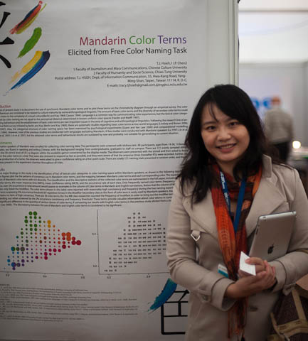
Tsuei-Ju Hsieh

At the AIC 2011 meeting, Tsuei-Ju Hsieh from the Chinese Culture University presented the poster Mandarin color terms elicited from free color naming task she prepared with I-Ping Chen of the Chiao-Tung University.

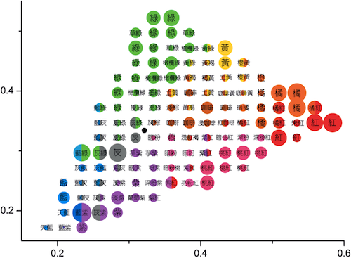
Up to now, there have been only few color naming experiments in Mandarin and their behavioral results are outdated. Tsuei-Ju Hsieh enrolled 36 native Mandarin speakers and asked them to freely name 121 evenly sampled stimuli sweeping the 50 cd/m2 level of the 1931 CIE chromaticity diagram. The response times were also recorded and following the production of a name, the observers were asked to give a confidence rating on a five-point scale.

The result is the identification of the foci of lexical color categories in a color naming space within Mandarin speakers, as shown in the figure below:

Mandarin color terms eliciting from free color naming task

There is significant difference in the quantity of various classes of color terms when comparing Tsuei-Ju Hsieh's results with the English color terms in a previous study elicited from a similar task.

A full journal paper is about to appear in Color Research and Applications.

Monday, June 20, 2011

Color naming experiment using 2D and 3D rendered samples

Midori Tanaka

At the AIC 2011 meeting, Midori Tanaka presented the paper Color naming experiment using 2D and 3D rendered samplesColor naming experiment using 2D and 3D rendered samples she wrote with Shoji Tominaga and Takahiko Horiuchi, all of Chiba University.

Usually in color naming experiments the observer is shown color swatches and asked to provide a color term for each swatch. In Tanaka's psychophysics experiments the observers were shown a single color swatch and then asked to assign to it one of the 15 basic Japanese color terms (the 11 universal plus turquoise, chartreuse, gold, and silver).

While usually the color swatch is completely uniform, i.e., the pixels all have the same identical RGB values, Tanaka chose a different rendering in each experiment. They were 2D (i.e., identical RGB values), 3D rendering with low contrast shading, 3D with high contrast shading, and 3D with shading and specular reflection:

Rendered green samples

An unexpected result is that observer determine the color term significantly faster with the 3D sample than with the 2D sample. Unfortunately this does not lead to a methodology for faster color naming. Indeed, the main result of the paper is that the number of bright color terms decreases in the case of 3D samples, so the data from 3D samples cannot be compared directly with data from 2D samples.

Not unexpected is that orange and brown change in opposite directions from 2D to 3D. This paper is clearly the beginning of research to much better understand the mechanisms of color naming in the human visual system.

Midori Tanaka will graduate from her master course next March and she still has to decide whether to pursue a Ph.D. or find employment in industry. If you can provide her with an active role in your organization, please let her know.

Monday, September 13, 2010

Color name boundaries

Papers on the World Color Survey often contain diagrams of the boundaries of the regions where the color patches are labeled with the same basic color term. The dream is to be able to somehow find the boundaries analytically, and for a much larger number of color categories than the 11 basic color terms.

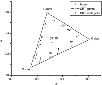
Tsuei-Ju Hsieh and I-Ping Chen of the Chiao-Tung University in Taiwan might be onto something by serendipity. Their original intent was to assess the effect of size on color appearance, as reported in their paper Colour Appearance Shifts in Two Different-Sized Viewing Conditions. To sample a color space, they chose Alvy Ray Smith's old HSV color space that was used in the early days of computer graphics. They varied H in 30º increments starting from 15º and kept S fixed at 70 and V at 75, obtaining the following samples plotted in the x-y chromaticity diagram:

stimuli plotted in x-y chromaticity diagram

The figure is a little hard to read, but they label the colors as follows:

1
reddish orange
2
yellow
3
greenish yellow
4
yellowish green
5
green
6
green-blue
7
blue
8
deep blue
9
purple-blue
10
purple
11
purple-red
12
purplish pink

Then their perform their color matching experiments and consider the errors in CIE DE2000 and use the CIECAM02 color appearance model to study the errors in the perceptual correlates.

Here we are interested in ∆H, the difference in CIECAM02 hue quadrature. Plotting ∆H for the 12 hues gives the following plot, where HB is for "color samples arranged along hue and brightness axes" and HSL is for "color samples arranged for hue and saturation"; the L postfix is for "large target."

modulation pattern of ∆H using large targets as baseline

The red curves are the sinusoidal fitting of the data. The authors write:

The fitting results exhibit a certain regularity of hue shifts in different conditions across the hue circle. In all histograms, the rise and fall of bars alternate in a rhythmic manner, discounting the slight phase shift that occurred when different baselines were used. The zero-crossing points correspond to hues that their neighbouring colours are converging toward.

and conclude:

In the large size conditions the hues around the hue circle are apparently drawn in groups to some anchoring colours, i.e., a typical representation colour within the hue group. We propose that this phenomenon might be due to some kind of categorical perception of colours, a hypothesis that calls for future studies to verify.

Wednesday, January 20, 2010

The Dark Side of Color

Last November I wrote shortly about the session called The Dark Side of Color at EI. The session is now starting. Here are our slides:

At the moment the server is having some hesitations after slide 11. If the problem still persists, click here.

Wednesday, December 9, 2009

Categorical color constancy for simulated surfaces

We all know about colorimetric color constancy, which for us in color imaging mostly takes the form of white point estimation and white balancing. The November 12, 2009 issue of the Journal of Vision has an interesting article by Maria Olkkonen et al. on a different kind of color constancy.

Color constancy in general refers to perceived color of objects not changing much when seen under different illuminations. In their paper Categorical color constancy for simulated surfaces, Maria Olkkonen, Thorsten Hansen, and Karl R. Gegenfurtner study the communication of color under different illuminations.

Color communication entails color naming and color naming entails categorical color. The authors start with the reflectance spectra of the Munsell color chips, calculate their tristimulus values under five different illuminations, and display them on a Sony Multiscan GDM-F520 monitor, whose gamut restricts them to limit the chips to 469 samples.

In a very diligently executed psychophysical experiment, four observers categorize each sample into one of the categories green, turquoise, blue, purple, red, orange, yellow, brown, or gray. The categories for orange and brown are pooled.

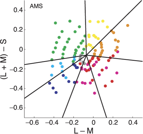
Chips with Munsell value 6 under the neutral illuminant are plotted in the isoluminant plane of DKL color space.

Since color matching is not involved, the authors are not using a colorimetric color space, but a perceptual color space, viz. the DKL color space, which is a linear transformation of the cone excitation space based on the Smith and Pokorny cone fundamentals. DKL is for Derrington, Krauskopf, and Lennie.

The observers perform the color naming experiment twice, with a 6 month hiatus, yielding a measure for the reliability of color naming. With this "calibration" the categorical color constancy is nearly perfect.

This result is important because the World Color Survey is performed under unrecorded random ambient conditions, a fact that has often been criticized. As we reported in our EI paper, Boynton wrote "the mechanisms of color constancy work so well that, within limits, the intensity and spectral distribution of the light used to illuminate the experimental materials make surprisingly little difference," but that was just an intuition. With their painstakingly rigorous experiment, Maria Olkkonen, Thorsten Hansen, and Karl R. Gegenfurtner deliver a definitive proof.

Some points to note:

  • In rigorous experiments, you can only have a small number of conforming observers (see Mavericks are best for crowd-sourcing)
  • When not doing color matching, a perceptual color space is better than a colorimetric one
  • They limit the categories to nine color terms
  • Yes Virginia, color naming via crowd-sourcing is legitimate

Tuesday, November 24, 2009

Color naming follow-up

I received some interesting feedback on the color naming tech. report. A reader implied that in traditional psychophysics experiments the informants are first screened for color vision deficiencies (CVD), and our on-line experiment fails to do that. This was felt to be a grave omission especially in light of the two recent JOSA A papers by Kimberly Jameson and Natalia Komarova: http://www.opticsinfobase.org/josaa/abstract.cfm?URI=josaa-26-6-1414 and http://www.opticsinfobase.org/josaa/abstract.cfm?URI=josaa-26-6-1424.

Sunday, November 22, 2009

Color naming: color scientists do it between Munsell Sheets of Color

Last year at the IS&T/SPIE Electronic Imaging symposium in San Jose the conference Color Imaging: Displaying, Hardcopy, Processing, and Applications started a session on controversial topics called "The Dark Side of Color." These are papers that transcend the incremental research methodology of solving a problem, proving the solution's contribution in an experiment, and reporting the result in a conference. This session consists of papers were authors go out on a limb, not afraid of intuition and speculation, and propose new paradigms.

A preprint of our contribution is now available at this link: http://www.hpl.hp.com/techreports/2009/HPL-2009-363.html.

Wednesday, November 18, 2009

A color never comes alone

This is a motto I was using 25 years ago. At that time I was working on VLSI design automation tools at Xerox PARC, more specifically on design rule checkers for full custom CMOS. The designers were doing so many layout errors that I could not understand how a top notch designer could do them. I had the suspicion that some of the designers could have a color vision deficiency — and 20 years later I discovered one of them is a dichromat — but that was not explaining the the type and volume of errors. I decided to investigate.

Monday, September 28, 2009

Thursday, May 28, 2009

Text color polarity

For the last month, when I had some dead time waiting until batch jobs run or the IDE rebuilds our GPU RIP system, I have been reworking the manuscript on understanding readability of colored text by crowd-sourcing on the Web I am trying to publish with Silvia Zuffi and Carla Brambilla, who did the actual work.

The work is about the threshold for readability efficiency, i.e., we are asking where the color contrast threshold is, at which reading performance in speed decreases or the number of errors increases.

In the introduction, we summarize the previous results. Here is what we learned about the effect of text polarity and background luminance:

The sign of the difference between background and foreground luminance defines polarity. Positive polarity, or negative contrast, is for example black-on-white, while an example of negative polarity, or reversed contrast, is white-on-black. Normal vision acuity is slightly better for reversed contrast, but the majority of studies on readability found that positive polarity is more suitable for text.

Previous studies performed on old displays produced different results about the effect of polarity on reading performance. This was due to the characteristics of the equipment; for the rapid refresh rate of modern displays, dark characters on light background seem to be better, but for the common refresh rate of old displays a dark background was preferable. Reading performance was also influenced by lighting conditions that could affect the perceptibility of flicker. Another review of early studies found an advantage of black-on-white for reading and characters recognition, while Legge did not find any difference in normal vision, but found that people with low vision read faster with reversed-contrast text. These were usually people with abnormal light scatter in the eyes. Pastoor found no evidence for an influence of luminance polarity on reading and search performance. According to Shiel polarity has a significant effect on visual performance in the sense that subjects perform better and have greater preference for dark targets on lighter backgrounds (positive polarity).

Sanders and McCormick suggested that a light background might be advantageous under situations with glare or reflection problems because it may reduce the visibility of reflected light. Scharff and Ahumada investigated whether the effect of text polarity is due to different sensitivities in the “on” and “off” retinal pathways, or the result of more experience with dark text on light background. They observed that light backgrounds yield better performance, with a predominant effect on the polarity of the text. As for the effect of luminance background, Lin found that in the case of positive polarity, better performance is obtained for a lighter background at the same luminance contrast but at different background luminance. The lessons learned from previous studies that are relevant to our experiment can be summarized as follows:

  1. Luminance contrast is the dominant factor to address readability
  2. The luminance polarity affects readability (negative polarity is more difficult)
  3. The luminance of the background affects readability (lighter backgrounds are preferable)
  4. An additional color contrast does not facilitate reading when a sufficient luminance contrast exists
  5. On achromatic background, wavelengths at the extremes of the spectrum are more difficult for text.

As seems to be the annual May ritual, our blogging system was updated. As you are noticing, the design now matches the overall hp.com look with its small white font. I spent a day fixing up old posts that became unreadable due to transparency for a light background, or because the font color was that of the color being discussed, such as International Klein Blue or Blue Iris.

I am very busy, as we are still fighting to get the performance up to the 1600 ppm target, so I took the liberty to take shortcuts, like just dropping transparency. In some places the text might be fuzzy because the anti-aliasing was done on a white background, and I do not have time to redo it on a black background. My apologies, but blog posts are ephemeral.

À propos 1600 ppm, although our blog has been moved from research to technology at home in the HP blog directory, Nathan and I are still totally focused on commercial printing (like the 7000 below, which is our current test device), so do not expect to see our technology on your kitchen table. And our target audience are still our fellow color scientists.

HP Indigo 7000 Digital Press, glow

Monday, December 22, 2008

Transitioning colors: glaucus

In Switzerland, when I was a pupil in elementary school, at the beginning of the school year we used to receive a small box of colored pencils in the main colors. The first years of school were spent learning the names and semiotics of those colors, as well as depicting our environment.

It was only later in elementary school that I learned a new color name, namely glauco. It was in a poem from our textbook, that we had to memorize.

The Zanichelli vocabulary translates glauco into English as blue-green, sea-green, glaucous. I guess the readers of this blog will be familiar with this color name from glaucoma, a condition of increased pressure within the eyeball, causing gradual loss of sight.

Today in Italian, glauco is associated most commonly with eye colors, because of the gray-green haze in the pupil.

Why am I counting this color among the transitioning colors? Over time, this color label is one that has changed quite dramatically in its association with a perceived color.

It starts with eye colors. My Sanesi classical Greek vocabulary from high school lists the following classical terms, in alphabetic order (apologies for the missing accents):

  • γλαυκιαω, to have an inflamed look
  • γλαυκ-ομματος, with inflamed eye
  • γλαυκος, scintillating, brilliant, shining || cerulean, azure
  • Γλαυκος, name of many characters
  • γλαυκοςτης, luster, shine of the eyes || cerulean color
  • γλαυκο-χρως, of azure color, of olive and pale color
  • γλαυκ-ωπις, of the shining, brilliant, cerulean eyes

In summary the classical use was for the shining color of eyes, mostly light blue, for example the color of Athene's eyes (glaukopsis). However, in the Homeric epics it has been used also for dark blue. Strangely, γλαυκο-χρως has been used also for olive and pale colors.

This strange use might at first explain why then in the later Middle Ages the meaning of the derived Latin term glaucus changed dramatically from blue-gray to yellow. Instead, I would like to speculate here that it might be connected to the loss of diphthongs as Latin became vulgarized.

In my Campagnini-Carboni classic Latin vocabulary from middle school I find these two definitions:

  • cærúleus, cerulean, azure, turquoise, dark; cærula cæli, or simply cærula, the azure, the azure sky
  • cerula, piece of wax

As you see, as the diphthongs were dropped with the vulgarization of Latin, cerulean blue might have become the color of wax. Indeed, Roger Bacon (~1214-1292) used glaucitas to refer to yellowness and ceruleus (wax color) as a yellow color falling between glaucus and citrinus (yellow and orange, respectively).

In the 14th century, Theodoric of Freiburg used glaucus with the same meaning. But then, in the mid-16th century, Scaliger (1557) put it back in the blue category, where it still was in the beginning of the 17th century with Francois d'Aguilon. (This data from Kuehni and Schwarz, Color Ordered, p. 8.)

If the label purple changed as a consequence of the collapse of a major civilization, the label glaucus might have been done in by an overworked or sloppy monk. In this case, γλαυκο-χρως used for olive and pale colors can be a medieval mistake rather than a genuine classical Greek color label.

Make sure, you dot your is and cross your ts, and watch out for those pesky diphthongs!

Wednesday, December 10, 2008

Transitioning colors: purple

In my post on the ephemerality of color names I wrote that color names can go out of fashion and then the label of a given color is lost. It also happens that a label is persistent, but the color associated with that name changes. Purple is such an example.

Nathan's color thesaurus responds to "porpora" with the color of hexadecimal value b23372, which looks like


However, if we look at this old mosaic in San Vitale in Ravenna, we see a different color for the same label "porpora":

What happened?

From Phoenician times the purple colorant was extracted from molluscs living in the coast of present day Lebanon and Israel. It was a rare colorant, hence used only for textiles destined to the rich and powerful. In fact, in 1464 Pope Paul II decreed that cardinals have to wear purple.

By coincidence this was the time the Byzantine empire crumbled and in the Ottoman empire the Purple industry in the Eastern Mediterranean disappeared. Hence, the tailors had to switch to a red colorant, but the papal decree cast the label "purple" into concrete.

If today you visit a religious clothing store, when you ask for Purple you will get a red cape, as shown below. In this case, Italian crowdsourcing returns Purple more to the original color, but not quite.

This is a big problem for restorers. As you might have seen in the Sixtine Chapel or Leonardo's Last Supper, today's restorers are very aggressive in restoring the original colors, instead of just freshening up the old paint in its current state.

One way to figure out the original colors is to study the master's notebooks and find textual descriptions of the colors. Unfortunately, for a given label, the colors transition, especially today when all paints care constantly reformulated to make them less toxic.

Anyway, these color transitions is exactly why Prof. Giovanni Brini in Torino has compiled his comprehensive color name dictionary. It is intended for restorers who have to pin-point the color for a given name at a given date.

Tuesday, December 9, 2008

The ephemerality of names

From the paper mentioned in my post of 2 December we know that color categorization is probably mediated by language, which is what is meant by the statement "a form of categorical perception that is lexically influenced." The next problem is how to deal with the ephemerality of language.

Languages are in constant evolution (well, maybe with the exception on French, where bytes are still called octets). For example, in Japanese the katakana script that was originally used for bureaucratic and male writing, has been repurposed to write words of foreign origin — and how many foreign words there are! Look at something as common as milk, which used to be 牛乳 (ぎゅうにゅう, gyuunyuu) but now is simply ミルク (miruku).

Closer to home, consider late ETH Prof. Heinrich Zollinger's work ca. 1975, where he collected color names from TKD chemistry students:

The ordinate is the frequency of occurrence for the name of the Munsell hue in the abscissa. Note how オレンジ (orenji) is more frequent than 橙 (ダイダイ, daidai) and ピンク (pinku) is more frequent than 桃色 (ももいろ, momoiro).

Maybe the change of the Japanese language is a bit extreme, but English is also changing fast, especially for words related to fashion, like color names. Look for example at the names in Coloroid hue 20 I showed last week:

Did you know the color name Arsigont? Did you know the difference between Pompeian yellow and Indian orange?

This is not a problem of the Coloroid system. Consult any color name compilation older than a few years, and you will find names that look unfamiliar. For example, a decade ago teal was all the rage in Palo Alto and all home decoration stores were selling many items in this color. Today, people hardly remember its appearance.

So, how do we deal with the ephemerality of language? Obviously a printed leather-bound collector's edition of a color dictionary is not the ticket. The ephemerality of a blog tool post is more like it. But color names are very hard to collect, we cannot start from scratch every few months.

This is why in the Italian version of his color thesaurus, Nathan included a mechanism to rate the pairing of the color name with the displayed color. As names fade, they get rated worse and by using the rating in the creation of the thesaurus, a more contemporary color name will emerge to label that color.

Tuesday, December 2, 2008

Categorical color perception moves from right to left hemisphere across life span

It feels a very long time ago when in 2003 I was assigned to solve a problem in variable data printing — when colored text is printed on a colored background and the colors are variable, the text may become unreadable. Since each copy is different in a variable data job, manual proofing is not feasible and an algorithm is required.

Conventional colorimetry is of no use, because it deals with color matching — small color differences — not the large color differences to be considered in readability issues. Required to quickly deliver some code, I came up with a heuristic based on ∆E units. Silvia Zuffi and Carla Brambilla of the CNR in Milano-Bicocca have revisited that work and performed genuine research replacing my heuristics.

Once the code was delivered, I implemented a different algorithm more suited to the task. As the research by Zuffi and Brambilla shows, the readability problem can be formulated as a reading speed problem. From Stevan Harnad's work we know that color discrimination is faster for colors in different perceptual color categories than for colors in the same perceptual categories, when their perceptual distance (∆E) is fixed.

The most obvious way to introduce structure in a color space, i.e., to introduce perceptual color categories, is by considering color names. The new problem now is to find a 3-dimensional tiling of a color space. I had the data for Nemcsics's names in the Coloroid system, so I implemented that.

The implementation of the readability solution was then straightforward. I used the lexical distance between the two colors and required at least 2, i.e., there had to be at least a color name between the two color's names.

The solution performed only so-so. In fact, there were a number of issues.

  1. The transformation from CIE tristimulus is only published in part and required a lot of experimentation to pin down
  2. This transformation is numerically instable, so an industrial-strength implementation that never fails is not trivial and requires skilled programing
  3. The tiling does not cover the whole gamut, so it needs to be "stretched"
  4. There is no reference in the literature on the origin of the categories and names — did Nemcsics cook them up heuristically?

But the biggest question is: are the color categories mediated by language? Is it legimimate to use color names for a lexical metric? Each time I put up my old color cognition diagram

co-blogger Nathan Moroney always interjects that color categorization may occur much earlier. The paper Categorical perception of color is lateralized to the right hemisphere in infants, but to the left hemisphere in adults in a recent issue of the Proceedings of the National Academy of Sciences comes very close to answer this question.

Franklin et al. take advantage of the difference between the left and the right hemisphere of our brains (let us assume for a moment we are all right-handed and have a normal corpus callosum) that the left hemisphere is geared to encoding categorical or relational information, while the right hemisphere is geared towards encoding metric information.

The linguistic hypothesis in color categorization is that colors are tagged by their category name and the tags are compared, i.e., that language mediates categorical color perception. The question is whether the color categorization is prelinguistic, i.e., whether there is a universally available color categorization and language just makes some minor adjustments, or color categorization is built from scratch after language is available.

Franklin et al. used a group of 21 years old right-handed adults and a group of 21 week old infants and compared their categorical color perception skills, obtaining these results:

(remember the neural axons get crossed in the optical chiasm). Categorical color perception is found in infants; however, the absence of a category effect in the left hemisphere for infants, but the presence of a greater left hemisphere than right hemisphere category effect for adults, suggests that language-driven categorical perception in adults may not build on prelinguistic categorical perception, but that language instead imposes its categories on a left hemisphere that is not categorically prepartitioned.

Their findings therefore suggests that there is a form of categorical perception that is nonlinguistic and right hemisphere based (found in infancy) and a form of categorical perception that is lexically influenced and biased to the left hemisphere (found in adulthood). Categorical color perception is found for both infants and adults, but the contribution of the left hemisphere and right hemisphere to categorical color perception appears to change across our life span.

Our digital presses are for adults, so my approach is valid.