Thursday, February 9, 2017

mirror mirror on the wall

Last November, I mentioned an app that makes you look like you are wearing a makeup when you do a teleconference. Now Panasonic lets you take it a step further. A new mirror analyzes the skin on your face and prints out a makeup that you can apply directly to your face.

The aim of the Snow Beauty Mirror is “to let people become what they want to be,” said Panasonic’s Sachiko Kawaguchi, who is in charge of the product’s development. “Since 2012 or 2013, many female high school students have taken advantage of blogs and other platforms to spread their own messages,” Kawaguchi said. “Now the trend is that, in this digital era, they change their faces (on a photo) as they like to make them appear as they want to be.”

When one sits in front of the computerized mirror, a camera and sensors start scanning the face to check the skin. It then shines a light to analyze reflection and absorption rates, find flaws like dark spots, wrinkles, and large pores, and offer tips on how to improve appearances.

But this is when the real “magic” begins. Tap print on the results screen and a special printer for the mirror churns out an ultrathin, 100-nanometer makeup-coated patch that is tailor-made for the person examined. The patch is made of a safe material often used for surgery so it can be directly applied to the face. Once the patch settles, it is barely noticeable and resists falling off unless sprayed with water.

The technologies behind the patch involve Panasonic’s know-how in organic light-emitting diodes (OLED), Kawaguchi said. By using the company’s technology to spray OLED material precisely onto display substrates, the printer connected to the computerized mirror prints a makeup ink that is made of material similar to that used in foundation, she added.

Read the full article by Shusuke Murai in the Japan Times News.

Panasonic Corp. engineer Masayo Fuchigami displays an ultrathin makeup patch during a demonstration of the Snow Beauty Mirror

Panasonic Corp. engineer Masayo Fuchigami displays an ultrathin makeup patch during a demonstration of the Snow Beauty Mirror on Dec. 1 in Tokyo. | Shusuke Murai

Wednesday, February 8, 2017

Konica Minolta, Pioneer set to merge OLED lighting ops

Konica Minolta and Pioneer are concluding talks to merge their OLED lighting businesses under a 50–50 joint venture as early as spring. The Japanese companies will spin off their organic light-emitting diode development and sales operations into a new venture that will be an equity-method affiliate for both.

The two companies aim primarily to gain an edge in the automotive OLED market, which is seen expanding rapidly. Konica Minolta's strength in bendable lighting materials made with plastic-film substrates will be combined with Pioneer's own OLED expertise and broad business network in the automotive industry. Taillights and interior lighting are likely automotive applications.

Read the full story in Nikkei Asian Review.

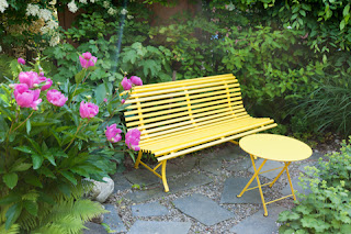
yellow may tire autistic children

A research team including Nobuo Masataka, a professor at Kyoto University’s Primate Research Institute, has found that boys with autism spectrum disorder (ASD) tend not to like yellow but show a preference for green. “Yellow may tire autistic children. I want people to take this into account when they use the color on signboards and elsewhere,” Masataka said.

The team, also including France’s University of Rennes 1, has confirmed the color preference of boys with the disorder, according to an article recently published in the journal Frontiers in Psychology. In the study, the color preference of 29 autistic boys aged 4 to 17 was compared with that of 38 age-matched typically developing (TD) boys. All participants were recruited in France, which has clear diagnostic criteria for autism spectrum disorder.

Shown cards of six colors—red, blue, yellow, green, brown and pink—the children were asked to answer which color they like. Yellow was liked by TD boys without the disorder but far less preferred by ASD boys. On the other hand, green and brown were liked more by boys in the ASD group than by those in the TD group, while red and blue were favored to similar degrees by both groups of boys. Pink was unpopular in both groups.

Given the relatively small sample size in each of the three age groups, the failure to find any difference in preference scores between TD children and children with ASD with regard to red, blue and pink might be attributable to a ceiling/floor effect.

The article said yellow has the highest luminance value among the six colors. “The observed aversion to this color might reflect hypersensitivity” of children with ASD, the article said. There is also a general consensus that yellow is the most fatiguing color. When yellow is perceived, both L and M must be involved. The perception of yellow should thus be the most heavily sensory-loaded of the perception of any type of color. Its perception is bearable for TD children but could be over-loaded for children with ASD whose sensitivity to sensory stimulation is enhanced.

Marine Grandgeorge and Nobuo Masataka: "Atypical Color Preference in Children with Autism Spectrum Disorder," Front. Psychol., 23 December 2016, https://doi.org/10.3389/fpsyg.2016.01976


the sun can make the bamboo straw wall of a tea house repulsive

that すずみだい might not be that restful after all

is a golden obi the best choice?