Showing posts with label color matching. Show all posts

Monday, February 12, 2018

Claudio Oleari

On 23 January 2018, Claudio Oleari passed away at the age of 73 in Reggio Emilia. He was the last and ultimate authority on the OSA-UCS color space and perceptually uniform color.

He was an eminent physics scholar and an associate professor at the University of Parma, at the Department of Physics and Earth Sciences. He devoted his life to the activities of teaching with the same passion and interest that he dedicated to research in the context of color, applying physics to perception and establishing its role in colorimetry. In 1995 he started the Gruppo in Colorimetria e Reflectoscopia, which later became the Associazione Italiana Colore.

His availability for colleagues and students and his ability to listen and advise are proverbial: his kindness will always be remembered by everyone who has known him. These qualities are exemplified by the message on his profile at the University of Parma “You are welcome any day and at any time, even without an appointment. It is useful to verify by telephone my presence in the office. To book a meeting and ask questions, sent an email to claudio.oleari@fis.unipr.it.”

He initiated, within the Italiana Association, many valuable informational activities and forged many connections which persist as a rich bibliography, always having in mind the need to invest in research and training both in Italy and abroad.” He initiated, within the Italiana Association, many valuable informational activities and forged many connections which remain as a rich bibliography, always having in mind the need to invest in research and training both in Italy and abroad.

His death leaves a void difficult to fill, and the world of color loses an intellectual and an attentive and informed scholar.

Claudio Oleari

Thursday, January 28, 2016

Impact of New Developments of Colour Science on Imaging Technology

Yesterday afternoon, at the Stanford Center for Image Systems Engineering, Dr. Joyce Farrell hosted Prof. M. Ronnier Luo for an update on the latest activities at the International Commission on Illumination (CIE), of which he is the Vice-President. He focussed on the aspects relevant to imaging.

Division 7, terminology, has been disbanded because it has finished its work. The e-ILV can be accessed at this link.

There is a new CIE 2006 physiologically based observer model with XYZ functions transformed from the CIE (2006) LMS functions. These functions are linear transformations of the cone fundamentals of Stockman and Sharpe, the 10º LMS fundamental colour matching functions. In the plot below, you can see the 2º XYZ CMFs transformed from the CIE (2006) LMS cone fundamentals. Note the different shapes around 450 nm compared to the 1931 and 1964 observer models.

XYZ CMFs transformed from the CIE (2006) LMS cone fundamentals

The new model is a pipeline in whose stages the age-related parameters can be set. The 10º LMS functions are corrected for the absorption of the ocular media and the macular pigment, and take into account the optical densities of the cone visual pigments, all for a 10° viewing field, yielding the low-density absorbance functions of these pigments. Using these low-density absorbance functions one can derive, taking into account the absorption of the ocular media and the macula, and taking into account the densities of the visual pigments for a 2° viewing field, the 2° cone fundamentals.

There is also a new luminous efficiency function V(λ), which has changed mostly in the blue region.

There are new scales for whiteness and blackness, which corresponds to those in the NCS system. They are based on the comprehensive CAM16 appearance model. Considering a hue leaf of CIELAB in cylindrical coordinates, the south–east ↘ diagonal scale is whiteness–depth and the north–east ↗ is blackness–vividness. These new scales are particularly useful in imaging for adjusting complexion. The skin colors of Asian and Caucasian people vary along the whiteness–depth scale and those of African people vary along the blackness–vividness scale.

Next, Ronnier explained the new color rendering index (CRI) that works also for LED light sources. He also presented a very compelling demonstration of the apparatus used to develop the standard. The new color rendering index is called CRI 2010 and IESNA-TM40. It is based on the measurement of 99 test samples.

I was a little disappointed that the new CRI is still based on colorimetry and not on spectral data. Using colorimetry is an analytical process and having a much larger number of samples helps. However, it does not allow a full characterization of a light source, as we learned many years ago with the tri-band fluorescent lamps. They use less energy, but at the cost of quality.

In this case, I am not too much of a fan of the energy reduction because in practice when you reduce the cost of running a light, people will just deploy more lights and in the end you do not save energy. This is so in consumer applications and does not hold for industrial applications.

Our environment is not made out of BICRA tiles and usually, we are not in aperture mode. We perceive complex images and the light from a set of spot lamps modulates our ambient. While in the case of OLED or fluorescent lamps we might have diffuse light, with LEDs and conventional halogen spot lamps we have more of a set of directed sources with a rapid fall-off.

The rooms in my house are painted in a fusion Italian and Japanese style. The colors are vivid (Italian style), but the paints have a very peaked spectrum so the color is modulated by the illumination (Japanese style). We use older high-quality LED sources with two different green phosphors (the additional one is based on Europium), which we dim. The visual effect is similar to candlelight, except for the correlated color temperature (CCT).

From my experience, I think that a CRI model should include the difference between the spectral distributions of the light source and the reference illuminant. I would also like to have two different reference distributions, A for mood light and D for work light. For thousands of years, we have evolved performing work in daylight and relaxing in blackbody radiator light from fires, oil lamps, and candles. When we want to be in a cozy mood, we pull out the candles, which is also common in upscale restaurants. Candles are more expensive and dangerous than LEDs in houses built from flammable materials.

Should the new CRI also have a provision for the blue hour? Ronnier concluded his presentation stating that the new research topic is tunable white.

Monday, March 23, 2015

Deciding what to wear

For those seeking an AI perspective on fashion, Colorful Board Inc.’s Sensy app for smart-phones seeks to determine the optimum outfit based on the user’s tastes. “It’s like a fashion coordinator who chooses clothes for me as I’m too busy to spare time for selection,” said Sachi Okuyama, a 36-year-old company employee in Tokyo.

The Sensy app, launched in November, uses an AI system the Tokyo-based information technology venture developed jointly with researchers at Keio and Chiba universities. Users of the service download the free app and sort out whether they like the images of wear sent to their smart-phones once a day. The AI system analyzes replies from the user in accordance with color, shape, price and 47 other criteria to find out that person’s taste, such as “favoring pin-striped red wear of famous brands at sharp discounts.”

Colorful Board has tied up with more than 2,000 fashion companies and online commercial sites both at home and abroad for women in their 20s and 30s. Out of a huge number of dresses introduced on the Internet, the AI system recommends clothes to each user based on accumulated data. When users purchase recommended clothes, sellers pay commissions to Colorful Board.

Okuyama recently bought a gray one-piece suit using Sensy “The more the Sensy app is used, the better matches it can recommend because it learns every day,” said Yuki Watanabe, president of Colorful Board.

It would be interesting if Sachi Okuyama could try out Kokko's ColorSisters we described a month ago. This would inform us whether machine learning can beat an expert system based on the knowledge of experts. I can imagine that the answer will be culture-dependent: Japanese or Germans prefer to blend in and for them an estimate based on big data would be preferable. Americans like to stand out and Italian like to express their individuality, so I can imagine they would prefer the advice of fashion and cosmetics experts.

But then, Sachi Okuyama could be a rebel, so we need plenty of data.

Source: The Japan Times, Artificial intelligence apps guiding users’ clothing choices, culinary tastes.

Friday, February 27, 2015

Illusion of a dress

Earlier this week I wrote about color not being a physical phenomenon, but rather an illusion taking place in our mind. I also wrote about Hunt's problem of completing a wardrobe. Hunt's example is a motivation for colorimetry. When we can keep constant the illuminants and observers, we can use CIE colorimetry and a color management system to closely match color scenes involving ordinary dyes and pigments.

When we can control but not keep constant the illuminants, then we can still do a pretty good job at matching the appearance of colors in a reproduction by using a color appearance model. "Control the illuminant" means we have to know what it is, as Randall Munroe suggests in his xkcd cartoon on the dress.

When we do not know the illuminant, we can estimate it if there is an object in the scene whose color we know. In the dress picture sparking the Internet on 26 February, there is no reference object, no complexion is visible. In this sense, the xkcd cartoon is not a faithful abstraction of the problem at hand because it shows a lot of skin. We would need a second picture were the lady is not wearing the dress. Actually, a nude by itself is not sufficient and the lady should also hold a calibration target, at least the white side of a gray card.

Back in the late 80s and the 90s, Robert Hunt used to teach a course on color science at the RIT. After the course, Roy Berns used to take out Dr. Hunt for a dinner. One year, he took him to a fancy Italo-American restaurant. On the East coast, the fancier a restaurant was, the darker it was, because the cultural understanding was that for a romantic date people would be willing to pay a premium price, but would want a low light level.

As they entered the restaurant, they noticed that the light-bulbs were red and the whole restaurant was imbued in pink. When they sat down at the table, they felt extremely uncomfortable, because they were not able to decide whether the tablecloth was white or pink. After a long discussion and the desperate search for a reference white, Roy Berns finally remembered he had his business card in the wallet and he knew it was white. This allowed them to enjoy their dinner.

In their honor, we should introduce a so-called Hunt-Berns effect: Inability of the cognitive factor to decide on a set. Example: When in an environment with colored illumination the brightest object is not known a priori to be white, the cognitive part of chromatic adaptation fails because it is not possible to establish whether that object is white or has a hue similar to that of the illuminant. This is especially so, if the observer is knowledgeable about the Helson-Judd effect.

This would take care of the illuminant problem by having a second photograph of the lady, this time in the nude and with a white reference target. However, this would not necessarily explain the effect seen in the photograph.

It is pretty obvious from the photograph, that the dress is not Lambertian, therefore the geometric appearance has also to be measured. We would need a spectrogoniometer rather than a simple colorimetric device like a camera, whose white balancing algorithm can get completely duped when confronted with an unexpected target.

As everybody who ever tried to touch up a dent in a car with metallic paint knows, not all surfaces have a color made with a simple dye or pigment based colorant. If for example the color is based on pearlescence or iridescence, you cannot reproduce it on a photograph displayed on a screen. At the very least you need a movie. In this end, you have to examine the original.

Color reproduction is about reproducing an illusion. It will always be hard.

Dorsal view of male batterfly which was captured in Peru and is stored in Muséum de Toulouse. Author: Didier Descouens

Monday, February 23, 2015

Completing a wardrobe with Kokko

Robert Hunt likes to start his color science lessons with the problem of completing a wardrobe. He starts with some observations:

  • If you want to buy a skirt or a pair of slacks to match a jacket, you cannot match the color by memory — you have to take the jacket with you
  • Just matching in the store light is insufficient, you have to match also under the incandescent light in the dressing room and outdoors
  • You always get the opinion of your companion or the store clerk

This leads to the three fundamental components of measuring color:

  • Light sources
  • Samples illuminated by them
  • Observers

When we complete our wardrobe, we are not interested at measuring colors, but into matching colors. This may sound easier than measuring color by making measurements and comparing the above three parameters, but it is not. In fact, color is not a physical phenomenon, so we cannot measure it. Color is an illusion that takes place in our mind. What we really have to do is to predict an illusion based on physical measurements, which is very difficult, because we cannot measure our mind.

With this, color science has more to do with art than with physics: color scientists have to develop a deep intuition of color perception, otherwise they are not able to interpret the values delivered by their instruments. This is even more so, when instead of just matching colors we need to assess things like the readability of colored text on colored background, or when we need to create a palette of colors that go well together.

Even such a mundane task as determining the best foundation for one's complexion requires a lot of science and intuition. Cosmetologists can do it almost completely with intuition, but it takes them a long time to develop this intuition. What scientists and engineers can do, is to try to put the cosmetologist or color consultant in a box, viz. into a mobile device.

This is what Nina Bhatti has set out to do with her new company Kokko. Kokko's scientifically developed color matching technology enables brands and retailers to revolutionize ways to shop online—specifically when color selection matters the most.

Kokko's solution for demystifying online purchasing of color cosmetics is called ColorSisters. By using the camera on any smart-phone with the specially printed color chart, Kokko's proprietary software can precisely measure skin tone and offer personalized makeup recommendations—proven to be as accurate as professional makeup artists' recommendations.

Thursday, February 23, 2012

Local optimization

I received a question about the paper Assessing color reproduction tolerances in commercial print workflow mentioned in a recent post. The interlocutor asks why I bother creating custom color scales, instead of just using the Farnsworth's 100 Munsell hues: the implementation would be much simpler.

I believe this question is a nice example of the difference between a color engineer and a color scientist. Let me explain:

Saturday, January 28, 2012

Assessing color reproduction tolerances in commercial print workflow

The presentation of this paper was somewhat hasty, because I forgot to finish the slides. I only realized this while I was setting up my laptop and quickly thumbed through the slides. I only had the short time during the break to quickly assemble the presentation by copying chunks from the paper, while also trying to help Dr. Tastl who was having a problem getting PowerPoint to recognize the projector. I guess this is what happens when we are burnt out…

Tuesday, March 1, 2011

The appearance of a Flamingo

flamingo group

Once upon a time, a day came when the management at Xerox PARC decided to hold elaborate Open Lab events to share our knowledge and achievements in pursuit of synergies. In the color project we had just finished building a research lab, and our director instructed us to better have a good demo in the Gray Lab, justifying is construction.

In fact, we had achieved quite a bit of notoriety, because we had it painted in gray, which was taken as a joke by our colleagues, who expected us building a colorful room. We even had it painted twice, because the first time, when we instructed the painting company to add pure black to white base and nothing else because we needed a spectrally flat color, they thought they were smarter than us and mixed a multitude of pigments to match the gray Munsell Sheet of Color we gave them as the standard.

When they called us upon finishing their job, their boss proudly held the Munsell Sheet against the wall, but we could see immediately that something was fishy, because the wall had a different color where it was hit by the light from the hallway (the lamps in the room were D50 simulators). We simply showed them their spectrum and they had to repaint the lab at their expense.

Other than the instruments and display monitors, the lab was completely bare, as to avoid contaminating the retina during psychophysics experiments. On the side we had also a small room completely painted in black with a spectroradiometer for the measurements. All lamps were D50, so we did not have to wait to adapt our visual system, and could reset it anytime by staring at a wall.

The announcement of the Open Lab event came with a big surprise: all the other team members would be on sabbatical or vacation that week, so I would have to set up the demo all by myself, including dealing with the crowd.

After some reflection, I concluded this was an impossible task, because all the other demos were very high concept. I decided to instead shoot a video in the lab and then just put in the door to the lab a cart with a big TV and a U-matic tape player. The question now was what experiment could I tape to demonstrate the need for a gray lab?

Chilean flamingoOne Sunday I surveyed the offices of my colleagues working in graphics and imaging, in search of an error possibly due to inaccurate color evaluation. Of course each office had pictures of Utah teapots showing off the occupant's algorithms, but I noticed that images of flamingos were quite common. I was amazed all these flamingos were of a vivid pink, unlike the vermilion I remembered from a zoo visit when I was a child.

So I thought I drive to Marine World/Africa U.S.A., which had just moved from Redwood City (now the site of Oracle) to Vallejo, get a flamingo feather, measure it, and achieve a perfectly matching reproduction on our monitors and printers, showing off the importance of chromatic adaptation and cross-device color reproduction.

My plan was to keep a professional Betacam in my office and just opportunistically record material, so I could make up a story at the end depending on what I was able to gather. When I showed the first drafts to my colleagues, they educated me that when Americans think of flamingos, they do not think of the bird at all, but instead they think of pink plastic lawn flamingos.

Well, so much for a naive boy from the Alps. There was not enough time for a different demo, so I stared at my hours of video sequences and made up this movie:

[If there is a problem with the above stream or you have a slow connection, you can download the movie from this link. If you stream from this link, there will be a buffering delay due to the slow connection.]

Unfortunately, the original U-matic cassette is no longer available, and my VHS copy is all gummed up. Unlike U-matic, VHS does not have SMPTE time code and the signal bandwidth is very narrow, so it took me 2 months of conditioning the tape and attempting replays, until I got most of the frames.

I would have loved to have Peter Schnorf's digital video editor having lost video frame protection, because I would just have run the digitization process a few times and the system would assemble the complete video.

I used a semiprofessional VHS player and first split the signal in separate luma and chroma components. I then adjusted each signal to fill its gamut and after analog-to-digital conversion denoised each signal. Since the signal is pretty bad, I did not try to do any enhancements, as they would amplify the defects: I simply transformed the digital video stream into MPEG-4 using Quicktime.

In the VHS device gamut of the YIQ color space, very little of the bandwidth is allocated to the magenta region, therefore the flamingos look terrible in the movie, washed out and like followed by a ghost.

An now a lame flamingo joke: Why do flamingos stand on one leg?

Digital Palette

If they would lift also the other leg, they would fall over.

Thursday, February 10, 2011

The Business of Color and Bose-Einstein Condensation

Surprised to hear this piece about Pantone on NPR this morning.
"One of the most influential committees is a group of 10 people whose names are a secret. They meet in Europe twice a year (May and November) at the invitation of Pantone, a company based in Carlstadt, N.J., whose only business is color. In fact, Pantone has a hand in the color of roughly half of all garments sold in the U.S."

"Why would any designer want to run with the pack? John Crocco, the creative director for Perry Ellis, calls color forecasts 'a self-fulfilling prophecy.' He says if designers choose to follow such forecasts, then they'll be 'part of what ultimately becomes the trend.' But if designers disregard the trend, they risk irrelevance — just about the worst thing imaginable for any label."
All of which begs the obvious question: Is this is an example of Bose-Einstein condensation (winner takes all) in a scale-free marketplace?

Tuesday, November 2, 2010

Measuring NCS Colors and Matching Marmalade

The NCS has announced the NCS Colour Scan 2.0 which is described as follows:

"Lightweight, easy to use and infinitely adaptable, NCS Colour Scan 2.0 gives the NCS Notation of a selected colour from any surface, also immediately visible in the screen. You can now identify colours on walls, render, carpets, furniture, flooring, and clothing - virtually any inspiration object."

As for the NCS Notation, the following video provides an overview, including custom mixing a marmalade color at 9 minutes in:

Wednesday, June 9, 2010

la misura del colore

Ora che abbiamo imposto una struttura all'insime dei colori, ordinandoli e introducendo relazioni tipo l'opponenza, la complementarità, l'armonia, ecc. dobbiamo trovare un modo per misurare il colore. Questo ci permette di communicare specifiche di colore senza dover spedire campioni, e ci permette di verificare che certe tolleranze siano mantenute.

Dato che abbiamo una struttura, dobbiamo solo introdurre un sistema di coordinate. Per uno spazio dove i campioni dei colori sono su di un reticolato, come è il caso per il sistema OSA, queste sono le coordinate cartesiane. Se l'atlante invece è fatto a spicchi, si usano le coordinate cilindriche. Per esempio, nel sistema Coloroid

la prima coordinata (angolo A) è la pagina (in questo caso 20), la seconda è l'ascissa T, e la terza l'ordinata V. Quindi, se le voglio communicare un colore, posso usare l'atlante per trovare il campione più vicino (cosa facile e veloce, dato che è ordinato) e le mando tre numeri, per esempio (A, T, V) = (20, 25, 60). Lei prende la sua copia dell'atlante e può vedere il campione di questo colore.

In modo simile, se sono un conciatore di pelle e devo assicuare che le parti di una borsetta abbiano lo stesso colore, se il colore di referenza è (A, T, V) = (20, 25, 60), devo solo assicurare che ogni parte sia più simile al campione di questo colore che non agli altri 26 campioni che gli sono adiacenti nell'atlante (8 sulla stessa pagina e 9 sulla pagina precedente e quella seguente).

Questo metodo, pur essendo economico, non è utile quando si devono caratterizare tanti colori o quando le tolleranze sono molto strette. Per esempio, nell'industria tessile il colore di una matassa deve essere completamente uniforme, quindi la tintoria deve misurare in continuazione la stoffa uscente dalla tintura. Voremmo dunque poter fare una misura fisica invece di fare una comparazione visuale.

Purtroppo questo è più difficile di quel che sembra, perché il colore non è un fenomeno fisico ma una illusione ottica che avviene nel sistema visivo. Il meglio che possiamo fare è di trovare un'esperimento fisico che abbia una buona correlazione con quello che percepiamo.

Il trucco che usiamo si chiama uguagliamento di colori. Partiamo dall'aggeggio visto in pianta nella figura qui sotto:

Si tratta di una scatola nera con davanti un'apertura per guardare dentro. Sulla parete opposta c'è uno schermo bianco, separato a metà da una partizione verso l'apertura. A sinistra, il bulbo violaceo rappresenta una sorgente luminosa colorata il cui colore vogliamo specificare. A destra ci sono tre sorgenti luminose che chiamiamo primarie.

Il colore delle sorgenti primarie non è importante, basta che i tre colori siano independenti, perché come abbiamo visto ieri nella puntata precedente, ci servono tre numeri per specificare un colore. Il metodo consiste nell'aggiustare la potenza delle tre sorgenti primarie fino a che le due parti dello schermo sono uguagliate. La figura qui sotto mostra l'esperimento.

L'osservatore guarda lo schermo attraverso l'apertura e vede due semicerchi come indicato nell'inserto in basso. L'osservatore ha tre manopole come mostrato a destra. Ogni manopola controlla la potenza di una delle sorgenti primarie. Attorno ad ogni manopola c'è una scala lineare, i cui valori sono arbitrari.

L'osservatore gira le manopole fino a quando i colori dei due semicerchi sono uguagliati. A questo punto i tre numeri sulle tre scale sono le coordinate che specificano il colore di sinistra.

La formazione del colore nella scatola è lineare, ed il sistema visivo è più o meno lineare. Per questo i valori sulle scale non sono importanti: basta fare una trasformazione lineare per passare da una scala ad un'altra.

Questo è anche il motivo per il quale i tre colori primari non sono importanti. Se voglio cambiarli, basta ripetere l'esperimento con ognuna delle tre sorgenti primarie precedenti consecutivamente nella parte sinistra della scatola e le sorgenti nuove nella parte di destra. I tre tripli di coodinate sono le colonne di una matrice che converte le coordinate dal sistema vecchio a quello nuovo.

Se il colore di sinistra è così vivace che non si riesce a fare l'uguagliamento, il trucco è di desaturare questo colore spostando dalla parte destra a quella sinistra la sorgente con il colore opposto. Sulla scala della sua manopola si cambia il segno da positivo in negativo.

L'ultimo dettaglio è la luce ambiente. Attorno all'apertura della scatola nera c'è un secondo schermo, illuminato da una sorgente neutrale indicata con il bulbo celeste in alto nella figura.

Ora viene la fisica.

Newton avava scoperto che il colore di una sorgente luminosa cambia in sintonia con il cambiare dello spettro di questa sorgente, dove la distribuzione spettrale è definita come la potenza in Watt al metro della radiazione ad ogni lunghezza d'onda nella gamma di luce visibile.

Se nella parte sinistra della scatola usiamo una sorgente monocromatica, per esempio una lampadina bianca con un prisma (Newton) o con un reticolo di diffrazione (Grimaldi), troviamo la risposta del sistema visivo ad ogni lunghezza d'onda. Naturalmente, data la variazione del sistema visivo da persona a persona, dobbiamo ripetere l'esperimento con molti osservatori e fare le dovute medie.

I valori sulle manopole danno quindi le funzioni colorimetriche:
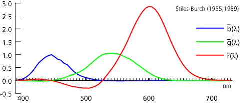
funzioni colorimetriche

Le parti negative sono dovute semplicemente all'aver dovuto portare una sorgente primaria dalla destra alla sinistra nella scatola per desaturare la luce a questa lunghezza d'onda.

I colori possono quindi venire specificati con un esperimento fisico come segue:

  1. misura con uno spettroradiometro la distribuzione spettrale dell'oggetto
  2. calcola l'integrale dello spettro usando consecutivamente le tre funzioni colorimetriche per ottenere le tre componenti tricromatiche

L'aspetto chiave da capire a questo punto è che si calcola un'integrale, quindi la forma dello spettro non è importante, solo l'area sotto la curva. Questa proprietà e fondamentale per poter riprodurre il colore: non occorre riprodurre gli spettri, basta riprodurre le componenti tricromatiche. Il termine tecnico è metamerismo.

(inizio | continua)

Friday, February 5, 2010

Steampunk Remote Proofing

From an 1892 letter to the editor in Science by Milton Bradley comes the following quote:

"As a manufacturer of an extended line of colored papers I am constantly putting this proposed nomenclature to a severe test by ordering new colors by telephone. That is to say, we make the desired combinations on the wheel in our office and then telephone them to the factory, ten miles distant, where they are again made on the wheel and the papers are manufactured to correspond with the results of these combinations. Under this plan we are liable to have occasion to 'telephone a color' frequently. In the same way we could cable colors to Europe should it be necessary."


Sounds like a possible steampunk remote proofing project.

Wednesday, November 18, 2009

A color never comes alone

This is a motto I was using 25 years ago. At that time I was working on VLSI design automation tools at Xerox PARC, more specifically on design rule checkers for full custom CMOS. The designers were doing so many layout errors that I could not understand how a top notch designer could do them. I had the suspicion that some of the designers could have a color vision deficiency — and 20 years later I discovered one of them is a dichromat — but that was not explaining the the type and volume of errors. I decided to investigate.

Tuesday, October 20, 2009

"The images always look better on the screen than on the page"

By way of follow-up to Neil's earlier post about Hockney's experimenting with inkjet printing is an NYRB article on Hockney's iPhone sketches.

Among other things he says: "the images always look better on the screen than on the page."


So I don't know but it might just be the difference between my screen and my print of his sketches but I'm not sure about always.

Thursday, August 9, 2007

Snap, match, shop

It appears I have not been on HP's home page for a month, because I totally missed a color related story, one that got a high reader score of 4.78 out of 5. This story, Snap, match, shop, is about the practical solution to a very difficult problem, namely finding the best shade of foundation for one's complexion.

As can be appreciated from the technical report, this is not the kind of problem that can be solved in a Silicon Valley garage. It requires a good research laboratory that can synergistically leverage deep expertise in color science, imaging and mobile communications.

The research team was led by Principal Scientist Dr. Nina Bhatti portraited below.

Principal Scientist Dr. Nina Batthi

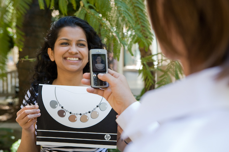
In the picture at below, Nina Bhatti holds the specially designed color chart near her skin while using a mobile phone camera to capture and send the photo via MMS to the advisory service for a color recommendation.

Dr. Nina Batthi holding special color chart

The full HP Labs team that helped to create the Color Match technology is presented in the picture below. Top row (left to right) Harlyn Baker, Sabine Susstrunk, Nina Bhatti, Nic Lyons. Bottom row: Mike Harville, John Schettino, Scott Clearwater.

Dr. Nina Bhatti's team including Harlyn Baker, Sabine Susstrunk, Nic Lyons, Mike Harville, John Schettino, and Scott Clearwater

Instead of sitting down with a consultant at a beauty counter, a shopper photographs herself using a mobile phone camera and while holding a specially designed color chart. The person then sends the photo as an MMS (multimedia message) to an advisory service. That system locates the person’s face within the image and color corrects the image for camera and lighting discrepancies.

Skin pixels are extracted from the color corrected image of the person’s face, and then compared to an existing database of previously captured and analyzed images of skin tones of real people. In a matter of seconds, people using the service receive a text message response with a recommendation on the shades of makeup that are best suited to their complexion.

The technology can work with any mobile operator and on any mobile phone equipped with a camera.

The photograph below illustrates that using the specially designed color chart and a mobile phone camera, a shopper can receive an expert recommendation on what shades of make-up are best suited for their complexion.

Special color chart and foundation palette

The photograph below illustrates how the system locates the consumer's face within the image and color-corrects the image for camera and lighting discrepancies.

The image is then compared to an existing database of previously captured and analyzed images of skin tones of real people. In a matter of seconds, the consumer receives a text message response, with a recommendation on the shade of foundation that best matches her complexion.

Face recognition

HP's Jhilmil Jain holds a newer version of the specially designed color chart near her skin while someone uses a mobile phone camera to capture and send the image via MMS to the advisory service for a color recommendation.

HP's Jhilmil Jain

A common mobile phone equipped with a camera can help shoppers identify the make-up shades that best suit their complexion. Users receive a text message, suggesting the appropriate shade of make up for their skin tone.

Jhilmil Jain receives a text message, suggesting the appropriate shade of make up for their skin tone.