Showing posts with label visualization. Show all posts

Monday, March 26, 2018

Stanford Workshop on Medical VR and AR

5 April 2018, there will be a public workshop on medical head-mounted displays in Stanford. The workshop is designed to support collaborations between the engineers who are developing VR and AR technologies and the surgeons and clinicians who are using these technologies to treat their patients.

The workshop features talks by researchers who are developing VR and AR technologies to advance healthcare and panel discussions with Stanford physicians who are using VR and AR applications for surgical planning and navigation and for alleviating pain and anxiety in their patients.

There will be an interactive demo session featuring research projects, clinical applications, and startup ventures.

Seating is limited, so if you wish to attend, we recommend that you register now at the website https://scien.stanford.edu/index.php/medicalvrar.

Stanford Workshop on Medical VR and AR

Tuesday, July 29, 2014

Traffic Lights and Visualization


Photo Attribution: Helgi Halldórsson

From Susanne Tak and Alexander Toet comes "Color and Uncertainty: It is not always Black and White" which finds that:

'A 'traffic light' configuration (with red and green at the endpoints and either yellow or orange in themiddle) communicates uncertainty most intuitively. '

A video presentation is also online.


Wednesday, July 2, 2014

Venture capital

We used to talk about the Silicon Valley, but nowadays it seems more appropriate to talk about that triad comprising San Francisco, the Peninsula, and San Jose. People prefer to talk about the Bay Area, but that includes too much "regular economy" to define correctly the locus of the current gold rush.

The previous gold rush was about the commercialization of the Internet and was called the .com boom. Today's rush is nicknamed Web 2.0, but it is much less of a technology rush. While .com came after the end of the cold war and the end of research labs spilling redundant scientists and researchers to fill the cubicles of technical entrepreneurs, Web 2.0 is much more about business.

The analogy is with patents. Gold diggers take an old business idea, add the word computer, get a patent, then sue the incumbents for patent infringement and get away with plenty of dollars.

In the real economy, the Web 2.0 entrepreneurs come up with an idea for a service that can be implemented on the Web. Today's various cloud providers make this very cheap and simple. The monetization consists in giving the impression that the service is free. In reality, the customers are used to crowd-source information by coaxing them to provide detailed information about themselves. This information can then be sold to one of the more than a thousand personal information brokers operating in the USA.

Recently, companies have been valued at up to $100 per customer, which is very high. Accordingly, investors are poring billions of dollars into this area. Because this is gambling and speculation, the amount of money is not a good indicator of the real economy here.

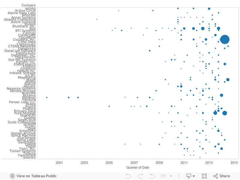
I tried to look at a more conventional technology, namely the storage industry. My data is just accumulated from press releases and is not authoritative nor complete, because I have not gathered it systematically. However, here it is:

On the abscissa we have funding dates, categorized by quarters. On the ordinate we have companies related to storage (my apologies for mistakes). Each point is an investment round. The diameter represents the accumulated funding so far of the company. You can click on a ball to see the details.

When there is a long horizontal line of regularly spaced balls of the same diameter, the start-up is not really taking off. When the diameter is rapidly increasing, the company is getting a lot of interest from the investors.

We see that as we move forward in time, many more companies are getting funded and some companies are real winners. This is a good sign, because it means that investors are not just gambling their money on social network companies but also investing in the nut and bold technologies that allow for a healthy sustainable future-oriented economy.

Friday, May 16, 2014

Color-coded pedestrians in Shibuya

NTT Docomo Inc. made a computer simulation visualizing what would happen if 1,500 pedestrians walked across the famous crossing in front of Shibuya station in Tokyo while texting: only 36% would make it across safely.

The pedestrians are color-coded by departure point and walk at 3, 4, or 6 km/h. They all have average height and weight, i.e., 160 cm resp. 58 kg. The model further assumes that texting reduces the vision range by 80% to 1.5 m. The green light lasts 46 seconds.

The result shown in the simulation is that only 547 pedestrian crossed without accidents. The others collided and either had to stop to apologize, fell, or dropped their phones.

Thursday, April 3, 2014

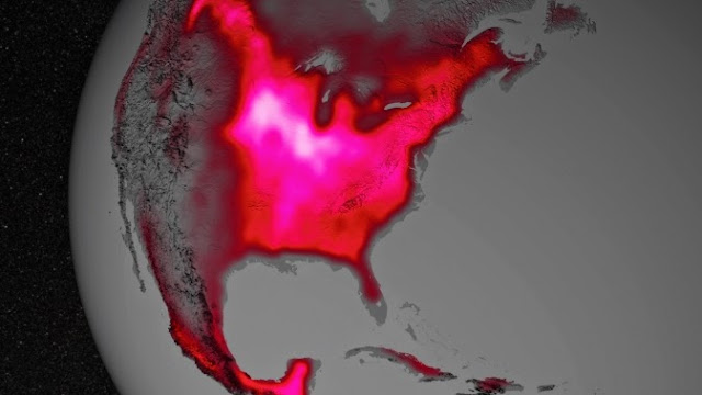
Half of the United States is glowing a bright pinkish red

Data from satellite sensors show that during the Northern Hemisphere's growing season, the Midwest region of the United States boasts more photosynthetic activity than any other spot on Earth, according to NASA and university scientists.

Healthy plants convert light to energy via photosynthesis, but chlorophyll also emits a fraction of absorbed light as fluorescent glow that is invisible to the naked eye. The magnitude of the glow is an excellent indicator of the amount of photosynthesis, or gross productivity, of plants in a given region. In the image below, the color red was applied to the illustration to represent the glow.

Image Credit: NASA's Goddard Space Flight Center

Research in 2013 led by Joanna Joiner, of NASA's Goddard Space Flight Center in Greenbelt, Md., demonstrated that fluorescence from plants could be teased out of data from existing satellites, which were designed and built for other purposes. The new research led by Luis Guanter of the Freie Universität Berlin, used the data for the first time to estimate photosynthesis from agriculture.

According to co-author Christian Frankenberg of NASA's Jet Propulsion Laboratory in Pasadena, Calif., "The paper shows that fluorescence is a much better proxy for agricultural productivity than anything we've had before. This can go a long way regarding monitoring – and maybe even predicting – regional crop yields."

Unlike most vegetation, food crops are managed to maximize productivity. They usually have access to abundant nutrients and are irrigated. The Corn Belt, for example, receives water from the Mississippi River. Accounting for irrigation is currently a challenge for models, which is one reason why they underestimate agricultural productivity.

NASA press release: Satellite Shows High Productivity from U.S. Corn Belt

PNAS paper: Global and time-resolved monitoring of crop photosynthesis with chlorophyll fluorescence

Thursday, March 20, 2014

Glass brain flythrough

This video gives viewers a colorful peek into the complex workings of the human brain as it thinks. In this case, we are “flying through” the brain of a volunteer who is been asked to simply open and close her eyes and hands, National Geographic reports. This 3D brain visualization was created by researchers at the University of California (UC), San Francisco, and UC San Diego with a combination of technologies, including an MRI scan, EEG and diffusion tensor imaging, a process that reveals tissue layout. Known as the Glass Brain, the imaging technology works in real time and may be used to learn more about how the human mind processes information.


Click here for more information

Tuesday, April 16, 2013

Wednesday, October 26, 2011

The Colorful Blind Painter

Turkish painter, Esref Armagan (shown seated in the upper left panel), has been completely blind from the time he was born in 1953. Nonetheless, he has been drawing and painting since childhood. Not only is he able to produce images with the correct shape and perspective—more importantly for readers of this blog—he is able to produce correct colors that he has never seen . The astonishing accuracy of his work is shown here in the other three panels and, as a result, he has held exhibitions in Turkey, Holland and the Czech Republic.

This being the 21st century, naturally his brain has been probed using fMRI and written up in Harvard Medicine:

"As expected, as Armagan drew, the frontal–parietal region of his cortex became active—this area is known to transform perception into two-dimensional imagery and to coordinate sensory–motor information in sighted and nonsighted artists alike. What surprised the researchers was the robust activity in Armagan’s occipital cortex, a region devoted to visual processing."
Glad that's all sorted.

Thursday, March 31, 2011

IBEX Camera Sees a Ribbon in the Sky

The NASA IBEX (Interstellar Boundary Explorer) mission (the size of a kitchen table) was launched in 2008 to map the heliosphere that surrounds our solar system. It carries a High-Energy Neutral Atom (HENA) camera that images energetic neutral atoms, rather than photons, to create maps of the boundary region between our solar system and the rest of our galaxy.


The surprise result (so far) is that the energy and particles at the galactic boundary are confined to a "ribbon" structure that envelopes the heliosphere. For reference, the Voyager spacecraft are just now passing through the heliopause, at about 100 AUs, after more than 30 years of in-flight operation. Both the heliosphere and heliopause are shown below on a logarithmic scale.


For the first ten billion kilometres of its radius, the solar wind travels at over a million kilometers per hour. As it begins to drop out with the interstellar medium, it slows down before finally ceasing altogether. The point where the solar wind slows down is the termination shock; the point where the interstellar medium and solar wind pressures balance is called the heliopause; the point where the interstellar medium, traveling in the opposite direction, slows down as it collides with the heliosphere is the bow shock. [Source: Wikipedia]

Monday, December 6, 2010

Fun with Collocates: Orange Vodka to Blue Skies

The SCOTS team at Glasgow University has posted a handy tool the BMC ComPair for visualizing collocates in the British National Corpus. Here's an example for orange and blue, also shown below.

The instructions clearly state: "Collocates of both words are shown, together with your search words. The collocates near each extremity have a strong collocational strength with that search word, collocates in the middle are used equally with both your words."


So vodka is more likely to be used with orange, while skies is more likely to be used with blue and light is roughly equally used by both orange and blue. Interestingly, the most common orange collocate is k-type, as in orange dwarf. The results for pink and beige are even more curious.

But first let's try red and green.

Monday, November 15, 2010

The Face of Sydney

I was poking around on the Web and found a link to this article. I no longer recall where I originally saw it, but it perfectly ties in to a few of the other threads of our blog.
When I first saw this, I immediately saw ties to the World Wide Gamma. I love the idea of taking loads of data, mashing it up, and seeing what happens. Last Friday I mentioned this to Giordano and he immediately saw the ties to Nathan's prosopagnosia post. I love our 9:30 AM Friday breakfast meetup!

Monday, November 1, 2010

Plethora of Colorful Pixels, Some Assembly Required

From Pixels XL comes revestimento removible or removable decorative color tiles. Nifty. Looks like a different palette than the post-it mosaics. The t-shirt is clever.

Monday, May 10, 2010

Location, location, location

Today, many conglomerates are not run by visionaries but by gnomes toting spreadsheets. The key factor for success is then the objective function being optimized by the model. More often than not, the objective function is cost minimization.

Because there are still substantial salary differences around the world, but all scientists are equally dumb (otherwise they would all work in the financial industry), it boils down to location. You can convince yourself of this by driving around the research parks of the Silicon Valley: it looks more and more like Bodie, although some optimistic realtors still leave up the "for lease" signs. The research labs moved from Palo Alto to Beijing, and from there to the Amazon. Who knows where the objective function will send them next.

Unless, somebody uses a different objective function. On 30 April 2010, Disney opened a new research lab in the most expensive city in the world: Zürich in Switzerland, joining companies like IBM and Google, who also have research labs there. Obviously, they concluded that the best location is not the one with the lowest wages, but the one with the sharpest brains, all in a fertile eco-system.

The story began four years ago: Disney's new CEO Robert Iger and Edwin Catmull, chief of the Pixar animation studios that belong to Disney since early 2006, decided to perform more research in house. Through Joe Marks, ETH professor Markus Gross prepared the winning proposal for a joint venture between ETH and Disney.

Prof. Markus Gross, ETH and Disney Research Zurich

Disney is paying the high Swiss salaries, while the ETH is contributing the infrastructure. This includes the building at Clausiusstrasse 47. The created intellectual property and their licensing fees will be shared between ETH and Disney. At the opening April 30, Disney Research Zurich started with 20 researchers, which will grow to 40 by 2011.

In the portrait above, Prof. Markus Gross is holding cheap 3-D goggles, but the agenda for Disney Research Zurich goes much further than that. For example, part of the eco-system in Zurich is a small company selling a mobile autosteroscopic video player the size of a paperback for just 400 francs. This video player presents 3-D movies without the spectator wearing special glasses.

Not far from Disney Research Zurich, near the city zoo, is FIFA, the Fédération Internationale de Football Association, who is organizing the 2010 FIFA World Cup South Africa. Disney's ESPN sports channel has announced that is will broadcast the Johannesburg games in 3-D. This will bring big financial opportunities for owners of virtual sky boxes around the world.

One especially hard problem in presenting 3-D contents on a 2-D surface is vergence, and this is one of the areas being researched at the new laboratory, for now with Swiss cows:

Left: original 3-D image; right: depth optimization to reduce vergence problems

Wednesday, March 3, 2010

Magnetic movie

Of course, we cannot see magnetic fields other than in the aurora borealis, that is why we have computer animation. Ruth Jarman and Joe Gerhardt of Semiconductor are two masters in the use of computer animations for visualizing phenomena.

Friday, February 26, 2010

Plot That Movie Plot

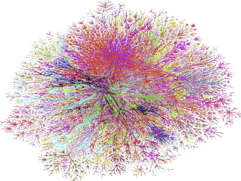
Reading Nathan's remark about seeing bits, reminded me of Bill Cheswick's recent off-the-wall project where he (previously of Internet map posters c. 1998) prints movies, frame by frame, using an HP DesignJet 6100ps plotter. Yes, every frame of the movie is literally printed as part of a contiguous whole—which really makes it more of an on-the-wall project, I suppose.


The plotter output shown above is from a 1.36 h animated movie comprising 720 frames per column by 163 columns. Cheswick's original motivation was to hammer the printer but, by considering each of the 117,360 micro-frames to be a color-encoded pixel, it might be possible to detect emergent global structure among the "bits" that is different from the typical story-board structure. However, caution is required because, although all meaning has a pattern, not all patterns have a meaning.

Monday, January 25, 2010

Visualizing Crayon Colors

From the inbox (thanks David) comes a link to a nice visualization of crayon colors.


Given data from a little over a century it looks as though number of crayon colors doubles every 28 years.