During the AIC meeting in Zurich, the AIC Study Group on the Language of Color (LC) held a meeting, moderated by the Chair Prof. Jinsook Lee. During the meeting, the delegates discussed two project proposals by Co-Chair Prof. Paul Green-Armytage.
Showing posts with label color dictionary. Show all posts
Showing posts with label color dictionary. Show all posts
Monday, June 27, 2011

Monday, March 7, 2011
Honeysuckle
Honeysuckle is not a color term in Nathan Moroney's color thesaurus, meaning none of the contributors to the online color naming experiment ever mentioned this term. It is a reddish pink, which is a color term in his dictionary. Unfortunately Google's Book Ngram Viewer is not of much help, because it cannot distinguish the color term from the widely distributed climbing shrub with tubular flowers that are typically fragrant and of two colors or shades, opening in the evening for pollination by moths. • Genera Lonicera and Diervilla, family Caprifoliaceae (the honeysuckle family).
Indeed, the graph (click on it for a larger view) shows a much higher frequency for honeysuckle than for rose pink, which is just a color term and would be more frequent than honeysuckle.

Nevertheless, this year you will hear it often used as a color term. Indeed, Pantone has declared it the color for 2011. Its formal specification is PANTONE 18-2120 Honeysuckle.

"In times of stress, we need something to lift our spirits. Honeysuckle is a captivating, stimulating color that gets the adrenaline going — perfect to ward off the blues," explains Leatrice Eiseman, executive director of the Pantone Color Institute. "Honeysuckle derives its positive qualities from a powerful bond to its mother color red, the most physical, viscerally alive hue in the spectrum."
Eiseman continues, "The intensity of this festive reddish pink allures and engages. In fact, this color, not the sweet fragrance of the flower blossoms for which it was named, is what attracts hummingbirds to nectar. Honeysuckle may also bring a wave of nostalgia for its associated delicious scent reminiscent of the carefree days of spring and summer."
Now we have to see how long it will take for honeysuckle to show up in Nathan's color dictionary and thesaurus.
Friday, June 25, 2010
Dealing with Red Lips
An anonymous reader is asking in a comment on the fuchsia post:
My daughter has asked me to paint the wall in her room this color:
http://img710.imageshack.us/img710/6656/img2676l.jpg
The color name on the paint can is "Hot Lips" but that is hardly appropriate. Can you tell me if this is Magenta or Fuchsia?
Here is how you can answer this kind of questions:
To give a "scientific" answer, you would have to measure your daughter's wall with a spectroradiometer and compare it to a measurement of the fuchsine colorant. If the two spectral curves are within a tolerance, you can say the color terms are synonyms. Unfortunately, this is not practical.
Since I happen to have a little FileMaker script on my PC, I can give you an "engineering" answer based on crowd-sourcing. Your photograph is not uniformly illuminated and you probably did not calibrate your camera and turn off the white balancing, so I just average a few pixels in the center of your picture. For the reference colors, I use Nathan's color thesaurus tool and query fuchsia and magenta, and just for the sake of it, I also query hotlips. Hotlips is not in the thesaurus, but it suggests lips, so let us take that. This gives me the following CIELAB values:
| L* | a* | b* | |
|---|---|---|---|
hot lips (wall picture) |
50 |
56 |
11 |
lips (thesaurus) |
50 |
56 |
20 |
magenta (thesaurus) |
56 |
46 |
-21 |
fuchsia (thesaurus) |
60 |
45 |
-24 |
The FileMaker script yields the following CIE94 ∆E matrix:
| hot lips | lips | magenta | fuchsia | |
|---|---|---|---|---|
hot lips |
0 |
4.72 |
18.8 |
21.98 |
lips |
4.72 |
0 |
22.74 |
25.69 |
magenta |
18.8 |
22.74 |
0 |
4.38 |
fuchsia |
21.98 |
25.69 |
4.38 |
0 |
From the last post we know that fuchsia and magenta are synonyms. Therefore, the tolerance for crowd sourcing is a little over 4 for these colors. From a crowd-sourcing perspective, you could not call the wall color in your daughter's room fuchsia nor magenta, but people have a pretty good idea the walls are lips colored even if you do not tell them.
So far we have discussed the "scientific" answer and the "engineering" answer, but actually you want a practical answer, i.e., a color name that you think would be more appropriate for your daughter's room walls. It turns out, that this is a very easy problem.
The solution is to turn to Nathan's color thesaurus, which contains the wisdom of crowds: http://www.mostlycolor.ch/2007/10/on-line-color-thesaurus.html. Just enter hotlips and click submit: this will give you four synonyms for lips and you just pick the color term you believe is most appropriate for your daughter.

So, people will know what you mean if you say coral red, carmine, scarlet, or punch.
At this point your daughter might insist to call her wall color as it is labeled on the paint can. If you are willing to spend a few dollars more, you can actually make everybody happy with the "marketing" answer. Many paint manufacturers also have an upscale brand in the name of a famous designer. The can will have the same paint, but the label on the paint can will be some fashionable fancy name evoking something exclusive. This would give you a posh name and your daughter the color she wants.
I can imagine many parent having this kind of problem, so we would be very interested in learning how you ended up solving your problem. Please leave us a comment below!
Wednesday, June 23, 2010
A Few Shahs
Of course, Shah refers to the title of Iranian kings including the Achaemenid dynasty which unified Persia and created a vast intercontinental empire. What does this have to do with color?
Some color names have been beaten up during history, like purple and glaucus. Presently, the most tormented color name refers to this color:

This is a device color. If you print his page, the rectangle is reproduced with 100% magenta ink and nothing else. On your display it is rendered with 100% red and 100% blue. What you perceive depends on your display device and its calibration or miscalibration state.
Legend has it the name comes from the City of Magenta, where 151 years ago a battle took place that left the fields in the above color from the soldier's blood. But the above color is not the color of Magenta, because in Italian by color of a city we mean the colors in its crest. Therefore, the colors of Magenta are yellow and black:

The little village of Magenta near Epernay, smack in the middle of Champagne, got its name from the Italian Magenta 151 years ago, to celebrate the French victory over the Austrians in the battle of Magenta. Unlike the yellow and black original Magenta, the French Magenta is all magenta, starting with its crest:

Their magenta Web site explains that in 1859 a new red colorant with a pink slant was discovered, and to commemorate the French blood spilled in the battle of Magenta, it was called magenta (and not because of the fields of Magenta being red from blood). In 1860 this color became fashionable in London as red magenta.
London notwithstanding, "magenta" is more a technical term from the printing industry than an everyday color name. According to the Wikipedia, magenta was originally called fuchsine, and it mentions fuchsia as the non-technical color name for the perception of the colored rectangle at the top of this page.
Indeed, we can confirm this from Nathan's color naming experiment, where the color name fuchsia is very frequent.
And here we come to the Persian kings. People generally know that this color is pronounced few Shah in English, but they have no idea on how to spell it, making it the most tormented color name in Nathan's English color name thesaurus.
The trick to remember how to spell few Shah, is to think at a German fox. The name comes from a flowering plant that in the western culture was identified in the late 17th century by Charles Plumier, who in 1703 named it after the German botanist Leonhart Fuchs (1501–1566).
Although I have driven through both the Italian and the French Magenta, I did not take pictures in either of them, also because in both green is a preponderant color as you scan the landscape. Since I started by showing you magenta, let me conclude with a few fuchsias from Mrs. Nonaka's garden (some have portions of a table as a background, and that table's paint color is named botticelli):


Friday, June 11, 2010
i nomi dei colori
Finora abbiamo visto come organizzare i colori, come misurarli, e come riprodurli. Abbiamo visto come possiamo trasmettere l'apparenza di un certo marrone specifico semplicemente communicando i tre numeri (A, T, V) = (20, 25, 60).

Il colore è un attributo usato troppo di spesso per richiedere che tutti ci portiamo dietro un atlante del colore per potere parlare delle cose.
Il linguaggio è una serie di convenzioni che ci permette di communicare. Dato che il colore è astratto, non c'è un aiuto da parte della fisica per trovare una formulare per derivare nomi di colori e quindi lo studio dei nomi dei colori è una scienza complessa che è ancora agli inizi.
Prima di tutto, i linguisti non dicono "nomi dei colori", bensì "termini del colore". La tecnica di base è di usare una tabella come lo si fa per la riproduzione del colore. Gli esperti del ramo si sono messi d'accordo su questa tabella:

I scienziati che studiano i termini del colore prendono questo reticolo e contattano i membri di una communità, come per esempio i Valtellinesi, i designer di moda di Parigi, ecc. Ad ogni membro chiedono di dare un termine ad ogni colore nel reticolo, poi fanno la media su tutti i partecipanti.
Questo studio è stato fatto per la prima volta da Berlin e Kay, ma poi è stato continuato da centinaia se non migliaia di linguisti in tutto il mondo, sotto il nome di World Color Survey, o WCS.
Il risultato è l'ontogenesi dei termini del colore, ovverosia come i termini del colore si sono evoluti con l'evolvere di una civiltà, cultura o sottocultura. Di solito l'ontogenesi viene rappresentata con questo diagramma:

L'interpretazione è che si sono solo undici termini universali per il colore. Questi termini sono ragruppati in sette stadi, e più una sottocultura è evoluta, più stadi usa.
Per l'italiano c'è un po' un pasticcio, perché è stato notato da parecchio tempo che in italano abbiamo due termini distinti per il blu. Però c'è stato un errore che è perpetuato in tutti gli studi seguenti: il secondo temine bluastro è chiamato azzurro, però descritto con la zona attorno al 25B, che noi veramente chiamiamo celeste e non azzurro.
Un'altro grosso problema è che i colori del reticolo WCS sono stati scelti sulla periferia della gamma dell'atlante Munsell, per cui mancano tutti i colori non vividi. Boynton e Olson hanno fatto uno studio di laboratorio molto preciso usando i campioni dell'atlante OSA, ed hanno ottenuto questa mappa dei colori universali:

Ricordati il diagramma dei colori opponenti di Leonardo nella prima puntata. Nello spazio OSA qui sopra l'ascissa j è la quantità di giallo, e l'ordinata g è la quantità di verde. Sappiamo da come è stato costruito, che l'atlante OSA è quello più uniforme.
Ciononostante, nota la diversa area occupata dai vari termini di colore: piccolissima per il grigio ed il rosso, grande per il verde. Nota anche che la maggior area della mappa è bianca: non ci sono termini universali per questi colori!
Ci sono stati parecchi tentativi di creare un dizionario dei colori completo, vale a dire senza spazi vuoti. Per esempio, Nemcsics ha dato nomi per tutti i colori dello spazio Coloroid. Ecco la famosa pagina per la tinta 20:

A parte che non ho la versione in italiano, ti puoi visualizzare cosa sia il giallo di Pompei? Ovviamente un architetto che lavora nel restauro di Budapest sa esattamente che colore è, ma per il resto di noi questo termine di colore è un mistero. D'altra parte, non ci vuole niente per un milanese o un bergamasco per imaginare cosa sia il polenta. Nota che un valtellinese penserebbe alla polenta nera fatto con la farina di saraceno, mentre in parigino non avrebbe la più pallida idea di cosa stia parlando.
Peggio ancora, i termini del colore cambiano nel tempo. Per esempio, il porpora è lentamente passato da un viola ad un rosso: http://www.mostlycolor.ch/2008/12/transitioning-colors-purple.html, mentre il glauco ne ha visti di tutti i colori, dal verde-blu al giallo: http://www.mostlycolor.ch/2008/12/transitioning-colors-glaucus.html!
La lezione che si impara è che quando si usa un termine non universale di colore, bisogna riflettere bene a chi si parla. Se l'interlocutore è nella stessa sottocultura ed è famigliare con il termine, lo si può usare senz'altro. Altrimenti è importante fare vedere un campione, cosa facile ora che tutti ci protiamo dietro vari aggeggi digitali.
Ovviamente quest'ultimo caso non è sempre realizzabile. Per esempio, compilando un vocabolario dei termini del colore non si può realizzare un campione per ogni voce. Occorre quindi descrivere ogni termine in parole.
Ciononostante, con il Web, si comincia ad essere in grado di compilare grossi dizionari del colore basato su centinaia di colori usando il crowd-sourcing. Il mio collega Nathan Moroney ha allestito un sito dove si possono contribuire i termini per dei colori: http://www.hpl.hp.com/personal/Nathan_Moroney/color-name-italian.html.
I dati messi a disposizione vengono puliti e poi usati per creare un utile dizionario dei sinonimi del colore. Se hai il nome di un colore e vuoi sapere che apparenza abbia, vai qui: http://www.hpl.hp.com/personal/Nathan_Moroney/color-thesaurus-italian.html
Per esempio, se scrivi senape, ricevi questa risposta:

Vedi un campione del colore, le coordinate RGB ed esadecimale per HTML, come pure dei colori simili e dei colori opposti. Ora che hai visto come funziona, provalo! [il testo segue in basso]
Con Nathan ho scritto un'articolo sulla nomenclatura del colore: http://dx.doi.org/10.1117/12.846957, con una versione non ufficiale ma gratuita qui: http://www.hpl.hp.com/techreports/2009/HPL-2009-363.html. In questa conferenza c'era pure una analisi corrispondente di Shoji Tominaga per il giapponese, che ho riassunto qui: http://www.mostlycolor.ch/2010/02/color-naming-at-ei.html.
In conclusione, abbiamo percorso un lungo viaggio per organizzare i colori, scoprendo che il tentativo di sviluppare un semplice modello additivo e sottrattivo con un po' di algebra non funziona. Il metodo giusto è di esaminare tutte le combinazioni possibili, caratterizarle in termin i di percezzione, ed invertire la tabella per ottenere la formulazione di coloranti che crei un dato colore. Per i termini del colore, è molto difficile creare un vocabolario che vada oltre una dozzina di termini; per il resto bisogna tenere conto delle sottoculture.
(inizio)
Friday, June 4, 2010
Short color dictionary
Friday, February 5, 2010
Color naming at EI
I did not yet summarize the discussions on color naming at EI three weeks ago, so here we go…
In the Color Imaging conference, Shoji Tominaga presented the result of his recent Investigation and Analysis of Color Terms in Modern Japanese.
Tominaga has worked on color naming for a long time. In this most recent study, he used the linguistic method of asking the respondents to compile lists of color names, i.e., no color samples are presented. The lists are then analyzed statistically.
The study is double, in the sense that the respondents where asked to compile two different lists: the first with basic color terms and the second with essential (called "absolute" in the paper) color terms.
The first figure shows the frequencies of the basic color terms:

Note that the 11 universal color term are followed by two metallic colors, silver and gold. Tominaga notes that this shows the advantage of the linguist's approach of harvesting names without showing samples, because for example the Munsell color tree does not include metallic colors, hence silver and gold would not have been elicited and would have been missed.
Note further colors terms 14 and 15. These terms would correspond to turquoise and chartreuse, which, as we commented in our own paper, have been proposed as being basic color terms in the far eastern languages.
Translating 水色 [みずいろ] with turquoise instead of aqua as in the paper and 黄緑 [きみどり] with chartreuse instead of yellow green is not completely justified, because by not anchoring the names to an actual color sample, we do not really know what the correct translation is. This is a point in our favor. Correct me if I am wrong, but note also that 黄緑 [きみどり] is not monolexemic, as the use of two kanji indicates, instead of the use of a radical (艾 ?).
The second figure shows the frequencies of the essential color terms.

Note how changing the question completely changes the distribution. There is a big frequency drop after Hering's opponent colors.
The data in the two figures have been cleaned up for synonyms, which is very important in Japanese, as for example 赤 、赤い、赤色、あか、あかい、あかいろ、レッド、red, all eight refer to the same color red. However, these synonyms are trivial.
An interesting result of Tominaga's paper is how they find all synonyms, based on the frequency of color terms in the list. Take for example gray. If you look the term up in a dictionary, you will find three translations, namely 灰色 [はいいろ] (ash color), 鼠 [ねずみ] (mouse), and グレー (gray). Are these synonyms?
This Venn diagram illustrates the proposed algorithm:

The lists are parsed to find entries that contain a pair of terms in a single entry. This counts as an intersection of the two terms and is tallied. For example, ash and gray appear 31 times as a pair.
Then the single occurrences of each term is counted. The non-obvious part of the algorithm is that when the number of pairs is smaller than both occurrences of the single term, then the two terms are synonyms, otherwise they are not.
Therefore, gray and ash are synonyms, gray and mouse are synonyms, but ash and mouse are not synonyms. By the way, ash is a light and mouse is a dark gray.
I did not understand why the tally for ash is different when compared to gray (1167) from when compared to mouse (1122). In their table with the details, the numbers are 1198, respectively 1598 for the same case.
The other two EI papers on this topic I attended were in the session on Art, Aesthetics, and Perception in the Human Vision conference. Stephen Palmer presented the paper Preferences for individual colors: WAVEs of color, culture, music, and emotion and Karen Schloss presented Aesthetics of color combinations. These papers are not yet available from the SPIE Digital Library.
I was not impressed by neither these papers, as the experiments were conducted with small numbers of respondents and the experimenters constrained the observations. I therefore think of the results more as opinions of the experimenters than as objective observations that can be generalized.
Anyway, Palmer was asked explicitly why metallic colors like silver and gold were not elicited. Palmer's answer was that specular reflections are not relevant, so silver and gray are synonyms, as are yellow and gold. After that, I do not have much to add.
After we gave our paper in the session on the Dark Side of Color, I sat down with Tominaga to discuss where to go from here. Essentially we agreed that he has a point against the Munsell Sheets of Color because they have no metallic samples, and I had a point for it because anchoring the color terms to colorimetric data allows operations like translations between different cultures, sub-cultures, and time epochs.
While we consider metallic colors, we should also be able to do both matte and glossy samples, because a matte color will reflect the illuminant diffusely and de-saturate the color by adding the white illuminant.
Tominaga noted that today, any experiment would be done on a computer display, so the color atlas should be a piece of software, not a physical atlas. Yet, it would have to be more than just a database of colorimetric values.
Fortunately, Tominaga has conducted extensive research on BRDF, bidirectional reflectance distribution function, for correctly rendering surface reflectance for any material. The proposal is then for Tominaga to have a Ph.D. student implement an application that can be embedded on a Web page to correctly render colored surfaces and collect color terms.
This software can then be used for a more rigorous implementation of Nathan's and Dimitris' online color naming experiments.
The more difficult problem will be how to get around the artificial limitations of sRGB and take full advantage of current display technologies as well as those of the future.
Sunday, November 22, 2009
Color naming: color scientists do it between Munsell Sheets of Color
Last year at the IS&T/SPIE Electronic Imaging symposium in San Jose the conference Color Imaging: Displaying, Hardcopy, Processing, and Applications started a session on controversial topics called "The Dark Side of Color." These are papers that transcend the incremental research methodology of solving a problem, proving the solution's contribution in an experiment, and reporting the result in a conference. This session consists of papers were authors go out on a limb, not afraid of intuition and speculation, and propose new paradigms.
A preprint of our contribution is now available at this link: http://www.hpl.hp.com/techreports/2009/HPL-2009-363.html.
Thursday, October 22, 2009
Please Pass the Chartreuse
In a profoundly scientific discussion about naming colors at HP Labs, the other day, the color name chartreuse came up. Nathan declared he'd never heard of it until he saw it recently used as a response to his ongoing web-based color-naming experiment. I stated that I only knew of it because my mother used that word when referring to a new dress or curtains or something. I told you it was a profound discussion.
Chartreuse probably stuck with me because, from age 12, I became fascinated with organic chemistry in general and, azo dyes, in particular. So, I'm almost sure it went on my list of chemical terms along with malachite green and paranitraniline red.
Chartreuse probably stuck with me because, from age 12, I became fascinated with organic chemistry in general and, azo dyes, in particular. So, I'm almost sure it went on my list of chemical terms along with malachite green and paranitraniline red.
Wednesday, October 14, 2009
Thanks for All the Colorful Fish
This is not goodbye, but hello and thanks to Giordano for the invitation to blog here. Oh! And all his colorful fish.
I'm not sure I'll have a lot to say because:
I'm not sure I'll have a lot to say because:
Don't know much about photographySo, with apologies to Sam Cooke, I'll give it the old collage try.
Don't know much color dictionary
Don't know much about a science book
Don't know what it means to take a look
But I do know what is Planck times Nu
And I know that if you read me too
What a colorful blog this will be
Tuesday, October 13, 2009
Unipolar vs. bipolar SD
Conferences are an opportunity to seek clarifications on facts and methods one does not understand well. For example, in my work I do not scale with semantic differentials, so I never looked into some of its subtleties, like the polarity of the scales.
In her proposal for the new AIC study group on the language of color, Lucia Ronchi wrote that the use of the semantic differential (SD) is necessary to compare the application of language and linguistics in the evaluation of the quality of color planned spaces and the prediction of color planning at the site of design.
In this statistical method for estimating people's reactions to stimulus words, one usually proceeds in three steps:
- Rank the factors relevant to an experience
- Rank the attributes for the most relevant factor(s)
- Combine the attributes with their antonyms to create semantic differential scales
The scales are then used to gather the data from the observers. A semantic differential scale typically looks like this:

This SD is called bipolar because the two extremes are antonyms and the scale is like a line. A unipolar SD is like a half-line or ray starting in this case from good:

where the number indicates the relative strength of the attribute.
I do not know the subtleties of unipolar vs. bipolar SD, but it seems obvious that they cannot be mixed in an experiment. Yet, in papers by Japanese authors, one can easily see them mixed. What is going on?
The AIC conference in Sydney was a good place to find out, because the over 320 delegates came from many different cultures, with the Japanese delegation 40 members strong.
In the Japanese culture, when feelings are be involved, you cannot use a negative attribute. Instead there has to be wiggling room for hesitation, uncertainty, and doubt:

More precisely, in the case of persons and feelings, the 1-dimensional line is not a good model at all. Instead, a Venn diagram is a better representation of socially acceptable discourse:

While there can be a well defined round judgment for a positive term, the antonym has to be broad and fuzzy, so one can hesitate, deflect, and nudge the discourse. The easiest way to accomplish that is to use a unipolar SD.
Hence, if you are estimating an abstract SD, your bipolar scale can extend from good (良い、いい、ii) to bad (悪い、わるい、warui). However, if the SD can pertain to feelings, like for example if you would want to rate this post, you have to use a unipolar scale from good (良い、いい、ii) to non-good (良いない、よくない、yokunai).
My conclusion is, that if you are doing a Western study, you can use bipolar SD, but if you are doing an Eastern study, then for consistency all your SD should be unipolar, so you do not have to worry about feelings.
The difficulty when publishing an Eastern study in a Western language is that to Westerners good and non-good are clear antonyms, while ii and yokunai are not, except they speak Japanese and know about the -nai form. Therefore, it is better to leave out romanizations from papers because they confuse the reader (or the author, as it has happened).
Monday, September 28, 2009
Towards robust categorical colour perception
We presented our paper Towards robust categorical colour perceptionand it was very well received. Here are the slides:
View more documents from Giordano Beretta.
Monday, December 22, 2008
Transitioning colors: glaucus
In Switzerland, when I was a pupil in elementary school, at the beginning of the school year we used to receive a small box of colored pencils in the main colors. The first years of school were spent learning the names and semiotics of those colors, as well as depicting our environment.
It was only later in elementary school that I learned a new color name, namely glauco. It was in a poem from our textbook, that we had to memorize.
The Zanichelli vocabulary translates glauco into English as blue-green, sea-green, glaucous. I guess the readers of this blog will be familiar with this color name from glaucoma, a condition of increased pressure within the eyeball, causing gradual loss of sight.
Today in Italian, glauco is associated most commonly with eye colors, because of the gray-green haze in the pupil.
Why am I counting this color among the transitioning colors? Over time, this color label is one that has changed quite dramatically in its association with a perceived color.
It starts with eye colors. My Sanesi classical Greek vocabulary from high school lists the following classical terms, in alphabetic order (apologies for the missing accents):
- γλαυκιαω, to have an inflamed look
- γλαυκ-ομματος, with inflamed eye
- γλαυκος, scintillating, brilliant, shining || cerulean, azure
- Γλαυκος, name of many characters
- γλαυκοςτης, luster, shine of the eyes || cerulean color
- γλαυκο-χρως, of azure color, of olive and pale color
- γλαυκ-ωπις, of the shining, brilliant, cerulean eyes
In summary the classical use was for the shining color of eyes, mostly light blue, for example the color of Athene's eyes (glaukopsis). However, in the Homeric epics it has been used also for dark blue. Strangely, γλαυκο-χρως has been used also for olive and pale colors.
This strange use might at first explain why then in the later Middle Ages the meaning of the derived Latin term glaucus changed dramatically from blue-gray to yellow. Instead, I would like to speculate here that it might be connected to the loss of diphthongs as Latin became vulgarized.
In my Campagnini-Carboni classic Latin vocabulary from middle school I find these two definitions:
- cærúleus, cerulean, azure, turquoise, dark; cærula cæli, or simply cærula, the azure, the azure sky
- cerula, piece of wax
As you see, as the diphthongs were dropped with the vulgarization of Latin, cerulean blue might have become the color of wax. Indeed, Roger Bacon (~1214-1292) used glaucitas to refer to yellowness and ceruleus (wax color) as a yellow color falling between glaucus and citrinus (yellow and orange, respectively).
In the 14th century, Theodoric of Freiburg used glaucus with the same meaning. But then, in the mid-16th century, Scaliger (1557) put it back in the blue category, where it still was in the beginning of the 17th century with Francois d'Aguilon. (This data from Kuehni and Schwarz, Color Ordered, p. 8.)
If the label purple changed as a consequence of the collapse of a major civilization, the label glaucus might have been done in by an overworked or sloppy monk. In this case, γλαυκο-χρως used for olive and pale colors can be a medieval mistake rather than a genuine classical Greek color label.
Make sure, you dot your is and cross your ts, and watch out for those pesky diphthongs!
Wednesday, December 10, 2008
Transitioning colors: purple
In my post on the ephemerality of color names I wrote that color names can go out of fashion and then the label of a given color is lost. It also happens that a label is persistent, but the color associated with that name changes. Purple is such an example.
Nathan's color thesaurus responds to "porpora" with the color of hexadecimal value b23372, which looks like

However, if we look at this old mosaic in San Vitale in Ravenna, we see a different color for the same label "porpora":

What happened?
From Phoenician times the purple colorant was extracted from molluscs living in the coast of present day Lebanon and Israel. It was a rare colorant, hence used only for textiles destined to the rich and powerful. In fact, in 1464 Pope Paul II decreed that cardinals have to wear purple.
By coincidence this was the time the Byzantine empire crumbled and in the Ottoman empire the Purple industry in the Eastern Mediterranean disappeared. Hence, the tailors had to switch to a red colorant, but the papal decree cast the label "purple" into concrete.
If today you visit a religious clothing store, when you ask for Purple you will get a red cape, as shown below. In this case, Italian crowdsourcing returns Purple more to the original color, but not quite.

This is a big problem for restorers. As you might have seen in the Sixtine Chapel or Leonardo's Last Supper, today's restorers are very aggressive in restoring the original colors, instead of just freshening up the old paint in its current state.
One way to figure out the original colors is to study the master's notebooks and find textual descriptions of the colors. Unfortunately, for a given label, the colors transition, especially today when all paints care constantly reformulated to make them less toxic.
Anyway, these color transitions is exactly why Prof. Giovanni Brini in Torino has compiled his comprehensive color name dictionary. It is intended for restorers who have to pin-point the color for a given name at a given date.
Tuesday, December 9, 2008
The ephemerality of names
From the paper mentioned in my post of 2 December we know that color categorization is probably mediated by language, which is what is meant by the statement "a form of categorical perception that is lexically influenced." The next problem is how to deal with the ephemerality of language.
Languages are in constant evolution (well, maybe with the exception on French, where bytes are still called octets). For example, in Japanese the katakana script that was originally used for bureaucratic and male writing, has been repurposed to write words of foreign origin — and how many foreign words there are! Look at something as common as milk, which used to be 牛乳 (ぎゅうにゅう, gyuunyuu) but now is simply ミルク (miruku).
Closer to home, consider late ETH Prof. Heinrich Zollinger's work ca. 1975, where he collected color names from TKD chemistry students:

The ordinate is the frequency of occurrence for the name of the Munsell hue in the abscissa. Note how オレンジ (orenji) is more frequent than 橙 (ダイダイ, daidai) and ピンク (pinku) is more frequent than 桃色 (ももいろ, momoiro).
Maybe the change of the Japanese language is a bit extreme, but English is also changing fast, especially for words related to fashion, like color names. Look for example at the names in Coloroid hue 20 I showed last week:
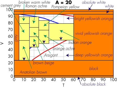
Did you know the color name Arsigont? Did you know the difference between Pompeian yellow and Indian orange?
This is not a problem of the Coloroid system. Consult any color name compilation older than a few years, and you will find names that look unfamiliar. For example, a decade ago teal was all the rage in Palo Alto and all home decoration stores were selling many items in this color. Today, people hardly remember its appearance.
So, how do we deal with the ephemerality of language? Obviously a printed leather-bound collector's edition of a color dictionary is not the ticket. The ephemerality of a blog tool post is more like it. But color names are very hard to collect, we cannot start from scratch every few months.
This is why in the Italian version of his color thesaurus, Nathan included a mechanism to rate the pairing of the color name with the displayed color. As names fade, they get rated worse and by using the rating in the creation of the thesaurus, a more contemporary color name will emerge to label that color.

Tuesday, December 2, 2008
Categorical color perception moves from right to left hemisphere across life span
It feels a very long time ago when in 2003 I was assigned to solve a problem in variable data printing — when colored text is printed on a colored background and the colors are variable, the text may become unreadable. Since each copy is different in a variable data job, manual proofing is not feasible and an algorithm is required.
Conventional colorimetry is of no use, because it deals with color matching — small color differences — not the large color differences to be considered in readability issues. Required to quickly deliver some code, I came up with a heuristic based on ∆E units. Silvia Zuffi and Carla Brambilla of the CNR in Milano-Bicocca have revisited that work and performed genuine research replacing my heuristics.
Once the code was delivered, I implemented a different algorithm more suited to the task. As the research by Zuffi and Brambilla shows, the readability problem can be formulated as a reading speed problem. From Stevan Harnad's work we know that color discrimination is faster for colors in different perceptual color categories than for colors in the same perceptual categories, when their perceptual distance (∆E) is fixed.
The most obvious way to introduce structure in a color space, i.e., to introduce perceptual color categories, is by considering color names. The new problem now is to find a 3-dimensional tiling of a color space. I had the data for Nemcsics's names in the Coloroid system, so I implemented that.
The implementation of the readability solution was then straightforward. I used the lexical distance between the two colors and required at least 2, i.e., there had to be at least a color name between the two color's names.
The solution performed only so-so. In fact, there were a number of issues.
- The transformation from CIE tristimulus is only published in part and required a lot of experimentation to pin down
- This transformation is numerically instable, so an industrial-strength implementation that never fails is not trivial and requires skilled programing
- The tiling does not cover the whole gamut, so it needs to be "stretched"
- There is no reference in the literature on the origin of the categories and names — did Nemcsics cook them up heuristically?
But the biggest question is: are the color categories mediated by language? Is it legimimate to use color names for a lexical metric? Each time I put up my old color cognition diagram

co-blogger Nathan Moroney always interjects that color categorization may occur much earlier. The paper Categorical perception of color is lateralized to the right hemisphere in infants, but to the left hemisphere in adults in a recent issue of the Proceedings of the National Academy of Sciences comes very close to answer this question.
Franklin et al. take advantage of the difference between the left and the right hemisphere of our brains (let us assume for a moment we are all right-handed and have a normal corpus callosum) that the left hemisphere is geared to encoding categorical or relational information, while the right hemisphere is geared towards encoding metric information.
The linguistic hypothesis in color categorization is that colors are tagged by their category name and the tags are compared, i.e., that language mediates categorical color perception. The question is whether the color categorization is prelinguistic, i.e., whether there is a universally available color categorization and language just makes some minor adjustments, or color categorization is built from scratch after language is available.
Franklin et al. used a group of 21 years old right-handed adults and a group of 21 week old infants and compared their categorical color perception skills, obtaining these results:

(remember the neural axons get crossed in the optical chiasm). Categorical color perception is found in infants; however, the absence of a category effect in the left hemisphere for infants, but the presence of a greater left hemisphere than right hemisphere category effect for adults, suggests that language-driven categorical perception in adults may not build on prelinguistic categorical perception, but that language instead imposes its categories on a left hemisphere that is not categorically prepartitioned.
Their findings therefore suggests that there is a form of categorical perception that is nonlinguistic and right hemisphere based (found in infancy) and a form of categorical perception that is lexically influenced and biased to the left hemisphere (found in adulthood). Categorical color perception is found for both infants and adults, but the contribution of the left hemisphere and right hemisphere to categorical color perception appears to change across our life span.
Our digital presses are for adults, so my approach is valid.
Monday, September 15, 2008
Visit to the sausage factory
Scientific research is a struggle with many wrong turns and lots of meticulous detail work. Then, after the Eureka moment, we reorder our ideas and write it all up in a nice clean and easy-to-follow paper.
If you just read papers, scientific research is a glorious activity, where the researcher is like a Zen master waiting for the right moment and then letting the arrow reach the target. Even in the case of Zen, reality is very different from what you see in the movies.
Therefore, scientists gather in conferences. Papers are given in formal presentations, to quickly communicate the final result of the research. However, the real action takes place in the hallways during the breaks and during meals. That is when the presenters are approached and war stories are exchanged.
The trick is to learn from other researcher's experience. It is like visiting the sausage factory so you know what to eat and most of all, what not to eat.
So here is the handout to our next conference presentation: HPL-2008-109.
For those not attending the conference, here is a trip report from the sausage factory.
HP used to have a literature distribution center in Campbell. It warehoused the brochures and other marketing collaterals for all currently shipping products. When sales representatives prepared an offer, they would order the pieces from Campbell and assemble the material in a booklet to present the customer.
Then HP bought Indigo. Now all those printed materials could be replaced by a document repository. The sales reps could "shop" for the required collaterals on a web site and the resulting document would be printed on demand on the Indigo press and finished, resulting in a professional booklet.
Our project built the prototype of this system called DPOD (I cannot recall what the acronym stands for). In alphabetic order, team included Hui Chao, Scott Clearwater, Anna Durante, Parag Joshi, Xiaofan Lin, Greg Nelson, Henry Sang, and Nick Saw.
We were not happy to build just a shopping cart solution as a front-end to a document management system. To maximize the document's impact, we implemented a custom printing system, also known as variable data printing system.
In the middle of the implementation, HP changed the colors in the corporate palette. To have a uniform look for all pieces in a marketing document, we had to automatically change the old corporate colors to the perceptually closest new colors.
Things could go particularly wrong with colored text on colored background. If in the old palette the text was readable, in the new palette it could become illegible. We had to check each foreground-background color pair for readability and then nudge one of the colors.
In the first prototype we did not yet have the code to parse the PDF and nudge the colors there. Instead, we ripped each page and fixed it pixel by pixel. To keep up with the Indigo's print speed, the implementation had to be very efficient. Yet, it also had to be very precise, so the nudged colors were consistent across the entire document.
My first implementation of the small color piece was colorimetric, i.e., I calculated ∆E94 differences and nudged the colors in cylindrical CIELAB coordinates before converting them back to sRGB.
In the second implementation, instead of enforcing a minimal ∆E distance, I enforced a lexical distance. I calculated the color name of the foreground and background colors and ensured there was at least one color name in-between.
Years before, at PARC, Maureen Stone had used the ISCC-NBS color naming system, so I looked for something different to implement.

I found that most of the naming research in the literature was focused on the basic color terms, so I settled with the Coloroid color naming system. Here is how the leaf for hue A = 20 looks:

There are many white areas in the plot. In addition, to make things run fast, there is no time for gamut mapping, so the entire addressable color range must be tiled, for a resulting naming algorithm as follows:
The system worked so well, we made a follow-up for a product called MoD, for marketing on demand. It was a web service that would allow small and medium businesses (SMB) to create their own professional marketing collaterals. By "their own" we mean that instead of hiring an expensive graphic designer, they can get done a comparable collateral by an administrative assistant.
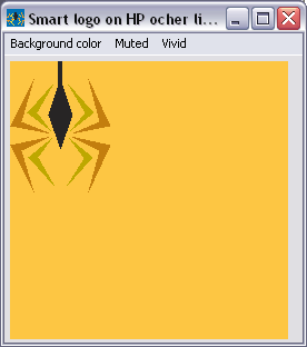
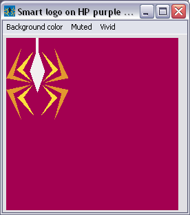
To avoid complexities like spec sheets for logos, we extended the color discrimination algorithms to work for any vector graphics element on a page. For example, the colored logo works on any background color from HP's corporate palette, as shown in these examples:





If we compare the web service to a minivan, then with our system we provided it with a racing car engine. Of course, from car manufacturers we learned that the buyer of a minivan hardly ever opens the hood, so there is no point in outfitting it with a racing engine, a lawn mover engine will do it. As my friend Irwin Sobel keeps telling me, the computer industry is learning fast from the US car manufacturer's cost-cutting strategies.
Now that you know what happened in the sausage factory you can read HPL-2008-109. Even better, come to the conference, where you can ask all your questions and learn from our experience.
Subscribe to:
Posts (Atom)


