I believe it was on a day at the end of March or beginning of April 1996, when out of the blue I received the assignment to write a report on why the world wide web would be important for my employer at the time. I was given only two weeks to write a blurb and a slide deck. I had not thought about this matter and it was a struggle to write something meaningful in such a short time, without any time to read up. It ended up as an exercise in automatic writing: just write ahead and never look back and revise.
At the end, I delivered the blurb, but management decided the web was just a short-lived fad like citizen band (CB) radio that would go away shortly and put the blurb in the technical report queue for external publication. I did not think much about it because such is life in a research lab. However, with all the hype of the time on the "Internet Tsunami" by Bill Gates, the "Dot in the Dot Com" by Scott McNealy, and all the others—while my employer remained silent and kept everybody curious—the report W3 + Structure = Knowledge was requested hundreds of times (at that time a tech report was typically requested much less than ten times). Subsequently, I received quite a few requests to present the companion slide deck.
In my struggle to write something in two weeks, I typed about the need to structure information on the world wide web so it can be easily navigated, instead of searching for information.
It appears today we are at such a disruptive juncture again. This time, it is not about websites: it is about data (some prefer to call it big data, but size does not really matter). Solid state drives are now inexpensive, can hold 60 TB of data in each 3.5" drive, and have access times similar to RAM. In addition, we have all the shared data in the various clouds.
Today, we are not interested in finding data, we are maybe wiling to navigate to data, but preferably we would like the data to anticipate our need for it and come to us in digested, actionable form. Actually, we are not interested in the data, we are interested in data in a context: knowledge. We want the data to come to us and ask us if it is OK to take an anticipated action based on a compiled body of knowledge: wisdom.
This is an emergent property because all the pieces have fallen together. Our mobile devices and the internet of things constantly gather data. There are open source implementations of deep learning algorithms. CUDA 8 lets us run them on inexpensive Pascal GPGPUs like the Tesla P100. Algebraic topology analytics lets us build networks that compile knowledge about the data. Digital assistant technology brings this knowledge at our service.
Another key ingredient is the skilled workforce. Mostly Google, but also Facebook, Apple, Amazon, etc. have been aggressively educating their workforce in advanced analytics, and as brains move from company to company in the Silicon Valley, these skills are diffused in the industry.
In a recent New York Times article, G.E.'s Jeffrey R. Immelt explained how he is taking advantage of this talent pool in a new Silicon Valley R&D facility employing 1,400 people. Microsoft is creating a new group, the AI and Research Group, by combining the existing Microsoft Research group with the Bing and Cortana product groups, along with the teams working on ambient computing. Together, the new AI and Research Group will have some 5,000 engineers and computer scientists.
This is the end of search engines. This is the end of metadata: we want wisdom based on all the data.
Here is a revised version of the post I wrote in July.
The asumption is that to be useful, technology has to enable society to become more efficient so life quality increases. The increase has to be at least one order of magnitude.
Structured data
In the context of big data, we read a lot about structured versus unstructured data. So far, so good. Things get a little murky and confusing when advanced analytics—which refers to analytics for big data—joins the conversation. The confusion comes from the subtle difference between "structured data" and "structure of data," which contain almost the same words (their edit distance is 3). Both concepts are key to advanced analytics, so they often come up together. In this post, we will try to shed some light on this murkiness to clarify it.
The categorization in structured, semi-structured, and unstructured data comes from the storage industry. Computers are good at chewing on large amounts of data of the same kind, like for example the readings from a meter or sensor, or the transactions on cash registers. The data is structured in the sense that each record has the same fields at the same locations, for example on an 80 or 96 column punched card, if you want a visual image. This structure is described in a schema.
Databases are optimized for storing structured data. Since each record has the same structure, the location of the i-th record on the disk is i times the record length. Therefore, it is not necessary to have a file system: a simple block storage system is all that is needed. When instead of the i-th record we need the record containing a given value in a given field, we have to scan the entire database. When this is a frequent operation in a batch step, we can accelerate it by first sorting the records by the values in this field, which allows us to use binary search, which is logarithmic instead of linear.
Because an important performance metric is the number of transactions per second, database management systems use auxiliary structures like index files and optimizing query systems like SQL. In a server-based system, when we have a query, we do not want to transfer the database record by record to the client: this leads to server-based queries. When there are many clients, often the same query is issued from various clients, therefore, caching is an important mechanism to optimize the number of transactions per second.
Database management systems are very good at dealing with transactions on structured data. There are many optimization points that allow for huge performance gains, but it is a difficult art requiring highly specialized analysts.
Semi-structured data
With cloud computing, it has become very easy to quickly deploy a consumer application. The differentiation is no longer by the optimization of the database, but in being able to collect and aggregate user data so it can be sold. This process is known as monetization and an example is click-streams. The data is to a large extent in the form of logs, but their structure is often unknown. One reason is that the schemata often change without a notification because the monetizers infer them by reverse engineering. Since the data is structured with an unknown schema, it is called semi-structured. With the Internet of Things (IoT), also known as Web of Things, Industrial Internet, etc., a massive source of semi-structured data is coming towards us.
This semi-structured data is high-volume and high-velocity. This breaks traditional relational databases because data parsing and schema inference become a performance bottleneck. Also, the indexing facilities may not be able to cope with the data volume. Finally, the traditional database vendor's pricing models do not work for high volumes of less costly data. The paradigms for semi-structured data are column based storage and NoSQL (not only SQL).
In big data scenarios, structured data can have high-volume and high-velocity. Although it may be fully structured, e.g., rows of double precision floating point values from a set of sensors (a time series), a commercial database system might lose data when reindexing. Even a NoSQL database might be too slow. In this case, this structured data is treated as unstructured and each column is stored in a separate file for concurrent writes. Typically, the content of such a file is a time series.
Unstructured data
The ubiquity of smartphones with their photo and video capabilities and connectedness to the cloud has brought a flood of large data files. For example, when the consumer insurance industry thought it can streamline its operations by having insured customers upload images of damages instead of keeping a large number of claim adjusters in the field, they got flooded with images. While an adjuster knows how to document a damage with a few photographs, consumers take dozens of images because they do not know what is essential.
Photographs and videos have a variety of image dimensions, resolutions, compression factors, and duration. The file sizes vary from a few dozen kilobytes to gigabytes. They cannot be stored in a database other than as a blob, for binary large object: the multimedia item is stored as a file or an object and the database just contains a file pathname or the address of an object. In general, not just images and video are stored in blobs, therefore we use the more generic term of digital items. Examples of digital items in engineering applications are drawings, simulations, and documentation. In their 2006 paper, Jim Gray et al. found that databases can store efficiently digital items of up to 256 KB [1].
For digital items, in juxtaposition to conventional structured data, the storage industry talks about unstructured data.
Unstructured data can be stored and retrieved, but there is nothing else that can be done with it when we just look at it as a blob. When we look at analytics jobs, we see that analysts spend most of their time munging and wrangling data. This task is nothing else than structuring data because analytics is applied to structured data.
In the case of time series data, the wrangling is easy, as long as the columns have the same length. If not, a timestamp is needed to align the time series elements and introduce NA values where data is missing. An example of misaligned data is when data from various sources is blended.
In the case of semi-structured data, wrangling entails reverse engineering the schema, convert dates between formats, distinguish numbers and strings from factors, and dealing correctly with missing data. In the case of unstructured data, it is about extracting the metadata by parsing the file. This can be a number of tags like the color space, or it can be a more complex data structure like the EXIF, IPTC, or XMP metadata.
Structure in time series
A time series is just a bunch of data points, so at first one might think there is no structure. In a way, statistics, with its aim to summarize data, can describe the structure in raw data. It can infer its distribution and its parameters, model it through regression, etc. These summary statistics are the emergent metadata of the time series.
Structure in images
A pictorial image is usually compressed with the JPEG method and stored in a JFIF file. The metadata in a JPEG image consists of segments beginning with a marker, the kind of the marker, and if there is a payload, the length and the payload itself. An example of a marker kind is the type (baseline or progressive) followed by width, height, number of components, and their subsampling. Other markers are the Huffman table (HT), the quantization tables (DQT), a comment, and application-specific markers like the color space, color gamut, etc. This illustrates that unstructured data contains a lot of structure. Once the data wrangler has extracted and munged this data, it is usually stored in R frames, or in a dedicated HIVE or MySQL database. These allow processing with analytics software.
Deeper structure in images
Analytics is about finding even deeper structure in the data. For example, a JPEG image is first partitioned in 8×8 pixel blocks, which are each subjected to a DCT. Pictorially, the cosine basis (the kernels) looks like in this figure:

The DCT transforms the data into the frequency domain, similar to the discrete Fourier transform, but in the real domain. We do this to decorrelate the data. In each of the 64 dimensions, we determine the number of bits necessary to express the values without perceptual loss, i.e., in dependence of the MTF of the combined HVS and capture & viewing devices. These numbers of bits are what is stored in the discrete quantization table DQT, and we zero out the lower order bits, i.e., we quantize the values. At this point, we have not reduced the storage size of the image, but we have introduced many zeros. Now we can analyze statistically the bit patterns in the image representation and determine the optimal Huffman table, which is stored with the HT marker, and we compress the bits, reducing the storage size of the image through entropy coding.
Like we determine the optimal HT, we can also study the variation in the DCT-transformed image and optimize the DQT. Once we have implemented this code, we can use it for analytics. We can compute the energy in each of the 64 dimensions of the transformed image. As a proxy for energy, we can compute the variance and obtain a histogram with 64 abscissa points. The shape of ordinates gives us an indication of the content of the image. For example, the histogram will tell us, if an image is more likely scanned text or a landscape.
We have built a rudimentary classifier, which gives us a more detailed structural view of the image.
Let us recapitulate: we transform the image to a space that gives a representation with a better decorrelation (like transforming from RGB to CIELAB, then from Euclidean space to cosine space). Then we perform a quantization of the values and study the histogram of the energy in the 64 dimensions. We start with a number of known images and obtain a number of histogram shapes: this is the training phase. Then we can take a new image and estimate its class by looking at its DCT histogram: we have built a rudimentary classifier.
An intuition for deep learning
We have used the DCT. To generalize, we can build a pipeline of different transformations followed by quantizations. In the training phase, we determine how well the final histogram classifies the input and propagate back the result by adjusting the quantization table, i.e., to fine-tune the weights making up the table elements. In essence, this is an intuition for what happens in deep learning, or more formally, in CNN.
In the case of image classification and object recognition, the CNN equivalent of a JPEG block is called receptive field and the generalization of the DCT DQT is called CNN filter or CNN kernel. The CNN kernel elements are the weights, just as they are the coordinates in cosine space in the case of JPEG (this is where the analogy ends: while in JPEG the kernels are the basis elements of the cosine space, in CNN the kernels are the weights and the basis in unknown). The operation of applying each filter in parallel to each receptive field is a convolution. The result of the convolution is called the feature map. While in JPEG the kernels are the discrete cosine basis elements, in CNN the filters can be arbitrary feature identifiers. While in JPEG the kernels are applied to each block, in CNN they “slide” by a number of pixels called the stride (in JPEG this would be the same as the block size, in CNN it is always smaller than the receptive field).
The feature map is the input for a new filter set and the process is iterated. However, to obtain a faster convergence, after the convolution it is necessary to introduce a nonlinearity, in a so-called ReLU layer. Further, the feature map is down-sampled, using what in CNN is called a pooling layer: this helps to avoid to overfit the training set. At the end, we have the fully connected layer, where for each class being considered, there is the probability for the initial image to belong to that class:
The filters are determined by training. We start with a relatively large set of images for whom we have determined manually the probabilities to belong to the various classes: this is the ground truth and the process is called groundtruthing. The filters can be seeded with random patterns (in reality we use the filters from a similar classification problem: transfer learning or pre-training, see the figure below) and we apply the CNN algorithm to the ground truth images. At the end, we look at the computed connected layer and compare it with the ground truth obtaining the loss function. Now we propagate the errors back to reduce the weights in the filters that caused the largest losses. The process of forward pass, loss function back-propagation, and weight update is called an epoch. The training phase is applied over a large ground truth over many epochs.
Evolution of pre-trained conv-1 filters with time; after 5k, 15k, and 305k iterations, from [2]:
CNN and all the following methods are only possible because of the recent progress in GPGPUs.
A disadvantage of machine learning is that the training phase takes a long time and if we change the kind of input we have to retrain the algorithm. For some applications, you can use your customers as free workers, like for OCR you can use the training set as captcha, which your customers will classify for free. For scientific and engineering applications, you typically do not have the required millions of free workers. This is the motivation for unsupervised machine learning.
Assimilation and accommodation
So far, we took a random walk from unstructured data to multimedia files, JPEG compression, a DCT-inspired classifier, and deep learning. We saw that the crux of supervised machine learning is the training.
There are two reasons for needing classifiers. We can design more precise algorithms if we can specialize them for a certain data class. For humans, the reason is that our immediate memory can hold only 7 ± 2 chunks of information. This means that we aim to break down information into categories each holding 7 ± 2 chunks. There is no way humans can interpret the graphical representation of graphs with billions of nodes.
As already Immanuel Kant noted, categories are not natural or genetic entities, they are purely the product of acquired knowledge. One of the functions of the school system is to create a common cultural background, so people learn to categorize according to similar rules and understand each other's classifications. For example, in the biology class, we learn to organize botany according to the 1735 Systema Naturæ compiled by Carl Linnæus.
As we know from Jean Piaget's epistemological studies with children, there is assimilation when a child responds to a new event in a way that is consistent with an existing classification schema. There is accommodation when a child either modifies an existing schema or forms an entirely new schema to deal with a new object or event. Piaget conceived intellectual development as an upward expanding spiral in which children must constantly reconstruct the ideas formed at earlier levels with new, higher order concepts acquired at the next level.
The data scientist's social role is to further expand this spiral. Concomitantly, data scientists have to be well aware of the cultural dependencies of acquired knowledge.
For data, this means that we want to cluster it (recoding by categorization). Further, we want to connect the clusters in a graph so we can understand its structure (finding patterns). At first, clustering looks easy: we take the training set and do a Delaunay triangulation, the dual graph of the Voronoi diagram. After building the graph with the training set, for a new data point, we just look in which triangle it falls and know its category. Color scientists are familiar with Delaunay triangulations because they are used for device modeling by table lookup. Engineers use them to build meshes for finite element methods.
The problem is that the data is statistical. There is no clear-cut triangulation and points from one category can lie in a nearby category with a certain probability. Roughly, we build clusters by taking neighborhoods around the points and the intersect them to form the clusters. The crux is to know what radius to pick for the neighborhoods because the outcome will be very different.
Algebraic topology analytics
This is where the relatively new field of algebraic topology analytics comes into play [4]. It has only been about 15 years that topology has started looking at point clouds. Topology, an idea of the Swiss mathematician Leonhard Euler, studies the properties of shape independent of coordinate systems, dependent only on a metric. The topological properties are deformation invariant (a donut is topologically equivalent to a mug). Finally, topology constructs compressed representations of shape.
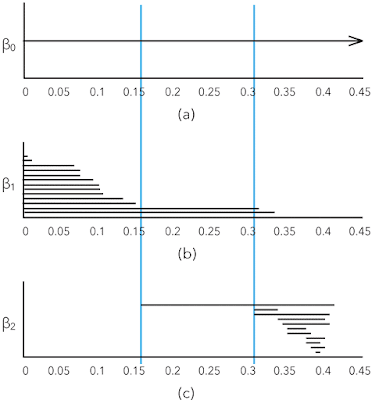
The interesting element of shape in point clouds are the k-th Betti numbers βk, the number of k-dimensional "holes" in a simplicial complex. For example, informally β0 is the number of connected components, β1 the number of roundish holes, and β2 the number of cavities.
Algebraic topology analytics relieves the data scientist from having to guess the correct radius of the point neighborhoods by considering all radii and retaining only those that change the topology. If you want to visualize this idea, you can think of a dendrogram. You start with all the points and represent them as leaves; as the radii increase, you walk up the hierarchy in the dendrogram.
This solves the issue of having to guess a good radius to form the clusters, but you still have the crux of having to find the most suitable distance metric for your data set. This framework is not a dumb black-box: you still need the skills and experience of a data scientist.
The dendrogram is not sufficiently powerful to describe the shape of point clouds. The better tool is the set of k-dimensional persistence barcodes that show the Betti numbers in function of the neighborhood radii for building the simplicial complexes. Here is an example from page 347 in Carlsson's article [4]:
Motifs
With large data sets, when we have a graph, we do not necessarily have something we can look at because there is too much information. Often we have small patterns or motifs and we want to study how a higher order graph is captured by a motif [5]. This is also a clustering framework.
For example, we can look at the Stanford web graph at some time in 2002 when there were 281,903 nodes (pages) and 2,312,497 edges (links).

We want to find the core group of nodes with many incoming links and the tied together periphery groups that are tied together and also up-link to the core.
A motif that works well for social network kind of data is that of three interlinked nodes. Here are the motifs with three nodes and three edges:

In motif M7 we marked the top node in red to match the figure of the Stanford web.
Conceptually, given a higher order graph and a motif Mi, the framework searches for a cluster of nodes S with two goals:
- the nodes in S should participate in many instances of Mi
- the set S should avoid cutting instances of Mi, which occurs when only a subset of the nodes from a motif are in the set S
The mathematical basis for this framework are motif adjacency matrices and the motif Laplacian. With these tools, a conductance metric in spectral graph theory can be defined, which is minimized to find S. The paper [5] in the references below contains several worked through examples for those who want to understand the framework.
References
- R. Sears, C. van Ingen, and J. Gray. To BLOB or not to BLOB: Large object storage in a database or a filesystem? Technical Report MSR-TR-2006-45, Microsoft Research, One Microsoft Way, Redmond, WA 98052, April 2006.
- P. Agrawal, R. Girshick, and J. Malik. Analyzing the Performance of Multilayer Neural Networks for Object Recognition, pages 329–344. Springer International Publishing, Cham, September 2014.
- G. A. Miller. The magical number seven, plus or minus two: Some limits on our capacity for processing information. Psychological Review, 63(2):81–97, 1956
- G. Carlsson. Topological pattern recognition for point cloud data. Acta Numerica, 23:289–368, 5 2014
- A. R. Benson, D. F. Gleich, and J. Leskovec. Higher-order organization of complex networks. Science, 353(6295):163–166, 2016


![By Microsoft Sweden [CC BY 2.0 (http://creativecommons.org/licenses/by/2.0)], via Wikimedia Commons](https://blogger.googleusercontent.com/img/b/R29vZ2xl/AVvXsEiiPcHrKLT8b4IDlezhraH4BsGJSZytoot5QBbdxSYdK7FC6eYwW0hJmRkUsa1Yc7Gol4vfnrLnJOBb10q7ywma2H3opAE4XH-v6PNrzR3TqPrQh0mKHBH-quqcRsqbBqsn-2jsSeQ8OehR/s1600/HoloLens_2.jpg)


