Monday, December 22, 2014

Glistenings in pseudophakic vision.

cc Rakesh Ahuja, MD. Aftercataract - Posterior capsular opacification post-cataract surgery (seen on retroillumination)

As we age, our crystalline lens becomes cloudy and we call it a cataract, maybe because the world is seen as from behind a large foaming waterfall. Already the Romans carried out cataract operations 2000 years ago, so the medical remedy is pretty much routine: the cataract is removed surgically and replaced with an intra-ocular lens (IOL). Such an IOL is generally known as a pseudophakic IOL and provides the light focusing function originally undertaken by the crystalline lens.

The ancient Greek word for lens is phakos, so phakia is the presence of the natural crystalline lens. Pseudophakia is the substitution of the natural crystalline lens with an IOL.

One problem of the pseudophakic patient is that sometimes in the weeks or months after the surgical procedure, visual discomfort due to glistenings is experienced. The glistenings are due to micro-vacuoles in the IOL, the vacuoles being part of the polymer's structure. After the IOL has been implanted, water can fill these vacuoles and water has a different refraction index (1.33) than the polymer ~1.55).

What was not known is how much the glistenings impact visual performance. One research technique was to measure the MTF. However, although MTF is related to visual acuity, it is not related to global contrast. and does not explain the visual discomfort. Alessandro Franchini, Andrea Romolo and Iacopo Franchini implemented a ray-tracing program to model and analyze the effect of the vacuoles.

They found that when a light source is in the field of view, without glistenings a clear secondary image is produced, but with glistenings light scattering introduces noise on entire visual field, reducing the global contrast.

The solution is to use hydrophobic acrylic lenses and to keep them in water before implanting them. With this, the IOL will contain 4% water instead of the usual 2%. After the lens is implanted, there will not be the current of liquids that causes the glistenings.

Citation: Alessandro Franchini, Andrea Romolo and Iacopo Franchini, Effect of glistenings on the pseudophakic patient vision, Atti della Fondazione Giorgio Ronchi, Vol. LXIX, N. 5, pp. 589–599.

Thursday, November 20, 2014

Shedding UV light on skin color

For a long time it was believed that dark complexion evolved to protect humans from skin cancer. However, this theory has a flaw: melanoma typically is contracted after the reproductive age. Hence, the traditional theory for complexion cannot be correct because melanoma does not impact evolution.

Recently Nina Jablonski has hypothesized that like chimpanzees, our ancient ancestors in Africa originally had fair skin covered with hair. When they lost body hair in order to keep cool through sweating, perhaps about 1.5 million years ago, their naked skin became darker to protect it from folate-destroying UV light.

Variation in complexion may have evolved to protect folate from UV irradiation

Neural tube birth defects such as spina bifida are linked to deficiencies in folate, a naturally occurring form of vitamin B; Nina Jablonski learned that sunlight can destroy folate circulating in the tiny blood vessels of the skin. Furthermore, lower vitamin D weakens the immune response to the mycobacterium that causes tuberculosis. With this there is a strong evolutionary explanation for complexion variation.

If you live in a Silicon Valley hacker dojo or wear a burka, do not forget your vitamin B pills!

Read the article in Science 21 November 2014: Vol. 346 no. 6212 pp. 934-936 DOI: 10.1126/science.346.6212.934

Friday, November 7, 2014

Sharp has developed a reflective liquid crystal display panel for wearable computer devices, such as smart-watches, that consumes 0.1% the energy of current backlit panels. The Japanese electronics maker will mass-produce the panel in Japan by next spring and ship it to device makers domestically and abroad.

The panels incorporate memory chips and can save power on retrieving data by storing images for a certain amount of time. Panels account for more than 30% of the power usage of current wearable devices. With the new model, devices will be able to function for 30% longer before recharging.

Nikkei Asian Review, 31 October 2014

Wednesday, October 22, 2014

LEGO-inspired microfluidic blocks from 3D printer

modular fluidic and instrumentation components

Pictured is a microfluidic system assembled from modular components that were fabricated using 3D printing at the USC Viterbi School of Engineering. Krisna C. Bhargava et al. used stereolithographic printing techniques to manufacture standardized, interchangeable, fluidic blocks of about 1 cm3 and assembled them by hand to produce variations of complex 3D circuits. Circuit behavior was predicted using design rules analogous to those used in electronic circuit design, and alleviated design limitations imposed by 2D circuit designs.

Microfluidic systems promise to improve the analysis and synthesis of materials, biological or otherwise, by lowering the required volume of fluid samples, offering a tightly controlled fluid-handling environment, and simultaneously integrating various chemical processes (applications include DNA analysis, pathogen detection, clinical diagnostic testing and synthetic chemistry). To build these systems, designers depend on microfabrication techniques that restrict them to arranging their designs in two dimensions and completely fabricating their design in a single step. This study introduces modular, reconfigurable components containing fluidic and sensor elements adaptable to many different microfluidic circuits. These elements can be assembled to allow for 3D routing of channels. This assembly approach allows for the application of network analysis techniques like those used in classical electronic circuit design, facilitating the straightforward design of predictable flow systems.

The authors devised computer models for eight modular fluidic and instrumentation components (MFICs), each of which would perform a simple task. They said that their work in developing these MFICs marks the first time that a microfluidic device has been broken down into individual components that can be assembled, disassembled and re-assembled repeatedly. They attribute their success to recent breakthroughs in high-resolution, micron-scale 3D printing technology.

Krisna C. Bhargava, Bryant Thompson, and Noah Malmstadt, Discrete elements for 3D microfluidics, PNAS 2014 111 (42) 15013-1501, doi:10.1073/pnas.1414764111

Wednesday, October 8, 2014

New reflective LCD panel slashes power consumption

Sharp has developed a touch panel that can accurately pick up text written with a ballpoint pen. This sets the device apart from conventional ones that require a stylus with a wider tip. The new liquid crystal display panel has roughly four times the sensitivity of hitherto existing models, making it the world's top performer in that regard, according to Sharp. The Japanese electronics company plans to start domestic mass production of the device next spring and make it a mainstay product in its LCD business.

Sharp's new panel works with ballpoint pens and mechanical pencils with 1mm or even narrower tips. The company's current production lines can make the panel.

Source: Nikkei

Friday, September 26, 2014

Unique hues

Color does not exist in nature, it is an illusion happening in our mind. Therefore, we can not solve color appearance problems with physics alone. The situation gets even hairier when we converse about color, because color names are just an ephemeral convention. For example, it is easy to "synonimize" blue and cyan or red and magenta.

Especially the latter is not out of the blue. Back in the days when I was doing research in color science, I had an OSA-UCS atlas. Periodically, I was getting updates of color tiles. One tile was standing out: the one that Boynton and Olson had determined to be the best red, with coordinates (L, j, g) = (–3.6, 1.5, –6.9), representing the consensus for the basic color term "red." Not only was it changing, but is was changing frequently. When I lined the updates up in the light-booth, the best red was shifting towards magenta.

I was so puzzled about the OSA changing the tile for the best red, that I called them up. I found out that they periodically where getting new tiles from their supplier Dupont when they developed new pigments. The OSA would then scale them visually and emit updates to the atlas. Therefore, the shift of basic red was a sign that industry was getting better at creating what humans consider to be the best red, and the hue was shifting from yellow towards magenta.

This indicates that the above synonymity is not arbitrary.

Art teachers are the ones most victimized by the non physicality of color, especially when they have to teach the difference between additive and subtractive color, as I wrote in "Is it turquoise + fuchsia = purple or is it turquoise + fuchsia = blue?" a few years ago. Recently I received the following question: do you have any ideas as to how I can prove that red, green, yellow and blue are the unique hues?

It is not that Goethe's yellow-red-blue (today we would write yellow-magenta-cyan) primary theory is wrong. His 1810 Farbenlehre and his battle against Newton with the theory of red-green-blue primaries was a little weird, especially considering Newton (1642–1727) had long been dead when Goethe started fighting against him.

Go back to the 1470s in Florence. The 1453 collapse of the Roman Empire of the Orient (Byzantium) had generated an influx of scientists fleeing from Constantinople to Venice, who took along their over 1500 year old libraries. Aldo Manuzio, exploited this trove of works and cheap scientists to create the new profession of "publisher" and popularized this knowledge that had gone lost in the west. This lead to the Renaissance in Italy, which essentially consisted in taking a field, studying all books about it, and formulating a theory about this field, which can be used to apply it over and over. An example was Niccolò Machiavelli studying politics and creating the field of political science.

At that time, somebody we would now call "engineer" did not go to study at a university but to a place called a "bottega" or "workshop" in English. One of the most famous ones in Florence at that time was the Bottega del Verrocchio, run by Andrea di Michele di Francesco de' Cioni. Verrocchio was his nickname and can be translated as "true eye."

In the pictorial arts, at that time the hot trend was to use very vivid colors and to try to reproduce reality as faithfully as possible. In Verrocchio's bottega, students would learn about pigments and binders and research the creation of new paints to realize highly vivid colors.

One of these students was a lad from the village of Vinci, called Leonardo. Leonardo was passionate about this quest for realism and would dissect cadavers at the hospital to learn how muscles and tendons worked anatomically. For color, he invented a new method to analyze a scene consisting in viewing it through a series of stained glasses (a common novelty in the street markets of the 1470s). Today we would call this a spectroradiometer.

From his studies, Leonardo da Vinci formed a new theory that color is not a physical quality mastered by studying pigment admixtures, rather it is a new phenomenon he called "perception." Perception is the capacity to have a sensate or sentient experience, what philosophers call quale (the plural is qualia). Quale is what something feels like; for example, the smell of a rose or the taste of wine as specific sensations or feelings. We experience the world through qualia, but qualia are not patterns of bits in memory, far from it.

From this he developed a methodology to paint the light illuminating a scene instead of the scene itself. The technique he developed was to paint in many layers with very little pigment. He called this technique "sfumato" and the result "sfumatura."

Working with the spectroradiometer, he realized that colors are not a discrete set with the names of pigments. Rather it was a set of opponents. Doing his drawings he realized, that white and black are actually colors (in 1475 they were not considered to be colors) and they are opposites he called "chiaro" and "scuro", resulting into a technique he called "chiaroscuro."

Once you realize colors are not related to pigments, you have to come up with a representation based on perception. This is where language comes in. When describing a color in 1475, you would say for example "this color is a vermilion with a hint of lapislazzuli" to describe a certain pink. So in 1475 the primary colors were the pure pigments, like oltremare (lapislazzuli), azzurro (azzurrite), indaco, tornasole, vermilion, gold, etc.

Some pigments like lapislazzuli were very expensive and others like azzurrite were more affordable. Admixture would allow you to obtain a given color with a cheaper paint that elicits the same perception. Therefore, Leonardo concluded that the old naming scheme is not useful. To find a representation, he then set out to find if there are any perceived colors that you would never describe as an admixture of two or more colors. This lead him to red, green, yellow, blue, black and white, which are his unique hues.

Further, he discovered that you would never use descriptions like reddish green, bluish yellow, or dark white. This is what he called the "color opponent system" and allowed him to describe perceived color as points in a 3-dimensional space. This is the basis for CIELAB and for the NCS color atlas. For the Munsell color tree there is an extra step for purple.

Leonardo da Vinci’s opponent colors, rendered here using his chiaro-scuro technique to suggest 3-dimensionality. Left: view from top. Center: view from slight left. Right: view from slight right.

With this you have the answer to the above question: you have to distinguish between the creation of color with colorants and the perception of color.

Friday, September 12, 2014

Towards a cure for macular degeneration

In macular degeneration capillaries grow out of control under the retina

Japanese researchers say they have conducted the world's first surgery using iPS cells, on a patient with a macular degeneration. The operation is seen as a major step forward in regenerative medicine. A team led by Masayo Takahashi from a RIKEN research lab in Kobe performed the operation on Friday with the cooperation of a team from the Institute of Biomedical Research and Innovation.

This is a simulation of what a person with macular degeneration might be seeing

The patient was a woman in her 70s with age-related macular degeneration, which involves a progressive decline in vision. The researchers obtained a small amount of the patient's skin cells and turned them into induced pluripotent stem cells. Using the iPS cells' ability to develop into any kind of body tissue, the team then transformed them into retinal tissue.

Patch of retinal tissue grown from the patient's iPS; this patch replaces a removed degenerated patch of the retina

Part of the patient's deteriorating retina was then surgically replaced with the iPS-derived tissue. The patient reportedly came out of anesthesia after being under for approximately 3 hours. The researchers told reporters the patient is recovering well in a hospital room. They added there has been no excessive bleeding or other problems.

Yasuo Kurimoto of the Institute of Biomedical Research and Innovation said he believes the surgery was successful. Masayo Takahashi of the RIKEN lab said she's relieved the surgery was completed safely. She added that although she wants to believe the first clinical case was a major step forward, much more development is needed to establish iPS surgery as a treatment method.

The researchers say the primary objective of the operation was to check the safety of the therapy. They say that since the patient has already lost most of her vision-related cells, the retinal transplant would only slightly improve her eyesight or slow its loss. But the researchers say the therapy could become a fundamental cure if its safety and efficacy can be confirmed by the transplant.

They plan to monitor the patient over the next 4 years. iPS cells were developed by Kyoto University Professor Shinya Yamanaka, who was awarded the 2012 Nobel Prize in Physiology or Medicine. This first-ever use of such cells in a human patient is seen as a major step forward for regenerative medicine — a kind of therapy aimed at restoring diseased organs and tissue.

Source: http://www3.nhk.or.jp/nhkworld/english/news/20140912_53.html

Tuesday, September 2, 2014

You only see what you want to see

Scientists sometimes have funny ways to name entities. Laymen then do not know if the topic is serious or their leg is being pulled. For example, in high energy physics the types of quarks are called flavors, and the flavors are called up, down, strange, charm, bottom, and top.

Molecular biologists tend to have even more bizarre ways to name their entities. For example, in wet color science to study top-down modulation in the visual system they may breed loxP-flanked tdTomato reporter mice with parvalbumin-, somatostatin-, or vasoactive intestinal peptide-Cre positive interneuron mice.

But then, these wet experiments in physiological research are very difficult and tedious. In practical color science, we mostly take a bottom-up approach, which most of the time works acceptably in engineering terms, but then can fail miserably in corner cases. More complete models are possible only when we take into account top-down processes, because in the visual system most information is transmitted top-down, not bottom-up.

Building models is a creative process in which one can easily get carried away, so in color science we have always to question the physiological basis for each model we propose. It is this physiological research that is very difficult. Recently a team from the University of California, Berkeley and Stanford University here in Palo Alto (Siyu Zhang, Min Xu, Tsukasa Kamigaki, Johnny Phong Hoang Do, Wei-Cheng Chang, Sean Jenvay, Kazunari Miyamichi, Liqun Luo and Yang Dan) have accomplished such a feat.

We often focus on a particular item out of a thousand objects in a visual scene. This ability is called selective attention. Selective attention enhances the responses of sensory nerve cells to whatever is being observed and dampens responses to any distractions. Zhang et al. identified a region of the mouse forebrain that modulates responses in the visual cortex. This modulation improved the mouse's performance in a visual task.

Before the work of Zhang et al., the synaptic circuits mediating top-down modulation were largely unknown. Among others, because long-range corticocortical projections are primarily glutamatergic, whether and how they provide center-surround modulation was unknown.

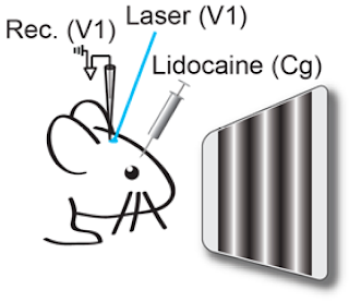
To examine the circuit mechanism of top-down modulation in mouse brain, Zhang et al. first identified neurons in the frontal cortex that directly project to visual cortex by injecting fluorescent latex microspheres (Retrobeads) into V1. They found numerous retrogradely labeled neurons in the cingulate area. To visualize the axonal projections from cingulate excitatory neurons, they injected adeno-associated virus [AAV-CaMKIIα-hChR2(H134R)-EYFP] into the cingulate.

Center-surround modulation of visual cortical responses induced by Cg axonstimulation after blocking antidromic spiking of Cg neurons

They discovered that somatostatin-positive neurons strongly inhibit pyramidal neurons in response to cingulate input 200 μm away. That they also mediate suppression by visual stimuli outside of the receptive field suggests that both bottom-up visual processing and top-down attentional modulation use a common mechanism for surround suppression.

Citation and link: Long-range and local circuits for top-down modulation of visual cortex processing. Siyu Zhang, Min Xu, Tsukasa Kamigaki, Johnny Phong Hoang Do, Wei-Cheng Chang, Sean Jenvay, Kazunari Miyamichi, Liqun Luo, and Yang Dan Science 8 August 2014: 345 (6197), 660-665. [DOI:10.1126/science.1254126]

Saturday, August 9, 2014

Photon Hunting in the Twilight Zone

Deep in the twilight zone of the ocean, small, glowing sharks have evolved special eye features to maximize the amount of light they see, researchers report this week in PLOS ONE. The scientists mapped the eye shape, structure, and retina cells of five deep-sea bioluminescent sharks, predators that live 200 to 1000 meters deep in the ocean, where light hardly penetrates.

The sharks have developed many coping strategies. Their eyes possess a higher density of rods than those of nonbioluminescent sharks, which might enable them to see fast-changing light patterns. Such ability would be particularly useful when the animals emit light to communicate with one another. Some species also have a gap between the lens and the iris to allow extra light in the retina, a feature previously unknown in sharks.

Claes JM, Partridge JC, Hart NS, Garza-Gisholt E, Ho H-C, et al. (2014) Photon Hunting in the Twilight Zone: Visual Features of Mesopelagic Bioluminescent Sharks. PLoS ONE 9(8): e104213. doi:10.1371/journal.pone.0104213

In the eyes of lantern sharks (Etmopteridae), the scientists discovered a translucent area in the upper socket. The researchers suspect this feature might help the sharks adjust their glow to match the sunlight for camouflage.

I wonder if we computer nerds will evolve our visual system similarly.

Citation (Open Access):

Claes JM, Partridge JC, Hart NS, Garza-Gisholt E, Ho H-C, et al. (2014) Photon Hunting in the Twilight Zone: Visual Features of Mesopelagic Bioluminescent Sharks. PLoS ONE 9(8): e104213. doi:10.1371/journal.pone.0104213

Tuesday, July 29, 2014

Traffic Lights and Visualization


Photo Attribution: Helgi Halldórsson

From Susanne Tak and Alexander Toet comes "Color and Uncertainty: It is not always Black and White" which finds that:

'A 'traffic light' configuration (with red and green at the endpoints and either yellow or orange in themiddle) communicates uncertainty most intuitively. '

A video presentation is also online.


Thursday, July 17, 2014

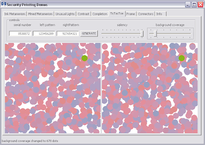
Tic-tac-toe patent 8,770,625 in color

As noted on lines 23 and 24 in column 4 of the printed version of patent 8,770,625,
the U.S. Patent Office procedure discourages the use of color drawings. This makes Fig. 4 a little hard to visualize for the non color scientist (there are no color figures in Wyszecki & Stiles), so here it is in color (right pane):

Figure 4 of US patent 8770625

The invention is relatively simple. The general field is anti-counterfeiting as it applies to packaging. Professional counterfeiters have no problem faking ordinary measures like serial numbers and holograms, so the trick is to embed information that cannot easily be perceived by a counterfeiter, hence is omitted in the facsimile. Fortunately color does not exist in nature, it is just an illusion happening in our minds. Therefore, all we have to do is to create an illusion you can only perceive if you expect it.

As described in patent 8,770,625, a number computed from the—possibly counterfeited—serial number on the package can be encoded positionally in a tic-tac-toe grid. The marking is just above the visual threshold, so the naive counterfeiter will reproduce the same pattern on all packages. The trained inspector can then quickly assert whether an actual positional code corresponds, for example, to the possibly fake serial number.

Patent 8,770,625 is relatively short with just three claims, but reducing it to practice is a little tricky, even when all the steps are disclosed in the patent. The difficult part is to design the tool to determine experimentally the visual thresholds for the print process being used and the light conditions under which the inspections are expected to happen. You need to be skilled in the art.

The above figure is a screen-shot of that tool. To implement it you need to write a spectral color management system with CIE colorimetry to simulate the press on the display and vision colorimetry to model what the actual human visual system perceives. The details of the controls are explained in patent 8,770,625.

Depending on your viewing conditions, the above color version of Fig. 4 might be under the visual threshold. If that is the case, in the figure below we crank up the saliency and decrease the background coverage, so you will see the encoding for sure. If you have aliasing problems, you can click on the figures to display them at the original resolution in which they were created eight years ago, early July 2006 (time flies).

a more salient alternate to figure 4 of US patent 877,625

Wednesday, July 16, 2014

Why peacocks have eyespots on their feathers

"BIRD PARK 8 0189" by Myloismylife - LOKE SENG HON - Own work by uploader - LOKE SENG HON. Licensed under Creative Commons Attribution-Share Alike 3.0 via Wikimedia Commons - http://commons.wikimedia.org/wiki/File:BIRD_PARK_8_0189.jpg#mediaviewer/File:BIRD_PARK_8_0189.jpg"BIRD PARK 8 0189" by Loke Seng Hon (Own work) via Wikimedia Commons

Charles Darwin ventured that the magnificent trains on male peacocks, which feature ornamental eyespots called ocelli, evolved because of sexual selection. He speculated that there was a single origin, which sexual selection then enhanced. A new genetic study of peacocks and closely related pheasants found that this trait appears in some birds but not others, which suggests that it independently evolved repeatedly.

Article: Keping Sun, Kelly A. Meiklejohn, Brant C. Faircloth, Travis C. Glenn, Edward L. Braun, and Rebecca T. Kimball: The evolution of peafowl and other taxa with ocelli (eyespots): a phylogenomic approach. Proc. R. Soc. B September 7, 2014 281 1790 20140823; doi:10.1098/rspb.2014.0823 1471-2954

Friday, July 11, 2014

Red and Romantic Rivalry

Viewing another woman in red increases perceptions of sexual receptivity, derogation, and intentions to mate-guard.

Woman worker dressed in red in the Douglas Aircraft Company plant 1942

Research has shown that men perceive women wearing red, relative to other colors, as more attractive and more sexually receptive; women’s perceptions of other women wearing red have scarcely been investigated. Adam D. Pazda, Pavol Prokop and Andrew J. Elliot hypothesized that women would also interpret female red as a sexual receptivity cue, and that this perception would be accompanied by rival derogation and intentions to mate-guard. Experiment 1 demonstrated that women perceive another woman in a red, relative to white, dress as sexually receptive. Experiment 2 demonstrated that women are more likely to derogate the sexual fidelity of a woman in red, relative to white. Experiment 3 revealed that women are more likely to intend to guard their romantic partner from a woman wearing a red, relative to a green, shirt. These results suggest that some color signals are interpreted similarly across sex, albeit with associated reactions that are sex-specific.

Adam D. Pazda, Pavol Prokop, and Andrew J. Elliot: Red and Romantic Rivalry: Viewing Another Woman in Red Increases Perceptions of Sexual Receptivity, Derogation, and Intentions to Mate-Guard. Pers Soc Psychol Bull 0146167214539709, first published on July 11, 2014 doi:10.1177/0146167214539709

Wednesday, July 2, 2014

Venture capital

We used to talk about the Silicon Valley, but nowadays it seems more appropriate to talk about that triad comprising San Francisco, the Peninsula, and San Jose. People prefer to talk about the Bay Area, but that includes too much "regular economy" to define correctly the locus of the current gold rush.

The previous gold rush was about the commercialization of the Internet and was called the .com boom. Today's rush is nicknamed Web 2.0, but it is much less of a technology rush. While .com came after the end of the cold war and the end of research labs spilling redundant scientists and researchers to fill the cubicles of technical entrepreneurs, Web 2.0 is much more about business.

The analogy is with patents. Gold diggers take an old business idea, add the word computer, get a patent, then sue the incumbents for patent infringement and get away with plenty of dollars.

In the real economy, the Web 2.0 entrepreneurs come up with an idea for a service that can be implemented on the Web. Today's various cloud providers make this very cheap and simple. The monetization consists in giving the impression that the service is free. In reality, the customers are used to crowd-source information by coaxing them to provide detailed information about themselves. This information can then be sold to one of the more than a thousand personal information brokers operating in the USA.

Recently, companies have been valued at up to $100 per customer, which is very high. Accordingly, investors are poring billions of dollars into this area. Because this is gambling and speculation, the amount of money is not a good indicator of the real economy here.

I tried to look at a more conventional technology, namely the storage industry. My data is just accumulated from press releases and is not authoritative nor complete, because I have not gathered it systematically. However, here it is:

On the abscissa we have funding dates, categorized by quarters. On the ordinate we have companies related to storage (my apologies for mistakes). Each point is an investment round. The diameter represents the accumulated funding so far of the company. You can click on a ball to see the details.

When there is a long horizontal line of regularly spaced balls of the same diameter, the start-up is not really taking off. When the diameter is rapidly increasing, the company is getting a lot of interest from the investors.

We see that as we move forward in time, many more companies are getting funded and some companies are real winners. This is a good sign, because it means that investors are not just gambling their money on social network companies but also investing in the nut and bold technologies that allow for a healthy sustainable future-oriented economy.

Monday, June 30, 2014

These days the moon is made of cheese

From the remarks by President Obama at University of California-Irvine Commencement Ceremony, Angel Stadium Anaheim, California, June 14, 2014, 12:10 P.M. PDT.

Part of what’s unique about climate change, though, is the nature of some of the opposition to action. It’s pretty rare that you’ll encounter somebody who says the problem you’re trying to solve simply doesn’t exist. When President Kennedy set us on a course for the moon, there were a number of people who made a serious case that it wouldn’t be worth it; it was going to be too expensive, it was going to be too hard, it would take too long. But nobody ignored the science. I don’t remember anybody saying that the moon wasn’t there or that it was made of cheese.

Official transcript of the remarks: The White House Office of the Press Secretary

President Barack Obama

Thursday, June 26, 2014

Appearance of flamingos reloaded

A few years ago we mused on the color appearance of flamingos:

Now Daniel B. Thomas, Kevin J. McGraw, Michael W. Butler, Matthew T. Carrano, Odile Madden and Helen F. James have studied the issue in general for plumed animals and more importantly, over time.

They visually surveyed modern birds for carotenoid-consistent plumage colors. They then used high-performance liquid chromatography and Raman spectroscopy to chemically assess the family-level distribution of plumage carotenoids, confirming their presence in 95 of 236 extant bird families. Using their data for all modern birds, they modeled the evolutionary history of carotenoid-consistent plumage colors on recent supertrees. Results support multiple independent origins of carotenoid plumage pigmentation in 13 orders, including six orders without previous reports of plumage carotenoids. Based on time calibrations from the supertree, the number of avian families displaying plumage carotenoids increased throughout the Cenozoic, and most plumage carotenoid originations occurred after the Miocene Epoch (23 Myr). The earliest origination of plumage carotenoids was reconstructed within Passeriformes, during the Palaeocene Epoch (66–56 Myr), and not at the base of crown-lineage birds.

Link to the paper: Ancient origins and multiple appearances of carotenoid-pigmented feathers in birds

Tuesday, June 24, 2014

Portraits reveal rare disorders

Doctors faced with the tricky task of spotting rare genetic diseases in children may soon be asking parents to email their family photos. A computer program can now learn to identify rare conditions by analysing a face from an ordinary digital photograph. It should even be able to identify unknown genetic disorders if groups of photos in its database share specific facial features.

Read the article in the New Scientist: Computer spots rare diseases in family photos

Friday, June 20, 2014

Staring at computers all day alters your eyes

As a color scientist you already know that you have to position your display and chair combination so that the top bezel is at the same height as your eyes. The reason is so your eyes are not wide open and dry out. You also avoid sticking a personal fan in the display's USB port and tilt the display face slightly down so you cannot see light fixture reflections.

To my surprise, although this is usually explained in the ergonomics booklets shipping with computers, this is not generally known and scientists can still get research grants to study it (The Osaka Study):

The data obtained in the present study suggest that office workers with prolonged VDT (visual display terminal) use, as well as those with an increased frequency of eye strain, have a low MUC5AC (mucin 5AC) concentration in their tears. Furthermore, MUC5AC concentration in the tears of patients with DED (dry eye disease) may be lower than that in individuals without DED.

Citation: Uchino Y, Uchino M, Yokoi N, et al. Alteration of Tear Mucin 5AC in Office Workers Using Visual Display Terminals: The Osaka Study. JAMA Ophthalmol. Published online June 05, 2014. doi:10.1001/jamaophthalmol.2014.1008.

The paper costs $30, but you can read the current JAMA issue for free if you register.

Thursday, June 19, 2014

Friedrich Miescher

James Watson and Francis Crick may be the names most associated with DNA, but many people were involved significantly in the study of DNA. Most famously, British biophysicist and X-ray crystallographer Rosalind Elsie Franklin (25 July 1920 – 16 April 1958) took the X-ray diffraction images of DNA which led to the discovery of the DNA double helix. According to Francis Crick, her data was key to determining the structure to formulate Crick and Watson's 1953 model regarding the structure of DNA.

DNA was first isolated by the Swiss physician Johannes Friedrich Miescher (13 August 1844 – 26 August 1895) who, in 1869, discovered a microscopic substance in the pus of discarded surgical bandages. As it resided in the nuclei of cells, he called it "nuclein." He intuited that the molecule played a role in heredity, but did not believe that a single molecule could lead to a huge variety of individuals and species, says Ralf Dahm, of the Institute of Molecular Biology in Mainz, Germany, who has written about Miescher's work. He says Miescher has kept a low historical profile, in part due to his "introverted" and "insecure" personality.

Earlier this year, CureVac, a company based in Tübingen, Germany, that develops RNA-based vaccines and therapies, won a €2 million prize for innovation from the European Union and announced plans to use some of that money to restore the University of Tübingen lab where Miescher made his discovery. Together with the university, the firm wants to transform the lab, the former kitchen of the old town's medieval castle, into a public exhibition about his work and legacy. (The university now uses the space as a computer room.)

Wednesday, June 18, 2014

Color facsimile flashback

Recently a friend showed me on YouTube a movie called Silicon Valley. The movie mostly introduced characters and their environment, finishing without a conclusion, so I suspect it is an episode from a TV series. The setting is a stereotype of the Web 2.0 Silicon Valley and a good part of the plot took place in a company called Hooli, a mini version of real world Google.

If you live in the Silicon Valley the movie might be boring. However, the technology the main character is supposed to have invented got my attention. It is supposed to be a lossless compression algorithm for audio files that can achieve a compression rate of 1:100. Of course, this is impossible as described in the movie, because on a stypical file the lossless compression rate using the Deflate algorithm (Lempel-Ziv followed by Huffman) is about 1:3. The description in the movie is impossible because there is not that much entropy in typical audio files.

Indeed, the writer forgot a qualifier, such as perceptually or better should have written about listening performance.

On that, my colleagues and I happen to have a couple of patents, namely US 5,883,979 A Method for selecting JPEG quantization tables for low bandwidth applications and US 5,850,484 A Machine for transmitting color images.

U.S. Patent 5,883,979 Method for selecting JPEG quantization tables for low bandwidth applications

Facsimile (fax) is an old technology for transmitting images over phone lines that is probably alien to today's readers. In analog fax, the machine consisted of a metal cylinder on which one would affix the page of a document. On the sender side, a head would shuttle in the fast scan direction and at the end of the cylinder the head would shuttle back while the cylinder rotates by one scan line in the slow direction. During the first shuttle, a photosensor in the head would produce a sound in the phone line each time it encounters a black photosite.

At the receiving end, a similar machine would move synchronously and each time a sound arrives in the phone line, it would produce a spark that would burn a dark spot in the paper.

This process was extremely slow, so it would be used only for dense documents. For text documents one would retype the document on a telex machine, which produces a legally valid copy of the text.

Forty years ago I was using fax all the time. When as a field engineer I had an OS crash I could not figure out, I would print out the core dump as a hexadecimal string and fax it from Zürich to Goleta, where the R&D division was. At the time email was not encrypted and people at any forwarding node could and did read the messages. Furthermore, telex was a European thing that was not commonly used in the USA.

A revolution happened in 1964, when Xerox invented the telecopier, which was based on a digital fax technology. The machine would convert the photosites into zeros and ones and store them in a buffer as a digital string. This string would be compressed before being transmitted. There was a hierarchy of compression algorithms that could use 1-d , 2-d coding schemes or pattern matching, with names like MH (ITU T.4), MR, MMR (T.6) and JBIG (T.85).

Having a digital signal that can be compressed with mathematical algorithms, the transmission time dropped dramatically from an hour to under two minutes per page with a typical 9600 baud modem of the time. A dozen years after the Xerox telecopier, Japanese companies were producing very affordable fax machines that became ubiquitous. In Japan, every household had a fax machine, because you could handwrite kanji text on a sheet of paper and fax it, while typing kanas was rather slow.

In 1994 I joined a team inventing the color fax technology. The international effort took place under the ITU umbrella as T.42. For the color encoding we used CIELAB, because being perceptually uniform it allowed the most compact representation. For the spacial encoding we used JPEG.

Compression methods used in color fax

At that time, digital color imaging was still in its infancy (in Windows 3.1 you could only have 16 device colors by default) and the early inkjet printers were fuzzy, as were the early color scanners of the time. The signal processing researchers on the team applied spacial filters to improve the quality of the images, but this actually made the images look worse because the compression artifacts were being amplified.

Artifacts in color fax text

I had the crazy idea of transforming the sharpening algorithm itself to the cosine domain. There the sharpening function could be expressed as a transformation of the DQT, or the quantization tables for the 64 kernels of the discrete cosine transform. We called this image processing in the compressed domain and essentially it consisted in lying about the DQT. For the JPEG encoding we used DQTs optimized for the input image, while the DQT included in the JPEG image was a transformed DQT including the sharpening. This is the essence of patent US 5,850,484.

Office documents consist of a combination of text and image data or mixed raster content (MRC, see here), so we would segment the document stripe by stripe and compress the foreground for example with JBIG, the mask with MMR and the background with JPEG. The ITU standards were T.44 for MRC and T.43 for JBIG in CIELAB.

Even so, transmitting the test targets (e.g., 4CP01) over a 9600 baud line would take 6 minutes per page, which in 1994 was considered unacceptable. At that time the experience was that when a device transitions from black-and-white to color, the price could be at most 25% more and the performance would have to be the same. We felt that a color fax could not take longer than 2 minutes per page on a 9600 baud connection. We achieved 90 seconds.

This prompted us to investigate perceptually lossy compression. In lossless compression, after decompression we obtain exactly the same data as in the input file. In perceptually lossless compression like JPEG or MPEG-2 Audio Layer III (a.k.a. MP3), after decompression we obtain less data, but we cannot perceive the difference. In other words, we leave out the information we cannot perceive anyway. The cosine transform makes the discretization straightforward.

This is like in color encoding we can transform the images to the CIELAB color space because it is perceptually uniform and one unit corresponds approximatively to a JND (just noticeable difference), so we can discretize from floating point to integer without perceiving a difference.

Staying with color, the next step is to further discretize the colors, so that we can perceive a difference (perceptually lossy), but it does not impair our ability to make correct decisions based on the degraded images. This had led us to color consistency and using color names to compare colors. This is related to cognitive color and categorization.

The analogue for the text in mixed documents is reading efficiency, i.e., our reading performance is not reduced based on reading speed or the ability to ready without errors. This is covered by patent 5,883,979, which I explained in this SPIE paper:

Giordano B. Beretta ; Vasudev Bhaskaran ; Konstantinos Konstantinides and Balas R. Natarajan "Perceptually lossy compression of documents", Proc. SPIE 3016, Human Vision and Electronic Imaging II, 126 (June 3, 1997); doi:10.1117/12.274505; http://dx.doi.org/10.1117/12.274505.

perceptually lossy compression

This is a long explanation and you cannot do it in a movie, but at least the script writer should have added the qualifier perceptual in the algorithm name and it would all have been more plausible.

Epilogue

If the invention is sufficiently novel that it can become the basis for a plot in a Hollywood movie twenty years later, why was my professional career a failure? As it happens, 1994 was also the time when the Internet became available to the general public and everybody went on email. An email attachment is more convenient than having a separate fax machine, especially in a crammed Japanese house. Also, the Internet was running on fiber to the home (FTTH) instead of the slow copper phone lines of the phone and fax.

Timing is everything.

Sunday, June 8, 2014

藍 versus 青 compared to 綠

Jingyi Gao has completed the dissertation: "Basic Color Terms in Chinese: Studies after the Evolutionary Theory of Basic Color Terms" which has as in its abstract the following summary:

The present dissertation researches basic color terms in seven historical and three contemporary lects (i.e., language varieties) of the Sinitic (i.e., Chinese) language family (commonly understood as Chinese languages in the West) with reference to the two main conceptions of the evolutionary theory of basic color terms: (1) The evolutionary trajectories of basic color terms (Berlin & Kay 1969: 2–3; Kay et al. 2009: 10–11, 30ff.); and (2) the composite color categories (Kay 1975; Kay et al. 1991: 15). The present studies of this dissertation has two main parts: (1) A philological portion on two themes (1.1) the basic color terms for black, white and red in Chinese lects; and (1.2) the official colors of Chinese regimes; (2) An experimental portion on the basic color terms in Mandarin Chinese.

Thursday, June 5, 2014

3D print of van Gogh's ear

Vincent van Gogh self-portrait with bandaged ear, 1889

The German artist Diemut Strebe used a 3D printer at a Boston hospital to create a replica of Vincent van Gogh's ear. Strebe said the copy of the ear uses DNA material from Lieuwe van Gogh, the great-great-grandson of Theo Van Gogh, Vincent's brother.

The artifact is on display at the Center for Art and Media in Karlsruhe, Germany through July 6.

Source: Los Angeles Times

Sunday, May 18, 2014

Old telecoms should be let to die

Today's techno-melodrama is on the damage old incumbent telecoms like AT&T are doing to the American economy by reducing our efficiency as their customers. We should just let them die of natural causes and move our service as soon as we can to newer technologically savvy companies.

In 1984, when I started working at Xerox PARC, I did not get a plain old telephone. Instead, at PARC we were using the Etherphone, which was packet based instead of being circuit based like plain old telephone service (POTS). We were wearing active badges, so the Etherphone system knew where we were in the building. When a phone call came in (this was before robocalls) the system would transfer the call to the nearest phone and play our personal tune (Doug Wyatt had skillfully arranged a Beethoven Prélude for my tune). To make a call, you could either dial a number, or just type "phone jane doe" in a command tool viewer and the Etherphone would look up Jane's number in the phone book and initiate the call.

Not being a great communicator, at home I have kept living for the last 30 years with the same anti-diluvial POTS from Ma' Bell. This was until May 7, 2014 when I made the bad decision to switch to AT&T's voice over IP (VoIP) service. More precisely, the bad part of the decision was to stay with that moribund dysfunctional colossus that is AT&T. I should have done my homework and switched to one of the new skilled VoIP providers.

I am not using the phone a lot, so at first I did not notice the line had been cut by AT&T for a couple of days. It was only when my roommate noticed that I was no longer getting robocalls (that theater of the absurd where the computer of a solicitor illegally calls the computer of my AT&T digital answering machine and bizarrely tries to sell to it some useless service such as carpet steam cleaning), that I checked if a phone was off the hook and noticed the line was dead.

Indeed, that same day on May 7 AT&T had promptly disconnected my landline, but instead of giving me VoIP, they switched my number to a service they call "AT&T Wireless Home Phone" which is run by their subsidiary Cingular Wireless, as their service people keep calling it. In my house I get zero to one bars on AT&T wireless, so I am not interested in that. Also, they gave me the Uverse equipment for VoIP, not the Wireless Home equipment.

So far, I have made three trips to the AT&T store in Palo Alto and I have been on the phone literally for several days with a number of people in AT&T’s support organizations (they have several and they do not talk to each other: they are dysfunctional). However, except for once for a few hours last Saturday’s morning, AT&T has not been able to restore my phone service.

This is where companies like AT&T are recklessly damaging the American economy. The life task of us scientists and engineers is to invent technologies that make society more efficient. The task of service companies is to deploy these technologies so general wealth is increased and we get to live in a better world.

Dysfunctional companies like AT&T not only prevent us from becoming more efficient: through their dysfunction they prevent us from doing our work and therefore they are a dead weight to society by slowing down its productivity.

AT&T Chairman, Chief Executive Officer and President Randall L. Stephenson

AT&T is a $127 billion conglomerate led by Chairman, Chief Executive Officer and President Randall L. Stephenson. Obviously, he does not know how to run an efficient organization. Maybe the campaign "It Can Wait" for which he is famous refers to his inability to integrate the companies making up his conglomerate.

According to the target compensation table on page 44 of AT&T’s 2014 proxy statement, Mr. Stephenson’s total target compensation is $20,600,000 per annum. Assuming Mr. Stephenson works 48 weeks a year and shows up five days a week, he works 240 days a year. Therefore, he makes over $85,833 a day.

So far, Mr. Stephenson wasted 11 days of my life, so he owes me already $944,163. To be honest, he does not owe this money to me but to my employer, because for 11 days so far at work I could only type with one hand since the other hand holds my phone while I am on calls with his various disconnected support services. In my free time I cannot relax to recharge my batteries to get back to work in good shape. Instead I have to interact with powerless AT&T employees.

I am sure this is not only happening to me but to thousands of AT&T customers. When we tally up the wasted time using Mr. Stephenson’s total target compensation, we get a significat number of the economic damage this causing to our society in terms of dollars.

Could Mr. Stephenson just be an innocent victim of a broken system? No! In January 2000, I spent $4,500 ($6,135 adjusted for inflation) to run an underground conduit from the utility box in the sidewalk to the service entrance in the back of the house. The City of Palo Alto had us put in the pipe because they had run an optical fiber cable in our neighborhood’s street as part of their Fiber to the Home (FTTH) project.

After the first 90 or so houses got hooked up with a 100 mbps Internet connection, the City turned off the light in the FTTH cable. This was because AT&T and Comcast had sued the City on this initiative and the City determined it did not have the financial means to fight out a battle in court. This proves that the AT&T executives are not innocent bystanders. Rather, they are ruthless bullies.

When I commute to work, I do not take the Ford street or the General Motors street and pay them a fee of $300 per month for their service. Rather, the respective governments own and maintain the various road communication systems like the interstates, the county roads, the city roads, etc. We call them freeways and we pay them through various taxes, fees, and tolls.

Today the Internet has the same economic importance as the road transportation system. It is time for the various governments to exercise their eminent domain rights and take the communications infrastructure over from inept private companies unable to provide a dependable service.

In light of the 2000 Watt Society, it would make sense to tax the consumption of electric energy to finance the Internet infrastructure, because of the energy footprint of the digital economy. To pay for the necessary new infrastructure investments, the government can levy installation fees, tolls on expensive usages, etc.

Like in road transportation the government provides the freeways but not the cars or the gasoline, the role of ISPs and content providers can be left open for competition to the many skilled new companies that know how to run communications services efficiently.

For example, my current ISP is AT&T, but they outsource the service to Yahoo!, which could provide me the ISP service directly. Similarly there are many efficient content providers and telecom providers that can do this much much better than the old companies. Examples are Amazon, Apple, Facebook, Google, Hulu, Netflix, Ooma among the most well known ones.

Let us jump ship from the old companies that are no longer able to provide reliable and affordable services. We do not need people making more than $85,000 a day while not delivering. Let them go back into the trenches and splice optical fiber cables.

In the meantime, I am incommunicado, so if you want to reach me, either come to my door or send a carrier pigeon.

Friday, May 16, 2014

Color-coded pedestrians in Shibuya

NTT Docomo Inc. made a computer simulation visualizing what would happen if 1,500 pedestrians walked across the famous crossing in front of Shibuya station in Tokyo while texting: only 36% would make it across safely.

The pedestrians are color-coded by departure point and walk at 3, 4, or 6 km/h. They all have average height and weight, i.e., 160 cm resp. 58 kg. The model further assumes that texting reduces the vision range by 80% to 1.5 m. The green light lasts 46 seconds.

The result shown in the simulation is that only 547 pedestrian crossed without accidents. The others collided and either had to stop to apologize, fell, or dropped their phones.

Tuesday, May 13, 2014

Commuting to work

For most of my life I have been lucky to work just 3 km from home, so I have not been exposed too much to the commuting woes. For example, when I arrived in the Silicon Valley, the 101 freeway had two lanes in each direction separated by a wide median strip planted with oleanders. Over the years, the median strip has disappeared and 101 became a freeway with four crowded lanes in each direction. For the last two or three years, a fifth auxiliary lane is being added in each direction in the portion between Marsh Road (Facebook) and 85 (Google, LinkedIn, Microsoft), so I have heard a lot of yammer from my coworkers.

For the past year I have been a commuter myself, barreling down 23 km to the San Jose airport every day. Unfortunately there is no usable public transportation, so I am condemned to this daily freeway maltreatment. It starts after 2 km, when I enter 101 on Embarcadero, where about 20% of the drivers illegally cross two double lines at a 90º angle to force themselves in a passing lane before the actual freeway entrance, while pushy Gbusses force themselves from the high occupancy vehicle lane to the exit lane and a few 100 m later a slew of cars try to make a –90º turn from the leftmost lane to the San Antonio Road exit.

During the past year I have tried to develop a driving model that would reduce my stress, but not very successfully. Last Saturday finally was able to see a sophisticated model in action and it was an eye-opener: I got to ride a Google Car from the Googleplex down 101 to the 280 interchange and back.

Sitting behind the "driver" I had a good view of the laptop on the lap of the lady in the front passenger seat, displaying the car's model of the surroundings based on the lidar spinning on top of the car and also a radar in the front of the car, an inertial sensor in the rear wheel axis and last but not least on countless hours of tweaking the model based on the feedback of skilled professional drivers like Anja—our pilot on this trip—who rides full-time for her work.

On the console we see the freeway lanes, our projected route, and the surrounding vehicles. When a vehicle creates a dangerous situation, it is marked with a danger sign. The model recognizes the lights of emergency vehicles and can pull over according to the law. However, it ignores other car's blinkers. In fact, the American driving culture is that the other drivers are your enemies and you do not want to warn them by letting your intentions to be known: the blinker is either never turned on or left blinking.

While as a human I can model a few cars around me, Google's algorithm can model many cars around our self-driving car, in all directions. When our car gets in the blind spot of another car, the icon of that car is flagged with a danger sign. With a surprising frequency, the flagged cars cut us off at a dangerously close distance. Since I am not driving, I can look in the offending cars and can never see those drivers turning their heads to check the clearance. Therefore, they are all driving erratically without looking, resulting in the car being cut off, breaking and propagating this backwards to the following cars.

Like computers can beat humans at chess because they can predict a larger number of steps, Google's car is better than human drivers because it can by far model more vehicles than a human can. Yet, humans are too stupid and reckless for Google's algorithm to be completely foolproof. For example, at one point in Santa Clara we were in the right lane and a big truck tried to pass us driving above the speed limit and on the shoulder. Our pilot Anja recognized, maybe from the truck's exhaust fumes, that he did not have enough torque to pass us and the shoulder turned into a ditch a few meters further ahead. This would have left the truck driver to either go full speed into the ditch or ramming us, so she floored our brakes.

Those reckless drivers are in part professional drivers who spend their working day on the freeway driving trucks, taxis, limos, etc. This indicates that most humans are unfit to drive cars.

But are driver-less cars the answer? When I was a teenager, I thought that by 2014 I could fly to the moon with TWA or PanAm and get to Paris in a couple of hours on a Trans Europ Express (TEE). It would never have crossed my mind that in 2014 I would be driving a car on a freeway full of incompetent erratic drivers.

The mistake being made by the Caltrans agency is to build those auxiliary lanes. Instead, they should have built a train like the S-Bahn on that old median strip. A skilled professional train driver could get me to work in a few minutes, safely and without stress.

Monday, April 7, 2014

Sony to bring 4K tech to surveillance cameras

If the recent flow of billions of dollars in VC capital into the data storage and analysis industry is any indication, we have evolved into compulsive data packrats. However, even billions of people cannot type all the data we hoard. It takes color imaging to produce exabytes of data. Millions of selfies and cat movies contribute to the data stash, but only machines can create "new" data at exabyte scale.

One of the most prolific kind of data generation machines are the surveillance video camera systems. With the relentless widening of the social gap, a larger proportion of the population is evolving into desperate sub-proletarians with nothing to lose. This increases home robberies and is triggering a boom for home video security systems.

On February 25 we wrote on purple disks from Western Digital (the corresponding disks from Seagate have a turquoise label) optimized for surveillance video. Unfortunately, the images the police sends to the neighbors asking for help in identifying thieves are often too blurry to clearly recognize a perpetrator.

Around 2015, Sony plans to put its 4K-resolution technology in its surveillance cameras, which will boast significantly improved picture quality. Even zoomed-in images will appear sharp. Larger CMOS sensors will be employed, and software to make effective use of the images will be developed.

This quadrupling of video image resolution will be a bonanza for the data storage industry, as the global market for surveillance cameras will grow from ¥700 billion in 2013 to nearly ¥1 trillion in 2015 ($6.791 billion to $9.402 billion).

Nikkei article

Thursday, April 3, 2014

Half of the United States is glowing a bright pinkish red

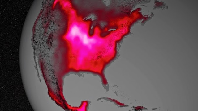
Data from satellite sensors show that during the Northern Hemisphere's growing season, the Midwest region of the United States boasts more photosynthetic activity than any other spot on Earth, according to NASA and university scientists.

Healthy plants convert light to energy via photosynthesis, but chlorophyll also emits a fraction of absorbed light as fluorescent glow that is invisible to the naked eye. The magnitude of the glow is an excellent indicator of the amount of photosynthesis, or gross productivity, of plants in a given region. In the image below, the color red was applied to the illustration to represent the glow.

Image Credit: NASA's Goddard Space Flight Center

Research in 2013 led by Joanna Joiner, of NASA's Goddard Space Flight Center in Greenbelt, Md., demonstrated that fluorescence from plants could be teased out of data from existing satellites, which were designed and built for other purposes. The new research led by Luis Guanter of the Freie Universität Berlin, used the data for the first time to estimate photosynthesis from agriculture.

According to co-author Christian Frankenberg of NASA's Jet Propulsion Laboratory in Pasadena, Calif., "The paper shows that fluorescence is a much better proxy for agricultural productivity than anything we've had before. This can go a long way regarding monitoring – and maybe even predicting – regional crop yields."

Unlike most vegetation, food crops are managed to maximize productivity. They usually have access to abundant nutrients and are irrigated. The Corn Belt, for example, receives water from the Mississippi River. Accounting for irrigation is currently a challenge for models, which is one reason why they underestimate agricultural productivity.

NASA press release: Satellite Shows High Productivity from U.S. Corn Belt

PNAS paper: Global and time-resolved monitoring of crop photosynthesis with chlorophyll fluorescence

Friday, March 21, 2014

3D print selfie

Sony Music Communications Inc. started selling the 3-D Print Figure product last year in which a figure is sculpted using full-color 3-D scanners. To create the figure, the scanner first obtains data through the scanning of a person from head to toe.

Then a computer models the data and outputs images through a 3-D printer using color ink, special bonding materials and white plaster powder. The price for a figure ranges from ¥49,000 to ¥120,000 ($600–$1500), depending on the size. According to Yosuke Takuma, who planned this business for Sony Music Communications, these 3-D figures are popular among people who want to mark such special occasions as weddings and matriculation ceremonies.

Koji Iwabuchi and his wife Yumi visited the studio from Suginami Ward, Tokyo, to order figures to commemorate their 20th wedding anniversary. “It’s like photography at the end of the Edo period as we cannot move at all,” Koji Iwabuchi said. “It’s interesting to feel like Ryoma Sakamoto. In the future, it might become an ordinary thing, but it’s fun that few people have experienced this,” he said. Ryoma Sakamoto (1836-1867) is known as the subject of some famous photos from that time.

Article with pictures

Thursday, March 20, 2014

Hyphenation of color compounds

In computer technology, the golden rule for hyphenation of new technology terms is to write them as separate words when they are first coined, as hyphenated words when they are widely used in the technology community, and as monolexemic terms when the terms are widely used by the general population. For example, in the Sixties we had electronic mail, in the Seventies we had e-mail, and around 1993 when the Arpanet was commercialized and renamed to Internet everybody went on email.

This rule is pretty simple to remember. For color compounds the situation is a little sticky, because if changed significantly in the 16th Edition of The Chicago Manual of Style. According to rule 7.85, section 1, under colors (page 375), the new rule is that in the manner of most other such compounds, compound adjectives formed with color words are now hyphenated when they precede a noun. They remain open when they follow the noun.

Examples:

  • emerald-green tie
  • reddish-brown flagstone
  • blue-green algae
  • snow-white dress
  • black-and-white print

but

  • his tie is emerald green
  • the stone is reddish brown
  • the water is blue green
  • the clouds are snow white
  • the truth is not black and white

While we are at it, rule 7.76 regarding the capitalization of “web” and “Internet” also changed. Chicago now prefers web, website, web page, and so forth—with a lowercase w. But capitalize World Wide Web and Internet.

Since files are now more important than colors, Chicago prefers to present abbreviations for file formats in full capitals. Therefore, write PDF instead of pdf, even when usually we use the latter when we actually specify file names.

More Chicago capitalization examples:

  • Macintosh; PC; personal computer
  • hypertext transfer protocol (HTTP); a transfer protocol; hypertext
  • Internet protocol (IP); the Internet; the net; an intranet
  • the Open Source Initiative (the corporation); open-source platforms
  • the World Wide Web Consortium; the World Wide Web; the web; a website; a web page

Returning to the opening, although nobody younger than 21 years of age has ever experienced a world without email, on page 380 the over twenty-one-year-old white-haired Chicago people still prefer e-mail and e-book.

Glass brain flythrough

This video gives viewers a colorful peek into the complex workings of the human brain as it thinks. In this case, we are “flying through” the brain of a volunteer who is been asked to simply open and close her eyes and hands, National Geographic reports. This 3D brain visualization was created by researchers at the University of California (UC), San Francisco, and UC San Diego with a combination of technologies, including an MRI scan, EEG and diffusion tensor imaging, a process that reveals tissue layout. Known as the Glass Brain, the imaging technology works in real time and may be used to learn more about how the human mind processes information.


Click here for more information

Tuesday, March 18, 2014

Traps in big data analysis

When I was a student, I had chosen mathematical statistics as one of my majors. At the time, the hot topics were robust statistics, non-parametric methods and optimal stopping times. Descriptive statistics was not part of the curriculum (PowerPoint did not yet exist and there was no need for meaningless 3-D pie charts).

In the student houses I lived, there were always medical students at the end of their studies who had to get a doctorate. Residencies were grueling and at that time the least effort thesis was to punch in some historical medical data. On their way home from the clinic, these students would spend part of the night in the empty punch card rooms, for about 6 months.

Thereafter, they would bring the punch cards to the data center and get 10 to 20 centimeters of SAS printout—and the desperation of not knowing how to get from hundreds of cryptic tables to a one hundred page thesis.

Many of them ended up knocking on my door with the printout and scratching their head. Because in the data center the students could not tell what analyses they needed—after all, there never was an experimental design—the data center people just ran all and every function available in SAS. Classical garbage-in garbage-out.

So, I had to tell the students to stare at the data and come up with a few hypotheses, then use the ANOVA routines to confirm them and the regression routines to do a few nice graphs.

Unfortunately, after all these years we are not much better off. Indeed, now we have to deal also with "big data hubris," the often implicit assumption that big data are a substitute for, rather than a supplement to, traditional data collection and analysis. Now we have tools like Google Correlate that allow us to correlate tons of apples with megatons of oranges.

A recent interesting paper by David Lazer et al. is a nice summary of how big data analysis allows us to create more statistical garbage: Lazer D, Kennedy R, King G, Vespignani A. Big data. The parable of Google Flu: traps in big data analysis. Science. 2014 Mar 14;343(6176):1203-5. doi: 10.1126/science.1248506. PubMed PMID: 24626916.

The authors conclude: "Big data offer enormous possibilities for understanding human interactions at a societal scale, with rich spatial and temporal dynamics, and for detecting complex interactions and nonlinearities among variables. We contend that these are the most exciting frontiers in studying human behavior. However, traditional 'small data' often offer information that is not contained (or containable) in big data, and the very factors that have enabled big data are enabling more traditional data collection. The Internet has opened the way for improving standard surveys, experiments, and health reporting. Instead of focusing on a 'big data revolution,' perhaps it is time we were focused on an 'all data revolution,' where we recognize that the critical change in the world has been innovative analytics, using data from all traditional and new sources, and providing a deeper, clearer understanding of our world."

Thursday, February 27, 2014

Google+ Auto Backup

Google does not talk to Google, or rather I should say Picasa does not talk to Blogger. Or, whatever.

I put the images for this blog on a folder called Google+Photos on my machine, downloaded the Google+ Auto Backup app and pointed it to this folder. It only took little time, but it was wasted time.

  1. For images, Google+ Auto Backup supports only the file formats jpg, webp and gif. Hello Google, GIF is an ancient file format for 8-bit images encoded with LZW; it has long been replaced by PNG, which uses the superior Flate encoding (LZ followed by Huffman) and supports both 8-bit and 24-bit images (yes, the latter is important because light typefaces can get destroyed by anti-aliasing).
  2. The uploaded JPEG images are visible on Google+, but not in Blogger, although Blogger has a tab called Select a file From Picasa Web Albums. Hello Google, why can your Blogger app not see images uploaded by your Google+ Auto Backup app?

Tuesday, February 25, 2014

Purple disk

Last year I wrote about Western Digital color-coding their hard disk drives to make it easier to find the optimal drive for an application. We saw that blue is for everyday use (about 40 hours per week in a PC), black for high performance, green for low power, and red for NAS (continuous operation, low power, vibration tolerance, error correction, streaming).

Now Western Digital has a new line color-coded purple. Purple is similar to red: it is aimed at surveillance video and meant to be always on, be deployed in bunches (vibration control), and used for streaming (different cache optimization). Although you could use red disks for video surveillance, the purple disks have an AllFrame firmware technology that reduces video frame loss.

Seagate's corresponding Surveillance HDD line has a turquoise label.

Thursday, February 20, 2014

What is your energy footprint?

In the USA, tucked into a 1,500-page budget bill now moving through Congress is a Republican provision that would restore the incandescent light bulbs that were supposed to be phased out in favor of greener lighting technology. Defenders of the traditional bulb say the government is again overreaching, that the marketplace should decide what kind of bulbs are manufactured in the USA. Led in the House by Rep. Michael Burgess, R-Texas, Republicans got the funding cutoff provision inserted into an energy and water spending bill that President Obama signed into law in mid-January 2014.

With this freedom of conspicuous consumption, according to the Wikipedia the average USA person consumes 12,000 watts of energy. By comparison, a person in Bangladesh on the average consumes 300 watts. The world average is approximately 2000 watts. Of course, the people in Bangladesh and elsewhere in the world would like to enjoy the same conspicuous consumption as USA people, so world energy production should increase to 7,148,400,000 × 12,000 = 85,780,800,000,000 watt.

Or not.

As Dr. Marco Morosini wrote in a paper on the 2000 Watt Society, in the last decades some authors suggested to consider the opportunity of a voluntary ceiling to the amount of primary energy used per capita. Wolfram Ziegler proposed a voluntary limit in the use of primary energy in central Europe under the level of 0.16 W/m2 (Ziegler 1979; 1996); this level was based on ecological arguments and was intended to limit the anthropic pressure on biodiversity. Starting from Ziegler's arguments and data, Dürr calculated and suggested a global value of 9 TW as a voluntary limit in the use of primary energy by mankind (Dürr 1993); this level would be around one fifth of the amount of solar energy transformed by terrestrial organisms, estimated by Dürr at 40–50 TW, for a human population of 6 billions at the end of the last century, Dürr suggested consequently the vision of a "1500-watt society." Goldemberg et al. (1985; Goldemberg 2004) claimed that 1000 watt of primary energy per capita would cover "basic needs and much more." Spreng et al. (2002) suggested to steer human societies towards an "energy window," defined by a lower social limit and an upper ecological limit in the use of primary energy. In Switzerland, the idea of setting a ceiling to energy usage was formulated at the beginning of the '90s (Imboden et al. 1992; Imboden 1993). Paul Kesselring (Paul Scherrer Institute, Switzerland), and Carl-Jochen Winter (German Aerospace Research Establishment, DLR) punctually suggested a "2000-watt society" as worldwide plausible vision achievable within 50–100 years (Kesselring and Winter 1994).

Primarily through the tireless efforts of Prof. Dieter Imboden, Switzerland is now on the path of a 2000 Watt Society.

If you want to learn more on the 2000 Watt Society, the best source is the brochure Smarter Living made available by Novatlantis. A 2000 watt person would consume 17,500 kilowatt hours or 1750 liters of petroleum over the course of a year.

What is your energy footprint?

You can easily calculate this number from the information provided by your utility company. For example, in Palo Alto you go to www.CityofPaloAlto.org/HomeEnergyReports.

In my case, from 18 June 2009 to 21 January 2014 I have used on average 308 watt of electricity and 1092 watt of gas for a total of 1400 watt, so at first sight I might have reached the year 2050 goal. However, the standard deviation of my gas energy usage is 1070, so clearly the average is not meaningful and I have to look at all the data.

My problem is that in the cool season I use too much natural gas for heating. The baseline for gas are the on-demand water heater and the cooking stove, while the baseline for the electricity are the refrigerator, lighting, and the electronics. In the cool season electricity use goes up a little because the heating furnace uses an electric fan.

As explained on page 16 in the Smarter Living brochure, only 20% of the overall heating energy demand can be determined by the behavior of the building's occupants. 80% of the ultimate energy needs are determined at the planning stage of a building. In 1960, when the Swiss were using 2000 watt, I was living in a new building made of bricks, cement, insulation, double pane windows, and rolling shutters. In 2014 I live in a typical 1948 California ranch house with no insulation, so I cannot do much better. In fact, according to the utilities department I even use less natural gas than my neighbors.

The reason I use more gas energy is that my neighbor's houses are mostly newer and therefore have solid plywood walls and some insulation. By efficient neighbors, the utility department refers to the most efficient 20 percent of my immediate neighbors.

Also my electricity use is not out of line with that of my neighbors.

This means that even with the 20% savings maximally possible with a retrofit, if I really want to be a 2000 watt person in Palo Alto I would have to tear down my house and rebuild it. This might be possible in rich Switzerland, but not in the impoverished USA.

There could be a potentially different way out. In 1960 we had a very low energy use because we were 5 people living in a two bedroom apartment, while now the occupancy of the current 176 m2 three bedroom house is much lower.

Indeed, my route to work is now 23.5 km and there is no usable public transportation. My car uses about 17 liters per 100 km or 4 liters per trip. This is a lot of gasoline and I keep it lower by car-pooling and dividing the number by 2. Similarly, I could reduce my energy use at home by increasing the number of residents.

In the intrest of full disclosure, here is the data provided by the City of Palo Alto and used in the graphs above.

year month
electricity
gas
total
2009 July
265.0 W
183.3 W
448.3 W
2009 August
286.7 W
117.3 W
404.0 W
2009 September
299.4 W
248.9 W
548.3 W
2009 October
265.2 W
130.4 W
395.5 W
2009 November
300.0 W
989.9 W
1,289.9 W
2009 December
392.6 W
2,042.2 W
2,434.8 W
2010 January
322.7 W
1,095.0 W
1,417.6 W
2010 February
309.7 W
1,627.3 W
1,937.0 W
2010 March
248.9 W
1,216.6 W
1,465.5 W
2010 April
272.9 W
963.7 W
1,236.5 W
2010 May
253.8 W
364.1 W
617.9 W
2010 June
281.3 W
330.0 W
611.2 W
2010 July
321.4 W
202.3 W
523.7 W
2010 August
286.5 W
227.1 W
513.5 W
2010 September
232.9 W
209.5 W
442.4 W
2010 October
251.0 W
242.7 W
493.8 W
2010 November
261.9 W
984.0 W
1,245.9 W
2010 December
289.7 W
1,941.8 W
2,231.5 W
2011 January
322.8 W
2,265.5 W
2,588.2 W
2011 February
287.7 W
2,081.5 W
2,369.2 W
2011 March
298.5 W
1,850.0 W
2,148.5 W
2011 April
241.4 W
849.6 W
1,090.9 W
2011 May
230.0 W
293.3 W
523.3 W
2011 June
166.3 W
146.6 W
312.9 W
2011 July
204.0 W
234.6 W
438.6 W
2011 August
320.0 W
217.3 W
537.3 W
2011 September
163.8 W
293.3 W
457.0 W
2011 October
251.3 W
256.6 W
507.9 W
2011 November
254.3 W
1,466.5 W
1,720.8 W
2011 December
304.3 W
2,555.9 W
2,860.2 W
2012 January
313.8 W
2,639.7 W
2,953.4 W
2012 February
287.1 W
2,178.8 W
2,465.9 W
2012 March
281.4 W
1,969.3 W
2,250.7 W
2012 April
247.5 W
1,136.5 W
1,384.0 W
2012 May
231.4 W
251.4 W
482.8 W
2012 June
220.0 W
195.5 W
415.5 W
2012 July
214.7 W
156.4 W
371.1 W
2012 August
219.3 W
161.8 W
381.1 W
2012 September
233.8 W
110.0 W
343.7 W
2012 October
217.8 W
130.4 W
348.1 W
2012 November
224.8 W
970.9 W
1,195.7 W
2012 December
309.0 W
2,063.2 W
2,372.2 W
2013 January
655.0 W
3,629.6 W
4,284.6 W
2013 February
533.3 W
3,345.8 W
3,879.1 W
2013 March
512.6 W
2,433.3 W
2,945.9 W
2013 April
432.5 W
806.6 W
1,239.1 W
2013 May
374.3 W
377.1 W
751.4 W
2013 June
355.7 W
377.1 W
732.8 W
2013 July
351.5 W
284.4 W
635.9 W
2013 August
362.8 W
283.2 W
645.9 W
2013 September
354.8 W
264.9 W
619.8 W
2013 October
385.8 W
794.7 W
1,180.5 W
2013 November
487.4 W
2,389.8 W
2,877.2 W
2013 December
541.5 W
3,970.8 W
4,512.3 W
2014 January
418.8 W
3,482.9 W
3,901.7 W