Wednesday, December 30, 2009

Why printing?

Why was printing invented? Because of the plague. Between 1347 and 1400 waves of plague ravaged Europe, decimating the population by about 30 percent. Consequently there was a labor shortage and salaries rose.

This sparked an intensive demand for technological inventions, and printing, or more precisely moveable type, was one of them. The tedious and time consuming manual copying of documents no longer made economic sense when Hans Genssefleisch von Mentz, also known as Gutenberg, around 1400 started experimenting with type.

Fonts were just a rudimentary idea of individually carved wood blocks, but the enterpreneurial Gutenberg and a few skilled colleagues founded a financing partnership, which rised substantial capital to develop the new technology of mass-produced reusable metal font types.

It ended up taking 10 years until the venture was able to print the first documents using the new technology and sell them for a profit.

Could Gutenberg repeat his feat today?

Monday, December 28, 2009

Imaging Superatoms

A superatom is a composite of atoms, either homogeneous or heterogenous, that exhibits a similar electronic profile to a given single atom in the periodic table. Using photoelectron imaging, the figure below shows that a superatom of titanium oxide (bottom row) mimics the electron energetics of a single nickel atom (top row).


Previous experiments have shown that a cluster of 13 aluminum atoms behaves like a single iodine atom. Now, there appears to be a kind of arithmetic for superatoms. Here's how it works.

Wednesday, December 23, 2009

Another Fish Story from Justin Marshall

Cichlids [pronounced sik-lids] have several different cone opsin genes that enable them to detect light across the visible and ultraviolet regions of the spectrum. Different species express different subsets of these opsins to create alternate visual systems. Recent research has shown that cichlid fish in the clear waters of Lake Malawi expressed a wide range of opsins, with closely related species differing in whether they used the shorter wavelength or longer wavelength gene combinations.

PLoS Biology article: "The Eyes Have It: Regulatory and Structural Changes Both Underlie Cichlid Visual Pigment Diversity" by Christopher M. Hofmann, Kelly E. O'Quin, N. Justin Marshall, Thomas W. Cronin, Ole Seehausen4,5, Karen L. Carleton. (Not just another fish story)

Friday, December 18, 2009

Real Virtual Pages and Virtual Real Pages

From the in-box comes two different links to digital pages. In one case it's real virtual pages and in the other it's virtual real pages. From Udi comes a link to a set of collectible magcloud magazines relating to the movie Avatar. Which is interesting - a dynamic and timely publication of a physical artifact based on a movie largely constructed with computer graphics.


But what does this have to do with football you may be asking yourself?

Wednesday, December 16, 2009

Beet Spectrum

From Tim comes a fun site rawcolor.com which includes a page on using cabbage, beet and pumpkin juice as colorants in an inkjet printer.


What fun! But why stop with some test prints - what exactly does the spectrum of a beet look like?

Thursday, December 10, 2009

Perceptual vs. colorimetric color spaces

In yesterday's post I noted that the authors had used a perceptual color space instead of a colorimetric one for their study. What is the difference?

It is already half a dozen years ago that I was assigned a project related to metamerism. To solve the open-ended problems, I implemented an extensive library for color science. For one specific solution I used a perceptual color space based on the McLeod's approach in making calculations using cone responses.

cone and rod responses

A principal color scientist then noted that perceptual color is used in vision research, but in engineering we use CIE based color spaces. Since my library was object oriented, all I had to do was to change a single import statement so that the CIE color matching functions (CMF) would be used as measures in the integration of the spectral data, instead of the cone fundamentals.

However, this minuscule engineering change has a big theoretical effect, because the CMF cover almost the entire visual domain, while the cone responses cover only a fraction of it. Form a signal processing point of view, the result is that that CIE color spaces have more signal modulation than perceptual spaces. Numerically the effect of this change in my code was small and irrelevant for the solution, but it is a big effect in terms of the underlaying science: when writing a paper the distinction is very important.

color matching functions


Now to my question.

I inherited a manuscript from a discouraged color scientist who gave up after years of rejection. I am now revising it in the hope of having it published, because the work has archival importance. The research is based on calculations in CIELAB. One of the reviewers writes:

"I object to […] their use of CIE modeling […], given that CIE did not design those models to serve as any sort of color appearance processing framework, but rather provided them as rules for engineers who want to reproduce chromaticities across different labs.

[…]

"Based on the history of the development and use of CIE, I believe it is suboptimal to model color appearance using CIE light mixture spaces (even the ones like CIELAB that claim to be approximately perceptually uniform). That is, using appropriate CIE chromaticities to report what stimuli are used in experiments is a fine practice, but for modeling and predicting human response to color it is best to go with psychophysically modeled spaces and the associated indices like Weber contrast, Michelson contrast or RMS contrast. To the degree that you continue to model human response with the CIE engineering emphasis, I think your results may be useful for rendering color in displays, but will tell us far less about the human response of [the studied effect]. I would suggest removing any CIE modeling of human response from your report and expanding explanations based on psychophysical modeling."

The implication here is that CIE colorimetry is not based on psychophysics. If I had the raw data, I might just have recomputed all quantities using cone responses, but unfortunately the raw data appears to be lost.

The only way out of this conundrum is to fully understand the difference between perceptual models and colorimetric models, then to provide a solid explanation. At this point I am seeking either an explanation or a good pointer to something I should read and understand.

Can you help?

conceptual CMF experiment

Wednesday, December 9, 2009

Categorical color constancy for simulated surfaces

We all know about colorimetric color constancy, which for us in color imaging mostly takes the form of white point estimation and white balancing. The November 12, 2009 issue of the Journal of Vision has an interesting article by Maria Olkkonen et al. on a different kind of color constancy.

Color constancy in general refers to perceived color of objects not changing much when seen under different illuminations. In their paper Categorical color constancy for simulated surfaces, Maria Olkkonen, Thorsten Hansen, and Karl R. Gegenfurtner study the communication of color under different illuminations.

Color communication entails color naming and color naming entails categorical color. The authors start with the reflectance spectra of the Munsell color chips, calculate their tristimulus values under five different illuminations, and display them on a Sony Multiscan GDM-F520 monitor, whose gamut restricts them to limit the chips to 469 samples.

In a very diligently executed psychophysical experiment, four observers categorize each sample into one of the categories green, turquoise, blue, purple, red, orange, yellow, brown, or gray. The categories for orange and brown are pooled.

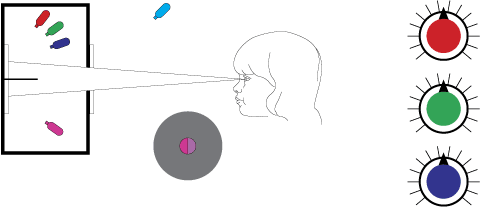
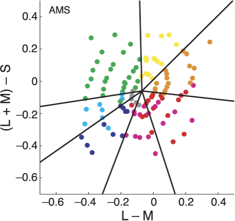
Chips with Munsell value 6 under the neutral illuminant are plotted in the isoluminant plane of DKL color space.

Since color matching is not involved, the authors are not using a colorimetric color space, but a perceptual color space, viz. the DKL color space, which is a linear transformation of the cone excitation space based on the Smith and Pokorny cone fundamentals. DKL is for Derrington, Krauskopf, and Lennie.

The observers perform the color naming experiment twice, with a 6 month hiatus, yielding a measure for the reliability of color naming. With this "calibration" the categorical color constancy is nearly perfect.

This result is important because the World Color Survey is performed under unrecorded random ambient conditions, a fact that has often been criticized. As we reported in our EI paper, Boynton wrote "the mechanisms of color constancy work so well that, within limits, the intensity and spectral distribution of the light used to illuminate the experimental materials make surprisingly little difference," but that was just an intuition. With their painstakingly rigorous experiment, Maria Olkkonen, Thorsten Hansen, and Karl R. Gegenfurtner deliver a definitive proof.

Some points to note:

  • In rigorous experiments, you can only have a small number of conforming observers (see Mavericks are best for crowd-sourcing)
  • When not doing color matching, a perceptual color space is better than a colorimetric one
  • They limit the categories to nine color terms
  • Yes Virginia, color naming via crowd-sourcing is legitimate

Wednesday, December 2, 2009

U.S. Share of World Research Community Declines

The UNESCO Institute for Statistics released a study on research last week. It provides new evidence of the global distribution of science capacity. According to the report, the number of individuals engaged in research worldwide grew from 5.8 million in 2002 to 7.1 million in 2007. As much of this growth was in developing countries, the U.S. share of the total declined from 23.2% to 20.3% and Europe's from 28.1% to 25.8%. China's share, meanwhile, grew from 14.0% to 20.1%. As a fraction of each nation's population, however, the U.S. still has more than 4.5 times as many researchers as China. The number of researchers in the developing world grew by a remarkable 56% between 2002 and 2007, while those in developed nations rose by 8.6%.

R&D investment in countries below 1.5%

At the same time, expenditure on research and development (R&D) is increasing. Globally, the percentage of GDP (Gross Domestic Product) devoted to R&D has gone up significantly in most countries. In 2007, 1.74% of the world’s GDP was devoted to R&D (1.71% in 2002). While most developing countries invest less than 1% of their GDP in R&D, there are certain exceptions such as China (1.5%) and Tunisia (1%). The average rate of expenditure in Asia reached 1.6% in 2007, influenced by the top investors: Japan (3.4%), the Republic of Korea (3.5%) and Singapore (2.6%). In contrast, India invested only 0.8% of its GDP in R&D in 2007.

These results indicate that many countries are now recognizing the importance of innovation, in the broader sense. “Policy makers seem to realize more and more that innovation is key for economic growth, to the point of setting R&D investment targets,” notes Martin Schaaper, program specialist at the UNESCO Institute of Statistics, one of the authors of the study. “China is the foremost example of a country setting a target: 2% by 2010 and 2.5% or more by 2020."

More information on the UIS study

Saturday, November 28, 2009

Mantis Shrimp Gets Fifteen Seconds of Fame

PBS is currently running a series entitled "Human Senses" and the most recent episode featured none other than our previously blogged friend and polarizing figure, the ultra-percieving mantis shrimp. It's quite something to actually see its remarkable pair of multi-channel photon detectors in action.

Mantis shrimp eyes
[Click for video and scroll to 09:02]

This episode will be repeated in the San Francisco Area tonight at 11:00PM on KQEDW (Digital 9.3). Elsewhere, check your local listings.

Tuesday, November 24, 2009

Checker This Out

Are the squares A and B the same shade of gray?


The answer is, yes! Do you need your eyes check(er)ed?

Color naming follow-up

I received some interesting feedback on the color naming tech. report. A reader implied that in traditional psychophysics experiments the informants are first screened for color vision deficiencies (CVD), and our on-line experiment fails to do that. This was felt to be a grave omission especially in light of the two recent JOSA A papers by Kimberly Jameson and Natalia Komarova: http://www.opticsinfobase.org/josaa/abstract.cfm?URI=josaa-26-6-1414 and http://www.opticsinfobase.org/josaa/abstract.cfm?URI=josaa-26-6-1424.

Postdoctoral Fellowship in Computational Categorization

The Print Production Automation Laboratory of Hewlett-Packard Laboratories in Palo Alto, California is seeking candidates for an ASEE/NSF postdoctoral fellowship in computational categorization in the area of color imaging. A brief description of this opportunity has been posted to the ASEE/NSF web site.


The position will apply experience and interests in perceptual categorization, machine learning, statistical pattern recognition, and natural computation to a sizeable, diverse and growing collection of laboratory and web-derived ground truthing databases for color imaging. Join a team working on advanced optical feedback for commercial printing and provide knowledge of multi-variate clustering, to implement software to perform computational categorization.

Sunday, November 22, 2009

Color naming: color scientists do it between Munsell Sheets of Color

Last year at the IS&T/SPIE Electronic Imaging symposium in San Jose the conference Color Imaging: Displaying, Hardcopy, Processing, and Applications started a session on controversial topics called "The Dark Side of Color." These are papers that transcend the incremental research methodology of solving a problem, proving the solution's contribution in an experiment, and reporting the result in a conference. This session consists of papers were authors go out on a limb, not afraid of intuition and speculation, and propose new paradigms.

A preprint of our contribution is now available at this link: http://www.hpl.hp.com/techreports/2009/HPL-2009-363.html.

Friday, November 20, 2009

Un nuovo libro

Studiose, storiche, giornaliste ed esperte del colore, Lia Luzzatto e Renata Pompas hanno maturato una lunga esperienza internazionale sul colore. Membre di network internazionali riconosciuti, tengono lezioni, conferenze, seminari in aziende, istituzioni e università. Oltre a centinaia di articoli e contributi in libri collettivi, hanno al loro attivo numerose pubblicazioni.

Thursday, November 19, 2009

Still Life with Sopapilla and Equations

Still digesting the technical content of CIC17. In the mean time here are some photos. Albuquerque, New Mexico has quite a few architectural gems. Here Steve is standing with one of them that has been clearly labeled.


Next is a still life with sopapilla and equations.

Mavericks are best for crowd-sourcing

Maverick is the antonym of conformist or a culturally competent person. Synonyms include: individualist, nonconformist, free spirit, unorthodox person, original, eccentric; rebel, dissenter, dissident, enfant terrible; informal cowboy, loose cannon.

When we do a psychophysics experiment the old fashioned way in a lab, we want informants that are culturally competent persons. In fact, we are very careful in writing clear instructions, make sure the informants understand them, and check they follow the rules. The experimental conditions are strictly controlled so all informants perform exactly the same experiment.

When we do a psychophysics experiment the new way on the Web using crowd-sourcing, we get all beaten up by our colleagues and our papers keep getting rejected. "You are getting all those disruptive loose cannons out there, your results are meaningless." Well, we could almost reply "consider this formula:"

mean correlation of the aggregated responses to a world standard

I have to write "almost" because James Shilts Boster started writing his paper The Value of Cognitive Diversity: The Correlation of Local Aggregates with World Standards on May 6, 2004, but then as far as I know never got around to publish it.

The formula is for the mean correlation of the aggregated responses to a world standard. rxy is the average individual informant's correlation with the world standard, rxx is the average correlation among informants on the similarity judgment task, and N is the number of informants in the pool of aggregated responses.

This formula teaches that when N is small, like in the case of the old fashioned experiment, then we get the best correlation when all informants are culturally competent. Check!

However, when N is large, like in crowd-sourcing, then each new conformist informant does not contribute much to the correlation. Instead, it is the maverick informants, or better, the disagreement among informants that allows their aggregation to closely approximate the world standard. Surprise!

With this we call all rebels, dissenters, and mavericks out there and beg them to contribute to our color naming experiment at the link of their language on this page: http://www.hpl.hp.com/personal/Nathan_Moroney/mlcn.html

Wednesday, November 18, 2009

A color never comes alone

This is a motto I was using 25 years ago. At that time I was working on VLSI design automation tools at Xerox PARC, more specifically on design rule checkers for full custom CMOS. The designers were doing so many layout errors that I could not understand how a top notch designer could do them. I had the suspicion that some of the designers could have a color vision deficiency — and 20 years later I discovered one of them is a dichromat — but that was not explaining the the type and volume of errors. I decided to investigate.

Saturday, November 14, 2009

New Image Search: No Training Required

Engineers at the UCSC have developed a new approach to computer recognition or categorization of images or videos. They claim to have overcome a major drawback of existing methods for computer recognition of objects in images—the need for an extensive training phase using a large number of samples. With a single photograph or video clip as a template, their software supposedly sifts through thousands of images or videos and presents the ones that look most like the template. Submitted to IEEE Trans. on Pattern Analysis and Machine Intelligence.

Thursday, November 12, 2009

CIC17 Presentations

The 17th IS&T/SID Color Imaging Conference in Albuquerque, New Mexico has been busy.

In addition to some twilight geocaching with the call of a rout of coyotes in the distance, was an opportunitity to give a last minute keynote. The first keynote speaker was unable to attend and so I gave an encore presentation of my 25th anniversary of the Munsell Color Science Laboratory keynote.


The presentation was well received and there were many follow-up questions, comments and discussions. This afternoon I will present the paper, Nominal Scaling of Print Substrates.

Color Sorting with a Bow-Tie

A Fractal antenna is more efficient than a conventional antenna, which is why most cell phones already have them embedded. This level of compactness is highly beneficial for long wavelength radiation such as: DTV, Wi-Fi, FM and AM radio. What about shorter wavelengths, like visible light?

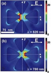
optical bow tie antennaResearchers at the Lawrence Berkeley National Laboratory have engineered a new class of bowtie-shaped devices that capture, filter and steer light at the nanoscale. These "nano-colorsorter" devices act as antennae to focus and sort light in tiny spaces, a potentially useful technique for harvesting broadband light for color-sensitive filters and detectors.

The scanning electron image (at left) of a nano color sorter shows the vertical bow-tie antenna shifted 5 nm to the left of center. In Figure (a) the bowtie has been exited at 820 nm and in Figure (b) at 780 nm wavelength. The two modes are spectrally and spatially distinct while maintaining nanoscale mode volumes. [Source: LBNL]

Friday, November 6, 2009

Encyclopedia of Color Science and Technology

A quick announcement about a new color related project - the Encyclopedia of Color Science and Technology. This major reference work about color in color will be published by Springer and I will be busy as the editor-in-chief. The first sample entry has been completed and is available on the project web site. It's an entry on CIECAM02.


The effort thus far has given me a new appreciation for indexing. As Harman(1) states of indexing: "the second key decision for any indexing is the choice of what constitutes a word and, then, which of these words to index." Stay tuned.

(1) D. Harman, Challenges in Indexing Electronic Text and Images, ASIS Monograph, Medford NJ, p. 249 (1994).

Tuesday, November 3, 2009

Nature's almost perfect quarter-wave retarder

On September 28, I reported on the keynote lecture on Why are animals colourful? Sex and violence, seeing and signals Justin Marshall gave at the AIC in Sydney. Prof. Marshall gave a description the mantis shrimp's eye noting how it can see polarization with the help of a structure like a kind of nanotube.

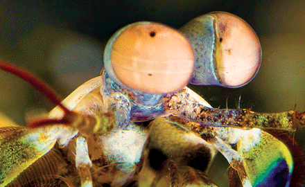
The eye of a particular species of mantis shrimp is well-known to have the most complex vision system in nature

With his colleagues, Prof. Marshall has just published a letter in Nature Photonics 3, 641-644 (2009) with the title A biological quarter-wave retarder with excellent achromaticity in the visible wavelength region.

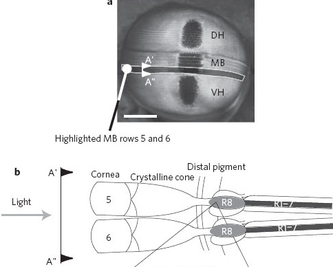
This paper explains in detail how the mantis shrimp detects polarization. The authors illustrate how a novel interplay of intrinsic and form birefringence results in a natural achromatic optic that significantly outperforms current man-made optical devices. Achromatic here means that polarization detection is independent from the wavelength (±2.7º), which is something we humans do not really know how to build.

a, A frontal view of the compound eye of Odontodactylus scyllarus with the midband rows 5 and 6 highlighted by the greyed out region. VH, ventral hemisphere; DH, dorsal hemisphere; MB, midband. The section A'–A'' is shown schematically in b. Scale bar, 800 m. b, Schematic of a transverse section (A'–A'' in a). This illustrates the arrangement of the 5th and 6th rows of the midband and the location of the 8th retinular cell (R8) quarter-wave retarder and the underlying R1–7 cells. The R8 cell is 150 m long.

A syntectic mantis shrimp eye could be a boon for remote sensing. However, with mother nature being and order of magnitude better than what physicists can build, this will not happen any time soon. It is interesting that this structure has not been repeated in any other animal, as far as we know.

Monday, November 2, 2009

Friday, October 30, 2009

Greener pastures

There has been much discussion that the United States risks losing its economic competitiveness because of a work force inadequately trained in science (in case you have not noticed, the Swiss Franc has reached parity with the US Dollar!). For us in research this assertion has always been somewhat puzzling, because the US still has the best universities for science and technology.

Tuesday, October 27, 2009

The Color of Your Galaxy May Vary

From yesterday's Astonomy Picture of the Day comes a striking image from the Galaxy Zoo web site. The image is also of interest because it is only one image of many thousands of images viewed by many thousands of online volunteers. These volunteers among other things, classified the shape of the galaxies for subsequent analysis and research purposes.


Crowdsourcing comes to astronomy research via distributed classification of galactic images.

But note the color of the galaxy you are evaluating may vary.

CGIV'10 Submission Deadline

The Society for Imaging Science and Technology has sent out reminders that the deadline for submissions to the Fifth European Conference on Colour in Graphics, Imaging, and Vision is coming up November 19, 2009.

From the General Chairs Jussi Parkkinen and Timo Jääskeläinen and Program Chairs Theo Gevers and Alain Tremeau comes the call:

The program committee is currently soliciting high-quality submissions from researchers working in a broad range of colour related fields from industry, academia, and national and international standards communities. Conference topics—listed in detail inside this Call— include colour science, computational colour, colour in computer graphics, colour reproduction, colour vision/psychophysics, colour image quality, colour image processing, and multispectral colour science. CGIV2010 will include oral paper presentations, poster sessions, exciting workshops—a new feature (see inside)—and an industry exhibit. As in years past, submissions will be subject to a rigorous peer review. Technical Chairs for each specific area will lead a group of technical experts who will conduct the rigorous review.

The conference will take place June 14-18, 2010 in Joensuu, Finland. The conference will be held in conjunction with MCS’10, the 12th International Symposium on Multispectral Colour Science.

For the full call for papers see: here.

Monday, October 26, 2009

Dynamic Iridescence and other Colors Aquatic

From the September-backlog pile is an item about dynamic on-off iridescence in the squid loligo opalescens. Apparently the squid's reflectin proteins are modulated by acetylcholine, a neurotransmitter. Which is quite remarkable, even without considering the applications to camouflage and perhaps communication.

And then one discovers there are over half a dozen octopus camouflage videos out there on the web.


And like potato chips you can't stop with just one.

Friday, October 23, 2009

Using Neural Measures of Economic Value to Solve the Public Goods Free-Rider Problem

The end of the year is the time for performance reviews in laboratories across the world. The question is always about the metrics. Managers could use measures like the number of ICC profiles created, the lines of code written, or the ∆E precision improvement in the color transformation algorithm.

Thursday, October 22, 2009

Please Pass the Chartreuse

In a profoundly scientific discussion about naming colors at HP Labs, the other day, the color name chartreuse came up. Nathan declared he'd never heard of it until he saw it recently used as a response to his ongoing web-based color-naming experiment. I stated that I only knew of it because my mother used that word when referring to a new dress or curtains or something. I told you it was a profound discussion.

Chartreuse probably stuck with me because, from age 12, I became fascinated with organic chemistry in general and, azo dyes, in particular. So, I'm almost sure it went on my list of chemical terms along with malachite green and paranitraniline red.

The Color of Grasped Porcine Liver

From the medical imaging side of color comes the paper "CIELAB and sRGB color values of in vivo normal and grasped porcine liver" by Smita De and co-authors.


The above is actually the in vivo normal porcine liver color.

Tuesday, October 20, 2009

"The images always look better on the screen than on the page"

By way of follow-up to Neil's earlier post about Hockney's experimenting with inkjet printing is an NYRB article on Hockney's iPhone sketches.

Among other things he says: "the images always look better on the screen than on the page."


So I don't know but it might just be the difference between my screen and my print of his sketches but I'm not sure about always.

Monday, October 19, 2009

Objects Make Better Gifts

This weekend was Alternative Press Expo in San Francisco.


During a webcomics panel at least two of the panelists said one of the reasons they decided to try out publishing a webcomic was to be able to experiment with color in their comics.

Which is to say web color is still cheaper than printed color.

Lawsuits in Suits

In what many regard as a decade-long abuse of the legal system, SCO Group (remember Xenix and UnixWare?) has finally fired CEO Darl McBride. McBride was the man behind SCO lawsuits against multiple corporate Linux users for copyright infringement and demands for hefty licensing fees.

A picture can be worth more than 1000 words

We are all familiar with this phrase. From time to time, scientists come up with pictures that are worth more than myriad words. I recently came across one of these images.

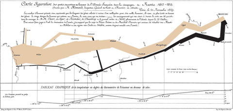
We are all familiar with Minard's graph of Napoleon's ill-fated 1812–1813 Russia campaign:

Carte figurative des pertes successives en hommes de l'Armée Française dans la campagne de Russie 1812-1813

Recently I came across a similarly powerful graphical representation of the ill-fated economic policies of the last half century.

I cannot stop wondering about the capability of the global financial industry. For example, since the beginning of this year, the US stock market index has increased by 50% while the gross domestic product has actually contracted into negative territory. This may be a fluke, but if we average over the larger data pool of the global economy in the past few years, the financial industry has still been able to achieve investment gains of 15% to 20% per annum while the real economy has grown only by 2% to 3%.

Does the financial industry have a perpetuum mobile? Can it defy the second law of thermodynamics? If so, we would be interested. We have a few problems we could cure with a little alchemy, like today's raster imaging processors (RIP) having the carbon footprint of a truck or cloud computing causing global warming even a nuclear winter cannot cool down.

Researchers working in risk management have a lot of data to analyze and explain the phenomenon. They can even predict what will happen in the short term future, but nobody is listening because the data is too dry.

Returning to the topic of pictures worth more than myriad words, I recently came across this graph by Prof. Didier Sornette, which is based on data compiled by Michel Husson. The caption is: The fork between consumption and salaries has continually opened and widened in the last 28 years. The plot shows the contribution of salaries and private consumption to the gross domestic product of USA, EU and Japan.

The fork between consumism and salaries has continually opened and widened in the last 28 years. The plot shows the contribution of salaries and private consumption to the gross domestic product of USA, EU and Japan

If you are interested in the raw data, you can download it from here.

Friday, October 16, 2009

How to See Deep Sea Blue: Move a Molecule

Speaking of fish and their vision, research just published in the Oct 13th issue of the Proceedings of the National Academy of Sciences, reports that the Scabbardfish has evolved from UV vision, like most fish that are surface feeders, to seeing blue in deeper water. What is remarkable about this finding is that the change did not occur gradually nor was it performed through a sequence of evolutionary steps. It occurred by the elision of a critical amino acid molecule from the fish's opsin. In other words, a single, simple change at the molecular level altered a phenotype. That's like deleting one byte of a program's code in memory and, rather than crashing, it exhibits a new functionality!

Journal of Vision Call for Papers: Perception of surface color and material properties

The Journal Vision has sent out a call for papers for a special issue on the perception of surface color and material properties. Guest editors David Brainard and Larry Maloney describe the intent of the issue as follows:

"Researchers have devoted much effort to understanding the perception of color and lightness for simple stimulus configurations, often consisting of flat matte surfaces rendered under diffuse illuminations, or simulations thereof. The objects we look at in daily viewing, on the other hand, are rarely flat, matte, or diffusely illuminated. There is now considerable interest in pushing our understanding into the realm of more complex, three-dimensional scenes, spurred in part by advances in computer graphics that allow physically accurate rendering of a variety of materials and thus permit exploration of interactions between object shape and orientation, object material, and illumination geometry. The Journal of Vision plans a Special Issue to bring together papers that describe recent advances in this area."

The deadline for submissions is March 15, 2010. For more details about this special issue see the call for papers: here.

MCSL Post-Doc in Image-Base 3D Modeling of Fine Art

The Munsell Color Science Laboratory of RIT has announced a two year post-doc in the area of image-based 3D modeling of fine art. The principle researchers are Dr Roy Berns and Dr Jim Ferwerda and the project will include extended residencies at MOMA in New York. I may be biased but this sounds like an oustanding research opportunity: 3D spectral capture in NYC with Roy and Jim! The full project description is:

"The Munsell Color Science Laboratory (MCSL) at RIT is seeking an outstanding researcher for a two-year postdoctoral fellowship in the area of Image-Based 3D Modeling of Fine Art. The goal of the research is to develop advanced methods for creating rich digital representations of paintings and other cultural heritage objects that can serve as surrogates for archiving, analysis, restoration, reproduction, and scholarship. The fellowship is sponsored by the Andrew W. Mellon Foundation as part of a project entitled “Improving Artwork Reproduction through 3D-Spectral Capture and Computer Graphics Rendering”. Research resources of the MCSL include a light measurement laboratory, a custom imaging goniospectrophotometer, a computer cluster, and calibrated spectral printing, display systems, and visual psychophysics laboratories. In addition to research at the MCSL in Rochester NY, the appointment will include extended residencies at the Museum of Modern Art in New York City."

For more information please refer to the opening announcement: here.

William Schreiber (1925-2009)

I received an email that MIT imaging professor William Schreiber has passed away. His full obituary is available here. I appreciate that it includes some of his Schreiber-isms:

"You get to do one big thing every 10 years in your career;" "HDTV is not about television; it's about jobs;" "MIT engineers should be building bridges;" and "There is no reason to be mean to a student."

Truely an innovator in the field of imaging and color.

Thursday, October 15, 2009

Inkjet Printer As a Paint Brush

Modern artist David Hockney, renowned for his portraiture, has been working more recently with computer-based tools like Photoshop and a Wacom tablet to create Inkjet-printed computer drawings on paper.

To Bits and Back Again

When we last heard about complex color, it was to say farewell and bear witness as a pile of papers migrated from desktop to recycling bin.


But a funny thing happened on the way to the recycling bin - there was an excursion. Several excursions.

Wednesday, October 14, 2009

Leonardo Recognized by His Paw Print

The ghost-like fingerprint in the top left corner of an obscure portrait painting appears to have been confirmed as one of the most extraordinary art discoveries—the first da Vinci in 100 years. This TimesOnline article gives the background and includes a short video.

Listen as Peter Paul Biro, a Montreal-based forensic art expert, explains more about how he imaged the portrait with a specially developed multispectral camera. (WMV audio portion starts @ 00:14:12)

This modern episode is reminiscent of the image recognition of another famous author, through the application of special Swiss optical devices.

Thanks for All the Colorful Fish

This is not goodbye, but hello and thanks to Giordano for the invitation to blog here. Oh! And all his colorful fish.

I'm not sure I'll have a lot to say because:
Don't know much about photography
Don't know much color dictionary
Don't know much about a science book
Don't know what it means to take a look

But I do know what is Planck times Nu
And I know that if you read me too
What a colorful blog this will be
So, with apologies to Sam Cooke, I'll give it the old collage try.

The Color of Fog at Night


I recently finished re-reading The Followship of the Rings by J.R.R. Tolkien out loud as a day's end story with C. and among other things I'm struck by the use of color in the book.

At one point Gandalf the Grey is recalling a debate with Sauruman of Many Colors:

'I looked then and saw that his robes, which had seemed white, were not so, but were woven of all colours, and if they moved, they shimmered and changed hue so that the eye was bewildered.
'"I liked white better," I said.
'"White!" he sneered, "It serves as a beginning. White cloth may be dyed. The white page can be overwritten; and the white light broken."
'"In which case it is no longer white," said I. "And he that breaks a thing to find out what it has left has left the path of wisdom."

Which sounds a lot like partitive color mixing, with a possibility of iridescence and side of epistemology.

Tuesday, October 13, 2009

Unipolar vs. bipolar SD

Conferences are an opportunity to seek clarifications on facts and methods one does not understand well. For example, in my work I do not scale with semantic differentials, so I never looked into some of its subtleties, like the polarity of the scales.

In her proposal for the new AIC study group on the language of color, Lucia Ronchi wrote that the use of the semantic differential (SD) is necessary to compare the application of language and linguistics in the evaluation of the quality of color planned spaces and the prediction of color planning at the site of design.

In this statistical method for estimating people's reactions to stimulus words, one usually proceeds in three steps:

  1. Rank the factors relevant to an experience
  2. Rank the attributes for the most relevant factor(s)
  3. Combine the attributes with their antonyms to create semantic differential scales

The scales are then used to gather the data from the observers. A semantic differential scale typically looks like this:

This SD is called bipolar because the two extremes are antonyms and the scale is like a line. A unipolar SD is like a half-line or ray starting in this case from good:

where the number indicates the relative strength of the attribute.

I do not know the subtleties of unipolar vs. bipolar SD, but it seems obvious that they cannot be mixed in an experiment. Yet, in papers by Japanese authors, one can easily see them mixed. What is going on?

The AIC conference in Sydney was a good place to find out, because the over 320 delegates came from many different cultures, with the Japanese delegation 40 members strong.

In the Japanese culture, when feelings are be involved, you cannot use a negative attribute. Instead there has to be wiggling room for hesitation, uncertainty, and doubt:

More precisely, in the case of persons and feelings, the 1-dimensional line is not a good model at all. Instead, a Venn diagram is a better representation of socially acceptable discourse:

While there can be a well defined round judgment for a positive term, the antonym has to be broad and fuzzy, so one can hesitate, deflect, and nudge the discourse. The easiest way to accomplish that is to use a unipolar SD.

Hence, if you are estimating an abstract SD, your bipolar scale can extend from good (良い、いい、ii) to bad (悪い、わるい、warui). However, if the SD can pertain to feelings, like for example if you would want to rate this post, you have to use a unipolar scale from good (良い、いい、ii) to non-good (良いない、よくない、yokunai).

My conclusion is, that if you are doing a Western study, you can use bipolar SD, but if you are doing an Eastern study, then for consistency all your SD should be unipolar, so you do not have to worry about feelings.

The difficulty when publishing an Eastern study in a Western language is that to Westerners good and non-good are clear antonyms, while ii and yokunai are not, except they speak Japanese and know about the -nai form. Therefore, it is better to leave out romanizations from papers because they confuse the reader (or the author, as it has happened).

Galilean Nights

The 400th anniversary of Galileo's telescopic observations is rapidly approaching. Next week, on 22-24 October 2009, the International Year of Astronomy 2009 Cornerstone Project Galilean Nights is coordinating local public astonomical observing events to share the wonders of heaven with your community. For more information visit http://www.galileannights.org/.

Saturday, October 10, 2009

Pink Ladies

In these difficult economic times, organizing a conference is hard. Most companies have sharply reduced travel and conduct even important business meetings online. Under the circumstances, the organizers of AIC Colour 2009 have done an excellent job. Although many habitués did not attend, the program had a good quality and the invited lectures were truly outstanding.

Monday, October 5, 2009

His "family attempted to throw his photographic collection away"

One of the things about skimming the wikimedia commons: licensing area is the stray photo of Leonard Nimoy.


That and the potential peril's of being a deceased photographer with a legacy awaiting curbside removal.

The Scanner is in the Frame

And why not?

A digital photo frame that scans your photo for immediate display.


The Exemode Yashica DVF828 is a digital picture frame with a built in scanner.

Simply take a picture with your digital camera. Next print the photo on a digital printer. Then scan the printed photograph in for immediate display. Otherwise find your shoebox full of photos and find a good one. Then scan the printed photograph in for immediate display.

Saturday, October 3, 2009

Translucent Metallics

On one page is a fluorescent green vellum and on the other is a translucent metallic paper.


Not your typical course notes. But then this was an afternoon class at PINC on paper basics given by Sabine Lenz, founder of PaperSpecs.

Friday, October 2, 2009

AIC Judd Award

Since 1973, when Betty Judd proposed to establish an AIC award in memory of her husband, Deane Brewster Judd, to recognize outstanding work in the field of color science, the AIC has been carrying out the process of selection of the recipients for this award every two years. The selection is an arduous procedure that includes nominations by AIC members and analysis of antecedents of the nominees by a Committee composed of previous recipients of the award.

Arne Valberg receives Judd Medal from Jose Caivano

As chairman of the Judd Award Committee, AIC Vice President Berit Bergström informs that the winner of the AIC Deane B. Judd Award 2009 is Dr. Arne Valberg. She can report that they have received four single nominations and one jointly nomination. All nominees have made outstanding contributions to our understanding of colour. Berit Bergström really hopes that they all will continue working in the international colour community for many years to come. The members of the 2009 Judd Award Committee have been: Paula Alessi, Robert Hunt, John Hutchings, Mitsuo Ikeda, Daniel Lozano, Alan Robertson, Lars Sivik, Gunnar Tonnquist and Pieter Walraven. These nine previous winners of the award and past president gave very careful consideration to the nominations.

Arne Valberg receives Judd Medal from Jose Caivano

Arne Valberg was born on December 31st, 1938. Below is an excerpt from his bio sketch as published by the AIC.

Arne Valberg receives Judd Medal from Jose Caivano

Education and positions

  • Studies at the Univ. of Oslo and Univ. of Basle, CH 1961-1967
  • Graduated as Cand real in Physics, Univ. of Oslo 1967
  • Research associate, Univ. of Basle, CH 1968-1971
  • Dr. philos, Univ of Oslo 1976
  • Ranked 2 for a Professorship in Biophysics, Univ. of Trondheim 1976
  • Research Scientist, Norwegian Research Council for Science and the Humanities, Univ. of Oslo, University of California, San Diego
  • Max Planck Inst., Göttingen and Univ. of Freiburg, BRD 1972-1990
  • Associate Professor, Univ. of Oslo 1990
  • Professor of Biophysics and Vision Science, Univ. of Oslo 1993
  • Professor of Biophysics and Vision Science, NTNU 1991 to present

Major grants and research projects

  • Norwegian Research Council for Science and the Humanities
  • European Science Foundation
  • Max Planck Gesellschaft
  • Deutsche Forschungsgemeinschaft
  • Schweizerische Nationalfonds zur Förderung der wissenschaftliche Forschung
  • Roche Science Foundadtion
  • IBM Norway
  • NSB Norway
  • NATO Grants for Collaborative Research
  • Thonning Owesen's Foundation
  • Blindeforbundet (Norw. Association for the Blind)
  • Thorstein Erbos Fund
  • European Union

From 1968 to 1994

  • Joint research projects in vision (psychophysics and electrophysiology) with groups from:
  • Univ. of Basle, Switzerland (1974).
  • Univ of Freiburg, BRD (1974-1980; B. Breitmeyer and L. Spillmann).
  • Max Planck Inst. for biophysical Chemistry, Göttingen, BRD (1981-1990, O.Creutzfeldt and B. Lee).
  • Univ. of California, San Diego, USA (1973).
  • Univ. of Chicago, USA.

From 1994 to present

  • Joint research on Low vision with Tambartun Centre for Low Vision Rehabilitation (with P. Fosse) and Univ. of Oslo (J.H. Wold and T. Seim), Norway.

From 1998 to 2001

  • Interdisciplinary Program at NTNU, ”Information coding and functional organisation of populations of nerve cells” Together with professors E. Moser and H. Mustaparta.

From 2000 to 2004

  • Strategic University Program from Norwegian Research Council, ”Neural mechanisms of sensory functions and memory” (same collaborators as above). Includes one dr. student (I. Rudvin) and one master student (G. E. Nygård).
2002-2006

  • Joint project with Brain Research Unit, University of Freiburg on ”Lateral interactions in vision”. Includes one German dr. student.

2002-2006

  • EU Concerted Action together with research groups from universities of Tübingen, Manchester and Utrecht. Project title: ”Photoreceptor dynamics in age-related macular degeneration”.

Editor/Author

  • From Pigment to Perception. Advances in Understanding Visual Processes. Plenum, 1991 (NATO ASI Series)
  • Die Farbe (editorial board)
  • Editor of Proceedings from 3 Scientific Conferences held in Norway
  • Lys Syn Farge, 280 pages (Tapir, 1998)
  • Light Vision Color, 460 pages (Wiley, & Sons, 2005)

Publications

  • About 100 full scientific papers
  • About 100 abstracts/short communications/scientific reports/conference contributions
  • 3 books
  • Several popular science articles

Clipboards, Solar Cells & Fluorescence

Colored solar panels have been covered elsewhere, but reading some of the details gives me a new appreciation for my fluorescent clipboard.


Thursday, October 1, 2009

Networking in Sydney Harbour

During hard economic times and travel hampered by security concerns, it is tempting to try to keep abreast of one's field reading proceedings instead of attending the conferences themselves. However, you then miss two important opportunities.

The first is getting valuable feedback on your research. There is nothing more efficient than presenting your work in a daring and controversial way, because you incite the audience to challenge it. You might be sitting in your cave for years brooding on your problem, chasing down the solution on a wrong path, but at a conference after a 15 minute presentation you may get tips from those that worked on the problem before, and also invaluable feedback on fallacious thought patterns.

The second is serendipity: you may sit on a lawn in front of the conference venue and somebody might strike a conversation with you on a problem you are secretly starting to work on and give you a key lead.

Scientia Lawn

Serendipity may be a passive recreation as the sign suggests, but concomitantly it can also be very potent. I think this is what the sign's author had in mind.

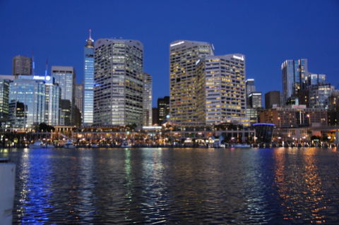
On a Wednesday evening, when the AIC is in session, Sydney Harbour, or more precisely Darling Harbour, may be a good place to be.

View from Darling Harbour

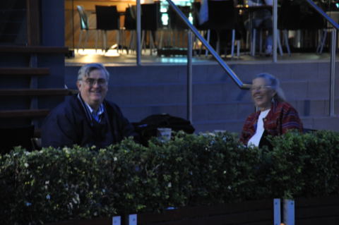
Carefully camouflaged in a garden restaurant you may find John and Mary McCann, and they will get you up to speed on the latest research on colour appearance for high dynamic range (HDR) imaging.

John and Mary McCann

And while you join them sitting at their table, on the pier in front of you, you may spot Prof. Jinsook Lee, who heads the newly formed AIC Study Group on Colour Naming.

Prof. Jinsook Lee

Thinking of it, boarding that vessel for a tour of the harbour may be a good idea.

In fact, I end up sharing a table with Maud Hårleman, who had presented an interesting paper on Thinking of colour with and without colour words the previous Monday and Anders Nilsson of the Färginstitutet.

Maud Hårleman and Anders Nilsson

Turns out Anders just released two weeks ago a new Web tool called NCS Navigator that allows you to explore NCS with a concomitant 3-dimensional view and a 2-dimensional projection. We had an interesting discussion on the suitability of various programming languages for implementing colour tools.

On my side of the table were Paul Green-Armytage and Harald Arnkil.

Paul Green-Armytage and Harald Arnkil

With Paul I had a long discussion about research on colour naming. For his dissertation he embarked to solve the same colour naming problem Nathan Moroney had, but he took a top-down approach instead of Nathan's bottom-up approach. After years of research, it is invaluable to be able to compare the two research approaches.

With Harald I had a discussion on Nathan's paper research he blogged yesterday. Turns out a colleague of his has worked on it for years and he was able to give me invaluable pointers.

In all, it has been a very productive evening.

Wednesday, September 30, 2009

Hi


Hi to everyone from AIC09 Sydney (as you can see from the picture),
happy to be part of the colored group
stay tuned ...

Bright and early

In a large metropolis the best light is in the morning, when the air is still pristine. Life in Coogee Bay starts bright and early. Many of the coffee shops open at six o'clock and immediately fill up with customers,
but the action is along the beach. Joggers and walkers occupy the promenade, and while the sand is being cleaned, swimmers emerge from the ocean and pools.

On the beach, coaches and personal trainers work out their clients.

Boxing appears to be a favorite with girls.

On the other side of the promenade, on the lawn, many group exercise classes are peaced through the daily training circuits by decisive coaches.