During the AIC meeting in Zurich, the AIC Study Group on the Language of Color (LC) held a meeting, moderated by the Chair Prof. Jinsook Lee. During the meeting, the delegates discussed two project proposals by Co-Chair Prof. Paul Green-Armytage.
The first proposal was as follows:
The eleven 'basic colour terms' have been mapped in an array of Munsell colour chips for several languages including Korean and English. This can make it possible for speakers of Korean and English to see the ranges of colours that would be described by the colour terms of each others' languages. However, the ranges of colours that are described by the different names vary greatly in extent. For example, there are many more 'greens' than 'yellows'. It might be useful to divide colour space into blocks of roughly equal size, take the focal colours from each block and then ask speakers of different languages to name the focal colours. The focal colours could then become a kind of basic AIC palette with names for each of the colours in several languages. This could serve as a bridge between everyday languages, as spoken in different countries, and the colour order systems such as Munsell, NCS and CIELAB. I think I sent you my paper on 'Colour Zones'. That has 27 named focal colours at level two and that could be a possible model. But there may be better ideas. Giordano Beretta will be at the conference in Zurich and he has done a lot of work on colour naming including an internet based project which he calls 'crowd-sourcing'. People were invited to name a set of colours displayed on their screens and he derived consensus names from that process. We might ask him to become involved. We could decide on a set of colours that we think would be a useful range to have named in different languages and then use the Wiki-workspace. People could be invited to log onto the Wiki site and contribute ideas for naming the set of colours. Do you know Giordano? I met him at AIC 2009 in Sydney and could contact him about this if you think this is a good idea.
At the meeting, Prof. Osvaldo da Pos summarized the core of the proposal as follows:
Isaac Newton tried to express color perception with 7 spectral color terms. Berlin and Kay then tried to do it with 11 basic color terms. Paul Green-Armytage is proposing to take it to the next level with a set of 27 named focal colours.
There are two fundamental reasons why in my view this proposal, with all due respect, might be somewhat misguided.
The first is that it has been known for many decades that when one plots color terms in a uniform color space, the color terms do not fill the color space uniformly, respectively are not located on a regular grid. Rather, the color terms form a foam in a uniform color space. Here are some visualizations by various authors:
Kenneth L. Kelly and Deane B. Judd (1955):

Robert M. Boynton and Conrad X. Olson (1987):

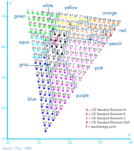
David L. Post (1992):
Shigenobu Kobayashi (1992):

Antal Nemcsics (1993):

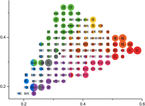
Heinrich Zollinger (1999):
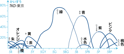
Tsuei-Ju Hsieh (2011):
The years here refer to the publication from which I took the figure, not the first publication of the figure. Anyway, I hope this is a sufficient visual proof that the distribution of color terms in a uniform color space is more like a foam than a set of focal points on a regular grid. For example, on page 3 of their 1955 book, Kenneth L. Kelly and Deane B. Judd write:
The 1933 recommendations by I.H. Godlove included a 20-point division of the hue circle for colors of moderate saturation, a 10-point division for weak colors and a 5-point division for very weak colors. These recommendations were followed closely at first with the thought that each color designation should refer to about the same fraction of the Munsell hue circuit. However, it was soon evident that deviations from this plan were necessary to make the designations accord with usage at that time in the National Formulary and the United States Pharmacopoeia, and more recently with usage in the textile industries and by the general public.
My second problem with the proposal is the approach itself. The proponent is taking the stance of the philosopher who has found the lapis philosophorum (philosopher's stone) and thus is the holder of some absolute truth. During the meeting, he kept repeating:
27 is the number of colours I can wrap my head around
To my knowledge, a color scientist's head circumference is not a constant of nature like π, h, or e, therefore I do not see why the AIC should standardize it. The custom of making arbitrary philosophical assumptions like the color zones or I.H. Godlove's subdivisions comes from the tradition of alchemy.

For example, Lorenzo Lotto's Enterprise of Creation may be cute, but if you click on the figure to reveal the original before the "Hello Kitty" treatment, you discover a lot of information, from the transformation of chaos into splendor to all the numerology of the ten Sephiroth of Kabbalah, the ten circles of the cosmological enterprise, the forty initiations to capture light and reach the philosopher's stone, etc.
All this is deep, interesting, and had an important impact on technologies created by the alchemists, but it is not how we do science today. Today's tradition follows from the teachings of Iraqi scientist Abu Ali al-Hasan ibn al-Haytham (965–1039) — or Leonardo da Vinci in the case of color science — which is to conduct experiments to collect data and analyze it.
Data is king. We are not interested in 7, 11, or 27 colors. We collect vast amounts of data and then analyze it to find fundamental principles helping to solve a specific problem. We use techniques like mathematical statistics, data mining, and machine learning to find the answers to our questions.
Our aim as color scientists is not to find some platitudes on a small number of colors. Rather it is to give people the knowledge and tools allowing them to take action and make commitments, rather than just accumulate information. Therefore, in a frequency plot of color terms, we are interested in the long tail: the locus of valuable information.
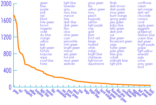
Which color terms are relevant and how they should be structured is an answer we have to reconstruct each time from a vast data corpus, depending on the application we are addressing.
When we can draw from a gigantic data corpus, we are not restricted to synchronic color terms. Indeed, we can explore the ephemerality of diachronic color terms:

The above figure (click on it for an enlargement) illustrates the diachronistic evolution of the synonyms of cyan over 200 years. We learn that aqua has become less common, while turquoise has emerged. Note also that the color term aqua does not correspond to the color term 水 (mizu), which are the Latin, respectively Japanese, translations of water. But even in a single language in a point in time, the color for the term aqua depends on the context, as we illustrated in the post on the color of water.


No comments:
Post a Comment