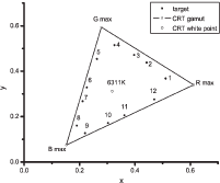
Papers on the World Color Survey often contain diagrams of the boundaries of the regions where the color patches are labeled with the same basic color term. The dream is to be able to somehow find the boundaries analytically, and for a much larger number of color categories than the 11 basic color terms.
Tsuei-Ju Hsieh and I-Ping Chen of the Chiao-Tung University in Taiwan might be onto something by serendipity. Their original intent was to assess the effect of size on color appearance, as reported in their paper Colour Appearance Shifts in Two Different-Sized Viewing Conditions. To sample a color space, they chose Alvy Ray Smith's old HSV color space that was used in the early days of computer graphics. They varied H in 30º increments starting from 15º and kept S fixed at 70 and V at 75, obtaining the following samples plotted in the x-y chromaticity diagram:
The figure is a little hard to read, but they label the colors as follows:
1 |
reddish orange |
2 |
yellow |
3 |
greenish yellow |
4 |
yellowish green |
5 |
green |
6 |
green-blue |
7 |
blue |
8 |
deep blue |
9 |
purple-blue |
10 |
purple |
11 |
purple-red |
12 |
purplish pink |
Then their perform their color matching experiments and consider the errors in CIE DE2000 and use the CIECAM02 color appearance model to study the errors in the perceptual correlates.
Here we are interested in ∆H, the difference in CIECAM02 hue quadrature. Plotting ∆H for the 12 hues gives the following plot, where HB is for "color samples arranged along hue and brightness axes" and HSL is for "color samples arranged for hue and saturation"; the L postfix is for "large target."

The red curves are the sinusoidal fitting of the data. The authors write:
The fitting results exhibit a certain regularity of hue shifts in different conditions across the hue circle. In all histograms, the rise and fall of bars alternate in a rhythmic manner, discounting the slight phase shift that occurred when different baselines were used. The zero-crossing points correspond to hues that their neighbouring colours are converging toward.
and conclude:
In the large size conditions the hues around the hue circle are apparently drawn in groups to some anchoring colours, i.e., a typical representation colour within the hue group. We propose that this phenomenon might be due to some kind of categorical perception of colours, a hypothesis that calls for future studies to verify.


I am a bit surprised that the authors didn't fit the sinusoidal curve with a constraint of periodicity between hue samples 12 and 1.
ReplyDelete