We are all familiar with this phrase. From time to time, scientists come up with pictures that are worth more than myriad words. I recently came across one of these images.
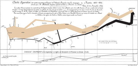
We are all familiar with Minard's graph of Napoleon's ill-fated 1812–1813 Russia campaign:
Recently I came across a similarly powerful graphical representation of the ill-fated economic policies of the last half century.
I cannot stop wondering about the capability of the global financial industry. For example, since the beginning of this year, the US stock market index has increased by 50% while the gross domestic product has actually contracted into negative territory. This may be a fluke, but if we average over the larger data pool of the global economy in the past few years, the financial industry has still been able to achieve investment gains of 15% to 20% per annum while the real economy has grown only by 2% to 3%.
Does the financial industry have a perpetuum mobile? Can it defy the second law of thermodynamics? If so, we would be interested. We have a few problems we could cure with a little alchemy, like today's raster imaging processors (RIP) having the carbon footprint of a truck or cloud computing causing global warming even a nuclear winter cannot cool down.
Researchers working in risk management have a lot of data to analyze and explain the phenomenon. They can even predict what will happen in the short term future, but nobody is listening because the data is too dry.
Returning to the topic of pictures worth more than myriad words, I recently came across this graph by Prof. Didier Sornette, which is based on data compiled by Michel Husson. The caption is: The fork between consumption and salaries has continually opened and widened in the last 28 years. The plot shows the contribution of salaries and private consumption to the gross domestic product of USA, EU and Japan.

If you are interested in the raw data, you can download it from here.


Actually depending on how you are doing your conversions from words to dollars the above picture is probably worth closer to 1800 words.
ReplyDelete