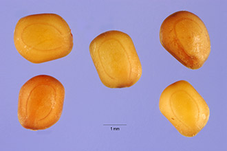
Monday, April 20, 2009

Aldo Manuzio

AldineThese are times similar to Venice in 1500, when Aldo Manuzio (alias Aldus Manutius, 1452-1516) joined a printing business and became a publisher. The adoption of Gutenberg's printing press, the brain drain of scientists from the collapsing Byzantine Empire bringing with them the Greek classics, an educated population that could read Greek, and a flourishing spice business whose profits allowed ordinary people to afford books; all of these contributed to a vibrant, innovative environment.

The price of Manuzio's books was about a teacher's day's salary. Before, books could be afforded only by princes and wealthy monasteries. Compare this with the price/performance development of computers and software.

Manutius formulated a key idea that made him a main contributor to the Renaissance: he became a publisher instead of a printer. He searched for material and selected what he thought might have the largest readership. When he came across a classic text he thought might appeal to a wide audience, he had it translated from the Greek and published in Latin, and when he thought he might have a best-seller, he would even publish it in Italian, the common people's language.

The lesson from Manutius is that although one can become rich by working hard operating a printing press, one can become wealthier by working smart and exploiting new emerging technologies (embracing and extending).

The press was owned by an established printer, Andrea Torresano. Manuzio managed the printing shop, selected the texts to be published, made editorial decisions, and arranged for the marketing of the books

Technology is just an enabler; paradigm shifts have more to do with social values. In Manuzio's time, one major problem was the sheer size of books. He came up with some technological solutions, like inventing the italic type style that can be easily read at a smaller size, and folding the paper form (folio) into 16 sheets to reduce the dimensions and make books portable. But with these techniques the books of the time where still too voluminous.

Manutius could have used a technical solution, like publishing each work in several volumes. Instead, he called upon a value judgement. In his time, the largest part of a book was taken by the annotations, which could be several times the number of words in the original text. It was believed that the value of a manuscript depended on the annotations, and on the number and quality of the commentators. Manutius decided that his readers would read the classics for their own intrinsic beauty and the comments would be of interest only to the scholarly. He published only the original text.

Publishing a book stripped of the annotations was not an obvious decision in Manuzio's time, and this is exactly the kind of disruption that a successful technology for the Web must enable. In 1500 Venice, general education and wealth had reached a critical mass; Manutius recognized the potential of the new market and came up with the critical ideas and technologies to redirect books from an erudite audience to the general public.

The Web media industry is evolving to the Internet the technologies initiated by Manutius and the methodology introduced by the press in the 1850s; this media industry is not inventing a disruptive technology — opportunity is knocking.

Gondola

Saturday, April 18, 2009

From 529 to 2009 via the telescope

One of the distinguishing features of humans is the ability to communicate complex thoughts. This ability is mastered at various levels by different humans, and those who have exceptional abilities are sought out. It the beginning they were shamans, but when civilizations were born some 6,000 years ago, they were structured in teaching and leadership organizations.

In the western culture, the oldest written historical records of such organizations are from the pharaonic dynasties. They were in charge of the calendar, court protocols and the training of rulers among other things. For example, a pharaoh had to be trained to become able to perform such feats as being in control of a lion, or riding a chariot at full speed on a dirt road charging an enemy army without getting hurt.

The techniques are the same as those used today, viz. forms of deep concentration like mindfulness, autogenic training, or meditation. These exceptional human's creative process is esoteric, as opposed to the exoteric process of us "normal" humans. The esotericism can be mystical (like in Kūkai's Shingon-shu or Abu Bakr's Sufism) or scientific (like in Jacques Derrida's deconstruction).

An example more close to us is the creative method of inventing mathematical theories. Until the beginning of last century, mathematics was organized along a number of disciplines, like number theory, calculus, geometry, etc. Then the so-called crisis of foundations, which lasted for about thirty years, broke out until new theories on ordered sets, lattices, topological spaces, groups, rings, fields, vector spaces, partial differential equations, etc. made it possible to reorganize mathematics from the point of view of structure.

In 1935 the members of the Bourbaki seminar started working on the multi-volume treatise “The Elements of Mathematics,” which is published under the nom de plume “Nicolas Bourbaki.” The way general structure theory is used to creatively extend mathematics is intellectually equivalent to Kūkai's process of reading sutras horizontally.

Benedetto da Norcia (480 - 547)Back to Egypt. The pharaonic leadership organizations later metamorphose under Christian influence and infiltrate into Europe in the form of monasteries. If a date important to us has to be set, it would be 529, when Benedict of Nursia built the abbey at Monte Cassino, which was the first modern western think tank. In fact, when for the first electronic imaging symposium of this Millennium John McCann and I were looking for a framing story for our welcome letter, we wrote a fictional account that we placed at Monte Cassino at the imaginary first imaging conference of the previous Millennium:


On 23 January 1000, Rodulfus Glaber of Auxerre finally reached sight of the symposium site on Montecassino. He was carrying a precious document from Amalfi, where he had met Ibn Sina (Avicenna) who was on his way to the new Dar al-ilm science library in Cairo to research for his Canon of Medicine. Avicenna gave him a copy of the Chinese Diamond Sutra scroll, the first printed document. While Glaber was admiring the print quality of the images, Avicenna had told him, that was nothing compared to the new imaging science invention that will dominate the new millennium, mentioning a paper by al-Hasan Ibn al-Haytham (Alhazen) on the camera obscura. At Montecassino, Glaber was burning to meet a monk from Malmsbury Abbey to discuss with him how the Canterbury School of manuscript illumination could catch up with these new inventions. Glaber was also somewhat anxious, because according to Benedectine Regula Magistri XXXVIII he had to give the luncheon lecture for the whole week.

On 23 January 2000, we welcome you comfortably to the first imaging conference of the new millennium, the Electronic Imaging Symposium. The IS&T and SPIE launched this symposium at a historical juncture; the end of the cold war has marked the end of big research. Before, a young researcher would have had to start his or her career humbly, doing grunt work for the senior fellows and slowly building a publication portfolio by working very hard. Giving a paper at a conference was a big hurdle to jump and was the first step on a career.

The Electronic Imaging Symposium is the stalwart of the new research paradigm. Rather than a stuffy restricted club, our symposium has been more of an uplifting bazaar, where the emphasis is on the rapid communication of new ideas. The conference chairs have been courageous visionaries, who have been willing to take the risk of encouraging unknown researchers with brilliant ideas, a task that is much harder than accepting papers based on the author's fame.

In this new research paradigm, career is no longer an escalator where one moves up as long as one works hard. Today there are many different — often intersecting — paths up the hill to successful careers; therefore, it is essential to build networks of colleagues with similar interests. New breakthroughs have to be detected immediately and must be assimilated in a very short time. In this situation the symposium fulfills two roles.

  • The first role is to serve as a synchronization event for a community. Everybody hears the latest results and can contribute to that emergent property that is the state-of-the-art in electronic imaging.
  • The second role is to interact with others in the community, to seek clarification at the source, to discover new opportunities for synergism, and to learn about the war stories that cannot find a way in scholarly publications.

We are honored that we can launch the Symposium on Electronic Imaging into the new millennium. A rich assortment of short courses allows you to quickly get in-depth knowledge from the masters of the art. The conferences are organized in programs that group similar research areas; the system of synchronized presentations encourages you to hop from conference to conference, maximizing the likelihood of serendipity. Last but not least, the informal atmosphere is meant to encourage you to interact with the speakers; take advantage of discussion sessions, panel sessions, and receptions to network and build a strong community.

The various Conference Chairs have made a special effort to make this conference a memorable event. The plenary speakers will reveal their roadmaps for the future. This year's symposium is an event you cannot miss.

See you in San Jose!

Giordano B. Beretta, Hewlett-Packard Co.

John J. McCann, McCann Imaging

Symposium Chairs


As I mentioned in my previous post about the colophon, the Benedictine monks transcribed and annotated books. They still do that today, like for example Brother Dominique, whose bio sketch on the Internet reads as follows:


Brother Dominique. Born 1954, I live since 14 years in the sanctuary Lady of Vorbourg in Delémont. There we welcome pilgrims, and your servant has digitized the books on our Web site. The raven reminds of the one who brought the poisoned bread loaves that were given to Saint Benedict. The comments are those of a reader who tries to form his own opinions and some personal notes.


Dan B. of the Google Book Project is possibly one of the avid readers of this blog. And the copyist of 2009 is as ahead of time as the copyist of 529 was. If you stand still, you fall behind.

Back to imaging and esotericism, but in the meantime hang on to digitizing and printing books, it is your homework if you reach the bottom of this post.

Hans Lipperhey (1570-1619)Around 1600, Hans Lipperhey, an optometrist from Middleburg, built an instrument to see closely distant things. This was the first practical telescope, but in 1608 the Council of the Province of Zeeland rejected his patent application on grounds it lacked novelty. Why was Lipperhey's invention of the telescope not considered a breakthrough? First, the idea was great, but the magnification was weak; second, he did not have a killer application. He did imaging, but he was not esoteric. Maybe he was just chasing a voyeuristic instinct with his spyglass.

The breakthrough was made a year later, and that is why this year we celebrate the 400th anniversary of the telescope and modern astronomy. It took an esoteric thinker so strong even the pope could not tame him.
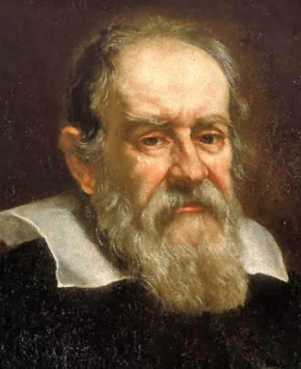
Galileo Galilei (1564 - 1642)In 1609 Galileo Galilei knew what the killer application was: tracking celestial bodies. Having a goal, he improved the magnification technology first by a factor 4 over Lipperhey's, then by a factor 30. The improved technology and the scientific collection of experimental data allowed him to publish the starry messenger newsletter Sidereus Nuncius in March 1610, and astronomy took off faster than blades or the iPhone today. Moons on Jupiter! Can you think of anything more exciting and captivating? Can you not be a cosmologist in 1610? Astutely naming the four moons after the powerful Medici bankers brought in the funding for more research, so shattering and revolutionary the Vatican felt threatened.

Skip forward 400 years. You have invented a digital press. What would you expect Galileo to do for you today? Let us first adjust the currency for the inflation over the past 400 years. You are a conglomerate or keiretsu (系列) and your business is $100G, i.e., to qualify as a killer application, it has to be a $10G idea, a so-called B++ idea.

Building a digital press and shipping it to the customer is like Lipperhey's telescope. You make a buck, but you do not become rich. Since in 2009 we like the concept of SaaS or software as a service, Galileo could sketch up a solution like this:

XNS Print Services

This would allow him to publish his Sidereus Nuncius, even remotely, and PSIP would ensure Johannes Kepler would see matching colors to those on Galileo's display. PSIP? Wait a minute, we already read that, it was the blog post on XNS and print services last year's March 19. That did not qualify as a B++ idea. Think farther out of the box.

If you ever visited a printer, i.e., a plant with a press that manufactures printed artifacts, you know that the printer is only a single piece in the building. Printing is manufacturing, and the press is just one machine in the factory.

There is a lot going on before the press: calculating printing costs and writing bids, preflighting the material, reformatting and processing it as necessary, obtaining missing elements like fonts and images in the correct format and quality, managing color profiles, making proofs, subcontracting manufacturing steps to a trade press or a remote partner, etc.

There is also a lot going on after the press: collating, laminating, folding, binding, trimming, quality-checking, shrink-wrapping, packaging, shipping, billing, etc. This is a bindery in Lausanne:
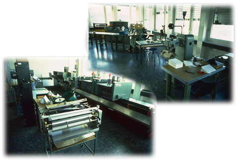
bindery at ESIG

I am showing the bindery because this is where the money is made. In 1568, Jost Amman published his Ständebuch, in which for each profession (Stand) he had a woodcut and a description of the profession in the professional's words.

If you read these descriptions, the book binder is the only one who states (in the last line): "I make a lot of money with my work":

Der Buchbinder

Galileo thinks: "hmm, this might be a B—, I think I can do better." He thinks about the idea of publishing his Sidereus Nuncius, in Prague, so Johannes Kepler can get it right away, but then hears the rumor that that year (1612) Kepler was thinking of moving to Linz in Austria, so to be sure he would need a printer both in Prague and Linz.

With Medici's funding, buying the digital press is not a problem. Having the vendor shipping the press and finding good operators is not a problem either. The problem is all that stuff before and after the press. Many interested printers already have other presses and all the related equipment. The real problem is making it all working together.

Sure, there are legions of printing consultants that can integrate the press, build all the color profiles, install all the correct firmware versions in the various devices, but it is a slow, error-prone, and difficult process.

press check

So here is Galileo's B+ idea. How does Intel make money by selling at cut-throat prices products that cost a fortune to develop and manufacture? Hand how can they keep doing Tick-Tock at that frenetic rate?

They could not do it with an army of consultants who travel around and upgrade fabs. Not at that speed and cost. Since all of Intel's fab facilities are fully automated and software controlled, the correct processing parameters and machine schedules are more or less uploaded from their Hillsboro research fab. Think about that; Intel will upload an entire factory!

Galileo hires a scientist with the required skills and starts a project to build a system that can upload from a print shop all their equipment parameters, their accounting, bid models, customer profiles, etc. Trust? it is a matter of branding. People trust Galileo.

Once all the information is in the lab, the system will come up with a number of options to upgrade the print shop. The sales rep and his or her sales engineer negotiate with the customer. Then the required equipment is shipped and installed. Once it is up and networked, the print shop is downloaded and the printer starts working and making money. Voilà, c'est simple, n'est pas?

But Galileo is not content with B+, he is shooting for B++. He is thinking of all the work tracking stars, taking notes, cross-checking data, writing papers, formatting them, etc. is a lot of work. And let us be honest, spending the night in a good restaurant in good company in Arcetri is more fun than staring in a telescope.

There are a lot of smart people in the world. They may not all be esoteric speculative designers like him, but there a lot of very smart and motivated people who can produce highly valuable printed goods. Galileo realizes two things: already Aldo Manuzio in Venice had found out that you make more money as a publisher than as a printer, and if the price is right, you can recruit a lot of top-notch collaborators through crowd-sourcing (of course, a crumbling Byzantine empire helps).

This is where being big is important, because to build a network of a gazillion editors and pay them automatically according to the sale of their publications requires vast resources, like your own bank to settle all the payments and a flexible open digital rights management system.

The latter is actually the easiest part, because MPEG-21 already contains a solution and MPEG-A—Multimedia Application Formats has all the code to quickly rig up a prototype and get the funding to build a production system.

See, was that not easy? All you need to do is put Galileo or somebody of his caliber in charge. When it is about communication, humans have always been willing to spend large amounts of money, because that money is an investment. But do not forget you need those special people that have valuable entities to communicate, groom your brand.

Homework: Why does Brother Dominique not have a B++ project?

Time for this scribe to wrap up and go back tweaking printer drivers. With Brother Dominique, a colophon invoking a pulchra puella? No. En lieu, to close the loop with Derrida, I will deconstruct in front of your very eyes a woman: 女. She consist of three strokes. Although you can never mix macho katakana with girly hiragana, we will take the strokes in order as a hiragana, a katakana, and a kanji: くノ一. In romanji that is kunoichi — Ninja!

Note: If you are a pupil or student and found this post researching on the Internet for your assignment, be aware that here you are not reading a scientific journal of archive quality. This is just an informal blog post and you are reading fiction written for entertainment (and branding).

Wednesday, April 15, 2009

The colophon

During the Middle Ages it was common for a copyist—scriptor—to leave a remembrance of his activity inside codices produced by him. The person copying a manuscript would enrich it with a signature, which was usually placed at the end of the text, in a part that was called explicit or colophon of the manuscript.

It turns out that there was a wide variation in the elements of these signatures; sometimes all elements were present, other times only a single element informed on the copyist, or on the times, the modalities, or the events that set apart the work of copying a codex.

Usually copyists communicated essential information: their name, the place, and the moment when the work was finished. This data, sometimes scanty and clear, was other times enriched with other elements.

The name of the copyist could be accompanied with his qualification, such as notarius, magister, frater, or his patronymic— his place of origin. The name could also be expressed by word plays, or by hiding it behind a cryptography. The place of copy could be not only the name of a city, but also a house, a street, a district, a monastery were the copyist was working.

As for the date, the chronic element, there were numerous possibilities. There could be mention of just the year, or also to the month and day according to the Roman calender or one of the many styles common in the Middle Ages to indicate the beginning of a year. Among the chronological elements there could even be the quote of the exact hour of the day or night, the reference to a liturgical moment like Easter, the holiday of a saint, or even a specific event in the copyist’s personal existence, such as during the Christmas vacation, or when he was a student in Padova, or when he was working for a ruler.

It is particularly interesting to look at the colophons in books of the Benedictine monks of Le Bouveret, who had accumulated a large number of signatures. These colophons tell us how copyists often added references to their own biographical events or to the events of great history. We can learn of the copyist’s diseases, such as gout, the growth of his family by the birth of a new son, or even of the crisis situation of an epidemic or a siege.

The signature was also the place where the copyist could express a vow or a request: to the reader for a prayer, to God to obtain absolution from sins and the certitude of eternal life. But requests could also be more profane and concrete, from a break deserved after the hard work of writing—many copyists repeated tres digiti scribunt, sed totum corpus laborat, three fingers write but the entire body suffers—to something to drink, especially a good wine, to the request for the company of a beautiful girl—pulchra puella.

Overhead view of business man and business woman sitting on couch with HP Notebook and HP iPAQ Handheld with information moving around them

This scribe worked in a Silicon Valley garage creating his post in GoLive 8.0.1 on a Quicksilver PC featuring a 733 MHz PowerPC 7450 (G4) processor with the AltiVec "Velocity Engine" vector processing unit and 256K "on chip" level 2 cache. Giordano Bruno Beretta de lacu Lugani, April 15, 2009.

Thursday, April 9, 2009

Comparing PC performance

A couple of weeks ago, I was trying to get a handle on the performance of an algorithm I had implemented a couple of decades ago. I wanted to get a rough idea on how fast it would be on a modern PC. By "rough idea" I mean within an order of magnitude.

Comparing computer performance over decades it tricky, because in the past we could always make things run much faster by programming the inner loops in microcode. Because of this, PCs 20 years ago were more responsive than a PC today. But then, we progressed from $50,000 ECL PCs consuming 3,000 W to $500 CMOS PCs consuming 15 W. And today's PC use a lot of cycles on fancy animations, sounds, and other GUI effects versus the frugal wabi-sabi (侘寂) GUIs of yore. Finally the system architectures are quite different.

In the old days, computers were rated in MIPS, or million operations per seconds. I thought this should still be a valid measure for comparing the performance in scientific computing. I went to HP's product page to look up the MIPS rating of my PC, but could get no other ratings than CPU clock speed and front side bus speed. Such numbers are not very meaningful, because you do not know how much time the processors are idling waiting for data (very little in the past, a lot today), etc.

I was equally left in the dark on Intel's product page, so I resorted to a search engine. The top result was a Wikipedia page, which rated the CPU in my PC to about 20,000 MIPS. I thought this did not feel right, so I asked the performance specialist on the Performance Agora. Read here what he has to say on modern microprocessor MIPS: http://perfdynamics.blogspot.com/2009/04/modern-microprocessor-mips.html.

Performance: Close-up of man on wakeboarding reaching down to touch water

On a separate note, if you enjoyed our April's fool post, you might be interested in this serious paper appeared on April 3: H.T. Ng and S. Bose, Entangled light from Bose–Einstein condensates, New J. Phys. 11 (2009) 043009.

Wednesday, April 1, 2009

g2 camera calibration for RIPs

There has been quite a bit of speculation about the motivation behind our work on the g(2) camera; we have even been slashdotted last January 25th, so we might as well open the kimono on it, at least a little tiny bit.

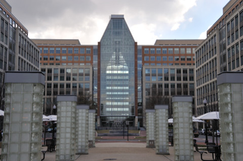
In fact we are now well protected after getting the necessary patents. Every year, 15 days before Tax Day, viz. on April 1st, the Patent Office allows inventors to demo their apparatus directly to the examiners, instead of filing a written patent application. Doing a demo is very efficient. We set up shop in the enormous hall of the Madison Building (see picture below, the tables outdoors are for inventors demonstrating a perpetuum mobile). We had two rows of tables with all the prototypes, gizmos, and gadgets we had developed and demonstrated them step by step and claim by claim to the attentive Examiners.

USPTO Madison Building

Of course the examiners had many questions and doubts, but fortunately at the left of the hall shown in the above picture there is one of the best libraries on this planet, so while we engineers were haggling with the Examiners, our managers and patent attorneys were busy building stronger cases and strengthening the claims.

Further down on Duke Street, on the block after the Whole Foods Market, there is a Marriott Residence Inn, where we could stay six people in each suite and get a lot of quality time to polish our inventions, while our interns prepared hearty meals for us. Our patent attorneys were comfortably lodging at the Westin across the street from the Federal Court building.

Marriott Residence Inn

But, we are digressing — back to the motivation for the g(2) camera. In high-speed digital printing, the bottleneck has always been in the ripping (RIP, Raster Image Processor) or, in HP parlance, the DFE (Digital Front End). For example, when we were working on the Xenith system at PARC in the mid-Eighties, Nick Sheridon was running the print engine at 300 ppm using Tibor Fisli's quad-spot laser diodes, while Gary Starkweather cranked the resolution up to 4000 dpi. Yet, even after adopting the Dragon's MBus, the shipping Docutech product could only run at 100 ppm and 600 dpi due to RIP limitations.

Concomitantly, at Canon the A-printer had been developed. This poster printer had a 40 inch wide array and was printing on paper rolls using bubble jet. The head actually consisted of four 10 inch heads mounted in a staggered pattern, and it was incredibly fast. Only, it required a MasPar mini-supercomputer to deliver the bits. The galleries and poster shops in Roppongi never ordered enough printers to make the product commercially viable.

Today, our valued customers buying high-speed digital presses still have to dive deep into their pockets to buy a costly DFE. This is why in Director Gary Dispoto's Print Production Automation Lab, Dr. I-Jong Lin manages the RIP project. This is also why Dr. Ray Beausoleil — who just became an HP Fellow — moved to the Quantum Science Research Department. We need quantum information technology (QIT) to deliver affordable DFEs for our high-speed digital presses.

One of the challenges in QIT is to store quantum bits (qbits) while avoiding a collapse of the wave function or decoherence. Typically, qbits are stored in a semiconductor (gallium arsenide, GaAs) microcavity, therefore, we have to study the interface interactions of emanating photons.

More formally, we need to study the Bose-Einstein condensation (BEC) phase transition in a polariton system in a semiconductor microcavity. The macroscopic quantum degeneracy is typically detected by probing the statistical properties of light emitted from a microcavity, under the presumption that the statistics of the exciton polaritons are faithfully transferred to the emanating photons.

The figure below shows Interference fringes (a) at 770 nm wavelength used to verify the BEC of polaritons in GaAs microcavity and (b) at 546 nm measured for the green line of a pulsed Hg-Ar discharge lamp.

This figure shows, that a coherent light source (e.g., a photon laser or decaying polariton BEC) can exhibit the same first-order correlations as a chaotic (or thermal) light source (e.g. Hg-Ar discharge lamp in (b)). The table below shows that proper disambiguation of a coherent state also requires measurement of the second-order correlation function g(2) associated with intensity noise correlations:

Function Incoherent Coherent Chaotic
g(1) 0 1 1
g(2) 1 1 2

In summary, as we wrote in our slashdotted paper, the application of the g(2) camera is to take pictures to confirm the presence of true Bose–Einstein condensates (BEC). The next challenge is calibrating the camera. As we wrote in or popular technical report on Spectrophotometer Calibration and Certification, tight calibration is very critical in this kind of applications.

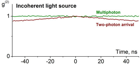
Fortunately, there is a condensate that is readily available and which is produced industrially at very tight tolerances: condensed milk. Alas, in our experiments we found a caveat. From the figure below we know that we are dealing with photon pairs. To correctly calibrate the SPADs, we have to be certain that both calibration photons have exactly the same color.

incoherent light source

As our esteemed colleague and co-blogger Steve Simske keeps warning us about, the caveat is in the rampant counterfeiting happening in the supply chain. What happens if one photon comes from the condensed milk but the other photon comes from melamine?

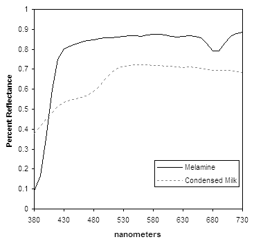
In our lab we have built a special spectroradiometer, which we use as a reference for the calibration instrument. We have used it to measure the spectrum of pure condensed milk and that of melamine. Here are the plots:

spectral reflectance

Now we just use the CIE formula with the color matching functions for the 2º observer:

and get the RGB values of the two photons.

Color science is about observers, and in the end what counts is whether an observer can tell apart photons with these two RGB values. The old way of doing this was to compute the ∆E*ab value in a perceptually uniform color space or in a CIECAM02 color appearance space based on the JND (just noticeable difference).

In our work on the color thesaurus we have established that a more reliable method is to determine whether the names of the two photon's colors are synonyms. Since the first to take a picture of a BEC will almost certainly get the Nobel Prize, we decided to use the data from our Swedish corpus of the färgbenämningsexperiment.

The RGB values calculated above yield mjölkaktig vit for the condensate and snövit for the melamine. Clearly there is no match and the g(2) camera would be calibrated incorrectly if the condensate is counterfeited. How did we solve this problem? The solution is in this Feinman diagram:

entanglement

Since photons are massless bosons, time is symmetric and at an event E we can say that a first photon (signal s) comes from a second photon (idler i) when the two photons are entangled to form a biphoton, In other words, each biphoton can be regarded as forming a loop between source and detector (CC is the coincidence counter).

Entanglement is just a fancy technical term to say that the two photon share the same wave function, also known as Schrödinger equation. Since the color of a photon is given by its wavelength, by entangling two photons we make them of the same color.

In other words, all we have to do, is to entangle the condensed milk photons with the melamine photons and we can always calibrate correctly the g(2) camera, regardless of possible counterfeiting with melamine, because the photons get the same color.

This movie shows principal color scientist Nathan Moroney in our lab entangling the photons.


Of course, the stirring requires a lot of training, because the wave function can easily collapse, so do not try this at home!

For the viewpoint of our performance analyst, see his post in the Performance Agora.

For now, having tattooed on our tonsils to finish the new RIP, we are focusing on that. Once we have delivered product, our future research ideas include feeding the entangled condensed milk photons to Schrödinger's cat and take its pictures with the g(2) camera. We will post our images here, so stay tuned!

In the meantime, we wish you a happy April Fool's Day.

Monday, March 30, 2009

Blue for research, red for development

Color scientists are notorious for surrounding themselves in gray in order not to pollute their retinas with after-images. Typically, the desktop background on their PC is gray so they can make unbiased color judgements.

Color scientists do not spend their day looking at pretty color images. Most of it is spent writing software implementing color rendering algorithms; sometimes they even do some research to come up with new algorithms. There is no imperative need for a gray desktop background.

Recent research by Ravi Mehta and Rui (Juliet) Zhu at the Sauder School of Business, University of British Columbia suggests color scientists should change their PC's desktop to blue when they are conducting research and to red when programming.

From a series of six studies reported in Science 27 February 2009: Vol. 323. no. 5918, pp. 1226 - 1229, they conclude that although people have an overall preference for blue versus red color, red can be beneficial when the focal task requires detailed attention.

The left advert version features visuals that are remotely related to the focal camera product; the right version features visuals that depict specific product details

Red is often associated with dangers and mistakes. They report, claims have been made linking the color red to the highest level of hazard and also the highest level of compliance. In contrast, blue is often associated with openness, peace, and tranquility (e.g., ocean and sky). A word association test confirmed that people indeed generate these different associations to red versus blue color in the cognitive task domain.

[Note that the red and blue may have different associations across cultures. Just replace the color names appropriately.]

Metha and Zhu propose that these different associations related to red versus blue color can induce alternative motivations. Specifically, red, because of its association with dangers and mistakes, should activate an avoidance motivation, which has been shown to make people more vigilant and risk-averse. Thus, red, compared with blue, should enhance performance on detail-oriented tasks.

In contrast, because blue is usually associated with openness, peace, and tranquility, it is likely to activate an approach motivation, because these associations signal a benign environment that encourages people to use innovative as opposed to "tried-and-true" problem-solving strategies. Indeed, an approach motivation has been shown to make people behave in a more explorative, risky manner. Thus, blue versus red should enhance performance on creative tasks.

Indeed, their study shows that red (versus blue) can activate an avoidance (versus approach) motivation and subsequently can enhance performance on detail-oriented (versus creative) cognitive tasks. When the task on hand requires people's vigilant attention (e.g., programming), then red might be particularly appropriate. However, if the task calls for creativity and imagination (e.g., a new product idea brainstorming session), then blue would be more beneficial.

Friday, March 27, 2009

Black

I was recently re-reading chapter 11 on the black printer in Yule's Principles of Color Reproduction [1].

black printer

When in 1719 Jacob Christoph Le Blon invented the principle of trichromatic printing (British patent 423), one of the innovations was his adding a fourth mezzotint engraving plate for a black separation [2]. The black separation simultaneously solved a number of problems:

  • since a gray component is present in a large portion of each image, the black separation can be used as a registration key (therefore the abbreviation K)
  • when the gray component is removed from the chromatic layers, these are thinner and therefore use less of the more expensive color inks
  • in addition, the drying time is shorter (ink limits) and the press can be run faster, further reducing cost
  • the gray balance is improved, more robust, and the blacks are cleaner
  • last but not least, the gamut is considerably extended for dark colors

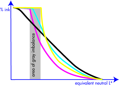
The first step in characterizing (i.e., determining the color transformation for) a color printer is to balance the grays. After this step, we know how much cyan, magenta, and yellow ink we need to print to obtain each gray level. Because yellow ink is lighter than cyan and magenta ink, we achieve a maximum gray level where we use the maximum amount of yellow, when there is still room to add cyan and actually only about half of the magenta ink is used.

The tone range from maximum magenta, cyan, yellow to maximum yellow is called the area of gray imbalance, because no gray can be produced. Adding a black separation, the tone range can be increased to include the area of gray imbalance.

Actually, because the black ink is much darker than even magenta, by going all the way to full black, the tone scale can be considerably extended in the range of dark colors.

area of grey imbalance

First a note on terminology. The gray component of a pixel's color was defined by Yule as the amount of the least predominant ink, i.e., min (C, M, Y). In gray component removal (GCR), this minimum was subtracted from the CMY coordinates and formed the black printer. Making room for black by reducing CMY by any other amount was called undercolor removal (UCR). Today the term UCR is no longer used and the term GCR encompasses both the original GCR and UCR.

The gray component replacement function (or simply black function) is difficult to optimize. Three regions in the tone scale are difficult: the dark colors, the light (right) edge of the area of gray imbalance, and the light colors.

Of the three, the middle tone region at the light edge of the area of gray imbalance is easiest to solve. Indeed, the constraint is that the black function must be smooth, i.e., not start abruptly.

In the dark region, the black function is determined by a trade-off between richness of the blacks, ink limits, and the ink cost. Because the shadows are darkened, their contrast is reduced and consequently the contrast has to be exaggerated in the shadows to preserve shadow detail visibility.

By making the middle region smooth, part of the gray component is removed in the light tone range. Normally the substrate on which we print is white. A lighter tone means that less ink is deposited, which in turns means that more white is added. Adding white to a color desaturates it, therefore an aggressive black function will yield a print lacking saturation [3, 4].

By avoiding black ink in light tones, a larger area of the substrate is covered with ink (hiding white), and because of simultaneous contrast, the perceived color is more vivid. This is somewhat related to a skeleton black ([1] p. 286), where such a black printer is used, but without UCR.

However, avoiding black in light tones introduces a complexity in designing the halftoning algorithm, because the simultaneous contrast also amplifies the perceived color error. Therefore, a poor halftoning algorithm requires more accuracy in the color transformation, while a good halftoning algorithm allows for larger tolerances in the color transformation, as well as in the printer stability.

The above information is purely historical. When Kodak's Yule wrote his book, my PC was an Olivetti P101 with 9 registers of data memory, program memory for 120 instructions, and processing speed limited by the time it took a register's mechanical wave on the memory wire to reach the reading terminal, probably running at a few dozen IPS. When Mik and Dusty wrote their report, my PC was a Dorado, with 4M bytes of memory and 1 MIPS. Today I have an HP xw4600 with 2G bytes and running at about 2000 MIPS.

Because of this incredible increase in performance, on today's computers we can compute a fancy black printer using algorithms based on computational and differential geometry models. While in the past we were limited to colorimetry based on aperture colors for color correction, now we can take spatial (complex) color into consideration. This is why today we get such and exceptional color print quality at such a low cost.

If you wrote or read a good recent paper on this subject, share it as a comment to this post.

  1. John A.C. Yule, Principles of Color Reproduction, Wiley, New York, 1967
  2. J.D. Mollon, "The Origins of Modern Color Science", in The Science of Color (Second Edition), Steven K. Shevell editor, Elsevier Science, 2003
  3. Michael G. Lamming and Warren L. Rhodes, Towards "WYSIWYG" Color, Xerox PARC Technical Report EDL-88-2, P87-00018, April 1988
  4. Michael G. Lamming and Warren L. Rhodes, "A Simple Method for Improved Color Printing of Monitor Images, ACM Transactions on Graphics, 9, 4, October 1990, 345-375

Monday, March 23, 2009

Mimosa

mimosa color

When I was a pupil in elementary school, our teacher Mr. Egidio Bernasconi used to give us mimeographed blank maps that we had to complete. One such map had the streets of Besso (a.k.a. Lugano 3) and from time to time he would give us the name of a plant we had to learn to recognize, find in the quarter, and mark on the map.

I still remember that for a mimosa pudica I had to go to via Coremmo, just a stone throw from school. I wish I had such a map today. Yes, now we have powerful search engines that allow us to find everything we need to know. However, searching the Web for a mimosa in Palo Alto just returns a company providing information immediacy, discovery and continuity for the new generation of critical enterprise information; and of course a number of local establishments serving mimosa cocktails.

I quickly walk a couple of blocks to Gamble Garden, camera in hand. Unfortunately, I do not find a mimosa. However, a major nursery is just a short drive away. Yet, they never heard about a plant called mimosa. How can they not know a mimosa pudica? It is so magic for children: you can touch a leave and it just shamefully closes.

A quick check in The Jepson Manual of higher Plants of California reveals its absence in the index. Hence, it does not exists here. In fact, the USDA database reveals that in the US, this mimosa is limited to Florida, Hawaii, Maryland, Virginia, Puerto Rico, and the Virgin Islands. Therefore, at his time I can only offer this canned picture, credits Steve Hurst @ USDA-NRCS PLANTS Database:

Steve Hurst @ USDA-NRCS PLANTS Database

Another proof that navigating is much more powerful than searching. Instead of finding 27,300 pages for my search, the engine should have told me "dummy, it does not grow here!"

Why was I looking for a mimosa in the first place? Every year, Pantone announces the color of the year. Last year it was blue iris, which I quickly found at Gamble Garden. This year is is mimosa, which I figured should bloom about now and therefore now would be the time to blog about it.

mimosa color

In their press release, Pantone describes mimosa as a warm, engaging yellow. They write: "In a time of economic uncertainty and political change, optimism is paramount and no other color expresses hope and reassurance more than yellow."

Leatrice Eiseman, executive director of the Pantone Color Institute, continues: "The color yellow exemplifies the warmth and nurturing quality of the sun, properties we as humans are naturally drawn to for reassurance. … Mimosa also speaks to enlightenment, as it is a hue that sparks imagination and innovation."

In the press release, Pantone concludes: "Best illustrated by the abundant flowers of the Mimosa tree and the sparkle of the brilliantly hued cocktail, the 2009 color of the year represents the hopeful and radiant characteristics associated with the color yellow. Mimosa is a versatile shade that coordinates with any other color, has appeal for men and women, and translates to both fashion and interiors. Look for women's accessories, home furnishings, active sportswear and men's ties and shirts in this vibrant hue."

Now let me don that mimosa tie I bought on my last business trip to Bergamo and go out for a mimosa. The blue flowers are a nice touch to last year's color, so I guess this is a transitional tie.

my tie

By the way, the cherries at Gamble Garden are about to burst out in さきみだれる. Get ready for the cherry blossom viewing or お花見.

cherry blossom, sakura, hanami

Friday, March 20, 2009

Patch your computers

Tomorrow is the first day of spring. This is a good time for spring cleaning — patch all your computers and your applications, make sure your firewalls are up, your WiFi networks password protected, etc. As John Markoff writes in a recent New York Times article (subscription required), a major botnet worm called Conficker might be released on April first, and you want your computer to be safe. After all, you will need it that day to enjoy all the April fool’s pranks.

Thursday, March 19, 2009

Paper sizes (formats)

In the office printing business we are so used to the generalization that all paper is letter size, that we often forget that is just one size in which we can buy cut sheet paper. Here is a handy compilation of popular sizes.

A series (main series)

A0 is 1 square meter. Formula: h = w * sqrt (2), i.e., the ratio of the sides is sqrt (2).

This is the normally used series.

A number size (mm) size (inch) area (m^2)
A0 841 x 1189 33.1 x 46.8 1.0
A1 594 x 841 23.4 x 33.1 0.5
A2 420 x 594 16.5 x 23.4 0.25
A3 297 x 420 11.7 x 16.5 0.125
A4 210 x 297 8.3 x 11.7 0.063
A5 148 x 210 5.8 x 8.3 0.031
A6 105 x 148    
A7 74 x 105    
A8 52 x 74    
A9 37 x 52    
A10 26 x 37    

B series (auxiliary series)

B0 is 1 m long on the short side.

This series is sold only in cut sheets (in plano) and can be used only if the required size is not available in the A series.

C series (intermediary series)

Geometric average between series A and series B. Example: C4 = sqrt (A4 * B4).

This series has been designed especially for envelopes and other mailing containers.

DIN Summary in mm

Class Series A Series B Series C Series D
0 841 x 1189 1000 x 1414 917 x 1297 771 x 1090
1 594 x 841 707 x 1000 648 x 917 545 x 771
2 420 x 594 500 x 707 458 x 648 385 x 545
3 297 x 420 353 x 500 324 x 458 272 x 385
4 210 x 297 250 x 353 229 x 324 192 x 272
5 148 x 210 176 x 250 162 x 229 136 x 192
6 105 x 148 125 x 176 114 x 162 96 x 136
7 74 x 105 88 x 125 81 x 114 68 x 96
8 52 x 74 62 x 88 57 x 81 48 x 68

Old European Formats

These formats were in use before the normalization and can still be found today in the graphic arts. This is just a selection in plano (= unfolded) papers. When the papers are folded, the name is prefixed by the folding number (e.g., in 4º Jésus refers to the Jésus format folded in four); usually the Latin names are used:

  • in folio, 2 sheets or 4 pages
  • in quarto, 4 sheets or 8 pages
  • in octavo, 8 sheets or 16 pages
  • in 16, etc.
Designation size (cm)
Couronne édition 37 x 47
Double pot 40 x 62
Coquille 44 x 56
Double Tellière 44 x 66
Carré 45 x 56
Couronne 46 x 72
Raisin 50 x 65
Raisin offset 51 x 66
Jésus 56 x 76
Double coquille 56 x 88
Double carré 56 x 90
Jésus offset 58 x 78
Carré offset 58 x 90
Colombier affiches 60 x 80
Colombier 63 x 90
Double raisin 65 x 100
Double raisin offset 66 x 102
Double Jésus 76 x 112
Double Jésus offset 78 x 112
Double Colombier 80 x 120
Quadriple carré 90 x 112

American Paper Sizes

Designation  size (in)
atlas
26 x 24
imperial
22 x 30
elephant
20 x 27
royal
20 x 25
small royal
19 x 25
medium
18 x 23
demy
17.5 x 22.5
crown
15 x 20
foolscap
17 x 13.5
pot
12.5 x 15.5

European Form Sizes

Class size (mm)
0 500 x 700
I 560 x 830
II 610 x 860
III 650 x965
III b 720 x 1020
IV 780 x 1120
V 890 x 1260
VI 1000 x 1400
VII 1100 x 1600
X 1400 x 2000

ANSI Paper Sizes

Designation size (inch)
A (letter) 8.5 x 11
B (tabloid) 11 x 17
C 17 x 22
D 22 x 34
E 34 x 44

ARCH Paper Sizes

Designation size (inch)
A 9 x 12
B 12 x 18
C 18 x 24
D 24 x 36
E 36 x 48

Favorite Cut Sheet Media

These are in plano formats common in the electronic printing industry.

Designation U.S. market (inch) metric market (mm)
US letter / ISO and JIS A4 8.5 x 11 210 x 297
US executive 7.25 x 10.5  
US legal 8.5 x 14  
ISO and JIS A5   148.5 x 210
JIS B5   182 x 257
Postcard 4 x 6 102 x 152
Greeting card 8.5 x 11 scored
(folds to 8.5 x 5.5)
210 x 297 scored
(folds to 210 x 148 )
Note card 5.5 x 8.5 scored
(folds to 5.5 x 4.25)
148 x 210 scored
(folds to 148 x 105 )
US index card
ISO and JIS A6 card
4 x 6, 5 x 8 105 x 148
Calendar kit 8.5 x 11 210 x 297
Hagaki (postcard)
葉書大「はがきだい」
  100 x 148
Oufuku-hagaki (return postcard)
往復葉書 「おうふくはがき」
  148 x 200

Favorite Envelope Sizes

Envelope description Envelope size
US commercial-10 4.125" x 9.5"
International DL 110 mm x 220 mm
International C6 114 mm x 162 mm
US A2 4.375" x 5.75"

Page Length Line Values

Paper Size  6 lpi 8 lpi
Letter 66 88
Legal 84 112
A4 70 93
Executive 63 84

American Paper Weights

onion skin
9 lb.
mimeograph paper
16 lb.
standard typing paper
20 lb.
standard letterhead paper
24 lb.
good for printing on both sides
60 lb.
business cards and postcards
65 lb.
coated magazine stock
100 lb.
poster board
120 lb.