Thursday, August 28, 2008

Noticing is remembering

In last week's post on fan color appearance, I wrote that in low light conditions today's top cameras do not reproduce faithfully color appearance because they remain photopic, in opposition to the human visual system which becomes scotopic. The result shown in the photographs was that while we humans see the crowd achromatic and the LED fans chromatic, the camera reproduced the fans achromatically and the crowd chromatically.

Reality is always more complex. For the camera, the image is flat, i.e., each photosite or pixel has the same importance. However, for the human visual system an object that attracts attention by being bright, colorful, and rapidly moving gets more memory resources allocated, i.e., it is more memorable. This fact makes the photopic/photopic confusion more striking for the photographers themselves than for viewers not present at the event.

The lesson is actually more general. Color scientists who are serious about their research still do psychophysics experiments. When designing these experiments, it is important not to overstretch the observer's memory capacity, because it might skew the experiment.

For more on this topic, the recent paper Dynamic Shifts of Limited Working Memory Resources in Human Vision by Paul M. Bays and Masud Husain in Science 8 August 2008: Vol. 321. no. 5890, pp. 851-854 presents the results of recent research on visual memory. Here is the editor's summary:

The dominant model of human visual working memory allows for the simultaneous representation of only three or four objects. With what precision is each visual object stored as a function of the number of items in a scene? Bays and Husain tested the ability of human subjects to remember the location and orientation of multiple visual items after a brief disappearance of the stimulus array, and found that visual working memory is a flexibly allocated resource. Making an eye movement toward an object, or directing covert attention to it, caused a greater proportion of memory resources to be allocated to that object, allowing the memory of its presence to be retained with far greater precision than other objects in the scene.

Saturday, August 23, 2008

Fan color appearance

One of the key accessories for 盆踊り (bon odori) is the flat fan or 団扇 (uchiwa). The best ones are made by creating a bone skeleton with bamboo from 四国 (Shikoku), on which 和紙 (washi, Japanese paper) is glued.

At this year's パロアルト (Palo Alto) お盆 (obon), I noticed that instead of the usual artistic fans with delicate designs, many dancers were wearing plastic fans like those handed out in hot summer nights by beer companies as marketing tools. I was surprised—with the consul here, why something so tacky?

It was only as the dance progressed and dusk had my vision switch from photopic to mesopic, that I discovered the secret. Today's flat fans are made with designs created by elaborate multicolored LED patterns and wave guides molded in the plastic fan. As the day wanes and vision progresses towards scotopic, these modern 団扇 (uchiwa) become eerie, creating an atmosphere where the living look more like the dead ancestors coming to visit us during お盆 (obon).

Scary! Has 四国 (Shikoku) been unsealed and become 死国 (Shikoku)?

And now to the challenge for color imaging. Below are photographs of paroaruto's bon odori in chronological order. As you note, the camera remains photopic. It cannot render correctly the fan color appearance and the scariness has completely disappeared.

Back to the drawing board! We need color rendering algorithms that can reproduce accurately the color appearance of contemporary flat fans.

Wednesday, July 30, 2008

Un dizionario dei sinonimi dei colori

L'anno scorso in questo blog avevamo presentato il dizionario online dei sinonimi dei colori. Era uno strumento in inglese che dopo varie peripezie è andato a finire nel sito HP Labs a http://www.hpl.hp.com/personal/Nathan_Moroney/color-thesaurus.html.

Comunque sia, questo strumento è sempre ancora molto utilizzato (infatti finora abbiamo avuto più di 113'064 utenti), per cui abbiamo deciso di fare una versione italiana basata sul'esperimento sulla nomenclatura del colore che si trova qui: http://www.hpl.hp.com/personal/Nathan_Moroney/color-name-italian.htm

lclicca per andare al sito

La versione italiana funziona come quella inglese. Segui questi semplici punti:

  1. Clicca su questo link con il bottone destro del mouse, così si apre in una nuova finestra: http://www.hpl.hp.com/personal/Nathan_Moroney/color-thesaurus-italian.html
  2. Ora puoi scrivere un nome, come per esempio "senape" e clicca sul bottone Invia
  3. 3. Se il colore è nel dizionario, vedi
    1. un quadrato di questo colore
    2. le coordinate sRGB e in esadecimale
    3. la colonna dei sinonimi
    4. la colonna degli antonimi
    5. la richiesta di un giudizio
  4. Questo giudizio è un elemento importante in esperimenti online; infatti non sappiamo nulla solla competenza delle persone contribuenti alla compilazione del dizionario dei nomi dei colori. Per migliorare la qualità del dizionario vi chiediamo di giudicare l'associazione del colore nel quadrato con il nome. Scegliendo la
    1. prima pallina si giudica che il quadrato ed il nome non combaciano nemmeno per sogno
    2. seconda pallina significa che sono sbagliati
    3. terza è il famoso bò, chi lo sa?
    4. quarta, vuol dire che combaciano
    5. quinta pallina si giudica il centro perfetto del colore nel quadrato ed il suo nome
  5. A questo punto, clicca sul bottone di Invia per mandarci il giudizio
  6. Se non troviamo il colore nel dizionario, vuole dire che meno di due persone diverse hanno cercato questo colore. Quindi visualizziamo un dispositivo che permette di proporre un colore premendo ripetutamente sui pulsanti colorati. Una volta contenti con l'apparenza del colore, clicca su Invia per aggiungerlo al dizionario.
  7. Il colore non è disponibile immediatamente, perché periodicamente facciamo la media dei colori proposti per un nome e presentiamo la media.

Buon divertimento e grazie per la partecipazione!

Wednesday, July 16, 2008

Face Recognition Accuracy

Science Magazine of 25 January 2008 had a paper with a very daring title: 100% Accuracy in Automatic Face Recognition. Can that be true?

The authors used industry standard face-recognition system FaceVACS by Cognitec Systems GmbH in Dresden (Germany), which is made available for free by the genealogy Web site My Heritage run by My Heritage Limited in Tel Aviv (Israel). Actually, what is made available for free is the retrieval of faces of celebrities.

When they presented the system with the face of a celebrity, they got a hit rate of 54%. They achieved the 100% hit rate by averaging together 20 images of the celebrity and using that average for the query. The averaging smoothens out the image quality and wide range of lighting conditions, facial expressions, poses, and age.

I happen to have 2 portraits of myself taken by HP under very similar conditions, with the only variable being the aging from 8 years of work in the trenches. Not being a celebrity, I am not in My Heritage's database, but I was nevertheless curious to see if the two portraits match up with the same celebrities — of course also aged by 8 years.

From the Jenkins & Burton paper I would expect that any look-alike better than 54% must be acceptable. So here is the first experiment:

I am not familiar with celebrities, so I do not know if the hits are good or bad, but from left to right they are: Howard Dean 67%, Joe Rogan 64%, Cab Calloway 63%, Tony Danza 63%, Ryo Nishikido 62%, Alizee 57%, Kian Egan 57%, Audrey Tautou 54%.

Puzzling. Maybe it is just garbage in – garbage out. Anyway, in the 8 years I did not have plastic surgery and my physiometrics have not changed, so I would expect to get the same answer with the second image. Instead, I get a completely different line-up.

From left to right the look-alikes are: Cillian Murphy 72%, Barry Williams 70%, John von Neumann 66%, Alan Turing 66%, Matt Leblanc 60%, Leonardo di Caprio 60%, Walter Matthau, 59%, Chloe Sevigny 59%.

Speaking of garbage in – garbage out, in this second query I know two of the celebrities by reputation, and I am quite sure that John von Neumann and Alan Turing are not mono-zygote twins, as the results would suggest.

100%, but lots of research still remains to be done. Roll up your sleeves and back to work!

Saturday, June 14, 2008

I-Jong Lin on Drupa 2008

As those of you who tried to get something from me know, I am still totally snowed under and my to do list is still quite long. Therefore, it is a particular pleasure when I get some help from friends, like today's blog post from my esteemed colleague Dr. I-Jong Lin. Here is his trip report from Drupa 2008.


Dear All,

Here are some pictures that I brought back from Drupa 2008. From all accounts, it seems that the HP booth was very impressive and very successful, and showed the leadership position that HP holds in commercial digital print market. I have some pictures of some competitors, but mostly the offerings from HP (since they made for the best pictures).

Enjoy!

I-Jong Lin

Some competition for IHPS from Miyakoshi. Didn't see it run. Also they have a LEP press that is a competitor to the Indigo LEP technology. For some reason, I felt bad about taking a picture of that press, though.

Photo by I-Jong Lin

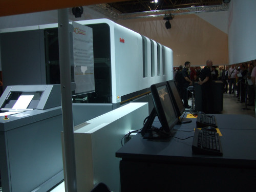
This picture is the high-speed inkjet "Stream" product from Kodak. It was a pretty huge box as you can see, but inside the tinted glass, it seemed pretty empty. From this massive box, you can see the 8 inch wide output coming out. Obviously, someone has performance issues.

Photo by I-Jong Lin

This picture is another view the high-speed inkjet "Stream" product from Kodak. Once again, note the very narrow web feed going into the huge box.

Photo by I-Jong Lin

This is the NexPress that was being shown at Kodak. It wasn't running and they seem to have boosted the speed to 120 A4 per minute. But otherwise, there's nothing too new here.
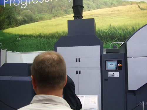
Photo by I-Jong Lin

Various views of the IHPS high-speed inkjet press. Very impressive. It was running and producing samples of books and short-run newspapers during the Drupa show.

Photo by I-Jong Lin

Photo by I-Jong Lin

Photo by I-Jong Lin

Photo by I-Jong Lin

Photo by I-Jong Lin

Note the size of the drying stage for ink has been reduced substantially. One can only imagine the paper path and the airflow through the chimney.

Photo by I-Jong Lin

Photo by I-Jong Lin

Photo by I-Jong Lin

This is the double engine web-fed press (w3250) from Indigo with speeds of 8000 A4 per hr.

Photo by I-Jong Lin

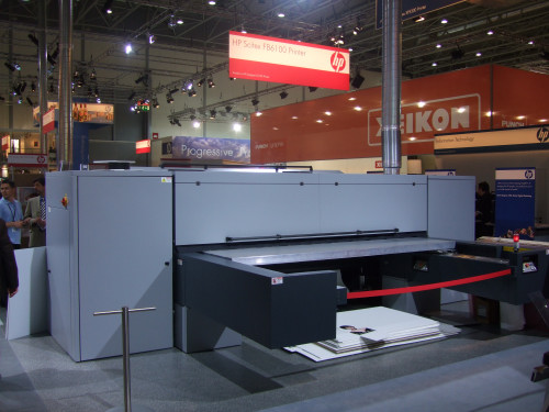
A really, really, really big inket printer: Scitex FB6100. The width of the paper is 87 inches wide. Yowza.

Photo by I-Jong Lin

Another really, really, really big inkjhet printer: Scitex TJ8500. This printer was popping out 6 feet by 4 feet posters every ten seconds or so. Unbelievable.

Photo by I-Jong Lin

Another really, really, really bigger inkjet. The way that printhead was moving around it could have hurt someone.

Photo by I-Jong Lin

Another really, really, really bigger inkjet. Even with its size, the image quality and the colors were very vibrant.

Photo by I-Jong Lin

A picture of the Indigo 7000, the double-speed press from the Indigo 3050. A very sweet press package due to the electronic transfer of the inks onto the page. This electronic transfer allows the ink to adhere at any angle allows for that very cute fan design for all the bids. All other press manufacturers have to set up their ink transfer stations in a linear fashion. But Indigo has a very neat and compact package.

Photo by I-Jong Lin

Birdeye's view of the IHPS inkjet high-speed press.

Photo by I-Jong Lin

A picture of the Global Graphics booth, our partners in RIP.

Photo by I-Jong Lin

Sunday, June 1, 2008

Your Personally Identifiable Information (PII)

In my 16th of May post on Your Portrait, I mentioned HP's stringent privacy rules. Now that we are on a commercial platform, we can be stricter about privacy.

As you may have noticed, you can now comment anonymously, i.e., without HP Passport. We will now be strict about rejecting any comment with personally identifiable information (PII). When you submit your comments without personal contact details, we will be happy to publish them; if you miss your comment, resubmit it without PII, as we have no way to get back to you. Also, if you log in using HP Passport, make sure your user ID is not your email address (instructions on how to change your user ID are on the login page). Thanks!

Of course, comments with other's PII, especially when defamatory or character assassinations, violate the HP Standards of Business Conduct and are also rejected, as explained in the post on Snakes in Suits.

Wednesday, May 21, 2008

See you soon

We wanted to let you know that HP blogs will be migrating to a new platform over the next week. As of Friday, May 23, we won't be posting to our blog and won't be able to receive any comments submitted. Please hold your comments until June 1 when our new site will be live.

Publish or perish

SocratesBeing an old person, my formative years were in a quite different publication ecosystem. Although I studied at a world class elite school, the new publish or perish system had not yet reached our mathematics department. It was believed that a mathematics professor has about one breakthrough idea every two years and hence it was expected he or she submits a paper to the journal every two years and that the paper will be published after a substantive review and revision.

For the students, the first two years were spent in the basic studies, while the third and fourth year were spent in specialization and learning how to perform research. We were doing the latter through seminars, where each student was assigned a fundamental paper to study and explain. The papers were difficult and required researching the literature; the result was a seminar presentation.

At the end, four months were spent in real research in the form of a diploma thesis, which was printed in half a dozen copies for the collaborators. When continuing with a doctorate, a conference presentation was made at the beginning, to make sure that one would not embark in research already done. At the end the dissertation was printed in about a hundred copies for library exchanges and for colleagues working in the field. The main result was also published in the form a technical report and sometimes as a paper.

Today, journals receive a large number of manuscripts at the seminar level. It appears that every master thesis is submitted for publication in a journal. Since the level of research has not changed, this means that journals are swamped with bad manuscripts. With bad I mean they do not present novel original research results and they convey everything the author has learned instead of being concise.

People may say that a given journal is first tier because it rejects 80% of the submitted manuscripts. Unfortunately the contrary is true — when a journal is first tier it gets swamped with 80% crap. You may argue, so what, the system works.

Actually, it works at a very high cost. Every manuscript still needs to be reviewed, and because reviewers are swamped, the reviews are getting less and less useful. This way the research process as a whole suffers because the feedback from peers is less conductive to improved quality. Also, even when the editorial process runs on a volunteer basis, a large staff is still required to get the manuscripts moving through the review process, increasing the price of journals.

One may be tempted of incriminating grant giving organizations, because they created the publish or perish system in the first place. However, these organizations work in the interest of society, and are interested more on impact and quality than dry artificial metrics. In my view, the responsible are the professors or research managers who are not diligent in screening what they allow for submission to a publication.

To finish on a positive note, I would like to share with you what I think was the best paper that crossed my desk in 2007. The paper appeared 1 August 2007 in Optical Engineering 46(08), and was written by Yael Termin, Gal A. Kaminka, Sarit Semo, and Ari Z. Zivotofsky. The title is Color stereoscopic images requiring only one color image and you can get it at this link.

This paper addresses the application and advancement of creating practical 3D stereoscopic visual scenes, and does so in a well-written fashion. Through the use of an antique stereo scope (from 1905) and a high tech Head Mounted Display (nVisor-SX HMD) the investigators show to 11-15 subjects paired stereoscopic images. These images are either both color, both gray scale, or a mix of one color and one gray scale. The results support the investigator's hypothesis that there is no significant difference between the percept of depth between the color/color images pairs and the mix image pairs. There is a slight decrease in the perception of color intensity but this seems to be negligible. The finding is novel and important to the field of optics and visual perception.

I hope you will read it and consider it a benchmark for your next manuscript submission.