One of the American strengths in the global economy is the demographic knowledge about itself. No other country publishes high quality statistical data as fast as the US, and nowhere else have companies such intimate knowledge of their customers. Nevertheless, HP's blogs are subject to very stringent privacy rules, and we know very little about You, our reader.
True, our Mostly Color blog readers are shy and prefer to comment via email, but not everybody comments, so we know very little about You. The only data we receive is a spreadsheet with the minimal data necessary to administer our performance appraisals.
Knowledge of the customer — or reader in this case — is important to decide which of the facts we see when we look out of our window we should blog about; after all, we are promising to divulge information that allows you to take action and make commitments. So I threw the April data we just got into pro Fit to see what we can interpolate.
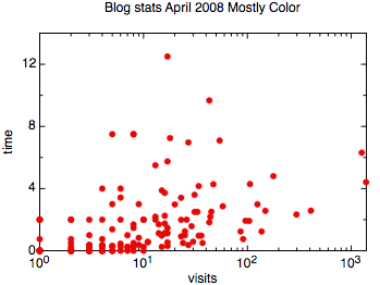
The first statistical tidbit is that you are not just reading our blog as we write it. In fact, although we just wrote a few posts, 146 pages were visited. By the way, a visit is the collection of the pages you visit during a session. For example, if you start from a page and then follow links to previous posts, it counts only as one visit. I am looking at visits instead of views, so I can limit the data to the posts you where interested in first and ignore deambulations.
 The first plot tells me that there are some posts that are wildly popular. Considering this is a more arcane blog reporting on news like non-local realism, compared to for example The Digital Mindset Blog reporting on Gwen Stefani, this is a surprising data point. Hmm, Nathan posted An On-Line Color Thesaurus half a year ago on October 29, 2007 and still had 1392 visits last month; I guess that is what would be called an evergreen.
The time on the ordinate is in minutes, so pages with zero time are the ones you dismissed after a cursory glance. Fittingly, more time was spent on the more popular pages. There are quite a few visits to pages read for more than two minutes, which tells us, that the level is about right for our audience.
Interpolation allows us to get a little more out of the data. First lets us categorize it. I should have taken the tags on each post, but that would have taken me too much time, so I just quickly make up nine categories and get

The color on the legend at the right is the reading time in minutes, and visits are the number of times a post was visited upon first reaching the blog. Yellow areas indicate were we hit your interests on the spot.
Posts on color science are most popular for diligent readers, with Nathan's tool posts hitting the jackpot. Surprising is the popularity of the trivia posts, where we mostly blogged about a particular color. We should do more of them.
The encouraging datum is that there are no categories that flopped, meaning that our eclecticism is in the correct ballpark for our readers. Actually, let me replot this with a linear scale and focussing on the posts with hundred or less visits, which are more the typical posts.

This confirms that each category has an attentive readership, mostly so the posts related to color science, hence the blog title is appropriate.


No comments:
Post a Comment