In the last couple of months I had been writing about the problem of selecting color palettes that are visually pleasing. I started with Mik Lamming's effort in bringing back to the office the colors that were sacrificed with the transition from mimeographs to Xerox copiers and from color-ribbon typewriters to IBM Selectrics. After a digression on the appearance of flamingos, I continued with the problem of selecting colors for VLSI design and illustration, showing the Meta-Palette and a set of other color selection tools.
Today I will step back a little and present a broader view. The problem of designing pleasing or harmonious palettes is as old as visual communication. In western culture a quantum leap occurred with Leonardo da Vinci's prolific work on color analysis and structure (leading to chiaroscuro), which continued with Michel Eugène Chevreul's simultaneous contrast (leading to Impressionism), and with Georges Vantongerloo's attempt to mathematically represent color palettes (leading to De Stijl and Bauhaus).
Essentially the Proto-Palette was just an evolution of this thread, made by a guy sitting in his office and talking to media designers. The fire test came around 1989, when it was decided that GlobalView's desktop would be in color. It turned out that the Proto-Palette tool (color harmony) was too regimented and the Digital Palette tool (palette database and color blending) needed a flexible user interface, so I integrated these tools, along with the earlier Meta-Palette and Maureen Stone's Color Tool.
This integrated set of tools allowed designers to start with a palette—for example, complexion—and add a contrasting color or changing a color lexically by adding a modifier like "muted." Codeveloping the color selection tools with the GlobalView GUI, all while the designers where working on the desktop (icons, etc.) proved to be very fruitful and efficient, leading to a paper at SPSE's 43rd Annual Conference (now IS&T). Since I had a full implementation, I gave a demo at the end of my presentation:
These tools were not the only game in town. At Tektronix, Jerry Murch and Joann Taylor were doing similar work. In Japan, Shigenobu Kobayashi had developed a system based on his Color Image Scale:

All this came together around 1993 with the release of Canon's Color Advisor, described in L. Lavendel and T. Kohler: The Story of a Color Advisor. In S. Sü̈sstrunk and A. Lakatos, editors, Sixth Color Imaging Conference: Color Science, Systems and Applications, volume 6, pages 228–229, Scottsdale (Arizona), November 1998.
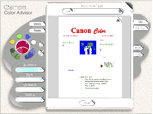
As they describe in their paper, Larry Lavendel and Tim Kohler actually surveyed their potential users, instead of just working with a few designers like I did. This allowed them to take into account the semantic aspects and thus create a tool that is easy to use by anybody, as opposed to my tools, which were usable only by designers and researchers.
It is a pity, the Canon Color Advisor did not survive in the market, because nothing better was produced after it and it looks like with their Canon Color Agent, Larry and Tim were up to something even much more powerful.
In retrospect, Canon's Color Advisor was just too far ahead of time. When in 1991 Canon implemented their device independent color management system, they tried hard to fully integrate it into Windows. When Microsoft refused to cooperate, Canon's CEO Dr. Yamaji flew to Seattle to negotiate directly with Bill Gates.
Unfortunately the latter declared that Windows users will never create color documents, and all that was needed in Windows was a fixed palette of 16 colors for the GUI, with none required for documents. When Dr. Yamaji insisted, Gates declared that color would require an additional floppy disk in the upcoming release of Windows 3.1, and at 15 million copies to be sold, the cost for enabling managed color documents would be the astronomical sum of $15 millions.
Unfortunately this forced Canon to bury its Color Advisor in the printer driver for a post-processing step, instead of making it available during document creation. However, it did save Microsoft $15 millions, and I am sure they made good use of it.
All this is old history. The notion of artists, designers, and scientists designing color palette selection tools is a concept of the second millennium. In this millennium, the process consists in crowd-sourcing large data corpora and using analytics to make inferences. The questions then are:
- Is crowd-sourced data reliable?
- Do the methods scale?
- When do we get a modern color advisor?


No comments:
Post a Comment