Thursday, December 13, 2007

High-Dynamic-Range (HDR) Photographic Survey

Mark FairchildLast August, Prof. Mark D.Fairchild, Professor of Color Science and Director of the Munsell Color Science Laboratory in the Chester F. Carlson Center for Imaging Science at the Rochester Institute of Technology released an image database for research in High-Dynamic-Range (HDR) imaging. This database is called the HDR Photographic Survey.

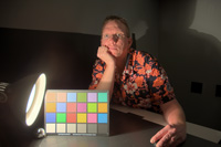
In these days, when camera sensors have a bit depth of 12 or 14 bits and LCD panels are at 12 bits, developing good compression and rendering algorithms for HDR images is increasingly important. Also, most SLR cameras nowadays feature automatic exposure bracketing, so it is relatively easy to create HDR images. The problem is having well characterized reference images that everybody can use, so algorithms can be compared.Mark Fairchild in 9 brackets

One aim of Prof. Fairchild's HDR Photographic Survey is to provide such images in the public domain to researchers working on HDR systems and perception with a key feature being the inclusion of camera characterization data to allow conversion to accurate device-independent image data, colorimetric measurements of original scene elements, color appearance scaling of scene elements, and other scene data allowing increased utility of the images.

There are 106 images in all. Twenty-eight have accompanying colorimetric and appearance data. The remaining images have various data associated with them, but as a minimum have an absolute luminance calibration. The link is http://www.cis.rit.edu/fairchild/HDR.html.

The images are saved as OpenEXR files. The OpenEXR format retains the image data as 32-bit floating-point values. These minimally-processed — and photometrically linear — OpenEXR files are what is available in the database. Each HDR image retains a dynamic range of about 800,000:1 (19-20 stops, or bits, of real image information).

The advantages of knowledge of the original scenes, both direct and through the appearance scaling and colorimetric data, cannot be overstated. It is already evident that having such data combined with HDR images can greatly enhance research on human visual perception and imaging techniques.

Image content includes many natural landscapes, but also portraiture and indoor/outdoor scenes of man-made objects. Lastly, some extra images are also available that are simply nice photographs.

The database images and data are in the public domain for research purposes. It is only requested that they not be reproduced for commercial purposes and that the source of the images be acknowledged in any publications or presentations resulting from research in which they are used.

Monday, December 10, 2007

Income level: economists are wrong

In traditional economic models of decision-making, the most important determinant of individual well-being is the absolute level of income. A recent study based on brain activity observed using functional magnetic resonance imaging (fMRI) proves these models wrong. Indeed, social comparison affects individuals' subjective well-being, and thus behavior.

Dr. Armin FalkThe study was done at the Neuroeconomics Lab at the University of Bonn located at the Life&Brain Research Center by Dr. Armin Falk and his co-workers and is reported in the 23 November 2007 issue of Science, Vol. 318. no. 5854, pp. 1305 - 1308 in the paper Social Comparison Affects Reward-Related Brain Activity in the Human Ventral Striatum.

The team in Bonn had access to two MRI machines placed side by side and was able to concomitantly give the same task to two subjects while rewarding them differently in case of coincident success. They included nineteen subject pairs, and analyzed data from 33 subjects.

The task involved estimating the number of dots on a screen. At the end of each of 300 trials, both subjects received a feedback. This feedback provided information about both subjects' performance (whether the estimates were correct or incorrect), as well as about both subjects' payments in a given trial. Subjects solved the estimation task correctly in 81 percent of the trials.

Analysis of variance suggested that the importance of relative comparison is independent of the level of payment. In addition, there was no significant impact of the side of the activation or the scanner type. Thus, the results provide neurophysiological evidence for the importance of social comparison on reward processing in the human brain.

Compensation boards should keep this in mind, if they want their organization's success to be sustainable.

Thursday, December 6, 2007

Bit rot antidote

PDF 1.7 is now a Draft International Standard, soon to become ISO 32000.

In my October 30 post on Photo permanence and durability I had written about the problem of bit rot. For documents, since 1993 the best antidote for bit rot has been PDF (Portable Document Format). In fact, since then I always keep a copy of my documents in its original format and in PDF. Most of my tutorial materials are created in FrameMaker, but since Adobe abandoned it on the Mac platform, I often end up making small changes directly in the PDF file, which I can edit in Illustrator or in PitStop, depending on the edit's nature.

Now PDF 1.7 has become an even more potent antidote to bit rot, because the ISO has promoted it to a Draft International Standard. To learn more about this, read Jim King's PDF blog entry of December 4 with title ISO Ballot for PDF 1.7 Passed!.

Above I wrote explicitly about documents, not about pictures. If you put your pictures in a PDF file you will always be able to read them, but note that PDF is a structured file format, not a file format for images. Therefore, inside a PDF file, the image will be encoded for example in GIF, JPEG or JPEG-2000. These encodings are also ISO standards, so there will always be decoders for them. However, JPEG does not specify a file format, so wrapping JPEG images in a PDF file is better against bit rot. This is not an issue for JPEG-2000, which specifies also file formats.

Wednesday, November 28, 2007

Postcard from Albuquerque

In big corporations the hand often does not know where the foot is and then shoots itself in the foot. Now I am finally able to get at my email after my old mailbox was secretly deleted over two weeks before I got access to the new mailbox. There I found a postcard from Albuquerque I would like to share with you. It was sent by John McCann, who shot it on his HP PhotoSmart C945 camera and kindly gave permission to reproduce it in this post.

The crown jewels of learned societies are its Fellows. The Fellowship Award has three purposes: it recognizes individuals with a lifelong contribution to their field, it points out eminent examples for the young to look up to, and it ranks the conferring society by the quality of its Fellow members.

When a society evaluates members for the Fellowship Award, it has to ponder if their promotion increases the average quality of its Fellows compared to that of other societies. Roughly, two criteria are evaluated: the scientific quality of their research, and the structural impact they had in their field and society in general.

Robert Buckley, Shoji Tominaga, Daniele Marini. (c) 2007 John McCann

The three gentlemen in McCann's postcard from Albuquerque are freshly minted IS&T Fellows who scored particularly high in structural impact, while obtaining outstanding achievements in imaging. Let me introduce them from left to right, first with their citation then with their bio sketch:

Robert R. Buckley
for his contributions to gamut mapping, color encoding, document encoding, and their standardization

A Research Fellow at Xerox Research Center in Webster, NY, Dr. Robert Buckley began his career at Xerox Corporation's Palo Alto Research Center (PARC) in 1981, after receiving a PhD in Electrical Engineering from MIT. He holds an MA in Psychology and Physiology from the University of Oxford, where he was a Rhodes Scholar, and a BSc in Electrical Engineering from the University of New Brunswick. During his career at Xerox, he has held research management and project leadership positions in color imaging and systems, and has worked on color printing, image processing, enterprise coherence, and standards for color documents and images.

Dr. Buckley pioneered gamut mapping and led the way in the use of uniform color spaces in the processing and coding of color images. He co-authored the first color encoding standard, invented the Mixed Raster Compression method, and co-invented object-optimized printing technology.

In the area of standards, Dr. Buckley influenced the color fax standard and was the lead author of the IETF standard file format for internet fax. He chaired the CIE Technical Committee on the Communication of Color and was project editor for Part 6 of the JPEG2000 standard. Dr. Buckley has lectured and consulted on the use of JPEG2000 in the cultural heritage community, designing the profile that the Library of Congress uses in the National Digital Newspaper Program.

Dr. Buckley has been active in the IS&T/SID Color Imaging Conference since its inception, serving on the Organizing Committee and co-chairing CIC in the second and twelfth year. More recently, he served as the founding co-chair of the new IS&T Archiving Conference for its first two years. He received the IS&T Service Award in 2005; in 2006, he became president of the Inter-Society Color Council and chaired the ISCC/CIE Symposium that celebrated the twin 75th Anniversaries of ISCC and the CIE Standard Observer.

Shoji Tominaga
for his contributions to color imaging science, particularly the interaction of light with materials, color constancy, and illuminant estimation

Shoji Tominaga was born in Hyogo Prefecture, Japan (1947) and received his BE, MS, and PhD in Electrical Engineering from Osaka University (1970, 1972, and 1975, respectively).

Since 2006 he has been professor in the Department of Information Science of the Graduate School of Advanced Integration Science at Chiba University in Japan. Prior to that he was with Electrotechnical Laboratory in Osaka (1975-1976) and Osaka Electro-Communication University (1976-2006). While at Osaka Electro-Communication University, Tominaga was professor in the Department of Engineering Informatics (1986-2006) and Dean of the Faculty of Information Science and Arts (2003-2006). During the 1987-1988 academic year, he was a Visiting Scholar in the Department of Psychology at Stanford University in California.

Dr. Tominaga's research is in the field of color imaging science. His interests include interaction of light with materials, color constancy, illuminant estimation, spectral imaging, digital archiving, color image rendering, omnidirectional imaging, imaging processing algorithms, and color image appearance.

Dr. Tominaga is active in several academic societies. He served on AIC Kyoto as an organizing committee member (1996-1997), and as a program committee member for the IS&T/SID Color Imaging Conference (1996-2004). In 2000, he founded the Visual Information Research Workshop in the Kansai Section of the Information Processing Society, Japan, and in 2001 the Visual Information Research Institute at Osaka Electro-Communication University, where he conducted many research projects as the chairman. He was conference co-Chair of the Eighth International Symposium on Multispectral Color Science (2006) and is now president of the Color Science Association of Japan. He has authored more than 150 scientific publications and received the Scientific Technology Award from the Suga Weathering Technology Foundation in Japan (2002) and an IEEE Fellow Award (2005).

Daniele Marini
for his contributions to computer graphics and his development of a practical approach to Retinex theory

Daniele Marini graduated with a degree in Physics from the Università di Milano in 1972. Since 1978, his research has encompassed several areas of graphics and image processing, with specific reference to visual simulation, realistic rendering, classification, image recognition and compression, color science and computational color models, and virtual reality. He taught Computer Graphics for the Graduate Program on Industrial Design at the Architecture Faculty of Politecnico di Milano (1996-1997) and is Associate Professor at the University of Milano, teaching Computer Graphics and Image Processing in the undergraduate programs in Informatics and Digital Communications. He is presently a member of the Dipartimento di Informatica e Comunicazione.

Prof. Marini pioneered the field of image synthesis in Italy, contributed to the founding of the Italian journal PIXEL, and was one of the founders of the Italian Aicographics Association. He founded Eidos, the first Italian company to specialize in advanced image processing, and created the Laboratorio di Eidomatica at the Dipartimento di Scienze dell'Informazione.

He has been scientific secretary of the National Commission "Conoscenza per Immagini" of the National Committee of Science and Information Technology of the National Research Council, and a member of the Commission for the SMAU Prize for Software Industrial Design, the National University Council (1997-2006), and the Academic Senate of the Università di Milano (2003-2006). In 1998, he was appointed supervisor and coordinator of the initiatives on multimedia at Triennale di Milano. This year Prof. Marini started a new initiative on virtual reality, installing the first University Virtual Theater at the Università di Milano. Prof. Marini has published more than 130 scientific and dissemination papers, as well as authored two books. He has been consultant for many Italian private companies, including Laben, Agusta Sistemi, ACS, SEA Informatica, Olivetti, CISE, VTR, Delphi, UIC, AIS, Artech Video Record, and STMicroelectronics, and has coordinated many national and international research programs.

So far for the postcard from Albuquerque. Other 2007 IS&T Fellowship awardees were Ralph E. Jacobson for his contribution in the field of image quality metrics and his leadership in imaging science education, and Bahram Javidi for his contributions to 3-D imaging science, information security, and image recognition.

Thursday, November 22, 2007

Fine art ink jet

The French magazine Réponses Photo just published its fifth special edition issue. It has a very interesting survey of ink jet printers for fine arts.

It starts on pages 39-39 with a brief overview. Then it presents the technologies and product line-ups by Epson, HP, and Canon. Interspersed is a glossary that elucidates terms like bronzing and metamerism.

After a section on papers, you will find a short article on creating black and white prints. After a question and answer section, Réponses Photo presents a series of interviews with gallery owners and curators.

This survey of ink jet printers for fine arts concludes on page 60 with a summary and discussion of the designation of prints. Réponses Photo recommends not to use the term digital print, as the original image can be AgX or digital, while a printer can be digital or laser on AgX. While in France — where Epson test marketed the first ink jet printers for fine arts, and therefore fine art ink jet prints have been around for many years — the term Digigraphie is common, Digigraphie it is not known in Anglo-Saxon countries. For example, in the US the French term of giclée is commonly used, while in France the same term is unknown in this context (the verb gicler means to spray ink on paper).

Réponses Photo recommends to write on the back of each print the ink type, paper, and printer model, which will help a future restoration if the print becomes valuable. For the nomenclature it recommends to at least distinguish between giclée pigmentaire and giclée dye.

It should go without saying that this survey is not a product test. Rather, it gives you the knowledge necessary to form your own buying decision depending on your artistic message.

Monday, November 19, 2007

The blue hour

In the Francophone world you often come across theatres and hotels named "l'heure bleue." When clocks are depicted in suggestive paintings, they are often set at the blue hour. When is the blue hour, and why is it important to painters and photographers?

Vincent van Gogh: Nuit étoilée (Saint-Rémy-de-Provence), 1889The blue hour is at four o'clock in the morning, before the opulent and busy morning has started and many people still sleep. During the blue hour, when the night plays with dawn, light has a rare quality from the sky's cold blue and the star's warm yellow light, which bathe objects with two opponent illuminants. At this mesoptic illuminance level our visual system is tetrachromatic, with rods and cones all contributing to colors appearance.

In the Silicon Valley, the light pollution is so high, that this special time of the day cannot be appreciated, but for example in the Alps, nature is still pristine and nights are dark. I invite you to experience the blue hour, and even dawn, on top of a pristine mountain. Then, please, help fighting light pollution and turn off your lights when you sleep.

By the way, five and six o'clock are not colored, they are "l'aube" (dawn), and "le levé" (get up).

In reality, l'heure bleue, this quiet time of the day when nocturnal animals have already gone to sleep and diurnal animals are still sleeping, has a different meaning to artists. That perfumes have been named L'Heure Bleue is a hint. As Félix Vallotton's 1899 "La visite" shows, it is the time for lovers to say good bye, and the time on the alarm clock on the gentleman's night stand indicates the blue hour.

Félix Vallotton: La visite, 1899

Wednesday, November 7, 2007

digital photo workflow for the rest of us

Recently a colleague a few cubicles down showed me some prints he did on his HP Photosmart Pro B9180. I was impressed with the image quality and I am wondering if time is ripe for the rest of us to switch from AgX to digital photography. You get your print in just 90 seconds and as Ingeborg Tastl's fade simulator illustrates, the permanence and durability is excellent.

Let me first explain what I mean with "the rest of us." In today's times of the transitioning organizations, the masses have become "transitioning consumers," obediently updating their gadgets every time a new release comes out. Besides the fact that for us researchers in transition such a strategy is not affordable, it is not meaningful from a quality point of view.

In fact, if you are not a commercial photographer, to win in competition you must be able to produce a gallery quality print in a reasonable amount of time. In my darkroom, I can crank out a 12x16 inch print every 10 minutes, including cropping and exposing a black frame to separate the photograph from the white frame. I am using an old Focomat and a Gossen exposure meter, so I do not need to focus nor make exposure trials.

This means that it is not only a pecuniary question but also a question to be skilled with the equipment. Developing implicit knowledge takes time and perseverance. Therefore, you cannot be a transitioning consumer but have to do it the old way by paradigm shifts or technology disruption.

For a long time I was shooting with a Nikon FM titanium and manual fixed focal length lenses. Then came the time my eyes had gotten sufficiently old that I was no longer able to focus instantaneously, so I had to make a paradigm shift to an F100 and a couple of autofocus lenses.

Today, digital cameras offer a substantial speed advantage over traditional cameras in that they use imaging technology to do quite a lot of processing from the time you press the release and the image is recorded. In fact, the cameras first sample an ambient light picture, then shoot one or two measurement flash bursts, compare the two images, and then compute the ideal exposure parameters and flash duration. All this takes place during the few milliseconds it takes to move up the mirror, a fraction of the time it takes the old way of controlling contrast with filters.

In summary, the printing technology and the camera technology are both ready for a paradigm shift. What I am not sure about is the workflow. As I stand now, a digital workflow is an order of magnitude slower than a wet chemistry workflow. Maybe you can tell me what I am doing wrong, so I will describe what I found out.

I downloaded a number of trial programs (fully functional software with a 30 day expiration date) and had to discover that little of it is practical.

Let me start with my hardware. For my tests I am using a D70 body I had around for producing legal documentation. My PC has a 667 MHz processor, 512 MB of RAM, and a 133 MHz bus, which are all sufficient for my day job as a researcher in computational color science.

Since today's sensors have a bit depth of 12 bits per pixel and today's LCD panels also have a bit depth of 12 bits per pixel, it does not make sense to use a JPEG workflow, which today requires retinexing the image down to 8 bits per pixel. Yes, ISO is adding a new layer to JPEG for high dynamic range (HDR) images and is considering JPEG XR, but they are not yet out and hence not implemented in any cameras.

Therefore, there is no other choice than using a "raw" workflow, in which the raw bits from the sensor are processed directly. Instead of raw file, the term "digital negative" is also used.

There is a number of quite powerful photo management programs for the consumer market. However, I quickly found out that when you throw at them a compact flash card full of raw images, they quickly choke and become unusable.

At the other end of the spectrum, professional photo management programs are unusable slow on my PC. It appears you need at least a quad-core, some 4 GB of RAM, and a 1.5 GHz bus — not everybody's kind of iron.

What I found to be usable is Nikon Transfer to download the images. The main advantages are that it completes the embedded XMP/IPTC metadata, renames the files to a systematic archival name, and automatically stores backup files on a second medium, which is more important than a conventional backup for my legal documentation images.

As you can see in the embedded EXIF metadata in the image below, this program has a bug in dealing with the date and time. During the transfer it did correctly update the clock in the camera, but is did not correct the time stamp in the EXIF data by the changed amount, which happens to be 8 hours because I forgot to reset the Daylight Saving Time and the offset from Universal Time Coordinates for my current location.

digital negative developed with ViewNX

The next step in the workflow is to individualize the metadata, tag the images, organize them in folders, and then convert copies to JPEGs that can be thrown in a consumer level photo management program. Since I keep my negative in binders with their contact sheets, I also want contact sheets from my digital images, so I can keep them in a binder for quick browsing.

Since Adobe did a good job with XMP, I would like to have all the metadata in the image file, not in a separate database or in sidecar files. Essentially the software for this workflow step should just be a veneer over the operating system's native file system.

Adobe's Bridge is attractive, but it is designed for sharing files between Creative Suite programs and does not fit well in the workflow I have come up with so far.

Nikon's ViewNX is a better fit, but is has some quirks. For example, to convert the image for the above figure, when I specified the size for this blog's column width, it changed the size to 640x426 pixels. Also, the conversion to JPEG is so slow that I have to let it run as a batch job over night. However, organizing the images is very fast, because the program appears to use the preview image in the metadata instead of rendering the raw image.

Before the images are converted, there should be a step for manipulating them. For example, I like to apply an unsharp mask, do some minor local contrast manipulation, and correct inevitable optical distortions in some lenses. I tried to use Capture NX, but on my PC it is way to slow and the program also has a problem to allocate memory, because often the image becomes just a black rectangle.

At this point I am stopping, because I really would like to hear about your experience. What did you try? What are you happy with?
Thursday, November 1, 2007

Colour: Design & Creativity

Form the AIC e-news, november 2007:

Colour: Design & Creativity, the new online journal from the Society of Dyers and Colourists (SDC), is intended to serve a gap in the marketplace by appealing to a multidisciplinary audience seeking a better understanding of colour and its application in design, theory and practice. In particular the journal will emphasise the synergy between colour and design, as opposed to their individual importance.

Comments editor, Prof. Stephen Westland, ‘Although design is for convenience recognised as a discrete discipline, it is truly multidisciplinary, involving aspects of science, technology, art, crafts and business. Design represents one of the significant interfaces between art and science, and the journal will be dedicated to exploring this interface.’

Among the topics covered in the inaugural issue are colour and emotions, analysis of colours in branding, design concepts using thermochromic colour change, colour forecasting and preference in the fashion industry, and an article that describes what the author calls ‘a new colour form’.

The journal will appeal to colourists, designers, scientists, artists and other professionals alike and seeks submissions of research related to colour: from explanatory papers, case studies and essays, to reviews of books, events, collections and installations. Being published online, a key feature will be the inclusion of ‘galleries’ of work, as well as material in movie and audio format. All articles will undergo a process of peer review, managed by the editor and assisted by a body of international experts forming an advisory panel.

In the first instance, Colour: Design & Creativity will be open access, thanks to funding received from the Worshipful Company of Dyers, and can be found at www.colour-journal.org. Anyone active in colour research, development and application is invited to submit material for subsequent issues, or to contact the editor, by emailing: editorial@sdc.org.uk.

Tuesday, October 30, 2007

Photo permanence and durability

A "house altar" depicting Akhenaten, Nefertiti and three of their DaughtersExperience your memory fading away.

Historically, we humans have been willing to spend any amount of money on communication. We have been willing to spend even more money on communicating with our descendants after our passing — sky is the limit.

In the past you had to be a head of state to afford having your life cast in stone for posterity, or you had to be so good and work so hard that you would leave behind a historical legacy through the history books.

Today, everyone in our society can afford to leave behind their legacy in the form of digital items, such as scanned or digital photos, HD videos, AAC files, etc. Although such an archive is compact and convenient, it is still subject to bit rot. Actually, with the acceleration of technological progress, the span of time until bits have rotted is getting shorter.

With this in mind, there is still a strong argument for printing your memories and keep them around as atoms instead of bits. There is also a remarkable convenience to hard copies, especially when they are in the form of photo books.

Atoms can also rot, and in particular the dyes and pigments in inks fade. Therefore, it is useful to know how long your prints last. More specifically, you want to know how long prints on a specific media printed with a specific ink last.

In a concrete example, imagine you took a photograph during your honeymoon trip and you would like to be able to still enjoy at at you golden anniversary. Can you use refilled cartridges on generic paper or should you shell out money for fancy HP Vivera inks and special photo paper?

My colleague Ingeborg Tastl wanted to find a good answer just to this kind of problem — how will the photo with my memory fade away during the years? Since Ingeborg is our ICC profiling specialist, she built an interactive tool that allows you to simulate the fading of your memory when printed on two different ink and paper combinations. This is how the tool looks in on my PC:

Yoko in Luzern, 1. August 1991. Häppy 700th börsdey Switzerland!

Ingeborg being a very nice person, she lets you have her tool. You can download it from here and look at your own memory fading away. Of course, the lawyers had to have their say to keep us out of Court, so the selections are somewhat restricted, but it is still an interesting tool. For now the simulator is Windows only, but you can run in on an a virtual PC in an Unix system like a Mac.

Monday, October 29, 2007

An On-Line Color Thesaurus

Color names are a powerful means of selecting and communicating colors. There are a variety of color vocabularies and dictionaries available but there has been less work in capturing the similiarities and differences in color naming. This post is a tool post in that the online color thesarus is embedded directly in the post.

Getting Started
To use the online color thesaurus, click on the screen-shot below to get to the thesaurus page. There simply type the color name in the text field. Once you have typed in your color name click on "submit" and then the results will be displayed. You can use the "clear" button to clear the text field.


Results
The results that are returned are a large color square with a rendering of the color if it was found. If the name was not found, for example "greeb" was entered, then the next nearest color name in terms of edit distance, in this case "green", will be returned. So no you won't have to remember how to spell fuchsia.

In addition to the colored square are the corresponding RGB and hexadecimal values. Finally there is a note about how common the color name is. Below this are the color synonyms and antonyms. Each column has smaller color squares rendering the color names and the names with links so that you can easily click-through to these names. The results are based on analysis of 20,000+ color name database in English collected from a 20+ language ongoing online color naming experiment.